I wanted to get some more experience working with GraphQL mutations, so I worked on a new feature for my site that enabled a user to “like” a blog article. I ran into a little gotcha that is kind of obvious now that I know the solution but wasn’t obvious at the time.
I didn’t think I needed to be fancy and store the “like” in the database and associate with the user, so I decided that tracking whether the user had liked the article in localStorage was enough and then keep track of the total article like count in the database. Seems easy enough right?
This was my first approach in retrieving whether or not the user had liked the article from localStorage:
And this is the error that I was getting:
ReferenceError: window is not defined
At first I was 🤔, but the fix is super simple and totally makes sense. Remix renders on the server, but I wanted to run this in the browser, so I simply needed to wrap it in a useEffect:
This is actually captured in the Remix docs, but it was kind of buried.
";s:10:"typeHandle";s:4:"blog";s:10:"bodyBlocks";a:7:{i:0;a:3:{s:2:"id";s:4:"2640";s:10:"typeHandle";s:4:"text";s:4:"text";s:884:"I wanted to get some more experience working with GraphQL mutations, so I worked on a new feature for my site that enabled a user to “like” a blog article. I ran into a little gotcha that is kind of obvious now that I know the solution but wasn’t obvious at the time.
I didn’t think I needed to be fancy and store the “like” in the database and associate with the user, so I decided that tracking whether the user had liked the article in localStorage was enough and then keep track of the total article like count in the database. Seems easy enough right?
This was my first approach in retrieving whether or not the user had liked the article from localStorage:
And this is the error that I was getting:
";}i:3;a:4:{s:2:"id";s:4:"2643";s:10:"typeHandle";s:4:"code";s:4:"code";s:37:"ReferenceError: window is not defined";s:4:"lang";s:4:"text";}i:4;a:3:{s:2:"id";s:4:"2644";s:10:"typeHandle";s:4:"text";s:4:"text";s:232:"At first I was 🤔, but the fix is super simple and totally makes sense. Remix renders on the server, but I wanted to run this in the browser, so I simply needed to wrap it in a useEffect:
This is actually captured in the Remix docs, but it was kind of buried.
";}}}i:1;a:8:{s:2:"id";s:4:"2266";s:5:"title";s:55:"Setting Up Live Preview with Craft CMS in Headless Mode";s:13:"sectionHandle";s:4:"blog";s:8:"postDate";s:35:"Sat, 22 Jan 2022 10:00:00 -05000000";s:3:"uri";s:60:"blog/setting-up-live-preview-with-craft-cms-in-headless-mode";s:4:"body";s:2823:"In my previous post, I talked about transitioning my site from being powered by Craft to being powered by Remix and a GraphQL endpoint coming from Craft. One of the best features of Craft is Live Preview, and it took a little configuration to get this working on my new Remix powered site.
These were specific changes that I needed to make on the Remix side, but really it would be the same for any GraphQL request. As Andrew Welch breaks down in his article, the key is passing the token parameter back that Craft included in the URL.
In the loader function of my blog post route, I call a helper function to setup the GraphQL client, and I pass the request to it:
And then in my helper function, I take that request, grab the URL params that I want to include, and add those to my GraphQL request endpoint URL:
It wasn’t totally necessary to include the x-craft-preview and x-craft-live-preview parameters, but I figured it couldn’t hurt.
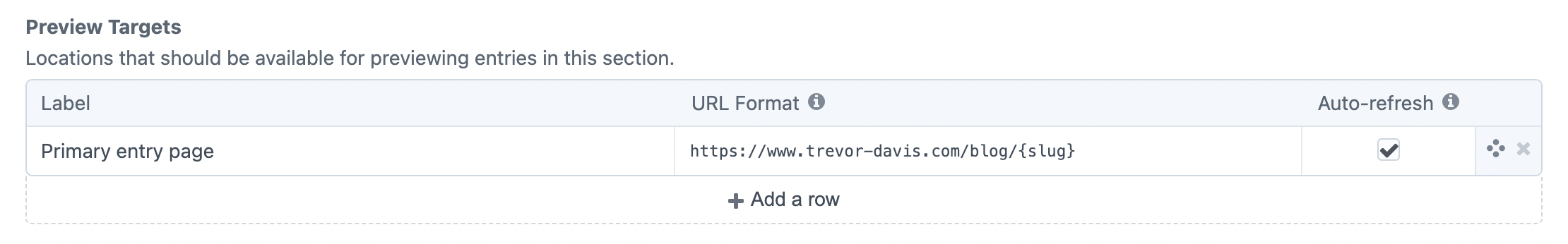
Now with the Remix configuration in place, I just needed to make two small changes to Craft to get it working correctly. First, I had to update the preview target for my Blog section to point to my Remix site:
Then, I had to update the config/general.php to allow iframe requests from my Remix domain:
And just like that, I had live preview working.
";s:10:"typeHandle";s:4:"blog";s:10:"bodyBlocks";a:7:{i:0;a:3:{s:2:"id";s:4:"2772";s:10:"typeHandle";s:4:"text";s:4:"text";s:999:"In my previous post, I talked about transitioning my site from being powered by Craft to being powered by Remix and a GraphQL endpoint coming from Craft. One of the best features of Craft is Live Preview, and it took a little configuration to get this working on my new Remix powered site.
These were specific changes that I needed to make on the Remix side, but really it would be the same for any GraphQL request. As Andrew Welch breaks down in his article, the key is passing the token parameter back that Craft included in the URL.
In the loader function of my blog post route, I call a helper function to setup the GraphQL client, and I pass the request to it:
";}i:1;a:4:{s:2:"id";s:4:"2773";s:10:"typeHandle";s:4:"code";s:4:"code";s:314:"import { json } from 'remix' import { gql } from 'graphql-request' import { gqlClient } from 'graphql.server' export const loader = async ({ request }) => { const { entries } = await gqlClient(request).request(gql` { YOUR GRAPHQL QUERY HERE } `) return json({ entries }) }";s:4:"lang";s:3:"jsx";}i:2;a:3:{s:2:"id";s:4:"2774";s:10:"typeHandle";s:4:"text";s:4:"text";s:153:"And then in my helper function, I take that request, grab the URL params that I want to include, and add those to my GraphQL request endpoint URL:
";}i:3;a:4:{s:2:"id";s:4:"2775";s:10:"typeHandle";s:4:"code";s:4:"code";s:852:"import { GraphQLClient } from 'graphql-request' // Extract allowed query params and construct query string const getQueryParams = (request) => { const url = new URL(request.url) const allowedKeys = ['x-craft-preview', 'x-craft-live-preview', 'token'] const filteredParams = Object.entries( Object.fromEntries(url.searchParams) ).filter(([key]) => allowedKeys.includes(key)) if (!filteredParams.length) { return '' } const queryString = filteredParams.map((val) => val.join('=')).join('&') return `?${queryString}` } export const gqlClient = (request = null) => { const queryString = request ? getQueryParams(request) : '' return new GraphQLClient(`https://your-endpoint-here/${queryString}`, { headers: { authorization: `Bearer YOUR_AUTH_TOKEN_HERE`, }, }) }";s:4:"lang";s:3:"jsx";}i:4;a:3:{s:2:"id";s:4:"2776";s:10:"typeHandle";s:4:"text";s:4:"text";s:706:"It wasn’t totally necessary to include the x-craft-preview and x-craft-live-preview parameters, but I figured it couldn’t hurt.
Now with the Remix configuration in place, I just needed to make two small changes to Craft to get it working correctly. First, I had to update the preview target for my Blog section to point to my Remix site:
Then, I had to update the config/general.php to allow iframe requests from my Remix domain:
And just like that, I had live preview working.
";}}}i:2;a:8:{s:2:"id";s:4:"2140";s:5:"title";s:32:"Why I’m So Excited About Remix";s:13:"sectionHandle";s:4:"blog";s:8:"postDate";s:35:"Mon, 17 Jan 2022 11:00:00 -05000000";s:3:"uri";s:34:"blog/why-im-so-excited-about-remix";s:4:"body";s:6064:"I’ve been building on the web for a long time. There’s a part of me that still has a bit of an old school mentality, and it’s hard for me to get really excited about new technology. Sure React was cool when it came out for its state management, but I didn’t see it as the be-all and end-all for building on the web. I really like Craft CMS for building CMS powered sites since I have full control over the HTML being sent to the browser, and it’s really easy to extend for complex functionality, but it can be a bit complex to setup for beginners and with additional complexity can come performance issues. So it’s been a while since I’ve seen something to be really excited about.
Enter Remix.
Remix is an interesting mix of old school techniques along with modern technology. Ryan Florence actually sums it up perfectly as to where Remix fits in.
Forget “full stack”. Remix is center stack.
— Ryan Florence (@ryanflorence) January 15, 2022
It’s an HTTP tunnel between interactivity and business logic. It’s the part of the stack that no tool before it has solved, not completely.
I think I finally know how to talk about Remix.
I was able to easily switch my site that was fully powered by Craft to utilize Craft only as a GraphQL endpoint and Remix powering the rest. The two big things I needed to figure out were: how to get data from the GraphQL endpoint, and then how to process input from a user (for my contact form). I would definitely recommend reading through the Remix docs and the two tutorials, but if you can understand these two big pictures things, you’ll have enough to get started with Remix and go deeper once you get into it.
Remix provides a loader hook that runs on the server to hydrate your component. In this simple example, I run a GraphQL request and return JSON with the results of that request in the loader function.
Then in my Index component, I access the data from the loader hook with useLoaderData(), and my component is now hydrated with that data. In MVC style of thinking, think of the loader hook as the controller processing the page load request, populating with data from the model, and then passing to the view.
The great part about Remix is that this doesn’t have to be specifically a GraphQL request. This data can come from anywhere. The Jokes tutorial in the Remix docs even thoroughly walks through how you can manage all this data in Prisma.
Ok great, so we’ve got data onto the page, but now we need to be able to handle user input. Remix also provides an action hook to process an action request (ex: a form submission). In my case, I have a contact form that sends me an email via SendGrid after submission.
If you don’t include an action attribute on your form, it will automatically submit to the same page. Again, in MVC thinking, the action would again be equivalent to the controller taking the request input and processing it. But honestly, this takes me back 15 years when form actions would point directly to PHP files.
Since Remix is running on the server, you can turn off JavaScript and everything still works great. Data still loads, form actions still process; it’s beautiful. This is not running loaders and actions on the client side; it’s running them on the server. This isn’t an accident, the Remix team is carefully considering the UX.
User experience (UX) and developer experience (DX) are both important. UX is more important than DX.@remix_run has taught me: It's easier to start with a great UX and work toward a good DX than it is to start with a great DX and work toward a good UX.
— Kent C. Dodds 💿 (@kentcdodds) January 15, 2022
Did I mention how fast everything renders? I don’t tend to put too much stock into Lighthouse scores since they seem so random, but Remix crushes Lighthouse without me having to invest any additional effort into improving performance.
Remix is built on the native Fetch API, so it can run anywhere. While Remix is relatively new, it’s certainly production ready, and there is a dedicated team behind it. If you aren’t ready to dive into Remix yet, at least keep your eye on it because this is a game changer.
";s:10:"typeHandle";s:4:"blog";s:10:"bodyBlocks";a:5:{i:0;a:3:{s:2:"id";s:4:"2942";s:10:"typeHandle";s:4:"text";s:4:"text";s:2413:"I’ve been building on the web for a long time. There’s a part of me that still has a bit of an old school mentality, and it’s hard for me to get really excited about new technology. Sure React was cool when it came out for its state management, but I didn’t see it as the be-all and end-all for building on the web. I really like Craft CMS for building CMS powered sites since I have full control over the HTML being sent to the browser, and it’s really easy to extend for complex functionality, but it can be a bit complex to setup for beginners and with additional complexity can come performance issues. So it’s been a while since I’ve seen something to be really excited about.
Enter Remix.
Remix is an interesting mix of old school techniques along with modern technology. Ryan Florence actually sums it up perfectly as to where Remix fits in.
Forget “full stack”. Remix is center stack.
— Ryan Florence (@ryanflorence) January 15, 2022
It’s an HTTP tunnel between interactivity and business logic. It’s the part of the stack that no tool before it has solved, not completely.
I think I finally know how to talk about Remix.
I was able to easily switch my site that was fully powered by Craft to utilize Craft only as a GraphQL endpoint and Remix powering the rest. The two big things I needed to figure out were: how to get data from the GraphQL endpoint, and then how to process input from a user (for my contact form). I would definitely recommend reading through the Remix docs and the two tutorials, but if you can understand these two big pictures things, you’ll have enough to get started with Remix and go deeper once you get into it.
Remix provides a loader hook that runs on the server to hydrate your component. In this simple example, I run a GraphQL request and return JSON with the results of that request in the loader function.
";}i:1;a:4:{s:2:"id";s:4:"2943";s:10:"typeHandle";s:4:"code";s:4:"code";s:775:"import { GraphQLClient } from 'graphql-request' import { gql } from 'graphql-request' import { useLoaderData, json } from 'remix' const endpoint = 'https://your-endpoint-here/' const options = { headers: { authorization: 'Bearer YOUR_AUTH_TOKEN_HERE', } } const EntriesQuery = gql` { YOUR GRAPHQL QUERY HERE } ` export const loader = async () => { const { entries } = new GraphQLClient(endpoint, options).request(EntriesQuery) return json({ entries }) } export default function Index() { const data = useLoaderData() return ( <> {data.entries.map((entry) => (Then in my Index component, I access the data from the loader hook with useLoaderData(), and my component is now hydrated with that data. In MVC style of thinking, think of the loader hook as the controller processing the page load request, populating with data from the model, and then passing to the view.
The great part about Remix is that this doesn’t have to be specifically a GraphQL request. This data can come from anywhere. The Jokes tutorial in the Remix docs even thoroughly walks through how you can manage all this data in Prisma.
Ok great, so we’ve got data onto the page, but now we need to be able to handle user input. Remix also provides an action hook to process an action request (ex: a form submission). In my case, I have a contact form that sends me an email via SendGrid after submission.
";}i:3;a:4:{s:2:"id";s:4:"2945";s:10:"typeHandle";s:4:"code";s:4:"code";s:654:"import { useActionData, Form, redirect, json } from 'remix' export async function action({ request }) { const formData = await request.formData() const errors = {} // Do data validation and add to the errors object if there are any errors if (Object.keys(errors).length) { return json(errors, { status: 422 }) } // No errors: send email, store in DB, do whatever you need to do with the form data return redirect('/contact/thanks') } export default function ContactIndex() { const errors = useActionData() return ( ) }";s:4:"lang";s:3:"jsx";}i:4;a:3:{s:2:"id";s:4:"2946";s:10:"typeHandle";s:4:"text";s:4:"text";s:2044:"If you don’t include an action attribute on your form, it will automatically submit to the same page. Again, in MVC thinking, the action would again be equivalent to the controller taking the request input and processing it. But honestly, this takes me back 15 years when form actions would point directly to PHP files.
Since Remix is running on the server, you can turn off JavaScript and everything still works great. Data still loads, form actions still process; it’s beautiful. This is not running loaders and actions on the client side; it’s running them on the server. This isn’t an accident, the Remix team is carefully considering the UX.
User experience (UX) and developer experience (DX) are both important. UX is more important than DX.@remix_run has taught me: It's easier to start with a great UX and work toward a good DX than it is to start with a great DX and work toward a good UX.
— Kent C. Dodds 💿 (@kentcdodds) January 15, 2022
Did I mention how fast everything renders? I don’t tend to put too much stock into Lighthouse scores since they seem so random, but Remix crushes Lighthouse without me having to invest any additional effort into improving performance.
Remix is built on the native Fetch API, so it can run anywhere. While Remix is relatively new, it’s certainly production ready, and there is a dedicated team behind it. If you aren’t ready to dive into Remix yet, at least keep your eye on it because this is a game changer.
";}}}i:3;a:7:{s:2:"id";s:4:"2093";s:5:"title";s:13:"MW Components";s:13:"sectionHandle";s:4:"work";s:8:"postDate";s:35:"Wed, 01 Dec 2021 06:50:00 -05000000";s:3:"uri";s:18:"work/mw-components";s:7:"website";s:29:"https://www.mwcomponents.com/";s:12:"listingImage";a:1:{i:0;a:1:{s:3:"url";s:53:"//assets.trevor-davis.com/uploads/images/work/mwi.jpg";}}}i:4;a:8:{s:2:"id";s:4:"2091";s:5:"title";s:37:"What I Love & Hate About Tailwind CSS";s:13:"sectionHandle";s:4:"blog";s:8:"postDate";s:35:"Wed, 01 Dec 2021 06:44:00 -05000000";s:3:"uri";s:40:"blog/what-i-love-hate-about-tailwind-css";s:4:"body";s:120:"As a long time skeptic of Tailwind CSS, I’ve finally given it a try and discovered some things I love and hate.
";s:10:"typeHandle";s:15:"externalArticle";s:7:"website";s:67:"https://www.viget.com/articles/what-i-love-hate-about-tailwind-css/";}i:5;a:8:{s:2:"id";s:4:"2089";s:5:"title";s:43:"How We Prevent Leaky Templates in Craft CMS";s:13:"sectionHandle";s:4:"blog";s:8:"postDate";s:35:"Wed, 01 Dec 2021 06:43:00 -05000000";s:3:"uri";s:48:"blog/how-we-prevent-leaky-templates-in-craft-cms";s:4:"body";s:87:"Prevent the flood of leaky templates in Craft CMS with just a little bit of PHP.
";s:10:"typeHandle";s:15:"externalArticle";s:7:"website";s:75:"https://www.viget.com/articles/how-we-prevent-leaky-templates-in-craft-cms/";}i:6;a:7:{s:2:"id";s:4:"2087";s:5:"title";s:21:"Human Rights Campaign";s:13:"sectionHandle";s:4:"work";s:8:"postDate";s:35:"Mon, 03 May 2021 15:50:00 -04000000";s:3:"uri";s:8:"work/hrc";s:7:"website";s:20:"https://www.hrc.org/";s:12:"listingImage";a:1:{i:0;a:1:{s:3:"url";s:53:"//assets.trevor-davis.com/uploads/images/work/hrc.jpg";}}}i:7;a:7:{s:2:"id";s:4:"2057";s:5:"title";s:23:"NFL Players Association";s:13:"sectionHandle";s:4:"work";s:8:"postDate";s:35:"Fri, 29 May 2020 15:00:00 -04000000";s:3:"uri";s:10:"work/nflpa";s:7:"website";s:22:"https://www.nflpa.com/";s:12:"listingImage";a:1:{i:0;a:1:{s:3:"url";s:55:"//assets.trevor-davis.com/uploads/images/work/nflpa.jpg";}}}i:8;a:8:{s:2:"id";s:3:"858";s:5:"title";s:48:"Level Up with Craft CMS: Know When to Ditch Twig";s:13:"sectionHandle";s:4:"blog";s:8:"postDate";s:35:"Fri, 07 Jun 2019 17:30:00 -04000000";s:3:"uri";s:52:"blog/level-up-with-craft-cms-know-when-to-ditch-twig";s:4:"body";s:121:"If you notice your Twig templates are getting overly complex, it may be time to extend Craft with a custom Module.
";s:10:"typeHandle";s:15:"externalArticle";s:7:"website";s:79:"https://www.viget.com/articles/level-up-with-craft-cms-know-when-to-ditch-twig/";}i:9;a:7:{s:2:"id";s:3:"856";s:5:"title";s:16:"Hamilton Company";s:13:"sectionHandle";s:4:"work";s:8:"postDate";s:35:"Wed, 23 Jan 2019 21:15:00 -05000000";s:3:"uri";s:21:"work/hamilton-company";s:7:"website";s:32:"https://www.hamiltoncompany.com/";s:12:"listingImage";a:1:{i:0;a:1:{s:3:"url";s:58:"//assets.trevor-davis.com/uploads/images/work/hamilton.jpg";}}}i:10;a:8:{s:2:"id";s:3:"854";s:5:"title";s:37:"Why You Should Update to Craft 3 ASAP";s:13:"sectionHandle";s:4:"blog";s:8:"postDate";s:35:"Wed, 23 Jan 2019 19:09:00 -05000000";s:3:"uri";s:42:"blog/why-you-should-update-to-craft-3-asap";s:4:"body";s:194:"Updating to Craft 3 means new features for your site with improved performance and security. This latest version was released earlier this year, and you should update as soon as possible!
";s:10:"typeHandle";s:15:"externalArticle";s:7:"website";s:69:"https://www.viget.com/articles/why-you-should-update-to-craft-3-asap/";}i:11;a:7:{s:2:"id";s:3:"781";s:5:"title";s:13:"BDI Furniture";s:13:"sectionHandle";s:4:"work";s:8:"postDate";s:35:"Thu, 21 Sep 2017 14:45:00 -04000000";s:3:"uri";s:8:"work/bdi";s:7:"website";s:23:"https://www.bdiusa.com/";s:12:"listingImage";a:1:{i:0;a:1:{s:3:"url";s:53:"//assets.trevor-davis.com/uploads/images/work/bdi.jpg";}}}i:12;a:7:{s:2:"id";s:3:"784";s:5:"title";s:22:"Bethesda Creation Club";s:13:"sectionHandle";s:4:"work";s:8:"postDate";s:35:"Wed, 20 Sep 2017 21:14:17 -04001717";s:3:"uri";s:27:"work/bethesda-creation-club";s:7:"website";s:36:"https://creationclub.bethesda.net/en";s:12:"listingImage";a:1:{i:0;a:1:{s:3:"url";s:72:"//assets.trevor-davis.com/uploads/images/work/bethesda-creation-club.jpg";}}}i:13;a:7:{s:2:"id";s:3:"780";s:5:"title";s:28:"PBS Kids Development Tracker";s:13:"sectionHandle";s:4:"work";s:8:"postDate";s:35:"Wed, 20 Sep 2017 21:04:00 -04000000";s:3:"uri";s:33:"work/pbs-kids-development-tracker";s:7:"website";N;s:12:"listingImage";a:1:{i:0;a:1:{s:3:"url";s:58:"//assets.trevor-davis.com/uploads/images/work/pbs-kids.jpg";}}}i:14;a:7:{s:2:"id";s:3:"779";s:5:"title";s:21:"Lupus Resource Center";s:13:"sectionHandle";s:4:"work";s:8:"postDate";s:35:"Wed, 20 Sep 2017 21:00:00 -04000000";s:3:"uri";s:26:"work/lupus-resource-center";s:7:"website";N;s:12:"listingImage";a:1:{i:0;a:1:{s:3:"url";s:71:"//assets.trevor-davis.com/uploads/images/work/lupus-resource-center.jpg";}}}i:15;a:7:{s:2:"id";s:3:"778";s:5:"title";s:11:"Lully Sleep";s:13:"sectionHandle";s:4:"work";s:8:"postDate";s:35:"Wed, 20 Sep 2017 20:54:00 -04000000";s:3:"uri";s:16:"work/lully-sleep";s:7:"website";N;s:12:"listingImage";a:1:{i:0;a:1:{s:3:"url";s:55:"//assets.trevor-davis.com/uploads/images/work/lully.jpg";}}}i:16;a:7:{s:2:"id";s:3:"774";s:5:"title";s:21:"Volunteers of America";s:13:"sectionHandle";s:4:"work";s:8:"postDate";s:35:"Thu, 07 Sep 2017 17:54:00 -04000000";s:3:"uri";s:8:"work/voa";s:7:"website";N;s:12:"listingImage";a:1:{i:0;a:1:{s:3:"url";s:53:"//assets.trevor-davis.com/uploads/images/work/voa.jpg";}}}i:17;a:8:{s:2:"id";s:3:"813";s:5:"title";s:36:"Managing CSS & JS in an HTTP/2 World";s:13:"sectionHandle";s:4:"blog";s:8:"postDate";s:35:"Thu, 24 Aug 2017 10:00:00 -04000000";s:3:"uri";s:39:"blog/managing-css-js-in-an-http-2-world";s:4:"body";s:669:"We have been hearing about HTTP/2 for years now. We've even blogged a little bit about it. But we hadn't really done much with it. Until now. On a few recent projects, I made it a goal to use HTTP/2 and figure out how to best utilize multiplexing. This post isn't necessarily going to cover why you should use HTTP/2, but it's going to discuss how I've been managing CSS & JS to account for this paradigm shift.
";s:10:"typeHandle";s:15:"externalArticle";s:7:"website";s:53:"https://www.viget.com/articles/managing-css-js-http-2";}i:18;a:7:{s:2:"id";s:3:"777";s:5:"title";s:20:"Open Space Institute";s:13:"sectionHandle";s:4:"work";s:8:"postDate";s:35:"Wed, 23 Aug 2017 20:37:00 -04000000";s:3:"uri";s:25:"work/open-space-institute";s:7:"website";s:35:"https://www.openspaceinstitute.org/";s:12:"listingImage";a:1:{i:0;a:1:{s:3:"url";s:53:"//assets.trevor-davis.com/uploads/images/work/osi.jpg";}}}i:19;a:8:{s:2:"id";s:3:"811";s:5:"title";s:27:"Craft Color Swatches Plugin";s:13:"sectionHandle";s:4:"blog";s:8:"postDate";s:35:"Tue, 08 Aug 2017 10:00:00 -04000000";s:3:"uri";s:32:"blog/craft-color-swatches-plugin";s:4:"body";s:607:"The control that Craft can provide a user is what makes it stand out as a content management system. But sometimes we want to limit what a user can choose from. Craft has a built-in Color field which allows a user to select any color from a color picker. There are times when we only want a user to choose from a select number of colors though. Previously we have done this by using a dropdown with a list of colors, but I decided to build a plugin to allow a user to select from an admin-defined set of colors.
";s:10:"typeHandle";s:15:"externalArticle";s:7:"website";s:58:"https://www.viget.com/articles/craft-color-swatches-plugin";}i:20;a:8:{s:2:"id";s:3:"810";s:5:"title";s:37:"Responsive Images with srcset & Craft";s:13:"sectionHandle";s:4:"blog";s:8:"postDate";s:35:"Tue, 22 Mar 2016 00:00:00 -04000000";s:3:"uri";s:40:"blog/responsive-images-with-srcset-craft";s:4:"body";s:438:"Tommy recently wrote about responsive background images in Craft, but I wanted to follow up about how we used the <img> element and srcset to build responsive images on this very site (powered by Craft).
On a recent project that was built on Craft, I finally got the chance the kick the tires on building a members-only section with Craft. Out of the box, Craft provides so much user functionality, but the user moderation process wasn’t exactly what the client wanted. Luckily, Craft provides us with the ability to change that process with ease.
";s:10:"typeHandle";s:15:"externalArticle";s:7:"website";s:60:"https://www.viget.com/articles/pending-user-plugin-for-craft";}i:22;a:8:{s:2:"id";s:3:"808";s:5:"title";s:32:"How to Survive Working from Home";s:13:"sectionHandle";s:4:"blog";s:8:"postDate";s:35:"Tue, 21 Apr 2015 09:30:00 -04000000";s:3:"uri";s:37:"blog/how-to-survive-working-from-home";s:4:"body";s:656:"When I started working here five years ago, we had two offices: one in Falls Church, VA and another in Durham, NC. Now we have a third office in Boulder, CO and a handful of employees, including myself, working remotely. Being set up the way we are, we are all used to interacting with remote team members, but the majority of the employees work in an office.
I happily worked from the Virginia office for three years, but because of personal circumstance, I had to move to Michigan for a year. I didn’t want to leave Viget, so I asked for the opportunity to work remotely; I was anxious and hesitant about giving up the office environment.
";s:10:"typeHandle";s:15:"externalArticle";s:7:"website";s:63:"https://www.viget.com/articles/how-to-survive-working-from-home";}i:23;a:8:{s:2:"id";s:3:"807";s:5:"title";s:29:"Front-End Parts Kits in Craft";s:13:"sectionHandle";s:4:"blog";s:8:"postDate";s:35:"Thu, 19 Feb 2015 00:00:00 -05000000";s:3:"uri";s:34:"blog/front-end-parts-kits-in-craft";s:4:"body";s:552:"Pattern library, style guide, UI library, parts kit; call them what you want, but these are essential to building websites of any scale. Typically, this is something you manually construct to demonstrate all the modules and pieces that you have constructed, but I have been investigating ways to make them a bit more dynamic when building sites with Craft.
";s:10:"typeHandle";s:15:"externalArticle";s:7:"website";s:60:"https://www.viget.com/articles/front-end-parts-kits-in-craft";}i:24;a:8:{s:2:"id";s:3:"806";s:5:"title";s:21:"Why We Love Craft CMS";s:13:"sectionHandle";s:4:"blog";s:8:"postDate";s:35:"Fri, 17 Oct 2014 00:00:00 -04000000";s:3:"uri";s:26:"blog/why-we-love-craft-cms";s:4:"body";s:101:"I decided to write a little post to give some insight into why we love Craft so much at Viget.
";s:10:"typeHandle";s:15:"externalArticle";s:7:"website";s:52:"https://www.viget.com/articles/why-we-love-craft-cms";}i:25;a:7:{s:2:"id";s:3:"760";s:5:"title";s:14:"Pointless Corp";s:13:"sectionHandle";s:4:"work";s:8:"postDate";s:35:"Fri, 12 Sep 2014 16:18:45 -04004545";s:3:"uri";s:19:"work/pointless-corp";s:7:"website";s:25:"http://pointlesscorp.com/";s:12:"listingImage";a:1:{i:0;a:1:{s:3:"url";s:67:"//assets.trevor-davis.com/uploads/images/work/pointless-listing.jpg";}}}i:26;a:7:{s:2:"id";s:3:"754";s:5:"title";s:6:"GoPole";s:13:"sectionHandle";s:4:"work";s:8:"postDate";s:35:"Fri, 12 Sep 2014 15:41:00 -04000000";s:3:"uri";s:11:"work/gopole";s:7:"website";s:23:"https://www.gopole.com/";s:12:"listingImage";a:1:{i:0;a:1:{s:3:"url";s:64:"//assets.trevor-davis.com/uploads/images/work/gopole-listing.jpg";}}}i:27;a:8:{s:2:"id";s:3:"805";s:5:"title";s:44:"Attending & Speaking at the Craft CMS Summit";s:13:"sectionHandle";s:4:"blog";s:8:"postDate";s:35:"Tue, 01 Jul 2014 10:00:00 -04000000";s:3:"uri";s:47:"blog/attending-speaking-at-the-craft-cms-summit";s:4:"body";s:818:"I’m a little belated, but I was lucky enough to attend and speak at the first Craft CMS Summit two weeks ago. This was the first online conference that I had ever attended, and I was thoroughly impressed. I had always been a bit hesitant to attend online conferences because I was unsure about the quality, but after experiencing it firsthand I won't hesitate in the future. Everything was very well organized and the speakers all gave excellent presentations. It was also nice to sit and learn in the comfort of my own home instead of having to deal with the extra burdon of traveling for a conference. Side note: Environments for Humans, the company who hosted the conference, has additional upcoming events.
";s:10:"typeHandle";s:15:"externalArticle";s:7:"website";s:47:"https://www.viget.com/articles/craft-cms-summit";}i:28;a:8:{s:2:"id";s:3:"804";s:5:"title";s:27:"Integrating Craft & Shopify";s:13:"sectionHandle";s:4:"blog";s:8:"postDate";s:35:"Fri, 16 May 2014 10:00:00 -04000000";s:3:"uri";s:30:"blog/integrating-craft-shopify";s:4:"body";s:367:"As we have the opportunity work on more Craft sites at Viget, we’ve been able to do some interesting integrations, like our most recent integration with the ecommerce platform Shopify. Below is a step-by-step guide to implementing Craft and Shopify by utilizing a plugin I built.
";s:10:"typeHandle";s:15:"externalArticle";s:7:"website";s:56:"https://www.viget.com/articles/integrating-craft-shopify";}i:29;a:8:{s:2:"id";s:3:"802";s:5:"title";s:24:"Reroute Plugin for Craft";s:13:"sectionHandle";s:4:"blog";s:8:"postDate";s:35:"Tue, 10 Dec 2013 10:30:00 -05000000";s:3:"uri";s:29:"blog/reroute-plugin-for-craft";s:4:"body";s:399:"You know what's really annoying? Having a million redirects in your .htaccess file. When we build EE sites, Detour Pro has become a part of our builds so that other team members and clients can manage redirects. But, that solution won't really work when you launch your first Craft site for a client!
";s:10:"typeHandle";s:15:"externalArticle";s:7:"website";s:48:"http://viget.com/extend/reroute-plugin-for-craft";}i:30;a:8:{s:2:"id";s:3:"801";s:5:"title";s:14:"Getting Crafty";s:13:"sectionHandle";s:4:"blog";s:8:"postDate";s:35:"Mon, 04 Nov 2013 09:00:00 -05000000";s:3:"uri";s:19:"blog/getting-crafty";s:4:"body";s:478:"Here at Viget, we have been using ExpressionEngine as our primary off-the-shelf CMS for years. Craft and Statamic, both of which are developed by EE add-on developers, have really caught our attention. We finally determined that Craft would be an appropriate solution for a project, and while building the site, I built a couple small plugins.
";s:10:"typeHandle";s:15:"externalArticle";s:7:"website";s:38:"http://viget.com/extend/getting-crafty";}i:31;a:7:{s:2:"id";s:3:"305";s:5:"title";s:3:"NEA";s:13:"sectionHandle";s:4:"work";s:8:"postDate";s:35:"Mon, 14 Oct 2013 17:36:00 -04000000";s:3:"uri";s:8:"work/nea";s:7:"website";s:19:"http://www.nea.com/";s:12:"listingImage";a:1:{i:0;a:1:{s:3:"url";s:62:"//assets.trevor-davis.com/uploads/images/work/nea-featured.jpg";}}}i:32;a:8:{s:2:"id";s:3:"799";s:5:"title";s:10:"You Matter";s:13:"sectionHandle";s:4:"blog";s:8:"postDate";s:35:"Thu, 19 Sep 2013 10:00:00 -04000000";s:3:"uri";s:15:"blog/you-matter";s:4:"body";s:258:"I’m not sure if it’s a couple of talks that I recently saw at Peers Conference or maybe the fact that I’m just getting older, but I’ve been thinking a lot lately about work/life balance and personal health.
";s:10:"typeHandle";s:15:"externalArticle";s:7:"website";s:36:"http://viget.com/flourish/you-matter";}i:33;a:8:{s:2:"id";s:2:"46";s:5:"title";s:46:"JavaScript Execution Patterns for Non-Web Apps";s:13:"sectionHandle";s:4:"blog";s:8:"postDate";s:35:"Tue, 30 Apr 2013 12:52:00 -04000000";s:3:"uri";s:51:"blog/javascript-execution-patterns-for-non-web-apps";s:4:"body";s:322:"I finally got back to blogging and wrote an article about JavaScript execution patterns, a topic which I recently presented on at the DC jQuery Meetup.
";s:10:"typeHandle";s:15:"externalArticle";s:7:"website";s:70:"http://viget.com/extend/javascript-execution-patterns-for-non-web-apps";}i:34;a:8:{s:2:"id";s:2:"49";s:5:"title";s:37:"Who Says the Web is Just for Squares?";s:13:"sectionHandle";s:4:"blog";s:8:"postDate";s:35:"Tue, 08 Jan 2013 11:43:00 -05000000";s:3:"uri";s:41:"blog/who-says-the-web-is-just-for-squares";s:4:"body";s:197:"I had some fun building a crazy diamond responsive grid for a project at work. This article explains how I did it.
";s:10:"typeHandle";s:15:"externalArticle";s:7:"website";s:61:"http://viget.com/inspire/who-says-the-web-is-just-for-squares";}i:35;a:7:{s:2:"id";s:3:"306";s:5:"title";s:19:"World Wildlife Fund";s:13:"sectionHandle";s:4:"work";s:8:"postDate";s:35:"Wed, 19 Dec 2012 14:45:00 -05000000";s:3:"uri";s:8:"work/wwf";s:7:"website";s:24:"http://worldwildlife.org";s:12:"listingImage";a:1:{i:0;a:1:{s:3:"url";s:62:"//assets.trevor-davis.com/uploads/images/work/wwf-featured.jpg";}}}i:36;a:8:{s:2:"id";s:2:"51";s:5:"title";s:27:"Dumbwaiter Chrome Extension";s:13:"sectionHandle";s:4:"blog";s:8:"postDate";s:35:"Fri, 28 Sep 2012 11:57:00 -04000000";s:3:"uri";s:32:"blog/dumbwaiter-chrome-extension";s:4:"body";s:3079:"I recently got around to trying out Statamic to create a little recipe manager. Yes, I know there are tons of apps out there that do this type of stuff, but I wanted to really be able to control everything.
I also wanted to figure out some way that my wife could bookmark recipes for us, and I didn’t expect her to login to my Statamic install and go through that whole process of adding a new entry. I wanted her to be able to click a button when she was on a site displaying a recipe that she wanted to bookmark, and an entry would then be created. That led me to create my first Chrome Extension, Dumbwaiter.
The basic idea is that you provide a URL that will be opened in a popup window when you click the exntension. Then you provide some JavaScript to do something on the current page you are on, and then some more JavaScript to do something with that data. So in my case, I grab the URL of the page where the recipe is coming from, grab the name of the recipe, and then whatever text is highlighted on the page. So, the process to add a recipe is to highlight the actual recipe, then click the Dumbwaiter icon, and all the data will be pre-populated into my Statamic new entry form.
Here is some example code that I am using, but the options are limitless: whatever you can do with jQuery, you can do with Dumbwaiter.
var title = jQuery('meta[property="og:title"]').attr('content');
var source = window.location.href;
var img = jQuery('meta[property="og:image"]').attr('content');
var content = window.getSelection().toString();

if(!title) {
	title = jQuery('title').text();
}

var data = {
	title: title,
	source: source,
	img: img,
	content: content
};function makeSlug(str) {
str = str.replace(/^\s+|\s+$/g, ''); // trim
str = str.toLowerCase();
// remove accents, swap ñ for n, etc
var from = "àáäâèéëêìíïîòóöôùúüûñç·/_,:;";
var to = "aaaaeeeeiiiioooouuuunc------";
for (var i=0, l=from.length ; i < l ; i++) {
str = str.replace(new RegExp(from.charAt(i), 'g'), to.charAt(i));
}
str = str.replace(/[^a-z0-9 -]/g, '') // remove invalid chars
.replace(/\s+/g, '-') // collapse whitespace and replace by -
.replace(/-+/g, '-'); // collapse dashes
return str;
};
$('#publish-title').val(data.title).focus();
var slug = makeSlug(data.title);
$('#publish-slug').val(slug);
$('input[name="page[yaml][source]"]').val(data.source);
$('textarea.markItUpEditor').val(data.content);You can download Dumbwaiter here, and let me know if you guys find any creative uses!
";s:10:"typeHandle";s:4:"blog";s:10:"bodyBlocks";a:0:{}}i:37;a:8:{s:2:"id";s:2:"52";s:5:"title";s:61:"jQuery Stick ‘em: Make Content Sticky on Scroll, to a Point";s:13:"sectionHandle";s:4:"blog";s:8:"postDate";s:35:"Tue, 11 Sep 2012 09:31:00 -04000000";s:3:"uri";s:20:"blog/jquery-stick-em";s:4:"body";s:164:"I created a plugin, jQuery Stick ‘em, to allow items to be “sticky” but only within a container.
";s:10:"typeHandle";s:15:"externalArticle";s:7:"website";s:40:"http://viget.com/inspire/jquery-stick-em";}i:38;a:8:{s:2:"id";s:2:"54";s:5:"title";s:50:"“Advanced” Templating with ExpressionEngine";s:13:"sectionHandle";s:4:"blog";s:8:"postDate";s:35:"Sun, 29 Jul 2012 08:18:03 -04000303";s:3:"uri";s:46:"blog/advanced-templating-with-expressionengine";s:4:"body";s:443:"I was luckily enough to be asked to speak at the DCEERs Day conference yesterday. I was asked to speak about best templating practices, which ended up being a talk about how I use Stash and how I build custom plugins to streamline templating. It was a great day filled with discussion about ExpressionEngine, and it made me look forward to EECI even more!
";s:10:"typeHandle";s:4:"blog";s:10:"bodyBlocks";a:0:{}}i:39;a:8:{s:2:"id";s:2:"56";s:5:"title";s:51:"Sass & Compass: Never Write Regular CSS Again";s:13:"sectionHandle";s:4:"blog";s:8:"postDate";s:35:"Tue, 24 Jul 2012 18:56:00 -04000000";s:3:"uri";s:47:"blog/sass-compass-never-write-regular-css-again";s:4:"body";s:640:"I gave a presentation last week at Refresh DC about Sass & Compass. After being introduced to Sass & Compass about six months ago, I can’t imagine writing regular CSS ever again. I was a little hesitant at first, but now I can’t live without it. I posted my slides online, and here is the git repo with all of the code samples.
";s:10:"typeHandle";s:4:"blog";s:10:"bodyBlocks";a:0:{}}i:40;a:8:{s:2:"id";s:2:"57";s:5:"title";s:18:"A Long Time Coming";s:13:"sectionHandle";s:4:"blog";s:8:"postDate";s:35:"Mon, 16 Jul 2012 17:42:58 -04005858";s:3:"uri";s:23:"blog/a-long-time-coming";s:4:"body";s:1083:"It’s funny how quickly you come to hate your own site. Almost exactly 2 years ago, I launched a redesigned version of my site. After maybe a year, I hated it. But who has time to redo their own site? Apparently it took me 6 months to find the time to finish mine.
Even within those 6 months, I found things that I had started on the site that I hated. My goals were to simplify things a bit, make it responsive, and play around with Sass and Compass. I also wanted to take some of the focus off of my blog, since I really don’t write too much on it anymore (I write almost all of my articles on the Viget Blogs these days).
Since I’m giving 2 presentations in the next few weeks (Refresh DC & DCEERS), I wanted to get my new site up. So I may have rushed a few things, but I’m pretty happy with it. Let me know if you run into any errors.
";s:10:"typeHandle";s:4:"blog";s:10:"bodyBlocks";a:0:{}}i:41;a:7:{s:2:"id";s:3:"309";s:5:"title";s:5:"Viget";s:13:"sectionHandle";s:4:"work";s:8:"postDate";s:35:"Sat, 16 Jun 2012 11:20:00 -04000000";s:3:"uri";s:10:"work/viget";s:7:"website";s:17:"http://viget.com/";s:12:"listingImage";a:1:{i:0;a:1:{s:3:"url";s:55:"//assets.trevor-davis.com/uploads/images/work/viget.jpg";}}}i:42;a:7:{s:2:"id";s:3:"312";s:5:"title";s:12:"Rumble Games";s:13:"sectionHandle";s:4:"work";s:8:"postDate";s:35:"Sat, 16 Jun 2012 11:18:00 -04000000";s:3:"uri";s:17:"work/rumble-games";s:7:"website";s:28:"https://www.rumblegames.com/";s:12:"listingImage";a:1:{i:0;a:1:{s:3:"url";s:65:"//assets.trevor-davis.com/uploads/images/work/rumble-featured.jpg";}}}i:43;a:7:{s:2:"id";s:3:"311";s:5:"title";s:13:"Ultimat Vodka";s:13:"sectionHandle";s:4:"work";s:8:"postDate";s:35:"Sat, 16 Jun 2012 11:18:00 -04000000";s:3:"uri";s:18:"work/ultimat-vodka";s:7:"website";N;s:12:"listingImage";a:1:{i:0;a:1:{s:3:"url";s:65:"//assets.trevor-davis.com/uploads/images/work/ultimat-feature.jpg";}}}i:44;a:8:{s:2:"id";s:3:"798";s:5:"title";s:53:"Building a Nested Responsive Grid with Sass & Compass";s:13:"sectionHandle";s:4:"blog";s:8:"postDate";s:35:"Tue, 15 May 2012 10:00:00 -04000000";s:3:"uri";s:56:"blog/building-a-nested-responsive-grid-with-sass-compass";s:4:"body";s:405:"Whether you are a hater of the technique or not, Responsive Design is one of the most important things happening on the web right now. I am finally getting a chance to work on a project where we are taking a responsive approach to the site, and it’s been great, but I have definitely come across a few gotchas here and there.
";s:10:"typeHandle";s:15:"externalArticle";s:7:"website";s:76:"http://viget.com/inspire/building-a-nested-responsive-grid-with-sass-compass";}i:45;a:8:{s:2:"id";s:3:"797";s:5:"title";s:54:"The ExpressionEngine Side of the New Viget.com: Part 2";s:13:"sectionHandle";s:4:"blog";s:8:"postDate";s:35:"Thu, 12 Apr 2012 09:30:00 -04000000";s:3:"uri";s:58:"blog/the-expressionengine-side-of-the-new-viget-com-part-2";s:4:"body";s:297:"I’ve already talked about the EE setup for the new viget.com, but now I want to talk about the code. It took a little longer than I wanted to get to it, but let’s finally talk templates and custom addon development.
";s:10:"typeHandle";s:15:"externalArticle";s:7:"website";s:55:"http://viget.com/extend/ee-side-of-the-new-viget-part-2";}i:46;a:8:{s:2:"id";s:3:"796";s:5:"title";s:54:"The ExpressionEngine Side of the New Viget.com: Part 1";s:13:"sectionHandle";s:4:"blog";s:8:"postDate";s:35:"Wed, 21 Mar 2012 09:00:00 -04000000";s:3:"uri";s:58:"blog/the-expressionengine-side-of-the-new-viget-com-part-1";s:4:"body";s:612:"Before I started at Viget, I remember thoroughly enjoying the articles by Doug about building Viget.comin EE. That was really some of my first exposure to EE, and from there I’ve come to love it. My hope is that I can recreate some of Doug’s magic and talk through how I built the current iteration of the Viget site in EE. I know, it’s gonna be hard to do. This post is going to be broken into multiple posts, but buckle up, this is gonna be a long one.
";s:10:"typeHandle";s:15:"externalArticle";s:7:"website";s:55:"http://viget.com/extend/ee-side-of-the-new-viget-part-1";}i:47;a:8:{s:2:"id";s:2:"59";s:5:"title";s:49:"Background-clip, Text-shadow, & Gradients; Oh My!";s:13:"sectionHandle";s:4:"blog";s:8:"postDate";s:35:"Thu, 29 Dec 2011 06:58:00 -05000000";s:3:"uri";s:52:"blog/background-clip-text-shadow-amp-gradients-oh-my";s:4:"body";s:247:"I have been able to play around with background-clip, text-shadow, and gradients on a few recent projects, and I wrote up some tricks that I have come across.
";s:10:"typeHandle";s:15:"externalArticle";s:7:"website";s:67:"http://www.viget.com/inspire/background-clip-text-shadow-gradients/";}i:48;a:8:{s:2:"id";s:2:"60";s:5:"title";s:45:"Notes From Our Default ExpressionEngine Build";s:13:"sectionHandle";s:4:"blog";s:8:"postDate";s:35:"Wed, 28 Sep 2011 12:34:00 -04000000";s:3:"uri";s:50:"blog/notes-from-our-default-expressionengine-build";s:4:"body";s:233:"I put together some notes about Viget’s default ExpressionEngine build in the hopes that you can find some tips and tricks in all of my nonsense.
";s:10:"typeHandle";s:15:"externalArticle";s:7:"website";s:64:"http://www.viget.com/inspire/our-default-expressionengine-build/";}i:49;a:8:{s:2:"id";s:2:"61";s:5:"title";s:31:"Is Ajax ExpressionEngine Plugin";s:13:"sectionHandle";s:4:"blog";s:8:"postDate";s:35:"Tue, 06 Sep 2011 15:14:25 -04002525";s:3:"uri";s:22:"blog/is-ajax-ee-plugin";s:4:"body";s:520:"For a recent project, I needed to detect whether a request was an AJAX request or not. MX Ajax Detect already existed, but I didn’t like that you needed the extra set of tags.
{if {exp:is_ajax} == "true"}
	OH YEAAAH
{if:else}
	OH NOOO
{/if}You can find the plugin on Devot:ee and GitHub.
";s:10:"typeHandle";s:4:"blog";s:10:"bodyBlocks";a:0:{}}i:50;a:7:{s:2:"id";s:3:"314";s:5:"title";s:4:"PUMA";s:13:"sectionHandle";s:4:"work";s:8:"postDate";s:35:"Wed, 03 Aug 2011 19:10:00 -04000000";s:3:"uri";s:9:"work/puma";s:7:"website";N;s:12:"listingImage";a:1:{i:0;a:1:{s:3:"url";s:62:"//assets.trevor-davis.com/uploads/images/work/puma-feature.jpg";}}}i:51;a:8:{s:2:"id";s:2:"62";s:5:"title";s:59:"Styling HTML5 Elements: An Irresponsible Choice…Right Now";s:13:"sectionHandle";s:4:"blog";s:8:"postDate";s:35:"Mon, 27 Jun 2011 10:28:00 -04000000";s:3:"uri";s:50:"blog/html5-elements-irresponsible-choice-right-now";s:4:"body";s:250:"I figured it was time to post about a controversial topic that had come up recently. I just don’t see the value in using most HTML5 elements right now.
";s:10:"typeHandle";s:15:"externalArticle";s:7:"website";s:75:"http://www.viget.com/inspire/html5-elements-irresponsible-choice-right-now/";}i:52;a:8:{s:2:"id";s:2:"65";s:5:"title";s:25:"A Couple of Presentations";s:13:"sectionHandle";s:4:"blog";s:8:"postDate";s:35:"Fri, 06 May 2011 13:24:47 -04004747";s:3:"uri";s:30:"blog/a-couple-of-presentations";s:4:"body";s:627:"I’ve given a couple of presentations recently, so I thought I would share them.
An internal presentation given to all of Viget to give an overview of EE and why I love it.
A presentation given to Clarksburg High School students with a supporting demo site to introduce them to some HTML5 and CSS3 features.
";s:10:"typeHandle";s:4:"blog";s:10:"bodyBlocks";a:0:{}}i:53;a:7:{s:2:"id";s:3:"315";s:5:"title";s:9:"PUMA Golf";s:13:"sectionHandle";s:4:"work";s:8:"postDate";s:35:"Tue, 08 Mar 2011 16:49:00 -05000000";s:3:"uri";s:14:"work/puma-golf";s:7:"website";N;s:12:"listingImage";a:1:{i:0;a:1:{s:3:"url";s:68:"//assets.trevor-davis.com/uploads/images/work/puma-golf-featured.jpg";}}}i:54;a:8:{s:2:"id";s:2:"66";s:5:"title";s:41:"My New Best Friend: CSS Generated Content";s:13:"sectionHandle";s:4:"blog";s:8:"postDate";s:35:"Thu, 03 Mar 2011 08:18:00 -05000000";s:3:"uri";s:26:"blog/css-generated-content";s:4:"body";s:191:"I’ve started to use generated content more and more these days. Here are a couple of examples from a recent project.
";s:10:"typeHandle";s:15:"externalArticle";s:7:"website";s:51:"http://www.viget.com/inspire/css-generated-content/";}i:55;a:8:{s:2:"id";s:2:"67";s:5:"title";s:45:"So You Want to Use .htaccess files with MAMP?";s:13:"sectionHandle";s:4:"blog";s:8:"postDate";s:35:"Mon, 21 Feb 2011 03:55:48 -05004848";s:3:"uri";s:33:"blog/use-htaccess-files-with-mamp";s:4:"body";s:1014:"Well, this was easy in the older version of MAMP that I had. You would just drop them in place, and they worked. I was having a problem with something, so I thought maybe there was an updated version of MAMP that would solve the problem. Sure enough, there was. So I installed it and went along my way. Then, I went back to the local version of my site, and it was completely busted.
I finally tracked it down to .htaccess files being ignored. So I opened up my http.conf file and went down to line 378, and sure enough this is what I saw:
<Directory />
    Options Indexes FollowSymLinks
    AllowOverride None
</Directory>
In the older version of MAMP that I had, the default for this value was All. In order to get .htaccess files working in the new version, I just had to change None to All, restart the server, and everything worked normally. Just thought I would share in case anyone else runs into this problem.
";s:10:"typeHandle";s:4:"blog";s:10:"bodyBlocks";a:0:{}}i:56;a:8:{s:2:"id";s:2:"69";s:5:"title";s:40:"ExpressionEngine Config Variables Plugin";s:13:"sectionHandle";s:4:"blog";s:8:"postDate";s:35:"Tue, 15 Feb 2011 16:23:29 -05002929";s:3:"uri";s:28:"blog/config-variables-plugin";s:4:"body";s:1148:"As I was in the process of moving this site into Git and having a local version, I have been trying to move as many paths as possible into the config.php. One of them included the cache path for image sizer. Since the local and production paths are different, I wanted some way for them to be dynamic. In my config.php file, I am using $_SERVER['DOCUMENT_ROOT'] to set the base_path. I could have enabled PHP in the template and then use the $_SERVER['DOCUMENT_ROOT'], but that seemed like a silly reason to enable PHP.
So I made a plugin that gives you access to everything in the $config array without having to use PHP.
{exp:config:vars value="base_path"}To see all possible values, just pass in “all”:
{exp:config:vars value="all"}You can download from GitHub or Devot-ee. As always, let me know if you run into any issues.
";s:10:"typeHandle";s:4:"blog";s:10:"bodyBlocks";a:0:{}}i:57;a:8:{s:2:"id";s:3:"793";s:5:"title";s:43:"Creating a Google Map with ExpressionEngine";s:13:"sectionHandle";s:4:"blog";s:8:"postDate";s:35:"Thu, 20 Jan 2011 15:27:00 -05000000";s:3:"uri";s:50:"blog/creating-a-google-map-with-expressionengine-1";s:4:"body";s:595:"As Richard Tape has begun to show in his part 1 and part 2 articles on Becoming an ExpressionEngine Superstar, EE is a flexible and easy to customize CMS. Now that everyone has some understanding of how EE works, I thought I would take this opportunity to show a relatively real world example of creating a dynamic Google Map powered by EE.
";s:10:"typeHandle";s:15:"externalArticle";s:7:"website";s:83:"http://net.tutsplus.com/tutorials/cmss/creating-a-google-map-with-expressionengine/";}i:58;a:8:{s:2:"id";s:3:"795";s:5:"title";s:51:"Building an ExpressionEngine Mini Calendar Scroller";s:13:"sectionHandle";s:4:"blog";s:8:"postDate";s:35:"Mon, 10 Jan 2011 10:30:00 -05000000";s:3:"uri";s:56:"blog/building-an-expressionengine-mini-calendar-scroller";s:4:"body";s:438:"I recently decided I wanted to add a calendar of blog entries on my personal site. Luckily, ExpressionEngine has a tag for that, the Calendar Tag. The functionality that I wanted was a little bit different from the two examples in the EE user guide. I wanted to show a calendar by month, and link the days that had an entry to that specific entry.
";s:10:"typeHandle";s:15:"externalArticle";s:7:"website";s:81:"http://www.viget.com/inspire/building-an-expressionengine-mini-calendar-scroller/";}i:59;a:8:{s:2:"id";s:2:"70";s:5:"title";s:10:"URL Design";s:13:"sectionHandle";s:4:"blog";s:8:"postDate";s:35:"Thu, 30 Dec 2010 04:54:23 -05002323";s:3:"uri";s:15:"blog/url-design";s:4:"body";s:146:"Great article about designing URLs. It really is an art and is so easy to do so wrong.
";s:10:"typeHandle";s:4:"blog";s:10:"bodyBlocks";a:0:{}}i:60;a:8:{s:2:"id";s:2:"71";s:5:"title";s:39:"Hon-ee Pot Captcha for ExpressionEngine";s:13:"sectionHandle";s:4:"blog";s:8:"postDate";s:35:"Wed, 29 Dec 2010 02:30:11 -05001111";s:3:"uri";s:40:"blog/hon-ee-pot-captcha-expressionengine";s:4:"body";s:2294:"I have a confession to make: I hate captcha. But on the other hand, spam is one of the most frustrating issues ever. So with that being said, I am a big fan of Honeypot Captcha.
I couldn’t find any ExpressionEngine addons that added honeypot captcha functionality for both the comment form and the Freeform module, so I decided to go ahead and create one.
This extension validates the EE comment form and Freeform forms to make sure a field that is hidden with CSS is left empty.
In the Freeform module, go to Fields → Create a New Field. Now create a field with the field name matching the field name in the Hon-ee Pot Captcha settings. The default is honeepot.
Now in your form, add the honey pot field:
<li class="screen-reader">
  <label for="honeepot">Don't put anything here</label>
  <input type="text" name="honeepot" id="honeepot" />
</li>
In my CSS, I have a class to move things off of the page:
.screen-reader {
  display: block !important;
  left: -9999px !important;
  position: absolute !important;
  top: -9999px !important;
}
You can add the same form field to your comment forms as well.
Hopefully this addition will help to combat some of the spam contact form submissions and comments (even though they get caught by Low NoSpam). You can download the Hon-ee Pot Captcha extension on Github. Let me know if you run into any issues.
";s:10:"typeHandle";s:4:"blog";s:10:"bodyBlocks";a:0:{}}i:61;a:7:{s:2:"id";s:3:"316";s:5:"title";s:22:"PUMA Clever Little Bag";s:13:"sectionHandle";s:4:"work";s:8:"postDate";s:35:"Tue, 30 Nov 2010 16:48:00 -05000000";s:3:"uri";s:27:"work/puma-clever-little-bag";s:7:"website";N;s:12:"listingImage";a:1:{i:0;a:1:{s:3:"url";s:67:"//assets.trevor-davis.com/uploads/images/work/puma-clb-featured.jpg";}}}i:62;a:8:{s:2:"id";s:2:"72";s:5:"title";s:39:"Custom File Inputs with a Bit of jQuery";s:13:"sectionHandle";s:4:"blog";s:8:"postDate";s:35:"Mon, 22 Nov 2010 14:52:06 -05000606";s:3:"uri";s:30:"blog/custom-file-inputs-jquery";s:4:"body";s:286:"I needed to create a custom file input when building Clever Little Bag, so I’ve written a tutorial on the Inspire blog discussing that process.
";s:10:"typeHandle";s:4:"blog";s:10:"bodyBlocks";a:0:{}}i:63;a:8:{s:2:"id";s:3:"794";s:5:"title";s:39:"Custom File Inputs with a Bit of jQuery";s:13:"sectionHandle";s:4:"blog";s:8:"postDate";s:35:"Mon, 22 Nov 2010 11:00:00 -05000000";s:3:"uri";s:44:"blog/custom-file-inputs-with-a-bit-of-jquery";s:4:"body";s:79:"File inputs are notorious for being a pain to style across all browsers.
";s:10:"typeHandle";s:15:"externalArticle";s:7:"website";s:69:"http://www.viget.com/inspire/custom-file-inputs-with-a-bit-of-jquery/";}i:64;a:7:{s:2:"id";s:3:"317";s:5:"title";s:9:"PUMA Time";s:13:"sectionHandle";s:4:"work";s:8:"postDate";s:35:"Sat, 23 Oct 2010 12:16:00 -04000000";s:3:"uri";s:14:"work/puma-time";s:7:"website";N;s:12:"listingImage";a:1:{i:0;a:1:{s:3:"url";s:68:"//assets.trevor-davis.com/uploads/images/work/puma-time-featured.jpg";}}}i:65;a:8:{s:2:"id";s:2:"73";s:5:"title";s:25:"Simple jQuery Refactoring";s:13:"sectionHandle";s:4:"blog";s:8:"postDate";s:35:"Mon, 11 Oct 2010 05:20:00 -04000000";s:3:"uri";s:30:"blog/simple-jquery-refactoring";s:4:"body";s:227:"I’ve learned so much about jQuery while working at Viget. I wrote a blog post about how you can improve your jQuery through some simple refactoring.
";s:10:"typeHandle";s:15:"externalArticle";s:7:"website";s:55:"http://www.viget.com/inspire/simple-jquery-refactoring/";}i:66;a:8:{s:2:"id";s:2:"74";s:5:"title";s:33:"jQuery One Page Navigation Plugin";s:13:"sectionHandle";s:4:"blog";s:8:"postDate";s:35:"Sun, 26 Sep 2010 16:35:14 -04001414";s:3:"uri";s:38:"blog/jquery-one-page-navigation-plugin";s:4:"body";s:3200:"When appropriate, I am a fan of the one-page sites. I really like the ones that add smooth scrolling and highlight the navigation depending upon which part of the page you have scrolled to. Here are a few examples: Brizk Design and Crush + Lovely. I finally have a freelance project where a one-page site makes sense, so I needed to write the JavaScript to make the navigation work how I wanted.
I wanted the page to scroll smoothly when the navigation was clicked, so I used the jQuery ScrollTo plugin. I also wanted the page to automatically highlight the correct navigation section depending upon which section was scrolled to, and that was where I added my custom code.
If you want to skip ahead, you can check out the demo and download the plugin from GitHub.
I started with an unordered list for the navigation and a bunch of sections:
<ul id="nav">
  <li class="current"><a href="#section-1">Section 1</a></li>
  <li><a href="#section-2">Section 2</a></li>
  <li"><a href="#section-3">Section 3</a></li>
</ul>

<div id="section-1">
  <strong>Section 1</strong>
  <p>Lorem ipsum dolor sit amet, consectetur adipisicing elit, sed do eiusmod tempor
  incididunt ut labore et dolore magna aliqua.</p>
</div>
<div id="section-2">
  <strong>Section 2</strong>
  <p>Lorem ipsum dolor sit amet, consectetur adipisicing elit, sed do eiusmod tempor
  incididunt ut labore et dolore magna aliqua.</p>
</div>
<div id="section-3">
  <strong>Section 3</strong>
  <p>Lorem ipsum dolor sit amet, consectetur adipisicing elit, sed do eiusmod tempor
  incididunt ut labore et dolore magna aliqua.</p>
</div>Then, I added jQuery, the ScrollTo plugin, and my plugin to the page:
<script src="jquery.js"></script>
<script src="jquery.scrollTo.js"></script>
<script src="jquery.nav.min.js"></script>
Finally, I just need to call my plugin on the navigation:
$(document).ready(function() {
  $('#nav').onePageNav();
});There are a few options for this plugin:
And that’s it. Check out the demo and download the plugin from GitHub.
";s:10:"typeHandle";s:4:"blog";s:10:"bodyBlocks";a:0:{}}i:67;a:8:{s:2:"id";s:2:"76";s:5:"title";s:40:"How I Got the Most Out of An Event Apart";s:13:"sectionHandle";s:4:"blog";s:8:"postDate";s:35:"Mon, 20 Sep 2010 19:25:24 -04002424";s:3:"uri";s:31:"blog/most-out-of-an-event-apart";s:4:"body";s:2622:"I had the pleasure of attending An Event Apart last week when they finally made it to DC. This was the third time I had atended An Event Apart conference, but I feel like I absorbed the most from this one.
The last two times I attended, I brought my laptop and took notes during the presentations. Sure I learned some things, but I think other things slipped by me as I was typing. This time, I brought a pencil & notebook, and an iPad that was so graciously given to me as a Viget 10th anniversary gift.
Now, I realize that not everyone has the luxury of choosing between a laptop and an iPad, but I really only used the iPad for checking email and Twitter during breaks, so I definitely could have gone without that. I really enjoyed just sitting, absorbing, and sporadically jotting down notes when I thought it was necessary. You’ve got the slides available to download, so don’t feel like you have to write down everything that is being presented to you.
I know A Feed Apart is really cool, but do you really want to spend your time on Twitter while speakers are presenting? Try checking A Feed Apart during the breaks to catch up on what everyone thought about the speaker. Leave your phone alone and stop checking your email. You paid good money for the conference, so pay attention.
I didn’t even make it to the opening night party this year because Thursdays are my basketball night, but I heard about numerous people who got drunk at the party. Really people? Aren’t we all adults now? Didn’t we pay good money for this conference? If you want to go re-live your college days, don’t waste $1000 to do it. So go to the party and mingle, but please don’t get sloppy drunk; we really don’t want to hear about it the next day of the conference.
You are surrounded by people just like you for two days; it’s fantastic. We even had lunch the first day with Jason Santa Maria and Jeremy Keith, how badass is that?
Much thanks goes to Zeldman & Eric Meyer for organizing such a fantastic conference, and I look forward to going back again next year.
";s:10:"typeHandle";s:4:"blog";s:10:"bodyBlocks";a:0:{}}i:68;a:8:{s:2:"id";s:2:"77";s:5:"title";s:28:"Find Your Own Starting Point";s:13:"sectionHandle";s:4:"blog";s:8:"postDate";s:35:"Thu, 09 Sep 2010 19:08:48 -04004848";s:3:"uri";s:33:"blog/find-your-own-starting-point";s:4:"body";s:1200:"Everyone and their mother has been releasing their HTML5 “boilerplates” for others to use. There is no chance that I would just take such a set of files and start building a site. You’ve got to find a good starting place for yourself, not someone else’s.
I have been starting from a similar point for everything that I build now, and I just finally put it out on GitHub. I’m not doing this because I want someone to use this template to start a site; I’m doing this so that I can have somewhere to always access this set of files.
With that being said, I would urge everyone to have their own starting point. You know your own coding patterns best, so just figure out the best place for yourself to start from. Sure, you can learn from everyone else’s, but it is much more beneficial to have your own. Mine is super basic, so feel free to start from mine and modify it to suit your needs.
See my starting point on GitHub and feel free to fork away and modify.
";s:10:"typeHandle";s:4:"blog";s:10:"bodyBlocks";a:0:{}}i:69;a:8:{s:2:"id";s:2:"78";s:5:"title";s:25:"A Couple of EE 2.x Addons";s:13:"sectionHandle";s:4:"blog";s:8:"postDate";s:35:"Mon, 16 Aug 2010 19:13:29 -04002929";s:3:"uri";s:17:"blog/ee-2x-addons";s:4:"body";s:1543:"It’s no secret that I’m a big ExpressionEngine fan. I’m really excited to get started using EE 2.x on projects, but the one thing holding me back is add-ons. I’ve never written an add-on, but I use tons of add-ons that others have written. With that being said, I ended up porting over a couple of add-ons to work with EE 2.x:
My hope is to eventually get this site converted over to EE 2.x, and I think the only add-on holding me back is the eeFlickr Module.
";s:10:"typeHandle";s:4:"blog";s:10:"bodyBlocks";a:0:{}}i:70;a:8:{s:2:"id";s:2:"79";s:5:"title";s:28:"jQuery Image Scroller Plugin";s:13:"sectionHandle";s:4:"blog";s:8:"postDate";s:35:"Tue, 10 Aug 2010 11:08:00 -04000000";s:3:"uri";s:33:"blog/jquery-image-scroller-plugin";s:4:"body";s:302:"While working on the individual product page for PUMA, I had to use jQuery to create a scrollable interface for really tall products. It’s kind of hard to describe, but have a look at the plugin for a better description.
";s:10:"typeHandle";s:15:"externalArticle";s:7:"website";s:58:"http://www.viget.com/inspire/jquery-image-scroller-plugin/";}i:71;a:8:{s:2:"id";s:2:"80";s:5:"title";s:27:"jQuery Show Password Plugin";s:13:"sectionHandle";s:4:"blog";s:8:"postDate";s:35:"Mon, 09 Aug 2010 07:47:41 -04004141";s:3:"uri";s:32:"blog/jquery-show-password-plugin";s:4:"body";s:3504:"In a recent project at work, I had to add in functionality so that a user could see what they had typed in a password field when they click a link. One would think that it is as easy as using JavaScript to change the type attribute, but that of course doesn’t work in IE. Virtually all of the jQuery plugins that I found used a checkbox instead of a link to toggle between the two states. So, I set out to write my own.
If you just want to get to the code, you can download the plugin from GitHub or check out the demo.
This plugin works by adding a text field that takes the value of what is typed into the password field. Then, when the link is clicked the password field is hidden and the text field is shown.
In the demo, we’ll just start with a simple form:
<form action="#">
	<ol class="forms">
		<li>
			<label for="username">Username</label>
			<input type="text" id="username" />
		</li>
		<li>
			<label for="password">Password</label>
			<input type="password" id="password" class="password" />
		</li>
		<li class="buttons">
			<button type="submit">Submit</button>
		</li>
	</ol>
</form>In the design that I was working on, the link to show the password actually sat on top of the password input field, so we just need to add a little bit of CSS to make that happen:
.forms li {
	position: relative;
}
.show-password-link {
	display: block;
	position: absolute;
	z-index: 11;
}
.password-showing {
	position: absolute;
	z-index: 10;
}
By default, the link to show the password has the class of show-password-link, but that can be changed in the plugin options. Also, the password-showing class is added to the text field that is used to show the password, but again, that can be changed via the plugin options.
To get started, you will need to include jQuery and my plugin:
<script type="text/javascript" src="scripts/jquery.js"></script>
<script type="text/javascript" src="scripts/jquery.showPassword.min.js"></script>
Then, you can instantiate it like this:
$(document).ready(function() {
	$(':password').showPassword();
});So there you have it. Check out the demo and download the plugin from GitHub.
";s:10:"typeHandle";s:4:"blog";s:10:"bodyBlocks";a:0:{}}i:72;a:8:{s:2:"id";s:2:"81";s:5:"title";s:31:"jQuery Simple Validation Plugin";s:13:"sectionHandle";s:4:"blog";s:8:"postDate";s:35:"Tue, 20 Jul 2010 21:00:46 -04004646";s:3:"uri";s:36:"blog/jquery-simple-validation-plugin";s:4:"body";s:7926:"I find that I end up consistently adding form validation to sites, and for some reason, I never made a plugin out of it. I feel like every jQuery validation plugin that I look at is way too bloated for what I really need, so I finally whipped up a simple validation plugin that comes in at about 1.5kb.
I tried to keep it really simple with this plugin: just check to see if a field that has been marked as required is not empty and check to see if an email address is valid.
If you want to skip ahead, Check out the demo and download the plugin from GitHub.
To get started, I would always start with a simple form marked up in an ordered list:
<form action="thanks.htm" method="post">
	<ol class="forms">
		<li>
			<label for="name"><em class="required">*</em> Name</label>
			<input type="text" name="name" id="name" />
		</li>
		<li>
			<label for="email"><em class="required">*</em> Email</label>
			<input type="text" name="email" id="email" />
		</li>
		<li>
			<label for="website">Website</label>
			<input type="text" name="website" id="website" />
		</li>
		<li>
			<label for="comment"><em class="required">*</em> Comment</label>
			<textarea name="comment" id="comment"></textarea>
		</li>
		<li class="buttons"><button type="submit">Submit</button></li>
	</ol>
</form>
Then, I need some way to denote which fields should be validated. The HTML5 required attribute, just isn’t supported well enough to use, so all that is needed is to add the class of required to each field that needs to be validated.
<form action="thanks.htm" method="post">
	<ol class="forms">
		<li>
			<label for="name"><em class="required">*</em> Name</label>
			<input type="text" name="name" id="name" class="required" />
		</li>
		<li>
			<label for="email"><em class="required">*</em> Email</label>
			<input type="text" name="email" id="email" class="required" />
		</li>
		<li>
			<label for="website">Website</label>
			<input type="text" name="website" id="website" />
		</li>
		<li>
			<label for="comment"><em class="required">*</em> Comment</label>
			<textarea name="comment" id="comment" class="required"></textarea>
		</li>
		<li class="buttons"><button type="submit">Submit</button></li>
	</ol>
</form>
Since I have an email field, I also need to add the class of email to the email field:
<form action="thanks.htm" method="post">
	<ol class="forms">
		<li>
			<label for="name"><em class="required">*</em> Name</label>
			<input type="text" name="name" id="name" class="required" />
		</li>
		<li>
			<label for="email"><em class="required">*</em> Email</label>
			<input type="text" name="email" id="email" class="required email" />
		</li>
		<li>
			<label for="website">Website</label>
			<input type="text" name="website" id="website" />
		</li>
		<li>
			<label for="comment"><em class="required">*</em> Comment</label>
			<textarea name="comment" id="comment" class="required"></textarea>
		</li>
		<li class="buttons"><button type="submit">Submit</button></li>
	</ol>
</form>
I also want to tell my plugin which forms to validate, so I’ll also add a class to the form itself:
<form action="thanks.htm" method="post" class="required-form">
	<ol class="forms">
		<li>
			<label for="name"><em class="required">*</em> Name</label>
			<input type="text" name="name" id="name" class="required" />
		</li>
		<li>
			<label for="email"><em class="required">*</em> Email</label>
			<input type="text" name="email" id="email" class="required email" />
		</li>
		<li>
			<label for="website">Website</label>
			<input type="text" name="website" id="website" />
		</li>
		<li>
			<label for="comment"><em class="required">*</em> Comment</label>
			<textarea name="comment" id="comment" class="required"></textarea>
		</li>
		<li class="buttons"><button type="submit">Submit</button></li>
	</ol>
</form>Get started by including jQuery and my Simple Validate plugin. Then, include them on the page:
<script type="text/javascript" src="scripts/jquery.js"></script>
<script type="text/javascript" src="scripts/jquery.simpleValidate.min.js"></script>
Now, I just need to call my plugin on any form that has required fields:
$(document).ready(function() {
	$('form.required-form').simpleValidate();
});
Just like that, the form validation will work, but I want to customize a few of the options. First, I want to change the error element to use an <em> tag instead of a <strong> tag:
$(document).ready(function() {
	$('form.required-form').simpleValidate({
		errorElement: 'em'
	});
});
Then, maybe I decide that I want to submit the form via AJAX. There is no need to add that kind of functionality into the plugin, AJAX is so easy with jQuery. So I just need to tell the plugin that I’m going to submit the form with AJAX, and then pass in my callback function which will fire once the form is submitted with no errors:
$(document).ready(function() {
	$('form.required-form').simpleValidate({
		errorElement: 'em',
		ajaxRequest: true,
		completeCallback: function($el) {
			var formData = $el.serialize();
			//Do AJAX request with formData variable
		}
	});
});Here are all of the available options for the plugin:
Check out the demo and download the plugin from GitHub. Let me know if you run into any bugs or have any feature requests.
";s:10:"typeHandle";s:4:"blog";s:10:"bodyBlocks";a:0:{}}i:73;a:8:{s:2:"id";s:2:"82";s:5:"title";s:50:"My Long Journey from WordPress to ExpressionEngine";s:13:"sectionHandle";s:4:"blog";s:8:"postDate";s:35:"Sat, 10 Jul 2010 20:55:00 -04000000";s:3:"uri";s:39:"blog/from-wordpress-to-expressionengine";s:4:"body";s:3066:"About the time I started my new job at Viget Labs in December 2009, I decided that it was time to start working on a redesigned website. This redesign was a chance for me to play around with some of the new CSS3 properties, @font-face, & jQuery.
My first three designs have also been very white, so I wanted to try something a little different.
I wanted to go with a dark background, and I wanted to be able to change the feel of the site very easily. So by changing the background color in the stylesheet, I can completely change how the site feels. Check it out with red, green, or purple. All that is done by just simply changing the background color on the body.
Another big step in this redesign is finally transitioning to ExpressionEngine. My first experience with content management systems began with WordPress, and I had a good run with it, but I felt like it was time to transition to a “real” CMS. Let me just say that going transferring posts form WordPress to ExpressionEngine was a huge pain in the butt.
ExpressionEngine can import a Movable Type format, but WordPress cannot export into that format. There are various scripts on the web that can convert WordPress to Movable Type, but all of them are outdated. So I decided to approach it by installing Movable Type on my server, importing the WordPress file, and then exporting the Movable Type file. Unfortunately, that process doesn’t work that smoothly, and Movable Type kept failing to import the WordPress file. After much searching, I finally found an AIR application that can convert from WordPress to Movable Type format.
So after some cleanup of the posts, I was finally ready to launch. I haven’t looked at the site in IE yet, and I’m sure there will be some broken URLs, but I will get to that eventually.
I’m also hoping to get back to posting articles more regularly here, so stay tuned.
It’s been a long time since I’ve posted anything here, but I’m hoping to change that soon. I’ve been busy with a new job, teaching, and I even found time to get married too.
I’ve been working on building a newly designed site with ExpressionEngine, and I am finally getting to the last stages. The hardest part now is porting all of my posts and comments over. So while I am transitioning, I am going to be turning off comments for this site so that I can pull everything over and not worry about missing anything. If you need to, you can contact me through my site.
";s:10:"typeHandle";s:4:"blog";s:10:"bodyBlocks";a:0:{}}i:76;a:7:{s:2:"id";s:3:"319";s:5:"title";s:9:"PUMA City";s:13:"sectionHandle";s:4:"work";s:8:"postDate";s:35:"Wed, 09 Jun 2010 18:15:00 -04000000";s:3:"uri";s:14:"work/puma-city";s:7:"website";N;s:12:"listingImage";a:1:{i:0;a:1:{s:3:"url";s:68:"//assets.trevor-davis.com/uploads/images/work/puma-city-featured.jpg";}}}i:77;a:8:{s:2:"id";s:2:"84";s:5:"title";s:49:"YouTube Chromeless Video Player – jQuery Plugin";s:13:"sectionHandle";s:4:"blog";s:8:"postDate";s:35:"Fri, 14 May 2010 06:15:00 -04000000";s:3:"uri";s:43:"blog/youtube-chromeless-video-jquery-plugin";s:4:"body";s:285:"In my latest blog post on the Viget Inspire blog, I discussed a YouTube Chromeless Video jQuery Plugin that I wrote while building the PUMA Running site.
";s:10:"typeHandle";s:15:"externalArticle";s:7:"website";s:68:"http://www.viget.com/inspire/youtube-chromeless-video-jquery-plugin/";}i:78;a:7:{s:2:"id";s:3:"321";s:5:"title";s:12:"PUMA Running";s:13:"sectionHandle";s:4:"work";s:8:"postDate";s:35:"Tue, 11 May 2010 18:46:00 -04000000";s:3:"uri";s:17:"work/puma-running";s:7:"website";N;s:12:"listingImage";a:1:{i:0;a:1:{s:3:"url";s:71:"//assets.trevor-davis.com/uploads/images/work/puma-running-featured.jpg";}}}i:79;a:8:{s:2:"id";s:2:"85";s:5:"title";s:46:"jQuery Presentation Plugin: Say NO to Keynote!";s:13:"sectionHandle";s:4:"blog";s:8:"postDate";s:35:"Wed, 24 Mar 2010 12:07:00 -04000000";s:3:"uri";s:31:"blog/jquery-presentation-plugin";s:4:"body";s:190:"I’m done with Keynote and Powerpoint. I created a jQuery Presentation Plugin to use when giving presentations.
";s:10:"typeHandle";s:15:"externalArticle";s:7:"website";s:56:"http://www.viget.com/inspire/jquery-presentation-plugin/";}i:80;a:8:{s:2:"id";s:2:"86";s:5:"title";s:37:"A Better jQuery In-Field Label Plugin";s:13:"sectionHandle";s:4:"blog";s:8:"postDate";s:35:"Fri, 12 Feb 2010 04:05:00 -05000000";s:3:"uri";s:42:"blog/a-better-jquery-in-field-label-plugin";s:4:"body";s:180:"I’ve just written another article for my company blog about using jQuery in-field labels.
";s:10:"typeHandle";s:15:"externalArticle";s:7:"website";s:67:"http://www.viget.com/inspire/a-better-jquery-in-field-label-plugin/";}i:81;a:8:{s:2:"id";s:2:"87";s:5:"title";s:8:"On Flash";s:13:"sectionHandle";s:4:"blog";s:8:"postDate";s:35:"Wed, 03 Feb 2010 17:42:46 -05004646";s:3:"uri";s:13:"blog/on-flash";s:4:"body";s:267:"Ever since the iPad was announced and we were informed that flash wasn’t supported, everyone and their mother has been writing articles about flash. I actually thoroughly enjoyed Jeff Croft’s take.
";s:10:"typeHandle";s:4:"blog";s:10:"bodyBlocks";a:0:{}}i:82;a:8:{s:2:"id";s:2:"88";s:5:"title";s:58:"The importance of teaching your clients and being the boss";s:13:"sectionHandle";s:4:"blog";s:8:"postDate";s:35:"Wed, 20 Jan 2010 17:14:32 -05003232";s:3:"uri";s:63:"blog/the-importance-of-teaching-your-clients-and-being-the-boss";s:4:"body";s:179:"Hallelujah: “We may check the site in a dozen browser and operating configurations but the visitors don’t, and never will, we can not forget that…”
";s:10:"typeHandle";s:4:"blog";s:10:"bodyBlocks";a:0:{}}i:83;a:8:{s:2:"id";s:2:"89";s:5:"title";s:36:"Do what works best for you, not them";s:13:"sectionHandle";s:4:"blog";s:8:"postDate";s:35:"Wed, 06 Jan 2010 06:42:02 -05000202";s:3:"uri";s:40:"blog/do-what-works-best-for-you-not-them";s:4:"body";s:219:"Cameron Moll reminds us that if something works for you, but isn’t recommended by others, who cares. Do what works best for you.
";s:10:"typeHandle";s:4:"blog";s:10:"bodyBlocks";a:0:{}}i:84;a:8:{s:2:"id";s:3:"792";s:5:"title";s:22:"Practical Uses of CSS3";s:13:"sectionHandle";s:4:"blog";s:8:"postDate";s:35:"Wed, 16 Dec 2009 15:27:00 -05000000";s:3:"uri";s:29:"blog/practical-uses-of-css3-1";s:4:"body";s:512:"We are certainly at an interesting point in time with the web. There are new techniques being created every day, and as developers, we have the privilege of deciding how and when to use them. I'm the new guy at Viget (only been here a few weeks), and every company is different, so it is interesting adapting to Viget's standards. Some companies utilize progressive enhancement more than others, and I love that we utilize it when we can.
";s:10:"typeHandle";s:15:"externalArticle";s:7:"website";s:52:"http://www.viget.com/inspire/practical-uses-of-css3/";}i:85;a:8:{s:2:"id";s:2:"91";s:5:"title";s:42:"Don’t fear the fold — people do scroll";s:13:"sectionHandle";s:4:"blog";s:8:"postDate";s:35:"Mon, 14 Dec 2009 16:45:51 -05005151";s:3:"uri";s:40:"blog/dont-fear-the-fold-people-do-scroll";s:4:"body";s:365:"I’m definitely in the camp of people who don’t believe in the fold in web design, and this user testing does provide evidence to support that was of thinking. Designs should still be structured so that more important information is higher on the page though.
";s:10:"typeHandle";s:4:"blog";s:10:"bodyBlocks";a:0:{}}i:86;a:8:{s:2:"id";s:2:"92";s:5:"title";s:25:"Simplest jQuery Slideshow";s:13:"sectionHandle";s:4:"blog";s:8:"postDate";s:35:"Fri, 11 Dec 2009 16:52:09 -05000909";s:3:"uri";s:30:"blog/simplest-jquery-slideshow";s:4:"body";s:241:"I totally agree with this thinking. Everyone loves jQuery plugins, but they can sometimes be extremely bloated for things that can be coded relatively simply.
";s:10:"typeHandle";s:4:"blog";s:10:"bodyBlocks";a:0:{}}i:87;a:8:{s:2:"id";s:2:"93";s:5:"title";s:59:"Smashing Magazine Killed The Community (Or Maybe It Was Me)";s:13:"sectionHandle";s:4:"blog";s:8:"postDate";s:35:"Wed, 25 Nov 2009 14:31:38 -05003838";s:3:"uri";s:62:"blog/smashing-magazine-killed-the-community-or-maybe-it-was-me";s:4:"body";s:274:"It is getting pretty tiresome reading blogs that just have lists as blog posts. Every once in a while they may be ok, but try putting some thought into your posts.
";s:10:"typeHandle";s:4:"blog";s:10:"bodyBlocks";a:0:{}}i:88;a:8:{s:2:"id";s:2:"94";s:5:"title";s:53:"Freeform + FieldFrame = ExpressionEngine Form Builder";s:13:"sectionHandle";s:4:"blog";s:8:"postDate";s:35:"Wed, 18 Nov 2009 20:37:00 -05000000";s:3:"uri";s:54:"blog/freeform-fieldframe-expressionengine-form-builder";s:4:"body";s:16716:"A form builder is a regular request for some clients when they are looking for a content management system. There aren’t that many CMS that have this kind of functionality built-in, and even if they do, the implementation is usually less than desirable.
If you follow along with what I’ve been up to, you can probably tell that I have been on a big ExpressionEngine kick. I’ve been using it on a ton of projects recently, and I love it for its flexibility. Although it does lack a true form builder, I figured out a simple way to build one.
If you are impatient and just want to get to the demo, go ahead. Although the form will look like nothing special, as I have just added some simple styling. The real magic of the form builder happens in the Control Panel.
This form builder would not be possible without the use of some awesome add-ons:
This one is a no-brainer. I can’t even imagine building a site without it.
If you need a form in EE, this is the way to do it.
A new fieldtype which pulls in templates and fields from the Freeform module.
I built a custom Field Group called Forms, which consisted of four fields:
The first three are pretty simple, so I will just give a quick run through on the specifications for those fields and give a more detail review of the Fields field:
This is where you select the Freeform template that will be used for the email. This field is not completely necessary, as just using the default template should be good enough, but I figured since it was an option, to throw it in.
This is where you will enter the email address(es) that you want to email when the form is submitted. Since Freeform wants multiple email addresses separated by the | character, I added some help text describing that as well.
This is where you enter the URL to the thank you page. Once a user successfully submits the form, they will be redirected here.
This is where the magic happens. This field is a FF Matrix field type that consists of five other fields. Each row of the FF Matrix represents one field (or field group) in the form. I’ll give a brief description of each field of the FF Matrix and show you a screenshot so you can get a better picture:
This is where you will enter the label for the form field:
This field pulls in all of the fields that have been entered into the Freeform module. So you are presented with a dropdown of all of the fields, and you just select the appropriate one:
This is where you select the type of form field you want to use. I put in a few different options, but this could be expanded upon too:
With most forms, there are some fields that are required and some that are not. If you want the field to be required, you just check the checkbox and the Freeform module will make sure it is filled in:
Finally, this field is used when you select a field type that has multiple options. For example, if you select a “Select” field type, you need to provide the options to populate it. So you enter the options separated by the | character:
So that is all you need for the Field Group, now go ahead and create a Forms Channel (or Weblog) and make sure to assign the Forms Field Group to it.
Now, when you go to publish a Forms entry, you should see something like this:
I made a demo form showing off the various types of form fields. Here is what that entry looks like in the Control Panel:
Now that we have our Channel and Field Group all setup, we need to deal with the template. You could really setup your template/template group in various ways, so I’m not going to get into those details. One detail that you need to know is that I enabled PHP for my template.
First, we just need to start with a simple exp:weblog:entries tag:
{exp:weblog:entries weblog="forms" limit="1" disable="categories|category_fields|member_data|pagination|trackbacks"}
…
{/exp:weblog:entries}
Next, we want to start the Freeform form tag:
{exp:weblog:entries weblog="forms" limit="1" disable="categories|category_fields|member_data|pagination|trackbacks"}
 {exp:freeform:form form_name="{url_title}" form_id="{url_title}" template="{form_template}" notify="{form_notify}" return="{form_return}"}
 …
 {/exp:freeform:form}
{/exp:weblog:entries}
Since we are inside of the exp:weblog:entries tag, we have access to everything that is being returned from that entry. If you have any questions about the various parameters, refer to the Freeform Documentation.
So far, the values that we are passing into the parameters are pretty straightforward, just custom fields from our entry. But, passing in the required parameter is a little more challenging, since we have to loop through all of the rows in our FF Matrix.
If we refer to the FF Matrix documentation, we can see how to loop through the rows in the matrix. I only want to return rows that have the required checkbox checked, and I want to separate the names of the fields with the | character. Then, I use the backspace parameter to remove the last one:
{exp:freeform:form form_name="{url_title}" form_id="{url_title}" template="{form_template}" notify="{form_notify}" return="{form_return}" <strong>required="{form_field search:required='y' backspace='1'}{field}|{/form_field}"</strong>}
…
{/exp:freeform:form}
Next, we want to add a title, ordered list that will contain the form fields, and the submit button:
{exp:freeform:form form_name="{url_title}" form_id="{url_title}" template="{form_template}" notify="{form_notify}" return="{form_return}" required="{form_field search:required='y' backspace='1'}{field}|{/form_field}"}
 <h1>{title}</h1>
 <ol class="forms">
  …
  <li class="buttons"><input type="submit" name="submit" value="submit" /></li>
 </ol>
{/exp:freeform:form}
Now here is where the code gets interesting. Just like we did with the required parameter, we want to loop through each row in the FF Matrix and display a list item for each one:
{form_field}
 <li>
 …
 </li>
{/form_field}
First, let’s display the label, if there is one, and denote if the field is required or not:
{if "{label}"}
 <label for="{field}">{if "{required}" == "y"}<em class="required">*</em>{/if}{label}</label>
{/if}
The rest of the code is a big conditional statement which depends upon the Field Types that you specified in the FF Matrix. Let’s first take a look at the Text Input, Textarea, and Checkbox types since they are pretty straightforward:
{if "{type}" == "Text Input"}
 <input type="text" name="{field}" id="{field}" />
{if:elseif "{type}" == "Textarea"}
 <textarea name="{field}" id="{field}"></textarea>
{if:elseif "{type}" == "Checkbox"}
 <input type="checkbox" class="checkbox" name="{field}" id="{field}" />
…
{/if}
So we are just checking the type column in the FF Matrix, and then displaying the rest of the data from the row in the appropriate form field.
Next, let’s walk through what happens if you select the Select or Multi-select types:
{if:elseif "{type}" == "Select" || "{type}" == "Multi-select" && "{options}"}
 <select name="{field}{if "{type}" == "Multi-select"}[]{/if}" id="{field}"{if "{type}" == "Multi-select"} multiple="multiple" size="4"{/if}>
  <?php $items = explode("|", '{options}'); ?>
  <?php foreach ($items as $item) { ?>
   <option value="<?php echo $item; ?>"><?php echo $item; ?></option>
  <?php } ?>
 </select>
…
{/if}
So first, we are displaying the select element, and if it is a Multi-select, we are adding [] to the name attribute, and adding the multiple and size attributes.
Next, we want to take the string of options that are separated by the | character, and create an array out of the string using the explode function.
Then, we loop through the array, and display the options for each one.
Finally, we do virtually the same thing for the Radio Group and Checkbox Group field types:
{if:elseif "{type}" == "Radio Group" && "{options}"}
 <ul class="group">
  <?php $items = explode("|", '{options}'); $count = 1; ?>
  <?php foreach ($items as $item) { ?>
   <li><input type="radio" class="radio" name="{field}" id="{field}<?php echo $count; ?>" value="<?php echo $item; ?>" />
   <label for="{field}<?php echo $count; ?>"><?php echo $item; ?></label></li>
   <?php $count++; ?>
  <?php } ?>
 </ul>
{if:elseif "{type}" == "Checkbox Group" && "{options}"}
 <ul class="group">
  <?php $items = explode("|", '{options}'); $count = 1; ?>
  <?php foreach ($items as $item) { ?>
   <li><input type="checkbox" class="checkbox" name="{field}[]" id="{field}<?php echo $count; ?>" value="<?php echo $item; ?>" />
   <label for="{field}<?php echo $count; ?>"><?php echo $item; ?></label></li>
   <?php $count++; ?>
  <?php } ?>
 </ul>
{/if}
So that’s it really. Here is the full template:
{exp:weblog:entries weblog="forms" limit="1" disable="categories|category_fields|member_data|pagination|trackbacks"}

 {exp:freeform:form form_name="{url_title}" form_id="{url_title}" template="{form_template}" notify="{form_notify}" return="{form_return}" required="{form_field search:required='y' backspace='1'}{field}|{/form_field}"}

  <h1>{title}</h1>
  <ol class="forms">
   {form_field}
    <li>
     {if "{label}"}
      <label for="{field}">{if "{required}" == "y"}<em class="required">*</em>{/if}{label}</label>
     {/if}
     {if "{type}" == "Text Input"}
      <input type="text" name="{field}" id="{field}" />
     {if:elseif "{type}" == "Textarea"}
      <textarea name="{field}" id="{field}"></textarea>
     {if:elseif "{type}" == "Checkbox"}
      <input type="checkbox" class="checkbox" name="{field}" id="{field}" />
     {if:elseif "{type}" == "Select" || "{type}" == "Multi-select" && "{options}"}
      <select name="{field}{if "{type}" == "Multi-select"}[]{/if}" id="{field}"{if "{type}" == "Multi-select"} multiple="multiple" size="4"{/if}>
       <?php $items = explode("|", '{options}'); ?>
       <?php foreach ($items as $item) { ?>
        <option value="<?php echo $item; ?>"><?php echo $item; ?></option>
       <?php } ?>
      </select>
     {if:elseif "{type}" == "Radio Group" && "{options}"}
      <ul class="group">
       <?php $items = explode("|", '{options}'); $count = 1; ?>
       <?php foreach ($items as $item) { ?>
        <li><input type="radio" class="radio" name="{field}" id="{field}<?php echo $count; ?>" value="<?php echo $item; ?>" />
        <label for="{field}<?php echo $count; ?>"><?php echo $item; ?></label></li>
        <?php $count++; ?>
       <?php } ?>
      </ul>
     {if:elseif "{type}" == "Checkbox Group" && "{options}"}
      <ul class="group">
       <?php $items = explode("|", '{options}'); $count = 1; ?>
       <?php foreach ($items as $item) { ?>
        <li><input type="checkbox" class="checkbox" name="{field}[]" id="{field}<?php echo $count; ?>" value="<?php echo $item; ?>" />
        <label for="{field}<?php echo $count; ?>"><?php echo $item; ?></label></li>
        <?php $count++; ?>
       <?php } ?>
      </ul>
     {/if}
    </li>
   {/form_field}
   <li class="buttons"><input type="submit" name="submit" value="submit" /></li>
  </ol>
 {/exp:freeform:form}
{/exp:weblog:entries}
This is not meant to be an all-inclusive form builder, as you can see there are many other parameters for the Freeform module. But, this was meant to show a creative use of ExpressionEngine and EE add-ons to add functionality that is not directly built into the CMS.
So go forth and create.
";s:10:"typeHandle";s:4:"blog";s:10:"bodyBlocks";a:0:{}}i:89;a:8:{s:2:"id";s:2:"95";s:5:"title";s:33:"Reversed Ordered List with jQuery";s:13:"sectionHandle";s:4:"blog";s:8:"postDate";s:35:"Tue, 10 Nov 2009 20:01:09 -05000909";s:3:"uri";s:33:"blog/reversed-ordered-list-jquery";s:4:"body";s:4303:"At work this past week, a client requested something that I wasn’t sure how to achieve: a reversed ordered list. So basically, they wanted to have a top 10 list, with the first item being numbered 10 and the last 1.
If you want to skip ahead to the demo, go ahead.
Now sure, I could have just written the numbers in as text, but it’s a list, and it’s ordered! Here is an example of what the client wanted:
10. Lorem ipsum dolor sit amet, consectetur adipiscing elit.
9. Lorem ipsum dolor sit amet, consectetur adipiscing elit.
8. Lorem ipsum dolor sit amet, consectetur adipiscing elit.
…
1. Lorem ipsum dolor sit amet, consectetur adipiscing elit.
After some digging around, I found out that you can add the value attribute to each list item to specify the number to display. So basically, I just needed to code my list like this:
<ol>
<li value="10">Lorem ipsum dolor sit amet, consectetur adipiscing elit.</li>
<li value="9">Lorem ipsum dolor sit amet, consectetur adipiscing elit.</li>
<li value="8">Lorem ipsum dolor sit amet, consectetur adipiscing elit.</li>
…
<li value="1">Lorem ipsum dolor sit amet, consectetur adipiscing elit.</li>
</ol>
Pretty straightforward, but also pretty ugly. So what happens when the client decides they want to insert another bullet in the middle of the list? Yep, that’s right, they would have to adjust the numbering for the rest of the list.
Pretty crappy, so let’s use the powerfulness of jQuery to make this a little better.
So just like before, we just want to create an ordered list, but this time, we will leave off the value attribute. We are also going to add a class to the ordered list that we will use as a hook to add in the jQuery functionality:
<ol class="reversed">
<li>Lorem ipsum dolor sit amet, consectetur adipiscing elit.</li>
<li>Lorem ipsum dolor sit amet, consectetur adipiscing elit.</li>
<li>Lorem ipsum dolor sit amet, consectetur adipiscing elit.</li>
…
<li>Lorem ipsum dolor sit amet, consectetur adipiscing elit.</li>
</ol>
Mapping out the code a bit: we want to select each element with a class of reversed, and count the total number of children list items. Then, we want to loop through the children, and update the value attribute to be the value of the total number of children minus a counter variable that we started at zero and increment each time through the loop.
That seems relatively straightforward, so I’ll just show the code that I wrote:
$(document).ready(function() {
 $('.reversed').each(function() {
  var $children = $(this).children('li');
  var totalChildren = $children.length;
  var start = 0;
  $children.each(function() {
   $(this).val(totalChildren - start);
   start++;
  });
 });
});
It looks like with HTML 5, we get a reversed attribute that accomplishes the same thing, but until it’s fully supported, this quick & easy solution seems to work.
I have been severely neglecting my blog, but for good reason. I have been teaching some intro to web development courses at CDIABU in Georgetown. Also, I will be starting a new job on December 1st. I will be joining the amazing team at Viget Labs as their new front-end developer.
";s:10:"typeHandle";s:4:"blog";s:10:"bodyBlocks";a:0:{}}i:90;a:8:{s:2:"id";s:2:"96";s:5:"title";s:40:"Creativity is Not Design (Design Test 2)";s:13:"sectionHandle";s:4:"blog";s:8:"postDate";s:35:"Mon, 02 Nov 2009 20:22:01 -05000101";s:3:"uri";s:43:"blog/creativity-is-not-design-design-test-2";s:4:"body";s:355:"Andy Rutledge has created a second design test to show that creativity does not necessarily mean you are an effective designer. The first test is excellent as well. I need to learn more about design principles…
";s:10:"typeHandle";s:4:"blog";s:10:"bodyBlocks";a:0:{}}i:91;a:8:{s:2:"id";s:2:"97";s:5:"title";s:47:"ExpressionEngine: Embed an Embed within Itself?";s:13:"sectionHandle";s:4:"blog";s:8:"postDate";s:35:"Sat, 17 Oct 2009 10:00:25 -04002525";s:3:"uri";s:50:"blog/expressionengine-embed-an-embed-within-itself";s:4:"body";s:7103:"At work this week, there was discussion on how to accomplish something in ExpressionEngine. We wanted to pull in entries that were in one category, but if there were no entries, then pull in from other categories and display that instead. We were kind of stumped as to how to do that.
I’m not sure if we were missing some easy way to do that, but we couldn’t think of a nice way to accomplish it.
I guess it will be helpful to give you some more context. We had created a Channel (our term for Weblog) for events. You could categorize the events, and they would publish in different places.
In this instance, the homepage, we wanted to pull an event from one category, but if there were none, then just display an event from another category.
This code was separated out in an embed so that we could use it in various places on the site:
{assign_variable:channel_name="{embed:channel}"}
{assign_variable:category_id="{embed:category}"}
{exp:weblog:entries weblog="{channel_name}" category="{category_id}" show_future_entries="yes" show_expired="no" limit="1" disable=“category_fields|custom_fields|member_data|pagination|trackbacksâ€}
<h2>{title}</h2>
{if events_feature_image}
<p class="rightSide"><a href="{url_title_path="{embed:template_path}"}"><img src="{events_feature_image}" alt="" /></a></p>
{/if}
{if events_summary}
{events_summary}
{/if}
<p><a href="{url_title_path="{embed:template_path}"}" class="more">Read more »</a></p>
{/exp:weblog:entries}
The code doesn’t really need to be explained; it’s not the important part of this post. So on the homepage, we had code that looked like this to pull in the event:
{embed="site/.events" channel="events" category="7" template_path="news-events/events"}
Now, what we really wanted to be able to do was to modify the exp:weblog:entries code to pull from a different category if there were no results. Something like this:
{exp:weblog:entries weblog="{channel_name}" category="{category_id}" show_future_entries="yes" show_expired="no" limit="1" disable=“category_fields|custom_fields|member_data|pagination|trackbacksâ€}
…
 {if no_results}
  Code  to pull from a different category
 {/if}
…
{/exp:weblog:entries}
But the problem was, there really was no code that we could put in there that would pull from another category since you can’t nest exp:weblog:entries tags. So that’s when I remembered that you could stick an embed file in there that could have the exp:weblog:entries tag inside of it.
Then we realized that the code we wanted to write would be exactly like the code in the embed file we were already working with.
So we did a little investigation and found out that according to the documentation (see notes section), you cannot embed an embed within itself.
That makes sense, because you could create an infinite loop. But what if we knew that it would not return an infinite loop?
So we determined that what we could do is not pass in the category on the embed statement, and that would pull back any events.
{exp:weblog:entries weblog="{channel_name}" category="{category_id}" show_future_entries="yes" show_expired="no" limit="1" disable=“category_fields|custom_fields|member_data|pagination|trackbacksâ€}
…
 {if no_results}
  {embed="site/.events" channel="events" template_path="news-events/events"}
 {/if}
…
{/exp:weblog:entries}
See how there is no category parameter this time? Here is the full modified code:
{assign_variable:channel_name="{embed:channel}"}
{assign_variable:category_id="{embed:category}"}
{exp:weblog:entries weblog="{channel_name}" category="{category_id}" show_future_entries="yes" show_expired="no" limit="1" disable=“category_fields|custom_fields|member_data|pagination|trackbacksâ€}
<h2>{title}</h2>
{if events_feature_image}
<p class="rightSide"><a href="{url_title_path="{embed:template_path}"}"><img src="{events_feature_image}" alt="" /></a></p>
{/if}
{if events_summary}
{events_summary}
{/if}
<p><a href="{url_title_path="{embed:template_path}"}" class="more">Read more »</a></p>
<strong>{if no_results}
{embed="site/.events" channel="events" template_path="news-events/events"}
{/if}</strong>
{/exp:weblog:entries}
And that worked!
But, we then realized that the same problem would occur if there were no future events in any categories. So, we still needed to go back and solve that problem by similarly passing the value for the show_expired parameter in the embed statement as well. I left that to my colleague, so I didn’t test this code, but this is my guess of how to solve that problem:
{assign_variable:channel_name="{embed:channel}"}
{assign_variable:category_id="{embed:category}"}
<strong>{assign_variable:show_expired="{embed:show_expired}"}</strong>
{exp:weblog:entries weblog="{channel_name}" category="{category_id}" show_future_entries="yes" <strong>show_expired="{show_expired}"</strong> limit="1" disable=“category_fields|custom_fields|member_data|pagination|trackbacksâ€}
<h2>{title}</h2>
{if events_feature_image}
<p class="rightSide"><a href="{url_title_path="{embed:template_path}"}"><img src="{events_feature_image}" alt="" /></a></p>
{/if}
{if events_summary}
{events_summary}
{/if}
<p><a href="{url_title_path="{embed:template_path}"}" class="more">Read more »</a></p>
{if no_results}
{embed="site/.events" channel="events" <strong>show_expired="yes"</strong> template_path="news-events/events"}
{/if}
{/exp:weblog:entries}
Was there some really easy way to do this that we completely blanked on? It seemed a little hacky, but the solution worked.
";s:10:"typeHandle";s:4:"blog";s:10:"bodyBlocks";a:0:{}}i:92;a:8:{s:2:"id";s:2:"98";s:5:"title";s:7:"SEO FAQ";s:13:"sectionHandle";s:4:"blog";s:8:"postDate";s:35:"Wed, 14 Oct 2009 21:07:20 -04002020";s:3:"uri";s:12:"blog/seo-faq";s:4:"body";s:133:"Derek Powazek clarifies some points from his latest post. Again, great stuff here.
";s:10:"typeHandle";s:4:"blog";s:10:"bodyBlocks";a:0:{}}i:93;a:8:{s:2:"id";s:2:"99";s:5:"title";s:37:"Spammers, Evildoers, and Opportunists";s:13:"sectionHandle";s:4:"blog";s:8:"postDate";s:35:"Tue, 13 Oct 2009 09:30:40 -04004040";s:3:"uri";s:40:"blog/spammers-evildoers-and-opportunists";s:4:"body";s:147:"Derek Powazek shares his opinion of SEO. I’m not going to lie; I agree with what he is saying.
";s:10:"typeHandle";s:4:"blog";s:10:"bodyBlocks";a:0:{}}i:94;a:8:{s:2:"id";s:3:"100";s:5:"title";s:34:"Dear Small Businesses: Some Advice";s:13:"sectionHandle";s:4:"blog";s:8:"postDate";s:35:"Fri, 02 Oct 2009 09:27:56 -04005656";s:3:"uri";s:38:"blog/dear-small-businesses-some-advice";s:4:"body";s:271:"Jonathan Longnecker has posted a well written article expressing his love and frustrations of designing websites with small businesses. Some very nice points and advice here.
";s:10:"typeHandle";s:4:"blog";s:10:"bodyBlocks";a:0:{}}i:95;a:8:{s:2:"id";s:3:"101";s:5:"title";s:11:"What Gives?";s:13:"sectionHandle";s:4:"blog";s:8:"postDate";s:35:"Thu, 01 Oct 2009 08:08:13 -04001313";s:3:"uri";s:15:"blog/what-gives";s:4:"body";s:239:"I like this: “We’re working at building the most important communications network in history. What we do today matters”. Good read, things need to change.
";s:10:"typeHandle";s:4:"blog";s:10:"bodyBlocks";a:0:{}}i:96;a:8:{s:2:"id";s:3:"102";s:5:"title";s:38:"The State of the Web Design Profession";s:13:"sectionHandle";s:4:"blog";s:8:"postDate";s:35:"Fri, 18 Sep 2009 08:16:51 -04005151";s:3:"uri";s:43:"blog/the-state-of-the-web-design-profession";s:4:"body";s:202:"Noah Stokes has written a fantastic article on the State of the Web Design Profession. Well said.
";s:10:"typeHandle";s:4:"blog";s:10:"bodyBlocks";a:0:{}}i:97;a:8:{s:2:"id";s:3:"103";s:5:"title";s:26:"Simple jQuery Text Resizer";s:13:"sectionHandle";s:4:"blog";s:8:"postDate";s:35:"Tue, 01 Sep 2009 19:25:43 -04004343";s:3:"uri";s:31:"blog/simple-jquery-text-resizer";s:4:"body";s:5887:"I have done JavaScript text resizers a couple of different ways before, but I think I found my favorite way on a recent project. In previous projects, I have messed around with determining the current font size and adjusting it appropriately. But, in my opinion, simplifying things has made it a much better implementation.
If you want to skip right to the demo, feel free.
Let me first say that I have started to size text in pixels and soft serving EMs to IE6. There are tons of different font sizing techniques you can use, but this is what is working for me. So use whatever technique you please, and adjust as needed.
Another thing: I hate text resizers. In my opinion, there is no reason to duplicate browser functionality. I feel the same about back and print links, but sometimes the functionality is requested, so I have to build it.
The idea is very simple: you click on the text size you want, and a class is added to the body to indicate which size the user has selected. Then, we take advantage of that body class when we are writing our CSS to size the different elements appropriately.
Let’s first start as we always should, by creating the markup:
<ul class="resizer">
 <li class="small"><a href="#">A</a></li>
 <li class="medium"><a href="#">A</a></li>
 <li class="large"><a href="#">A</a></li>
</ul>
The markup was simple enough, so let’s get started on the jQuery. First, we want to execute our code when the document is loaded, and then add an event when one of the resizer links are clicked:
$(document).ready(function() {
 $('.resizer a').click(function() {

 });
});
Next, we want to get the class of the parent of the link that has been clicked, remove any of the resizer classes from the body, and add the new one:
$(document).ready(function() {
 $('.resizer a').click(function() {
  var textSize = $(this).parent().attr('class');
  $('body').removeClass('small medium large').addClass(textSize);
 });
});
We also don’t want to regular action of the link to be followed, so we need to return false:
$(document).ready(function() {
 $('.resizer a').click(function() {
  var textSize = $(this).parent().attr('class');
  $('body').removeClass('small medium large').addClass(textSize);
  return false;
 });
});
I also think it is important to remember what text size a user has selected while browsing the site, so we will take advantage of the jQuery Cookie plugin to help us with that. We will set a cookie that denotes which size the user has selected:
$(document).ready(function() {
 $('.resizer a').click(function() {
  var textSize = $(this).parent().attr('class');
  $('body').removeClass('small medium large').addClass(textSize);
  $.cookie('TEXT_SIZE',textSize, { path: '/', expires: 10000 });
  return false;
 });
});
Finally, we just need to add a check to the beginning of the script, so that if that cookie is set, we add that size as a class to the body:
$(document).ready(function() {
 if($.cookie('TEXT_SIZE')) {
  $('body').addClass($.cookie('TEXT_SIZE'));
 }
 $('.resizer a').click(function() {
  var textSize = $(this).parent().attr('class');
  $('body').removeClass('small medium large').addClass(textSize);
  $.cookie('TEXT_SIZE',textSize, { path: '/', expires: 10000 });
  return false;
 });
});
Now is where we get to the really powerful part of doing the text resizing like this: the CSS. We can start by simply stating our text size when it is in the small/default state:
body { font: 12px/18px Arial, sans-serif; }
Then, we just need to make a simple adjustment for the medium and large sizes:
.medium { font-size: 16px; line-height: 22px; }
.large { font-size: 20px; line-height: 26px; }
So you can just carry through this idea for the rest of the elements that have been assigned a font size:
h1 { font-size: 30px; line-height: 36px; }
.medium h1 { font-size: 34px; line-height: 40px; }
.large h1 { font-size: 38px; line-height: 44px; }
h2 { font-size: 24px; line-height: 30px; }
.medium h2 { font-size: 28px; line-height: 34px; }
.large h2 { font-size: 32px; line-height: 38px; }
h3 { font-size: 18px; line-height: 24px; }
.medium h3 { font-size: 22px; line-height: 28px; }
.large h3 { font-size: 26px; line-height: 32px; }
The idea is very simple, and it really separates the presentation and behavioral layers. So what do you think? Do you have another technique that you like?
";s:10:"typeHandle";s:4:"blog";s:10:"bodyBlocks";a:0:{}}i:98;a:8:{s:2:"id";s:3:"104";s:5:"title";s:58:"Create a Newsletter with ExpressionEngine & FieldFrame";s:13:"sectionHandle";s:4:"blog";s:8:"postDate";s:35:"Mon, 17 Aug 2009 21:36:36 -04003636";s:3:"uri";s:57:"blog/create-a-newsletter-with-expressionengine-fieldframe";s:4:"body";s:7026:"I guess it is time to come back from my little hiatus to actually write a blog post. I recently moved, so I have been busy with getting settled and working on freelance projects as well. If you follow me on Twitter, you may have noticed that I have recently become obsessed with ExpressionEngine. I completed a project at work using it, and I realized that I could have done something much more efficiently.
I had to create an “online newsletter” that had issues that were made up of multiple articles. I ended up creating two separate weblogs: one for each issue, and one for individual articles. In the issues weblog, there was a Playa custom field which could be used to pick the individual articles to be published in that issue. But, another one of Brandon Kelly’s fabulous extensions, FieldFrame, seems to be a much better choice for creating this functionality.
So, download, install, & enable the FieldFrame Extension, and let’s be on our way.
First, let’s create a field group named Newsletter. Now, we just need to create one custom field with the field name of newsletter_articles. Select FF Matrix as the field type.
We want to have two cells in the FF Matrix: articles_title & articles_body. The cell types should be text and textarea, respectively. Then, adjust the sizes as you see fit.
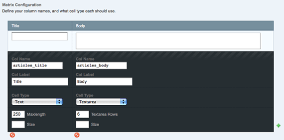
Now that we have the custom field group setup, we need to create a new weblog called newsletter and make sure to assign our Newsletter field group to it. Now that the newsletter weblog is created, we can start adding newsletters.
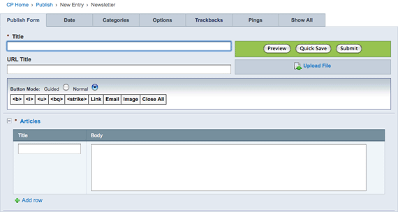
First, fill in the main title field, and then add in one or more articles. Now, let’s get onto coding the output template.
Let’s start by creating a new template group called newsletter. We have two different pages that we want to create: the page listing all of the newsletter entries, and the individual newsletter entry displaying all of the articles. But, we can do this with only one template.
So, open up the index template in the newsletter template group, and we will start by setting up the structure of the template:
{assign_variable:weblog="newsletter"}
{embed="newsletter/.header" title="{if segment_2}
 {!--Display individual newsletter entry title here--}
{if:else}
 Newsletters
{/if}
"}

{if segment_2}
 {!--Display full individual newsletter entry with 1 or more articles--}
{if:else}
 {!--Display list of newsletters entered--}
{/if}

{embed="newsletter/.footer"}
We start by creating a variable to store the name of our weblog. Then, I created a simple header and footer to store some of the HTML that frames the page. I am passing in the title value in an embed variable to the header and displaying that in the browser title.
If the segment_2 value is not null, we know that we are on an individual newsletter page, so we will display that title. If the segment_2 value is null, then we are on the main newsletter listing page, so we just display Newsletters.
We are using the same conditional again for the content on the page. We either show the individual newsletter entry with the articles, or we show the list of newsletter entered. So let’s build out the code a little more. First, let’s finish displaying the title:
{embed="newsletter/.header" title="{if segment_2}
 {exp:weblog:entries weblog="{weblog}" limit="1" disable="categories|category_fields|custom_fields|member_data|pagination|trackbacks"}
  {title} : {entry_date format="%F %j, %Y"}
 {/exp:weblog:entries}
{if:else}
 Newsletters
{/if}
"}
Pretty simple stuff here, just displaying the title and entry date of the newsletter entry. Next, let’s tackle displaying the single newsletter entry view:
{if segment_2}
{exp:weblog:entries weblog="{weblog}" limit="1" disable="categories|category_fields|custom_fields|member_data|pagination|trackbacks"}
<h1>{title}: {entry_date format="%F %j, %Y"}</h1>
{newsletter_articles}
<div class="entry">
<h2>{articles_title}</h2>
{articles_body}
</div>
{/newsletter_articles}
{/exp:weblog:entries}
<p><a href="{path="newsletter"}">« Back to Newsletters</a></p>
The beginning should look pretty normal: just using the standard exp:weblog:entries tag to pull in the individual entry. We first display the title and entry date. Then, the next part is where we are taking advantage of the FieldFrame Matrix. We are basically just looping through all of the newsletter_articles and displaying them in divs.
Finally, let’s finish up by displaying the list of newsletter entries:
{if:else}
 {exp:weblog:entries weblog="{weblog}" disable="categories|category_fields|custom_fields|member_data|pagination|trackbacks"}
  {if count == 1}
   <ul>
  {/if}

   <li><a href="{url_title_path="newsletter"}">{title}: {entry_date format="%F %j, %Y"}</a></li>
  {if count == total_results}
   </ul>
  {/if}
 {/exp:weblog:entries}
{/if}
Simple stuff again: just looping through all newsletter entries and displaying them in a list. The two conditional statements are so you don’t end up with any empty unordered lists when there are no entries.
I wish I would have realized this would have been a more efficient way to build a newsletter in EE for the project; but, this is why always learning is so important.
";s:10:"typeHandle";s:4:"blog";s:10:"bodyBlocks";a:0:{}}i:99;a:8:{s:2:"id";s:3:"105";s:5:"title";s:27:"Packt Book Giveaway Winners";s:13:"sectionHandle";s:4:"blog";s:8:"postDate";s:35:"Sun, 26 Jul 2009 22:07:31 -04003131";s:3:"uri";s:32:"blog/packt-book-giveaway-winners";s:4:"body";s:1065:"Thank you everyone for participating in the Packt Book Giveaway. It was interesting to see how many more people were interested in the jQuery book compared to the others. Now, on to the winners…
The Choosing an Open Source CMS book was won by Eric D. Greene with his comment on the blog article.
The WordPress 2.7 Complete book was won by Adrian Turner with his Twitter entry.
The Learning jQuery 1.3 book was won by CodeJoust Chattanooga Webdesign Development for their comment on the blog article.
The winners have been contacted, but if their are any problems, I will choose a new winner. Thanks everyone for the entries, and I hope to be able to do this again.
";s:10:"typeHandle";s:4:"blog";s:10:"bodyBlocks";a:0:{}}i:100;a:8:{s:2:"id";s:3:"106";s:5:"title";s:23:"Web Design is a Journey";s:13:"sectionHandle";s:4:"blog";s:8:"postDate";s:35:"Thu, 23 Jul 2009 07:56:12 -04001212";s:3:"uri";s:28:"blog/web-design-is-a-journey";s:4:"body";s:320:"I definitely don’t categorize myself as a designer because there is no way I can create such amazing work as this. It’s fantastic to see the very different directions that Mike went in before reaching the final design.
";s:10:"typeHandle";s:4:"blog";s:10:"bodyBlocks";a:0:{}}i:101;a:8:{s:2:"id";s:3:"107";s:5:"title";s:29:"Strangers at a cocktail party";s:13:"sectionHandle";s:4:"blog";s:8:"postDate";s:35:"Mon, 20 Jul 2009 14:55:54 -04005454";s:3:"uri";s:34:"blog/strangers-at-a-cocktail-party";s:4:"body";s:214:"I love this way of thinking. A successful environment is one where you are able to tell people when they’re full of crap.
";s:10:"typeHandle";s:4:"blog";s:10:"bodyBlocks";a:0:{}}i:102;a:8:{s:2:"id";s:3:"108";s:5:"title";s:61:"Packt Book Giveaway: jQuery, WordPress, & Open Source CMS";s:13:"sectionHandle";s:4:"blog";s:8:"postDate";s:35:"Thu, 16 Jul 2009 21:42:00 -04000000";s:3:"uri";s:24:"blog/packt-book-giveaway";s:4:"body";s:6214:"I am pleased to announced that I have 3 Packt books to giveaway: Learning jQuery 1.3, WordPress 2.7 Complete, & Choosing an Open Source CMS. Entering to win one of these books is very simple, and you can enter in two different ways.
But first, let me provide a little more detail about the books.
 To build interesting, interactive sites, developers are turning to JavaScript libraries such as jQuery to automate common tasks and simplify complicated ones. Because many web developers have more experience with HTML and CSS than with JavaScript, the library's design lends itself to a quick start for designers with little programming experience. Experienced programmers will also be aided by its conceptual consistency.
Revised and updated for version 1.3 of jQuery, this book teaches you the basics of jQuery for adding interactions and animations to your pages. Even if previous attempts at writing JavaScript have left you baffled, this book will guide you past the pitfalls associated with AJAX, events, effects, and advanced JavaScript language features.
 Using WordPress you can easily create dynamic blogs and web sites with great content and many outstanding features. It is an ideal tool for developing blogs and although it is chiefly used for blogging, it can also be used as a complete CMS with very little effort. You can customize the features, incorporate your own design, and even write your own plug-ins with ease. Its versatility and ease of use have attracted a large, enthusiastic, and helpful community of users. While it is easy to get started with WordPress, its full power is not obvious.
If you want to create a powerful, fully-featured blog or non-blog web site in no time, this book is for you. It will give you a rapid and straightforward introduction to the rich and powerful features of WordPress and get you up and running with a state-of-the-art blog as quickly and painlessly as possible. It will help you learn everything WordPress has to offer, from the ground up, so you can build your complete web site. You will see many of WordPress's hidden powers that will help you build a fully functioning web site.
 There are many powerful open source CMSs available to take the pain away from managing a web site. These systems are feature rich, often easy to use, and free. Unfortunately, there are so many choices it's tough to be sure you're choosing the right one. How can you be sure that you are selecting and working with the right tool?
This book will guide you through choosing the right CMS for your needs. You can be confident in your choice of CMS for the needs of your project. It will also help you make a start using the CMS, and give you a feel for what it's like to use it – even before you install it yourself.
Are you bewildered by the many open source CMSs available online? Open source CMSs are the best way to create and manage sophisticated web sites. You can create a site that precisely meets your business goals, and keep the site up to date easily because these systems give you full control over every aspect of your site. Because open source CMSs are free to download, you have a huge amount of choice between the various systems.
There are two different ways to enter:
http://bit.ly/5J7Gj Free Packt Book Giveaway from @davist11 I want the (BOOK NAME HERE) book.
Then just replace BOOK NAME HERE with the book of your choice: jQuery, WordPress, or CMS.You can enter once by submitting a comment on this post and as many times as you want on Twitter. The contest will end Friday, July 24th at 6 PM ET. Once over, I will randomly choose the winners and notify them to get their addresses.
That’s it, now get going and enter already. Big thanks to Packt Publishing for sponsoring the giveaway!
";s:10:"typeHandle";s:4:"blog";s:10:"bodyBlocks";a:0:{}}i:103;a:8:{s:2:"id";s:3:"109";s:5:"title";s:23:"Misunderstanding markup";s:13:"sectionHandle";s:4:"blog";s:8:"postDate";s:35:"Tue, 07 Jul 2009 14:11:26 -04002626";s:3:"uri";s:28:"blog/misunderstanding-markup";s:4:"body";s:214:"Everyone is freaking out about the XHTML 2 Working Group disbanding at the end of the year. Relax people! Jeremy Keith helps to explain why nobody should worry.
";s:10:"typeHandle";s:4:"blog";s:10:"bodyBlocks";a:0:{}}i:104;a:8:{s:2:"id";s:3:"110";s:5:"title";s:27:"Enough with the IE6 Whining";s:13:"sectionHandle";s:4:"blog";s:8:"postDate";s:35:"Tue, 30 Jun 2009 21:25:04 -04000404";s:3:"uri";s:32:"blog/enough-with-the-ie6-whining";s:4:"body";s:1707:"Seriously, I can’t go a day without reading about someone complaining about IE6. Yes, we all know it’s support is terrible. Yes, we know that Microsoft sat around and did nothing for 5 years. But look, they have stepped their game up, they have released 2 browser versions in 3 years. Yes, they are not up to par with more standards compliant browsers, but they are a major improvement over IE6.
So I ask you: what is Microsoft supposed to do?
It isn’t their fault that users won’t upgrade their browser.
If you call yourself a web developer, you should be able to make things presentable in IE6. If you can’t, then you probably shouldn’t call yourself one. So suck it up and deal with it. Doesn’t the challenge make our jobs more interesting?
I’m not saying that your site has to look exactly the same in all browsers. We already know the answer to that question. Just make it presentable. Make sure a user can access all content on the site. Remember, it’s still all about the content.
Take a look at the traffic to the site and determine to what degree you even need to support it. If IE6 visitors only compromise a very small percentage, maybe consider using Andy Clarke’s Universal Internet Explorer 6 CSS. That will put the content front and center in IE6, and you won’t even have to worry about it.
Just please, stop complaining.
</rant>
";s:10:"typeHandle";s:4:"blog";s:10:"bodyBlocks";a:0:{}}i:105;a:8:{s:2:"id";s:3:"111";s:5:"title";s:24:"Walls Come Tumbling Down";s:13:"sectionHandle";s:4:"blog";s:8:"postDate";s:35:"Tue, 30 Jun 2009 08:00:52 -04005252";s:3:"uri";s:29:"blog/walls-come-tumbling-down";s:4:"body";s:287:"Andy Clarke has posted the slides and transcript from his presentation at @media2009. It’s a long one, so I scanned it, but it looked like a fantastic presentation.
";s:10:"typeHandle";s:4:"blog";s:10:"bodyBlocks";a:0:{}}i:106;a:8:{s:2:"id";s:3:"112";s:5:"title";s:25:"jQuery Inline Form Labels";s:13:"sectionHandle";s:4:"blog";s:8:"postDate";s:35:"Tue, 16 Jun 2009 03:25:01 -04000101";s:3:"uri";s:30:"blog/jquery-inline-form-labels";s:4:"body";s:3624:"I’ve been seeing the trend of applying inline labels on form elements more and more these days. So I definitely needed to come up with a solid solution that would help me easily apply this effect.
 Maybe I need to explain a little better what I am referring to. Instead of using a label that is next to or above the input element, the label is actually within the input. Then, when the input is focused, the label goes away and you can enter your value into it. Finally, when the input is no longer focused, if there is no value entered, the inline label is then added back in.
The title attribute.
It’s so simple, but perfect. A great benefit of using the title attribute, is that when you hover over the input, you get a little tooltip displaying the inline label. So all I need to do is add a title attribute with the text that we want to have show up as the inline label. Then, we just use a little jQuery to make it all happen.
First, we want to select each input that has a title attribute, once the document is loaded:
$(document).ready(function() {
 $('input[title]').each(function() {
 …
 });
});
Next, if the value of the input element is empty, we want to take the title attribute and add it as the value of the input.
$(document).ready(function() {
 $('input[title]').each(function() {
  if($(this).val() === '') {
   $(this).val($(this).attr('title'));
  }
 });
});
After that, we want to setup a function that will fire once the input is focused. When it is focused, if the value is equal to the title attribute, we want to set the value to nothing and add a class of focused:
$(document).ready(function() {
 $('input[title]').each(function() {
  if($(this).val() === '') {
   $(this).val($(this).attr('title'));
  }

  $(this).focus(function() {
   if($(this).val() === $(this).attr('title')) {
    $(this).val('').addClass('focused');
   }
  });
 });
});
The reason why we add the class of focused is so that we can change the text color, border or anything to make it noticeable that the input is being focused. You can see this effect in the demo.
Finally, we want to add a function that will fire when the input loses focus. When it does, if the input value is empty, we want to set the value back to the title attribute and remove the class of focused:
$(document).ready(function() {
 $('input[title]').each(function() {
  if($(this).val() === '') {
   $(this).val($(this).attr('title'));
  }

  $(this).focus(function() {
   if($(this).val() === $(this).attr('title')) {
    $(this).val('').addClass('focused');
   }
  });

  $(this).blur(function() {
   if($(this).val() === '') {
    $(this).val($(this).attr('title')).removeClass('focused');
   }
  });
 });
});
And that’s it. It’s just a little bit of code, but it can go a long way. So take it and build on it.
";s:10:"typeHandle";s:4:"blog";s:10:"bodyBlocks";a:0:{}}i:107;a:8:{s:2:"id";s:3:"113";s:5:"title";s:24:"Dog and Pony Show Design";s:13:"sectionHandle";s:4:"blog";s:8:"postDate";s:35:"Fri, 12 Jun 2009 08:07:48 -04004848";s:3:"uri";s:29:"blog/dog-and-pony-show-design";s:4:"body";s:357:"Andy Rutledge continues to blow my mind with his fantastic articles. “Multiple design options are what you visit in your design process on your way toward a solution. What you present to your client must be the most effective result of your exhaustive efforts. Nothing less.”
";s:10:"typeHandle";s:4:"blog";s:10:"bodyBlocks";a:0:{}}i:108;a:8:{s:2:"id";s:3:"114";s:5:"title";s:28:"Remember, You are the Expert";s:13:"sectionHandle";s:4:"blog";s:8:"postDate";s:35:"Tue, 02 Jun 2009 22:18:16 -04001616";s:3:"uri";s:32:"blog/remember-you-are-the-expert";s:4:"body";s:1719:"I’ve been realizing lately that there is a big problem in the web design/development field: we aren’t thought of as experts. Ok maybe that’s not completely true, but I’ve seen a lot of clients “guiding” the process. But actually, maybe this is our own fault, so how can we fix it?
We have to remember that we are the web experts in this relationship. We need to show confidence when talking with clients. Talk authoritatively about the details of the project and show them that we know what we are talking about. Just like we wouldn’t go tell an architect how to design a house, our clients need to trust us to build their website.
So let’s say a client suggests something that you know would work better if you did it a different way; don’t just say yes to the client, make your suggestion and build a case for it. Reference other examples. Site statistics. Fight for the best solution. Remember, you are the expert.
The web is full of great articles, bad examples of web sites, good examples of web sites, and much more. So by just spending time browsing the web, you can amass a huge amount of knowledge about what works and what doesn’t. This will provide you with loads of ammunition to use when clients need your guidance.
I struggle with it all the time. It’s hard to say no to a client when they are the ones paying you. But the best thing to do is to make your suggestions, back it up with statistics & examples, and hope that the client trusts your judgment.
Remember, you are the expert.
";s:10:"typeHandle";s:4:"blog";s:10:"bodyBlocks";a:0:{}}i:109;a:8:{s:2:"id";s:3:"115";s:5:"title";s:25:"Of Brands and Commodities";s:13:"sectionHandle";s:4:"blog";s:8:"postDate";s:35:"Mon, 01 Jun 2009 10:10:04 -04000404";s:3:"uri";s:30:"blog/of-brands-and-commodities";s:4:"body";s:253:"Genius: “Turning down money to make money; sounds like a dodgy strategy, but it’s more powerful than you might think. And it’s required if you want to build a brand.”
";s:10:"typeHandle";s:4:"blog";s:10:"bodyBlocks";a:0:{}}i:110;a:8:{s:2:"id";s:3:"116";s:5:"title";s:44:"10 Cost Effective Web Development Techniques";s:13:"sectionHandle";s:4:"blog";s:8:"postDate";s:35:"Fri, 22 May 2009 11:27:23 -04002323";s:3:"uri";s:49:"blog/10-cost-effective-web-development-techniques";s:4:"body";s:201:"Excellent, excellent, excellent presentation from Drew McLellan. Wish I could have seen it in person.
";s:10:"typeHandle";s:4:"blog";s:10:"bodyBlocks";a:0:{}}i:111;a:8:{s:2:"id";s:3:"117";s:5:"title";s:43:"Creating a Google Map with ExpressionEngine";s:13:"sectionHandle";s:4:"blog";s:8:"postDate";s:35:"Wed, 13 May 2009 06:24:01 -04000101";s:3:"uri";s:48:"blog/creating-a-google-map-with-expressionengine";s:4:"body";s:235:"Since I have a newfound love of ExpressionEngine, I wrote my most recent article for NETTUTS about creating a Google Map with it.
";s:10:"typeHandle";s:4:"blog";s:10:"bodyBlocks";a:0:{}}i:112;a:8:{s:2:"id";s:3:"118";s:5:"title";s:30:"User Experience Beyond the Web";s:13:"sectionHandle";s:4:"blog";s:8:"postDate";s:35:"Mon, 11 May 2009 21:10:24 -04002424";s:3:"uri";s:35:"blog/user-experience-beyond-the-web";s:4:"body";s:3894:"I had the “pleasure” of having jury duty last week. This was the first time I had ever been called for it before, and I must say that the experience definitely left a lot to be desired. It is definitely clear that all of the time spent on user experience on the web ends up providing a better experience for the end user. But my question now is: why isn’t that kind of effort put in outside of the web?
There was basically no part of my jury duty experience that was pleasurable. Let me walk you through how my day went.
First off, I had to get up super early in order to get there on time. If I am just going to be waiting around most of the day, why do I have to be there at 8:15am?
So I pulled into the parking lot that they told me to park in, and started to walk to the court house. But wait, I had no clue where to go. There were no signs at all. Luckily I guessed right, or I would have been late.
Since I was going into a court house, I totally expected to have to go through security. I was told that jury duty would probably end up being a lot of waiting around, and I saw that they had wireless internet access there, so I figured I would bring my laptop and get some work done.
First, I had to check my cellphone since it had a camera on it. I’m not really sure what I would want to take pictures with, but whatever, I checked it. I did feel a little lost without my phone though.
Next, I had to go through the metal detectors and put my bag on the x-ray machine. The security officer asked me to take out my laptop and turn it on. I was confused as to why I would need to turn it on, but I hit the button and waited for it to power up. Then, he sees that my laptop has a built-in camera, and tells me that I can’t bring it in.
I looked at him befuddled because I couldn’t imagine sitting with my laptop facing out in the courtroom, taking pictures, and not having someone say something to me. The security officer tells me that I have to take it back to my car. So, I had to walk the quarter of a mile back to my car, put the laptop in there, then walk back and go through security.
Seems a little ridiculous, right? I must give them credit for actually having wireless internet, but not being able to bring in my laptop really pissed me off.
Once I got through security and checked in, I was directed to a big room with a bunch of tables and chairs where we would wait for the next hour or so. Of course, the chairs were jammed in together, and there were not enough seats in the room for everyone.
We watched a 15 minute training video, and then the courthouse employees tried to get us to donate money to the court system. Yeah, after you put me in a bad mood because I couldn’t bring in my laptop, I’m sure I’ll jump at the opportunity to give you money.
What a great start to the morning.
Finally, my group got called to the courtroom, and we stood around and waited for about two hours until we finally got called into the court room to go through the jury selection process.
So again, more waiting, that’s basically what I did all day.
Here we are in a situation where we are supposed to be impartial and have no biases, and I was in a piss poor mood. Why don’t they make these kind of situations as painless as possible? Why isn’t there someone making sure that the experience of having jury duty is not awful?
Just like we devote time thinking about users’ experiences on the websites we are creating; organizations need to consider what those experiences outside of the web are like.
";s:10:"typeHandle";s:4:"blog";s:10:"bodyBlocks";a:0:{}}i:113;a:8:{s:2:"id";s:3:"119";s:5:"title";s:53:"Designer, Owner, Manager - 1: Hiring the Right People";s:13:"sectionHandle";s:4:"blog";s:8:"postDate";s:35:"Tue, 05 May 2009 19:12:23 -04002323";s:3:"uri";s:53:"blog/designer-owner-manager-1-hiring-the-right-people";s:4:"body";s:235:"Andy Rutledge’s latest article seems like it will come in handy when I eventually start my own business. Some great tips here; especially numbers 6 & 8.
";s:10:"typeHandle";s:4:"blog";s:10:"bodyBlocks";a:0:{}}i:114;a:8:{s:2:"id";s:3:"120";s:5:"title";s:30:"Let your links look like links";s:13:"sectionHandle";s:4:"blog";s:8:"postDate";s:35:"Thu, 23 Apr 2009 22:46:32 -04003232";s:3:"uri";s:35:"blog/let-your-links-look-like-links";s:4:"body";s:247:"Roger Johansson discusses one of my big pet peeves: links need to look like links. Links are the most important part of the web. Make them stand out.
";s:10:"typeHandle";s:4:"blog";s:10:"bodyBlocks";a:0:{}}i:115;a:8:{s:2:"id";s:3:"121";s:5:"title";s:51:"Review: Building Websites with ExpressionEngine 1.6";s:13:"sectionHandle";s:4:"blog";s:8:"postDate";s:35:"Mon, 20 Apr 2009 06:00:26 -04002626";s:3:"uri";s:55:"blog/review-building-websites-with-expressionengine-1.6";s:4:"body";s:3180:"I was lucky enough to be contacted by Packt Publishing to review the book Building Websites with ExpressionEngine 1.6 by Leonard Murphy. I have recently become very infatuated with ExpressionEngine, and I have devoted a lot of time to learning how to use it. This book was a great opportunity to see where my skill set was at.
This book is definitely aimed toward beginning users of EE who have some knowledge of HTML. There is no knowledge of EE needed in order to read this book. So basically anyone who wants to learn how to use EE would benefit from reading this. While I have had some experience with EE, I found many parts of this book that were more of a review for me.
I really liked that Leonard uses a lot of screenshots and code snippets to help walk through how he is doing something. They definitely would have helped me to comprehend some of the EE concepts that I did not understand until devoting a lot of time online doing research.
This book does a great job of covering a variety of topics, from installing EE and creating a calendar to using other modules and plugins. Even though I have prior experience with EE and this book is geared toward beginners, I did learn a few things about EE from reading this book.
There seemed to be a large chunk of the book devoted to applying CSS to the examples to make them presentable. I don’t think there is any need to go through and explain the CSS; people are buying the book for information about EE.
I also wish that the example site that is used in the book were a bit more realistic. I really learned a lot from Mike Boyink’s Building a Church Site and Building a Small Business Site tutorials because the content and functionality of the sites were real.
This book is really the only EE book out there. So if you are one of those people who has trouble learning from online tutorials and needs a book, this is definitely a solid choice to get started with EE. You can get a preview of it by downloading a sample chapter.
I actually wasn’t aware of this, but Mike Boyink also has his tutorials available as books.
";s:10:"typeHandle";s:4:"blog";s:10:"bodyBlocks";a:0:{}}i:116;a:8:{s:2:"id";s:3:"122";s:5:"title";s:23:"Dear Designer, You Suck";s:13:"sectionHandle";s:4:"blog";s:8:"postDate";s:35:"Thu, 09 Apr 2009 20:02:00 -04000000";s:3:"uri";s:27:"blog/dear-designer-you-suck";s:4:"body";s:281:"As usual, another well thought out post from Khoi Vinh. I agree completely: I thrive on criticism. Even though I’m not a designer, I’m always looking to improve by hearing the thoughts of others.
";s:10:"typeHandle";s:4:"blog";s:10:"bodyBlocks";a:0:{}}i:117;a:8:{s:2:"id";s:3:"123";s:5:"title";s:18:"CSS Naked Day 2009";s:13:"sectionHandle";s:4:"blog";s:8:"postDate";s:35:"Thu, 09 Apr 2009 05:48:29 -04002929";s:3:"uri";s:23:"blog/css-naked-day-2009";s:4:"body";s:708:"Yep, today, April 9, 2009, is the annual CSS Naked Day. Some people may think it is a huge risk to completely strip the design from my site for a day, but I think otherwise.
If anything, it gives visitors a chance to see my ability to code with web standards. I take the time and effort to write well structured XHTML, so it is still readable without any style applied.
I am striping my design with the CSS Naked Day WordPress Plugin. I encourage everyone else to strip down and show off your body.
Is anyone else going naked today?
";s:10:"typeHandle";s:4:"blog";s:10:"bodyBlocks";a:0:{}}i:118;a:8:{s:2:"id";s:3:"124";s:5:"title";s:30:"Creating a jQuery Word Counter";s:13:"sectionHandle";s:4:"blog";s:8:"postDate";s:35:"Mon, 06 Apr 2009 14:24:00 -04000000";s:3:"uri";s:35:"blog/creating-a-jquery-word-counter";s:4:"body";s:266:"I had to code a form at work that required word limitations on each textarea. The article describing how I created a jQuery word counter was published on the ThemeForest blog.
";s:10:"typeHandle";s:15:"externalArticle";s:7:"website";s:69:"http://blog.themeforest.net/tutorials/creating-a-jquery-word-counter/";}i:119;a:8:{s:2:"id";s:3:"125";s:5:"title";s:44:"Presentation to Damscus High School Students";s:13:"sectionHandle";s:4:"blog";s:8:"postDate";s:35:"Mon, 30 Mar 2009 20:17:51 -04005151";s:3:"uri";s:49:"blog/presentation-to-damscus-high-school-students";s:4:"body";s:1940:"I have been noticeably absent from my blog recently, but for good reason. I was honored when Jeff Brown, a teacher at Damascus High School, asked if I wanted to speak to the students in his advanced web class. I have always been interested in speaking about web development, so this seemed like a great first opportunity.
So basically, Mr. Brown has people in the industry come in and speak to his students every Friday. After looking at the list of other speakers, I sure was nervous. I mean; I go to conferences to see some of these guys speak.
Mr. Brown has a great program going, and I was glad to be a part of it. He is one of the few teachers that actually teach about web standards and is a member of the WaSP Education Task Force. He also gave a presentation at RefreshDC about web education the night before my presentation, that I unfortunately missed.
I decided to focus my presentation on my path through web development, some tips to become successful as a front-end developer, and then how to maintain that success.
I was pretty nervous, and I felt like I raced at times, but I think it turned out well. Mr. Brown has posted the audio from the presentation on his site.
I would love to hear any feedback on the presentation, so let me know what you all think.
";s:10:"typeHandle";s:4:"blog";s:10:"bodyBlocks";a:0:{}}i:120;a:8:{s:2:"id";s:3:"126";s:5:"title";s:35:"Browser Compatibility Master Tables";s:13:"sectionHandle";s:4:"blog";s:8:"postDate";s:35:"Mon, 30 Mar 2009 18:40:38 -04003838";s:3:"uri";s:40:"blog/browser-compatibility-master-tables";s:4:"body";s:235:"PPK has updated his browser compatibility tables to include more CSS3 testing, new browsers, and more. This is a great resource to determine which browsers support what.
";s:10:"typeHandle";s:4:"blog";s:10:"bodyBlocks";a:0:{}}i:121;a:8:{s:2:"id";s:3:"127";s:5:"title";s:43:"The 13 Most Essential Plugins for WordPress";s:13:"sectionHandle";s:4:"blog";s:8:"postDate";s:35:"Fri, 13 Mar 2009 07:26:01 -04000101";s:3:"uri";s:48:"blog/the-13-most-essential-plugins-for-wordpress";s:4:"body";s:307:"I feel like right after I install WordPress; I immediately install the same set of plugins. I figured this would be a good topic for a post, so I chose that for my most recent article at NETTUTS.
";s:10:"typeHandle";s:4:"blog";s:10:"bodyBlocks";a:0:{}}i:122;a:8:{s:2:"id";s:3:"791";s:5:"title";s:43:"The 13 Most Essential Plugins for WordPress";s:13:"sectionHandle";s:4:"blog";s:8:"postDate";s:35:"Fri, 13 Mar 2009 01:09:00 -04000000";s:3:"uri";s:50:"blog/the-13-most-essential-plugins-for-wordpress-1";s:4:"body";s:353:"WordPress is a very powerful and flexible blog/content management system, but the thousands of plugins really help to extend the basic functionality. Here are 13 essential plugins that you should immediately install after finishing the WordPress installation.
";s:10:"typeHandle";s:15:"externalArticle";s:7:"website";s:90:"http://net.tutsplus.com/articles/web-roundups/the-13-most-essential-plugins-for-wordpress/";}i:123;a:8:{s:2:"id";s:3:"128";s:5:"title";s:32:"Dynamically Set a Body Id in PHP";s:13:"sectionHandle";s:4:"blog";s:8:"postDate";s:35:"Tue, 10 Mar 2009 21:38:26 -04002626";s:3:"uri";s:37:"blog/dynamically-set-a-body-id-in-php";s:4:"body";s:2137:"I have already written a couple of articles about body ids: Set a Body Id Using PHP and Setting Body Ids in Expression Engine, but in a recent project, I was looking for a more dynamic way to do it in PHP and WordPress.
I don’t think it’s necessary to discuss the benefits of body ids because I have already discussed them in the other posts. So if you still aren’t using body ids/classes, go read the articles, and start using them.
This seems so straightforward that I’m not sure why I didn’t start with this method. So basically, I look at the URI, and if it is equal to / then I give it a body id of home. Otherwise, I grab the first “folder” and set that as the body id.
Let’s say that the URI is: /about/team/leadership/. The body id would be about. Ok, the seems easy, let’s get to the code.
Here is our setBodyId function:
function setBodyId() {
 $path = $_SERVER['REQUEST_URI'];

 if($path === '/') {
  $bodyId = 'home';
 } else {
  $bodyId = substr($path, 1, (strpos($path,'/',1)-1));
 }

 return $bodyId;
}
If you are using this in WordPress, put this function in your theme function.php file.
Then, you want to call the function and assign it to a variable:
$bodyId = setBodyId();
Finally, if the $bodyId variable is not empty, add the id attribute on the body tag:
<body<?php if(!empty($bodyId)) echo ' id="'.$bodyId.'"';?>>
It’s so simple, yet powerful. This could also easily be recoded in other programming languages. What do you think? Any ideas for improvement?
";s:10:"typeHandle";s:4:"blog";s:10:"bodyBlocks";a:0:{}}i:124;a:8:{s:2:"id";s:3:"129";s:5:"title";s:9:"We Refuse";s:13:"sectionHandle";s:4:"blog";s:8:"postDate";s:35:"Tue, 10 Mar 2009 08:07:02 -04000202";s:3:"uri";s:14:"blog/we-refuse";s:4:"body";s:289:"You know what, I refuse too. Just because someone tells you that you shouldn’t do something, that doesn’t mean you have to listen. Would you have gotten to where you are today by only listening to other people?
";s:10:"typeHandle";s:4:"blog";s:10:"bodyBlocks";a:0:{}}i:125;a:8:{s:2:"id";s:3:"130";s:5:"title";s:42:"There’s always time to launch your dream";s:13:"sectionHandle";s:4:"blog";s:8:"postDate";s:35:"Tue, 10 Mar 2009 05:31:00 -04000000";s:3:"uri";s:44:"blog/theres-always-time-to-launch-your-dream";s:4:"body";s:294:"I agree completely, stop with the excuses. I don’t think I tried that hard in school either. Definitely the quote of the article: “Never let your schooling interfere with your education”.
";s:10:"typeHandle";s:4:"blog";s:10:"bodyBlocks";a:0:{}}i:126;a:8:{s:2:"id";s:3:"131";s:5:"title";s:48:"WordPress & jQuery Contact Form without a Plugin";s:13:"sectionHandle";s:4:"blog";s:8:"postDate";s:35:"Wed, 25 Feb 2009 17:07:00 -05000000";s:3:"uri";s:51:"blog/wordpress-jquery-contact-form-without-a-plugin";s:4:"body";s:18614:"There are lots of WordPress plugins for contact forms, but wouldn’t it be nice to have more control over the markup? In this tutorial, I am going to show how to use a custom page template to create a contact form in WordPress without a plugin.
Some people may want to skip the post and get to the demo and source files:
View Demo Download Source Files
Well, I think that a contact form is so simple that a WordPress plugin that doesn’t provide exactly what I want is pretty lame. Plus, I don’t need all those fancy interfaces for building the form; I just need the code.
Our plan is to create a custom WordPress Page Template, then create a page that uses that template. Finally, we will add in a little jQuery to improve the form. Let’s write a little pseudo code to help determine how our page template will be structured.
<code>If form was submitted validate it
 If the form was submitted successfully
  Send email(s)
 Else
  Set variables to show errors

If the form was submitted successfully
 Show thank you message
Else
 Show form (with errors if there are any)
Alright, so first, we are going to start with some basic stuff: define the template name, include the header/sidebar/footer, and setup the basic structure of our pseudo code.
<code><?php
/*
Template Name: Contact Form
*/
?>

<?php
//If the form is submitted
if(isset($_POST['submitted'])) {
 //If there is no error, send the email
 if(!isset($hasError)) {

 }
} ?>

<?php get_header(); ?>

<?php
//If the email was sent, show a thank you message
//Otherwise show form
if(isset($emailSent) && $emailSent == true) {
?>

<?php } else { ?>

<?php } ?>

<?php get_sidebar(); ?>

<?php get_footer(); ?>
Next, let’s code the actual form. I also want to provide the ability for the user to enter some text to go above the form, so we are going to use the regular loop:
<code><?php if(isset($emailSent) && $emailSent == true) { ?>

 <div class="thanks">
  <h1>Thanks, <?=$name;?></h1>
  <p>Your email was successfully sent. I will be in touch soon.</p>
 </div>

<?php } else { ?>

 <?php if (have_posts()) : ?>

  <?php while (have_posts()) : the_post(); ?>
   <h1><?php the_title(); ?></h1>
   <?php the_content(); ?>

   <?php if(isset($hasError) || isset($captchaError)) { ?>
    <p class="error">
     There was an error submitting the form.
    <p>
   <?php } ?>

   <form action="<?php the_permalink(); ?>" id="contactForm" method="post">

   </form>

  <?php endwhile; ?>
 <?php endif; ?>
< } ?>
If the emailSent variable is set to true, we display the thank you message. Otherwise, we show the form. So we are outputting the title of the page, and any content that was entered. Then, we are checking to see if there was an error. Finally, we display the form:
<code><ol class="forms">
 <li>
  <label for="contactName">Name</label>
  <input type="text" name="contactName" id="contactName" value="
  <?php if(isset($_POST['contactName'])) echo $_POST['contactName'];?>"
   class="requiredField" />
  <?php if($nameError != '') { ?>
   <span class="error"><?=$nameError;?></span>
  <?php } ?>
 </li>

 <li>
  <label for="email">Email</label>
  <input type="text" name="email" id="email" value="
  <?php if(isset($_POST['email']))  echo $_POST['email'];?>"
  class="requiredField email" />
  <?php if($emailError != '') { ?>
   <span class="error"><?=$emailError;?></span>
  <?php } ?>
 </li>

 <li class="textarea">
  <label for="commentsText">Comments</label>
  <textarea name="comments" id="commentsText" rows="20" cols="30" class="requiredField">
  <?php if(isset($_POST['comments'])) {
   if(function_exists('stripslashes')) {
    echo stripslashes($_POST['comments']);
   } else {
    echo $_POST['comments'];
   }
   } ?></textarea>
  <?php if($commentError != '') { ?>
   <span class="error"><?=$commentError;?></span>
  <?php } ?>
 </li>
 <li class="inline">
  <input type="checkbox" name="sendCopy" id="sendCopy" value="true"
  <?php if(isset($_POST['sendCopy']) && $_POST['sendCopy'] == true)
   echo ' checked="checked"'; ?>
  />
  <label for="sendCopy">Send a copy of this email to yourself</label>
 </li>
 <li class="screenReader">
  <label for="checking" class="screenReader">If you want to submit this form, do not enter anything in this field</label>
  <input type="text" name="checking" id="checking" class="screenReader" value="
  <?php if(isset($_POST['checking']))  echo $_POST['checking'];?>"
  />
 </li>
 <li class="buttons">
  <input type="hidden" name="submitted" id="submitted" value="true" />
  <button type="submit">Email me »</button>
 </li>
</ol>
Note: Line wrapping added for readability.
Ok, wow, that may seem like a lot. So let’s break down the name field to see what this code is actually doing:
<code><li><label for="contactName">Name</label>
 <input type="text" name="contactName" id="contactName" value="<?php if(isset($_POST['contactName'])) echo $_POST['contactName'];?>" class="requiredField" />
 <?php if($nameError != '') { ?>
  <span class="error"><?=$nameError;?></span>
 <?php } ?>
</li>
We are displaying each form field in a list item, displaying the label, input field, and then showing an error message if there is one. We are also displaying the value in the form field if it was already submitted.
So in essence, we are just doing that for each field of the form. You could easily go into the code to add more fields.
We are also using honeypot captcha to see if a bot was trying to submit the form:
<code><li class="screenReader">
 <label for="checking" class="screenReader">If you want to submit this form, do not enter anything in this field</label>
 <input type="text" name="checking" id="checking" class="screenReader" value="<?php if(isset($_POST['checking']))  echo $_POST['checking'];?>" />
</li>
That list item is pushed off the page with CSS, and if there is a value in that field, we can assume that it is not a human trying to submit the form:
<code>.screenReader {
 left: -9999px;
 position: absolute;
 top: -9999px;
}
Next, we are going to have a conditional statement to determine if the form was submitted or not:
<code><?php
//If the form is submitted
if(isset($_POST['submitted'])) {

} ?>
Within that conditional, is where we are going to do all of our validation of the required fields. First, let’s check to see if our honeypot captcha form field is filled in. If it is, then we will display an error and not check anymore of the form:
<code>//Check to see if the honeypot captcha field was filled in
if(trim($_POST['checking']) !== '') {
 $captchaError = true;
} else {

}
So if the captcha field was left blank, we will continue to validate the required fields:
<code>//Check to make sure that the name field is not empty
if(trim($_POST['contactName']) === '') {
 $nameError = 'You forgot to enter your name.';
 $hasError = true;
} else {
 $name = trim($_POST['contactName']);
}

//Check to make sure sure that a valid email address is submitted
if(trim($_POST['email']) === '')  {
 $emailError = 'You forgot to enter your email address.';
 $hasError = true;
} else if (!eregi("^[A-Z0-9._%-]+@[A-Z0-9._%-]+.[A-Z]{2,4}$", trim($_POST['email']))) {
 $emailError = 'You entered an invalid email address.';
 $hasError = true;
} else {
 $email = trim($_POST['email']);
}

//Check to make sure comments were entered
if(trim($_POST['comments']) === '') {
 $commentError = 'You forgot to enter your comments.';
 $hasError = true;
} else {
 if(function_exists('stripslashes')) {
  $comments = stripslashes(trim($_POST['comments']));
 } else {
  $comments = trim($_POST['comments']);
 }
}
Again, that may seem like a little much, so let’s just take a look at the validation on the name field:
<code>if(trim($_POST['contactName']) === '') {
 $nameError = 'You forgot to enter your name.';
 $hasError = true;
} else {
 $name = trim($_POST['contactName']);
}
If the name field if empty, set a variable that will display the name error and set a flag saying that there was an error on the form. Otherwise, set a variable that will contain the name value from the form.
Now, we want to send the email if there are no errors:
<code>//If there is no error, send the email
if(!isset($hasError)) {

 $emailTo = '<strong>me@somedomain.com</strong>';
 $subject = 'Contact Form Submission from '.$name;
 $sendCopy = trim($_POST['sendCopy']);
 $body = "Name: $name nnEmail: $email nnComments: $comments";
 $headers = 'From: My Site <'.$emailTo.'>' . "rn" . 'Reply-To: ' . $email;

 mail($emailTo, $subject, $body, $headers);

 if($sendCopy == true) {
  $subject = 'You emailed <strong>Your Name</strong>';
  $headers = 'From: <strong>Your Name</strong> <<strong>noreply@somedomain.com</strong>>';
  mail($email, $subject, $body, $headers);
 }

 $emailSent = true;

}
Note: Items bolded are values that you will want to change before implementing.
I personally like to have the contact form submission come from myself. That way, I just setup a filter in Gmail, and I can guarantee that it won’t get caught in my spam filter. The second email is only sent if the user checks the checkbox to send a copy to themselves.
View Entire Custom Page Template
First, you want to upload the contact-form.php page template to your themes folder. Next, you will create the page in WordPress and select Contact Form as the page template.

Then, just publish your page and you will have your contact form. Well, the form will be usable, but we are going to add in some CSS and jQuery to finish it off.
I recently wrote an article about styling forms, so we are just going to stick with some basic styles:
<code>.screenReader { left: -9999px; position: absolute; top: -9999px; }
.thanks { background: #F2F3F6; border: 1px solid #7E8AA2; padding: 10px; }

/*****Forms*****/
ol.forms { float: left; list-style: none; margin: 0; width: 100%; }
ol.forms li {
 clear: both;
 float: left;
 margin-bottom: 18px;
 position: relative;
 width: 100%;
}
ol.forms label {
 cursor: pointer;
 display: block;
 float: left;
 font-weight: bold;
 padding-right: 20px;
 width: 100px;
}
ol.forms input, ol.forms textarea {
 border: 1px solid #7E8AA2;
 border-radius: 3px;
 font: inherit;
 -moz-border-radius: 3px;
 padding: 2px;
 -webkit-border-radius: 3px;
 width: 214px;
}
ol.forms textarea { height: 300px; width: 334px; }
ol.forms input:focus, ol.forms textarea:focus { background-color: #f2f3f6; border-color: #ff9800; }
.error { color: #f00; }
ol.forms li .error { font-size: 12px; margin-left: 20px; }
ol.forms li.textarea .error {
 display: block;
 position: absolute;
 right: 0;
 top: 0;
 width: 100px;
}
ol.forms li.screenReader { margin-bottom: 0; }
ol.forms li.buttons button {
 background: #ff9800;
 border: none;
 color: #000;
 cursor: pointer;
 font: 16px/16px "Avenir LT Std", Helvetica, Arial, sans-serif;
 overflow: hidden;
 padding: 6px 3px 3px 3px;
 text-transform: uppercase;
 width: auto;
}
ol.forms li.buttons button:hover { color: #222; }
ol.forms li.buttons button:active { left: -1px; position: relative; top: -1px; }
ol.forms li.buttons, ol.forms li.inline { float: right; width: 460px; }
ol.forms li.inline input { width: auto; }
ol.forms li.inline label { display: inline; float: none; width: auto; }
So drop that CSS in your theme stylesheet and you will see the form start to look much better.
I have also already written about creating AJAX forms with jQuery, but I thought I would specifically talk about an AJAX script for a contact form.
First, we want to execute our jQuery when the document is ready and the form was submitted:
<code>$(document).ready(function() {
 $('form#contactForm').submit(function() {

  return false;
 });
});
Next, we want to hide any error messages if there are any and validate any required fields which are denoted with a class of requiredField:
<code>$('form#contactForm .error').remove();
var hasError = false;
$('.requiredField').each(function() {

});
After that, we want to validate that the field is not empty and append an error message if it is:
<code>if(jQuery.trim($(this).val()) == '') {
 var labelText = $(this).prev('label').text();
 $(this).parent().append('<span class="error">You forgot to enter your '+labelText+'.</span>');
 hasError = true;
}
If the field is not empty and also has a class of email, we want to validate that the email address is valid:
<code> else if($(this).hasClass('email')) {
 var emailReg = /^([w-.]+@([w-]+.)+[w-]{2,4})?$/;
 if(!emailReg.test(jQuery.trim($(this).val()))) {
  var labelText = $(this).prev('label').text();
  $(this).parent().append('<span class="error">You entered an invalid '+labelText+'.</span>');
  hasError = true;
 }
}
If there are no errors, then we want to replace the submit button with a loading image:
<code>if(!hasError) {
$('form#contactForm li.buttons button').fadeOut('normal', function() {
 $(this).parent().append('<img src="/wp-content/themes/td-v3/images/template/loading.gif" alt="Loading…" height="31" width="31" />');
});
Note: You will need to update the source of the image to wherever you upload it in your theme.
Finally, let’s submit the form via an AJAX request, slide the form up, and show a thank you message:
<code>var formInput = $(this).serialize();
$.post($(this).attr('action'),formInput, function(data){
 $('form#contactForm').slideUp("fast", function() {
  $(this).before('<p class="thanks"><strong>Thanks!</strong> Your email was successfully sent. I check my email all the time, so I should be in touch soon.</p>');
 });
});
Take a look at the entire script:
<code>$(document).ready(function() {
 $('form#contactForm').submit(function() {
  $('form#contactForm .error').remove();
  var hasError = false;
  $('.requiredField').each(function() {
   if(jQuery.trim($(this).val()) == '') {
    var labelText = $(this).prev('label').text();
    $(this).parent().append('<span class="error">You forgot to enter your '+labelText+'.</span>');
    hasError = true;
   } else if($(this).hasClass('email')) {
    var emailReg = /^([w-.]+@([w-]+.)+[w-]{2,4})?$/;
    if(!emailReg.test(jQuery.trim($(this).val()))) {
     var labelText = $(this).prev('label').text();
     $(this).parent().append('<span class="error">You entered an invalid '+labelText+'.</span>');
     hasError = true;
    }
   }
  });
  if(!hasError) {
   $('form#contactForm li.buttons button').fadeOut('normal', function() {
    $(this).parent().append('<img src="/wp-content/themes/td-v3/images/template/loading.gif" alt="Loading…" height="31" width="31" />');
   });
   var formInput = $(this).serialize();
   $.post($(this).attr('action'),formInput, function(data){
    $('form#contactForm').slideUp("fast", function() {
     $(this).before('<p class="thanks"><strong>Thanks!</strong> Your email was successfully sent. I check my email all the time, so I should be in touch soon.</p>');
    });
   });
  }

  return false;

 });
});
Just include it in the head of your document after jQuery, and you are good to go:
<code><script type="text/javascript" src="<?php bloginfo('template_directory'); ?>/scripts/jquery.js"></script>
<script type="text/javascript" src="<?php bloginfo('template_directory'); ?>/scripts/contact-form.js"></script>
Note: You may need to change the source depending upon where you upload the files in your theme.
View Demo Download Source Files
That’s it! Just upload the files and you’ve got your form. Since you’ve got the code right in front of you, it should be very easy to tweak and add on to. Enjoy!
CenturyLink Deals: Internet, Phone, & TV Bundles
";s:10:"typeHandle";s:4:"blog";s:10:"bodyBlocks";a:0:{}}i:127;a:8:{s:2:"id";s:3:"132";s:5:"title";s:33:"Orange You Sorry About Tropicana?";s:13:"sectionHandle";s:4:"blog";s:8:"postDate";s:35:"Tue, 24 Feb 2009 16:07:54 -05005454";s:3:"uri";s:37:"blog/orange-you-sorry-about-tropicana";s:4:"body";s:335:"Khoi Vinh discusses the disastrous Tropicana redesign and wonders if the branding agency behind it, Arnell, did it just for the press. I certainly agree that it was a disaster, as I felt like I was trying to find my orange juice for 5 minutes.
";s:10:"typeHandle";s:4:"blog";s:10:"bodyBlocks";a:0:{}}i:128;a:8:{s:2:"id";s:3:"133";s:5:"title";s:51:"Achieve Your Big Goals With Incremental Persistence";s:13:"sectionHandle";s:4:"blog";s:8:"postDate";s:35:"Tue, 24 Feb 2009 12:43:21 -05002121";s:3:"uri";s:56:"blog/achieve-your-big-goals-with-incremental-persistence";s:4:"body";s:394:"Incremental success really helps in working toward your larger goals. I’ve been trying to improve something on my site every day. Recent examples: tooltips on my portfolio & better pagination on my blog.
";s:10:"typeHandle";s:4:"blog";s:10:"bodyBlocks";a:0:{}}i:129;a:8:{s:2:"id";s:3:"134";s:5:"title";s:28:"10 tips for efficient design";s:13:"sectionHandle";s:4:"blog";s:8:"postDate";s:35:"Fri, 20 Feb 2009 05:47:57 -05005757";s:3:"uri";s:33:"blog/10-tips-for-efficient-design";s:4:"body";s:369:"Paul Boag says that “being a good designer is not always enough to survive hard economic times. You need to be efficient too.” With that, he gives us 10 tips for efficient design. I think #10 should be emphasized and then emphasized again; it’s so important!
";s:10:"typeHandle";s:4:"blog";s:10:"bodyBlocks";a:0:{}}i:130;a:8:{s:2:"id";s:3:"135";s:5:"title";s:36:"5 Ways to Instantly Write Better CSS";s:13:"sectionHandle";s:4:"blog";s:8:"postDate";s:35:"Mon, 16 Feb 2009 04:04:42 -05004242";s:3:"uri";s:41:"blog/5-ways-to-instantly-write-better-css";s:4:"body";s:539:"In my most recent article at NETTUTS: 5 Ways to Instantly Write Better CSS, I share some tips that have helped me to write better CSS.
This is definitely not me trying to tell you to code in a certain way; they are just some tips that I have found to become very useful for myself. I hope you enjoy, and feel free to share other tips.
";s:10:"typeHandle";s:4:"blog";s:10:"bodyBlocks";a:0:{}}i:131;a:8:{s:2:"id";s:3:"790";s:5:"title";s:36:"5 Ways to Instantly Write Better CSS";s:13:"sectionHandle";s:4:"blog";s:8:"postDate";s:35:"Sun, 15 Feb 2009 23:09:00 -05000000";s:3:"uri";s:43:"blog/5-ways-to-instantly-write-better-css-1";s:4:"body";s:141:"Sure, anyone can write CSS. Even programs are doing it for you now. But is the CSS any good? Here are 5 tips to start improving yours.
";s:10:"typeHandle";s:15:"externalArticle";s:7:"website";s:83:"http://net.tutsplus.com/tutorials/html-css-techniques/5-tips-to-writing-better-css/";}i:132;a:8:{s:2:"id";s:3:"136";s:5:"title";s:30:"CSS3 Feedback: Selector Blocks";s:13:"sectionHandle";s:4:"blog";s:8:"postDate";s:35:"Thu, 12 Feb 2009 05:57:15 -05001515";s:3:"uri";s:34:"blog/css3-feedback-selector-blocks";s:4:"body";s:194:"Ohh, please make the ability to do this happen. It would make CSS so much more lightweight and easier to write.
";s:10:"typeHandle";s:4:"blog";s:10:"bodyBlocks";a:0:{}}i:133;a:8:{s:2:"id";s:3:"137";s:5:"title";s:45:"Fixing a Twitter WordPress Plugin with jQuery";s:13:"sectionHandle";s:4:"blog";s:8:"postDate";s:35:"Wed, 11 Feb 2009 19:57:52 -05005252";s:3:"uri";s:50:"blog/fixing-a-twitter-wordpress-plugin-with-jquery";s:4:"body";s:3273:"I use the fantastic Twitter for WordPress plugin on my website. Sometimes though, Twitter decides that it doesn’t want to make my tweets available. The plugin has accounted for this, and it displays No public Twitter messages when this happens. That kinda sucks though.
It’s definitely nice that the plugin doesn’t throw an error, but I really don’t want that message displayed on my site. So what’s the solution? jQuery of course.
Here is the markup that is displayed on my site when a tweet comes through successfully:
<div id="twitterContainer">
 <a class="twitter-link" href="http://twitter.com/davist11/status/1200405534">
  I feel like I'm in an episode of Seinfeld right now.
 </a>
</div>
This is what you end up with:
<div id="twitterContainer">
 No public Twitter messages.
</div>
My thinking is that I will check the contents of div#twitterContainer to see if it is No public Twitter messages. If it is, I think it would be useful to replace that text with a link to my Twitter account with a message telling people to follow me.
So first, let’s execute the jQuery code when the document is loaded:
$(document).ready(function() {

});
Next, we are going to check and see if the contents of div#twitterContainer is No public Twitter messages:
$(document).ready(function() {
 <strong>if(jQuery.trim($('div#twitterContainer').text()) == 'No public Twitter messages.') {

 }</strong>
});
Finally, let’s just replace this text with a link to my Twitter feed:
$(document).ready(function() {
 if(jQuery.trim($('div#twitterContainer').text()) == 'No public Twitter messages.') {
  <strong>$('div#twitterContainer').html('<a href="http://twitter.com/davist11" class="twitter-link">Follow Me on Twitter</a>');</strong>
 }
});
 That’s it. This is just another example of how I have used jQuery to improve a WordPress plugin on my site.
You can see this in action on my site, or take a look at the demo.
I do just like Roger Johansson says: I make sites perfectly usable in IE, but not necessarily exactly the same. As long as everything is accessible, it’s good enough for me.
";s:10:"typeHandle";s:4:"blog";s:10:"bodyBlocks";a:0:{}}i:135;a:8:{s:2:"id";s:3:"139";s:5:"title";s:40:"10 Harsh Truths About Corporate Websites";s:13:"sectionHandle";s:4:"blog";s:8:"postDate";s:35:"Tue, 10 Feb 2009 17:31:06 -05000606";s:3:"uri";s:45:"blog/10-harsh-truths-about-corporate-websites";s:4:"body";s:219:"The legendary Paul Boag gives us a reality check. While it’s hard to believe, I think I agree with all of them.
";s:10:"typeHandle";s:4:"blog";s:10:"bodyBlocks";a:0:{}}i:136;a:8:{s:2:"id";s:3:"140";s:5:"title";s:45:"42 Web Design Companies: Designs That Move Me";s:13:"sectionHandle";s:4:"blog";s:8:"postDate";s:35:"Fri, 06 Feb 2009 12:53:55 -05005555";s:3:"uri";s:49:"blog/42-web-design-companies-designs-that-move-me";s:4:"body";s:223:"There are so many web design companies that have amazing websites. I felt inspired after looking through these. Now it’s just a matter of execution…
";s:10:"typeHandle";s:4:"blog";s:10:"bodyBlocks";a:0:{}}i:137;a:8:{s:2:"id";s:3:"141";s:5:"title";s:37:"Setting Body Ids in Expression Engine";s:13:"sectionHandle";s:4:"blog";s:8:"postDate";s:35:"Wed, 04 Feb 2009 02:08:57 -05005757";s:3:"uri";s:42:"blog/setting-body-ids-in-expression-engine";s:4:"body";s:8001:"Expression Engine has become a popular choice to power many sites. I have just begun experimenting with it, and I have been very impressed. One thing that I have been interested in determining was to figure out if I could set an id on the body like I do when building other sites. I have already written one article showing how to do this in PHP and WordPress, but this will show how to do it dynamically in Expression Engine.
Body ids can be useful for styling sections differently, displaying certain parts of a dynamic template, displaying current navigation states, and many other things.
Let’s say that I want to have my font size be 14 pixels, except on the homepage. It would be as easy as this:
body { font-size: 14px; }
body#home { font-size: 12px; }
Pretty useful. By using body ids, we now have a unique hook for each section of the website.
I do utilize body classes as well. I typically use the body id to indicate the section, then other various items for the body classes.
For my own blog, I have some pages that I want to have a left gutter on it so that I can push images, quotes, etc. into the column. I also have another class that indicates when it is a blog article page. So, I can just continue to use multiple classes on the body to help me control the width and layout of the page.
Here is what the body element looks like on a blog article on my site:
<body id="blog" class="subpage leftGutter article">
The subpage class just indicates that it is not the homepage. Not completely necessary since I already have a specific id on the homepage, but it can sometimes become useful.
The leftGutter class is used to push the content area to the right and make it narrower. Then, I can pull elements into the left-hand gutter as well.
The article class is useful because some of the markup for the blog entry information is the same as the homepage and archive pages. Using this class, I can be more specific with my styles to change the way that these elements are displayed on the blog article page.
I always try and add classes and id attributes as high up in the tree as possible. This let’s me utilize descendant selectors in the CSS without having to add additional classes and ids lower down.
I want to have complete control over the body id, so I want to be able to have it set dynamically and also be able to set it statically.
So my thought behind this is that first, I want to check to see if the body id was set statically. When I say statically, I mean passing the variable in as an attribute on my embed statement. Next, I will then set the body id dynamically.
In order to make changes to the overall website structure simpler, I have a header template the sits in the includes template group. So in all of the other template groups, I embed the header on the page:
{embed="includes/header"}
Then, if for some reason I want to specifically pass in a body id, I can just change it to this:
{embed="includes/header" body_id="contact-us"}So the first step in the header is to check to see if the embed:body_id variable is set:
<body
{if embed:body_id}
 id="{embed:body_id}"
{/if}
>
Note: Line wrapping added for readability.
If we are not statically setting the body id, we want to then do it dynamically. My thinking is that I will take advantage of Expression Engine’s URL segments to determine which section we are in.
Here is an example of URL segments using the following URL:
http://ee.trevor-davis.com/index.php/about/me/education/
Then, we can reference each segment like so:
So basically what we want to do is assign the body id the value of {segment_1} if it is not empty. So continuing on our example:
<body
{if embed:body_id}
 id="{embed:body_id}"
{if:elseif segment_1}
 id="{segment_1}"
{/if}
>
Note: Line wrapping added for readability.
But wait, what about the homepage? The homepage will have nothing for the value of {segment_1}, so we can just put in an else statement:
<body
{if embed:body_id}
 id="{embed:body_id}"
{if:elseif segment_1}
 id="{segment_1}"
{if:else}
 id="home"
{/if}
>
Note: Line wrapping added for readability.
Here is the line of code without any line wrapping:
<body{if embed:body_id} id="{embed:body_id}"{if:elseif segment_1} id="{segment_1}"{if:else} id="home"{/if}>
I created a demo Expression Engine site to test this functionality.
Since we have body ids for each section and an id on each list item in the navigation, I have created the current state for the navigation with a few simple line of CSS:
body#home ul#primaryNav li#homeNav a,
body#about ul#primaryNav li#aboutNav a,
body#services ul#primaryNav li#servicesNav a,
body#contact-us ul#primaryNav li#contactNav a {
 background: #B3602D;
 border-top-color: #B3602D;
 color: #fff;
}
Note: Line wrapping added for readability.
I also want to show the sidebar on all of the subpages, so I just need 1 more conditional:
{if embed:body_id || segment_1}
 <div id="sidebar">
 </div>
{/if}
This is checking to see if {embed:body_id} or {segment_1} are not empty, and displaying the sidebar if one or both are set.
These are just a few examples of using a body id in Expression Engine, but the possibilities are endless.
Another thing that I was trying to figure out was how to create a variable that I could reuse in multiple embed files. So what I want to do is in my conditional statement, determine that the body id should be and assign it to a variable. Then, I want to be able to access that variable in the footer without have to use the same conditional statement.
Is this possible? I was messing around with the {assign_variable} tag, but that didn’t seem to do the job because it can only be used in the same template. Anyone know how to do this? I’m relatively new to Expression Engine, so I am still learning.
";s:10:"typeHandle";s:4:"blog";s:10:"bodyBlocks";a:0:{}}i:138;a:8:{s:2:"id";s:3:"142";s:5:"title";s:29:"I’m a Weekly NETTUTS Writer";s:13:"sectionHandle";s:4:"blog";s:8:"postDate";s:35:"Tue, 03 Feb 2009 16:54:43 -05004343";s:3:"uri";s:31:"blog/im-a-weekly-nettuts-writer";s:4:"body";s:999:"As I noted in my last post, I submitted a tutorial to NETTUTS to be considered as a weekly writer. I am very happy to announce that they chose me!
In my second article, Creating a “Filterable” Portfolio with jQuery, I take a look at creating a portfolio that can be filtered by category.
This tutorial was kind of inspired by the effect that I created on my company’s portfolio.
Yes, I am not going to be able to write articles as frequently on my blog, but I am still going to be posting some articles. I will also post a note each week discussing my weekly NETTUTS article.
I hope you all enjoy the articles.
";s:10:"typeHandle";s:4:"blog";s:10:"bodyBlocks";a:0:{}}i:139;a:8:{s:2:"id";s:3:"143";s:5:"title";s:37:"Twitter Chatter During the Super Bowl";s:13:"sectionHandle";s:4:"blog";s:8:"postDate";s:35:"Tue, 03 Feb 2009 07:51:31 -05003131";s:3:"uri";s:42:"blog/twitter-chatter-during-the-super-bowl";s:4:"body";s:268:"The New York Times created an interactive information graph of tweets during the super bowl. I love how at halftime, there was an explosion of Springsteen tweets.
";s:10:"typeHandle";s:4:"blog";s:10:"bodyBlocks";a:0:{}}i:140;a:8:{s:2:"id";s:3:"789";s:5:"title";s:49:"Creating a “Filterable” Portfolio with jQuery";s:13:"sectionHandle";s:4:"blog";s:8:"postDate";s:35:"Mon, 02 Feb 2009 23:08:00 -05000000";s:3:"uri";s:48:"blog/creating-a-filterable-portfolio-with-jquery";s:4:"body";s:366:"If you have worked in your field for a while, there is a pretty good chance that you have a rather extensive portfolio. To make it a little easier to navigate, you will probably be tempted to break them into different categories. In this tutorial, I will show you how to make "filtering by category" a little more interesting with just a little bit of jQuery.
";s:10:"typeHandle";s:15:"externalArticle";s:7:"website";s:94:"http://net.tutsplus.com/tutorials/javascript-ajax/creating-a-filterable-portfolio-with-jquery/";}i:141;a:8:{s:2:"id";s:3:"144";s:5:"title";s:47:"WebAIM screenreader survey…the results are in";s:13:"sectionHandle";s:4:"blog";s:8:"postDate";s:35:"Mon, 02 Feb 2009 05:35:54 -05005454";s:3:"uri";s:49:"blog/webaim-screenreader-surveythe-results-are-in";s:4:"body";s:291:"The WebAIM screenreader survey results are in. Not surprisingly: 76% of users always or often navigating by headings; 72% of screen reader users reported that Flash is very or somewhat difficult.
";s:10:"typeHandle";s:4:"blog";s:10:"bodyBlocks";a:0:{}}i:142;a:8:{s:2:"id";s:3:"145";s:5:"title";s:33:"How we reduced chargebacks by 30%";s:13:"sectionHandle";s:4:"blog";s:8:"postDate";s:35:"Wed, 28 Jan 2009 15:36:13 -05001313";s:3:"uri";s:37:"blog/how-we-reduced-chargebacks-by-30";s:4:"body";s:287:"Jason Fried discusses how they reduced chargebacks by 30%. My favorite part of this is how 37Signals determines the problem and quickly finds the simple solution to it.
";s:10:"typeHandle";s:4:"blog";s:10:"bodyBlocks";a:0:{}}i:143;a:8:{s:2:"id";s:3:"146";s:5:"title";s:19:"Sprite Optimization";s:13:"sectionHandle";s:4:"blog";s:8:"postDate";s:35:"Wed, 28 Jan 2009 15:18:41 -05004141";s:3:"uri";s:24:"blog/sprite-optimization";s:4:"body";s:261:"Dave Shea is starting to notice the use of huge CSS Sprites. I think I am in his state of mind: optimize when possible, but I’m not too interested in making one of those huge sprites.
";s:10:"typeHandle";s:4:"blog";s:10:"bodyBlocks";a:0:{}}i:144;a:8:{s:2:"id";s:3:"147";s:5:"title";s:25:"My First WordPress Plugin";s:13:"sectionHandle";s:4:"blog";s:8:"postDate";s:35:"Mon, 26 Jan 2009 07:40:59 -05005959";s:3:"uri";s:30:"blog/my-first-wordpress-plugin";s:4:"body";s:285:"In a recent project at work, I had to integrate WordPress and bbPress. It proved to be a little more difficult than I anticipated, and I had to write my first WordPress plugin: Add bbPress Default Role.
";s:10:"typeHandle";s:4:"blog";s:10:"bodyBlocks";a:0:{}}i:145;a:8:{s:2:"id";s:3:"148";s:5:"title";s:47:"Exactly How to Create a Custom jQuery Accordion";s:13:"sectionHandle";s:4:"blog";s:8:"postDate";s:35:"Wed, 21 Jan 2009 11:27:00 -05000000";s:3:"uri";s:52:"blog/exactly-how-to-create-a-custom-jquery-accordion";s:4:"body";s:457:"Yesterday, I saw that NETTUTS was looking for another staff writer. I figured that I would give it a shot and write a tutorial about creating a custom jQuery accordion (just like the one on the sidebar of my website). Well what do you know, they published it.
";s:10:"typeHandle";s:15:"externalArticle";s:7:"website";s:98:"http://net.tutsplus.com/tutorials/javascript-ajax/exactly-how-to-create-a-custom-jquery-accordion/";}i:146;a:8:{s:2:"id";s:3:"149";s:5:"title";s:23:"A List Apart: Issue 276";s:13:"sectionHandle";s:4:"blog";s:8:"postDate";s:35:"Tue, 20 Jan 2009 04:53:32 -05003232";s:3:"uri";s:27:"blog/a-list-apart-issue-276";s:4:"body";s:231:"This issue focuses around one of the biggest problems in web development: education, or lack thereof. I know I would have loved to actually go to school for web development.
";s:10:"typeHandle";s:4:"blog";s:10:"bodyBlocks";a:0:{}}i:147;a:8:{s:2:"id";s:3:"150";s:5:"title";s:29:"Design Share, an Event Series";s:13:"sectionHandle";s:4:"blog";s:8:"postDate";s:35:"Thu, 15 Jan 2009 12:39:02 -05000202";s:3:"uri";s:33:"blog/design-share-an-event-series";s:4:"body";s:234:"Viget’s write up about the design share event that I attended and summarized. This one with video!
";s:10:"typeHandle";s:4:"blog";s:10:"bodyBlocks";a:0:{}}i:148;a:8:{s:2:"id";s:3:"151";s:5:"title";s:33:"Web Development Project Estimator";s:13:"sectionHandle";s:4:"blog";s:8:"postDate";s:35:"Tue, 13 Jan 2009 04:27:19 -05001919";s:3:"uri";s:38:"blog/web-development-project-estimator";s:4:"body";s:311:"“A simple tool that allows web designers and site developers to quickly and thoroughly estimate the time and materials required for a proposed web project.” Yes, all of this could be accomplished through other programs, but this is a pretty nice interface.
";s:10:"typeHandle";s:4:"blog";s:10:"bodyBlocks";a:0:{}}i:149;a:8:{s:2:"id";s:3:"152";s:5:"title";s:49:"Use jQuery to Enhance your WordPress Comment Form";s:13:"sectionHandle";s:4:"blog";s:8:"postDate";s:35:"Mon, 12 Jan 2009 19:47:29 -05002929";s:3:"uri";s:54:"blog/use-jquery-to-enhance-your-wordpress-comment-form";s:4:"body";s:6971:"I have already completed a couple of tutorials on forms and jQuery (Ajax Forms with jQuery and Flexible and Semantic Forms with a Little jQuery), but I wanted to show another example of using a simple jQuery script to enhance functionality. This example will be about the comment form on a WordPress powered site.
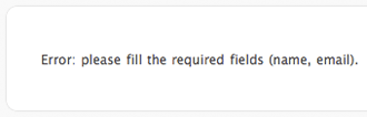 Depending upon your configuration, WordPress will validate the comment form for required fields. In my configuration, I want to make sure that users fill in their name and email address If you submit my comment form without those, WordPress will perform server side validation.
But, do you really want users to see this error page? Wouldn’t it be so much better if we used to JavaScript to validate on the client side so that they never have to leave the form?
I think so. Before we get started, I created a sample of the WordPress comment form.
I have tweaked my markup somewhat from the default WordPress comment form, so you will need to make changes to account for your markup. Here is the markup for my form:
<form action="#" method="post" id="commentform">
<p class="required">* Denotes Required Field</p>
<ol class="forms">
<li>
<label for="author">Name <span class="required">*</span></label>
<input type="text" class="requiredField" name="author" id="author" size="22" />
</li>
<li>
<label for="email">E-Mail <span class="required">*</span></label>
<input type="text" class="requiredField" name="email" id="email" size="22" />
</li>
<li>
<label for="url">Website</label>
<input type="text" name="url" id="url" size="22" />
</li>
<li class="textarea">
<label for="comment">Comments <span class="required">*</span></label>
<textarea class="requiredField" name="comment" id="comment" cols="100%" rows="10"></textarea>
</li>
<li class="subscribe-to-comments">
<input type="checkbox" name="subscribe" id="subscribe" value="subscribe" />
<label for="subscribe">Notify me of followup comments via e-mail</label>
</li>
<li class="buttons">
<button type="submit" name="submit" id="submit">Add Comment »</button>
</li>
</ol>
</form>
I don’t think there is much that I need to discuss about that markup; it is pretty standard. The only thing to mention is the class name of requiredField on the form fields that I want to be required. Note: I also removed the action on the form so that the sample form cannot really be submitted to the database.
I of course am going to show this example using jQuery, but you could create something comparable with any other JavaScript library or just with some plain old JavaScript.
Once the document is loaded, let’s start by adding a function for when the comment form is submitted:
$(document).ready(function() {
 $('form#commentform').submit(function() {
 …
 });
});
Next, we want to remove any errors if they are showing, and create a flag that will let us know if an error has occured:
$(document).ready(function() {
$('form#commentform').submit(function() {
<strong>$('form#commentform .error').remove();
var hasError = false;</strong>
…
});
});
Ok, here is where we really start to do some coding. I want to take each form field that has a class of requiredField, check to see if it is empty, copy the name of the label (and remove the required asterisk), traverse to the parent list item, and append the error message. Here is where we will also set the hasError flag so that we know an error has occurred:
$(document).ready(function() {
$('form#commentform').submit(function() {
$('form#commentform .error').remove();
var hasError = false;
<strong>$('.requiredField').each(function() {
if(jQuery.trim($(this).val()) == '') {
var labelText = $(this).prev('label').text().replace(' *','');
$(this).parent().append('<span class="error">'+labelText+' is a required field.</span>');
hasError = true;
}
});</strong>
…
});
});
Finally, you want to check the hasError variable to determine whether or not you should submit the form to the server:
$(document).ready(function() {
 $('form#commentform').submit(function() {
  $('form#commentform .error').remove();
  var hasError = false;
  $('.requiredField').each(function() {
   if(jQuery.trim($(this).val()) == '') {
    var labelText = $(this).prev('label').text().replace(' *','');
    $(this).parent().append('<span class="error">'+labelText+' is a required field.</span>');
    hasError = true;
   }
  });
  <strong>if(hasError) {
   return false;
  }</strong>
 });
});
Note: The end of the script is slightly different on the example form because I did not want to actually submit the form.
Just another simple example of how we can improve the user experience by using jQuery. Like usual, there are jQuery plugins out there that can do the same thing, but I think it is important to understand how to do things yourself. Plus, that is only 17 lines of JavaScript compared to much, much more for a plugin.
Anyone have any ideas on how to improve the script?
";s:10:"typeHandle";s:4:"blog";s:10:"bodyBlocks";a:0:{}}i:150;a:8:{s:2:"id";s:3:"153";s:5:"title";s:45:"CSS Testing of Selectors and Pseudo Selectors";s:13:"sectionHandle";s:4:"blog";s:8:"postDate";s:35:"Sun, 11 Jan 2009 16:33:03 -05000303";s:3:"uri";s:50:"blog/css-testing-of-selectors-and-pseudo-selectors";s:4:"body";s:164:"A list of selectors and their supported browsers. There seems to be a trend of the non-supported ones…
";s:10:"typeHandle";s:4:"blog";s:10:"bodyBlocks";a:0:{}}i:151;a:8:{s:2:"id";s:3:"154";s:5:"title";s:25:"The State of the Web 2008";s:13:"sectionHandle";s:4:"blog";s:8:"postDate";s:35:"Fri, 09 Jan 2009 04:44:21 -05002121";s:3:"uri";s:30:"blog/the-state-of-the-web-2008";s:4:"body";s:227:"The detailed report from the State of the Web Survey has been compiled. Wow, 62% of the people using JavaScript libraries are using jQuery; I love it.
";s:10:"typeHandle";s:4:"blog";s:10:"bodyBlocks";a:0:{}}i:152;a:8:{s:2:"id";s:3:"155";s:5:"title";s:12:"Design Share";s:13:"sectionHandle";s:4:"blog";s:8:"postDate";s:35:"Thu, 08 Jan 2009 21:39:39 -05003939";s:3:"uri";s:17:"blog/design-share";s:4:"body";s:7384:"I had the pleasure of being invited to Design Share at Viget Labs Wednesday night. The idea of the event was that 6 presenters would each give a 5 minute presentation on design, and then there was a question and answer period. It was especially great since I am not really a designer. Always great to learn new things.
Brian started the night off by discussing the process of bringing the National Geographic Green Guide online. It was quite an undertaking since they were taking a print publication and creating a supporting website.
Usually, something gets lost in translation going from print to the web. So, they wanted to still have these interesting layouts and help tie in the site to the printed collateral. They also wanted to get the community involved in providing information and commentary.
I think a lot of the screenshots that he showed us are not in production yet, but they looked great. There were charts, information organization in a sensible manor, and nice simple layouts.
Next, Jay discussed his “Papa Bear, Mama Bear, & Baby Bear” approach to mood boards. The example he used was from his experience in building the mood boards for the AOL Red redesign.
This is the “safety” board. It’s comfortable because it was similar to the previous design. They wanted to show that they incorporated elements to meet the goals of the project.
With this board, they do not expect it to be chosen. It’s edgier and purposely a little bit too far over the top. The idea of this board is that it will help to generate thought and ideas.
This board is kind of the best of the Mama & Papa bear boards. It is that happy medium. It has the familiar feel of the Papa bear board, but that edginess that will help to cater to the teen audience.
Of course, the final decision was to use elements from each board.
The most interesting part of this talk was that real design elements were actually worked into the mood boards. I haven’t seen too many mood boards, but all of the ones I had seen were very abstract. This was a nice change.
Eric had the opportunity to help re-brand and redesign the NHL website. Before his company was involved, the NHL had no real brand; they had all of these different banners with different treatments of their logo. They helped to standardize the logo and provide a simple system for expanding it.
 So AKQA developed mood boards, and the entire design concept was inspired by one image: black ice. This is where the dark concept came from. It really gives the site a sleek look, and it makes the large action shots really pop.
Another difficult task that they encountered was dealing with the teams logos. They were all odd shaped and nothing tied them all together. They decided to do some intense cropping to gain consistency between the logos.
Finally, Eric talked about adding more interactivity to the site. You can see game highlights, watch games live, and even look through an enormous photo gallery. The new NHL site is a tremendous design success.
Ari was tasked with developing 3 mood boards for an intranet that had a Web 2.0 feel (yuck, I hate saying that). Of course she had a tight deadline. This is where she found that her bookmarking service really paid off. All of that time she spent bookmarking cool sites and ideas really paid off and saved time.
She took screenshots, organized into different folders, and then got started on the mood boards. She setup a consistent grid for the boards, and this made it easier to swap things in and out.
There was some good discussion afterward about good tools that help to organize screenshots: LittleSnapper and Paparazzi
Rob talked about the Viget design process. The project begins by sending a couple of surveys to the client. The surveys ask some abstract questions like “What kind of car would your company be” and “What magazine(s) describe your company”. These surveys help the client to focus on their thoughts of their brand and help to give the designers a better idea of what the client is looking for.
Once a project is ready to be designed, a lead designer is assigned the project, and they sit down with 2 other designers. They discuss 3 directions that they want to go in and discuss elements that they want to include in the mood boards. While this is going on, the user experience designer is working on the wireframes.
One thing that I thought was really interesting was that they discuss specific elements to add to the mood boards. So for example, a submit button for a form, a headline, and the navigation. While sometimes they also do abstract mood boards, I think it seems more useful to real elements that you would see on a site.
When Jason used to work at AOL, he was involved in creating Ficlets which is basically an online community for short story writers. It became popular relatively quickly, and they had a solid community. A few years later…Jason and the others who helped to create Ficlets no longer work at AOL, and suddenly, AOL decided they are going to shut down Ficlets.
It is not really clear what the reasoning is, basically AOL just sucks. Well, Jason and the others who created it didn’t want the site to go away. It was successful and had a solid community. So Jason and friends decided to basically recreate it.
This is quite an opportunity for anyone creating a website. They were able to examine the way that users were using Ficlets and found some ways to improve it. They are facing some tough decisions trying to determine what to do with past Ficlets’ stories and the community. Somehow, they need to transport the community from Ficlets to Ficly, which will be the new home starting on January 15th.
It was very interesting to hear about the process and experience of so many talented people. I think the format of the 5 minute presentation also helped to focus the discussion. All in all, it was a good time.
";s:10:"typeHandle";s:4:"blog";s:10:"bodyBlocks";a:0:{}}i:153;a:8:{s:2:"id";s:3:"156";s:5:"title";s:38:"Jason Santa Maria is Leaving Happy Cog";s:13:"sectionHandle";s:4:"blog";s:8:"postDate";s:35:"Tue, 06 Jan 2009 06:48:44 -05004444";s:3:"uri";s:43:"blog/jason-santa-maria-is-leaving-happy-cog";s:4:"body";s:197:"Probably my favorite designer out there right now is going freelance. Hey Jason, want to come work at my company instead?
";s:10:"typeHandle";s:4:"blog";s:10:"bodyBlocks";a:0:{}}i:154;a:8:{s:2:"id";s:3:"157";s:5:"title";s:25:"A Plea for WordPress Help";s:13:"sectionHandle";s:4:"blog";s:8:"postDate";s:35:"Mon, 05 Jan 2009 20:14:07 -05000707";s:3:"uri";s:30:"blog/a-plea-for-wordpress-help";s:4:"body";s:2866:"I love using WordPress to power websites.
While it began strictly as a blogging platform, it has evolved into a pretty solid CMS, but there is one little thing that has been bugging me for a while now.
With the launch of my redesigned site, I was interested in using the WP-PageNavi plugin because I think it provides much better paging than the default WordPress previous/next.
The problem is that WordPress includes /category/ in the URL, and I hate it. For example, on my blog page, you can click the older entries link at the bottom of the content area, and you can see that the link points to here:
//trevor-davis.com/blog/page/2/
But, you will notice that you actually get redirected to:
//trevor-davis.com/category/blog/page/2/
I had to do this because /blog/page/2/ returned a 404 error. You can see this by going directly to the third page.
I read through a couple of forum posts discussing the problem, but none of the fixes mentioned seemed to work.
The most discussed suggestion was to change the category base permalink to /., but that did not work for me. Surprisingly, some people said it worked for them. That was pretty bizarre to me, so I kept looking.
Another suggestion was to edit a core WordPress file, which I do not want to do.
I came across 3 plugins that were supposed to fix the problem, but none of them worked for me either.
So I am not the greatest with regular expressions and htaccess and all that jazz, but my thinking is that I can use the Redirection plugin to use a pass-through to rewrite any link like this:
/blog/page/(*)/
To this:
/blog/page/$1/
Is that not possible? I could not get it to work. Does anyone know how to get something like this to work? WordPress team, why has this been a problem for so long?
";s:10:"typeHandle";s:4:"blog";s:10:"bodyBlocks";a:0:{}}i:155;a:8:{s:2:"id";s:3:"158";s:5:"title";s:7:"Tabinta";s:13:"sectionHandle";s:4:"blog";s:8:"postDate";s:35:"Tue, 30 Dec 2008 12:56:28 -05002828";s:3:"uri";s:12:"blog/tabinta";s:4:"body";s:207:"When editing stuff in WordPress, I was always so annoyed that I could not tab in the textareas. Tabinta Firefox plugin to the rescue.
";s:10:"typeHandle";s:4:"blog";s:10:"bodyBlocks";a:0:{}}i:156;a:8:{s:2:"id";s:3:"159";s:5:"title";s:47:"Design Decisions: The new Highrise signup chart";s:13:"sectionHandle";s:4:"blog";s:8:"postDate";s:35:"Tue, 30 Dec 2008 07:08:47 -05004747";s:3:"uri";s:51:"blog/design-decisions-the-new-highrise-signup-chart";s:4:"body";s:328:"Jason Fried discusses the many design iterations for the Highrise signup chart. What they ended up with is very appealing and accomplishes they goals they seemed to set out.
";s:10:"typeHandle";s:4:"blog";s:10:"bodyBlocks";a:0:{}}i:157;a:8:{s:2:"id";s:3:"160";s:5:"title";s:21:"WordPress Cheat Sheet";s:13:"sectionHandle";s:4:"blog";s:8:"postDate";s:35:"Tue, 23 Dec 2008 17:11:07 -05000707";s:3:"uri";s:26:"blog/wordpress-cheat-sheet";s:4:"body";s:275:"This WordPress cheat sheet seems like it could be pretty useful. I think there are some important functions that are left off though, and it’s definitely geared more towards beginners.
";s:10:"typeHandle";s:4:"blog";s:10:"bodyBlocks";a:0:{}}i:158;a:8:{s:2:"id";s:3:"161";s:5:"title";s:30:"WordPress Art Direction Plugin";s:13:"sectionHandle";s:4:"blog";s:8:"postDate";s:35:"Sun, 21 Dec 2008 17:28:11 -05001111";s:3:"uri";s:35:"blog/wordpress-art-direction-plugin";s:4:"body";s:293:"Inspired by Jason Santa Maria’s “art directed” site, Noel Jackson decided to create an art direction plugin for WordPress, which allows you to add per post styling. Interesting.
";s:10:"typeHandle";s:4:"blog";s:10:"bodyBlocks";a:0:{}}i:159;a:8:{s:2:"id";s:3:"162";s:5:"title";s:41:"Jeffrey Zeldman: Understanding Web Design";s:13:"sectionHandle";s:4:"blog";s:8:"postDate";s:35:"Fri, 19 Dec 2008 09:37:01 -05000101";s:3:"uri";s:45:"blog/jeffrey-zeldman-understanding-web-design";s:4:"body";s:316:"A video of Jeffrey Zeldman presenting his talk on Understanding Web Design. I saw this presentation at An Event Apart, and I am still amazed at how great of a speaker he is.
";s:10:"typeHandle";s:4:"blog";s:10:"bodyBlocks";a:0:{}}i:160;a:8:{s:2:"id";s:3:"163";s:5:"title";s:34:"Google pushing users away from IE?";s:13:"sectionHandle";s:4:"blog";s:8:"postDate";s:35:"Fri, 19 Dec 2008 05:00:57 -05005757";s:3:"uri";s:38:"blog/google-pushing-users-away-from-ie";s:4:"body";s:389:"When users use Gmail in Internet Explorer, a red link appears at the top right of the page that says “Get faster Google Mail”. The link takes you to a page suggesting faster browsers. Love it.
";s:10:"typeHandle";s:4:"blog";s:10:"bodyBlocks";a:0:{}}i:161;a:8:{s:2:"id";s:3:"164";s:5:"title";s:26:"The Death Throes of Print?";s:13:"sectionHandle";s:4:"blog";s:8:"postDate";s:35:"Thu, 18 Dec 2008 05:43:16 -05001616";s:3:"uri";s:30:"blog/the-death-throes-of-print";s:4:"body";s:201:"Jason Santa Maria wonders if print really is nearing its death. I still can’t imagine reading a book online though.
";s:10:"typeHandle";s:4:"blog";s:10:"bodyBlocks";a:0:{}}i:162;a:8:{s:2:"id";s:3:"165";s:5:"title";s:18:"Using jQuery Clone";s:13:"sectionHandle";s:4:"blog";s:8:"postDate";s:35:"Thu, 18 Dec 2008 04:33:35 -05003535";s:3:"uri";s:23:"blog/using-jquery-clone";s:4:"body";s:5383:"I love how I can use jQuery to solve all of my problems. When I was working on a website for The Lighting of the National Christmas Tree, I had to create a page that displayed all of the ornaments. Thank god for the jQuery clone() method, which saved me loads of time and effort.
I was on a tight deadline, and had to figure out some way to layout all of the state ornaments. Not to mention the fact that I had to crop and resize 56 images to 2 different sizes. Yes, I know there are only 50 states, but the US territories were included as well.
So the layout had to be easy enough for everyone to see all the ornaments and be able to click to get a more detailed photo and some information about the ornament. I really was not interested in creating 56 separate pages with information about each ornament, so I went scouring through the jQuery documentation to see how I could copy elements.
Before I get started describing what I had to do, here is a demo page that I created.
So basically, this is what I wanted to happen when an ornament was clicked:
The styling of the example is nothing special, so I will stick to explaining the script.
First, we want all of this to happen after the document is loaded and when the ornament links are clicked:
$(document).ready(function() {
 $('ul.ornaments a').click(function() {
  return false;
 });
});
Next, we want to setup the modal window with a couple of empty divs: (Note: line breaks added for readability)
$('body').append('<div id="overlay"></div>
 <div id="modal">
  <div id="modalInner">
   <a href="#" id="close" title="Close">Close</a>
   <div id="modalImageColumn"></div>
   <div id="modalTextColumn"></div>
   <div class="clearing"></div>
  </div>
 </div>');
Since IE6 doesn’t support fixed positioning, we need to get the actual height of the page so we can apply that height to the overlay:
if($.browser.msie && $.browser.version <= 6.0) {
 var windowHeight = $(document).height();
 $('#overlay').height(windowHeight);
}
Next, we set the opacity of the overlay, start to fade it in, position the modal window, and start to fade it in.
$('#overlay').css('opacity', 0.5).fadeIn('fast');
$('#modal').fadeIn('slow');
var scrollPos = $(window).scrollTop() + 50;
$('div#modal').css('top',scrollPos+'px');
The order of these things can be moved around some, but this is what I ended up doing, and everything looked good.
Next, we want to close and remove the modal window when the close button is clicked or the background overlay is clicked:
$('div#modal a#close,div#overlay').bind('click', function() {
 $('div#modal').fadeOut('fast',function() {
  $('div#overlay').fadeOut('fast',function() {
   $(this).remove();
  });
  $(this).remove();
 });
 return false;
});
Next, we grab the url of the link that was clicked, which goes to the full size image, and append the image to the modal window. Once the image has been loaded, we fade it in:
var imgUrl = $(this).attr('href');
$('div#modalImageColumn').append('<img src="'+imgUrl+'" alt="" class="frame" height="400" id="ornament" width="400" />');
$('img#ornament').load(function() {
 $(this).fadeIn();
});
Finally, we get to use the clone() method. We target the div with the class of stateDescription that is a sibling of the link we clicked, clone it, and append it to the modal window:
$(this).siblings('.stateDescription').clone().appendTo('div#modalTextColumn');
Pretty cool stuff if I say so myself. I don’t think there are any jQuery plugins out there that would have helped me achieve this, which is why it is important to actually understand jQuery.
Here is the full script to download. You can also take a look at the final product on the National Christmas Tree site.
But, I would encourage you to actually understand jQuery instead of just grabbing code and using it.
";s:10:"typeHandle";s:4:"blog";s:10:"bodyBlocks";a:0:{}}i:163;a:8:{s:2:"id";s:3:"166";s:5:"title";s:18:"Version 3 Launched";s:13:"sectionHandle";s:4:"blog";s:8:"postDate";s:35:"Wed, 17 Dec 2008 09:26:49 -05004949";s:3:"uri";s:23:"blog/version-3-launched";s:4:"body";s:972:"Well, I finally think my redesign is good enough for the public eye. There are definitely some tweaks that I need to make, but it’s good enough for now.
I plan on tweaking stuff for the rest of the week and doing some clean up on some of the older articles.
This goal of this design was to adhere to a very strict grid, and I used the 16 column 960 grid.
View Grid (click on the grid to remove it)
I also wanted to have a stronger focus on some of the things that I can do with jQuery. Check out the accordion and recent work in the sidebar and the comments on the blog articles.
Well, that is enough for now. I’m sure I will have more to talk about later, but I have to run. Please give me your feedback. I by no means call myself a designer, which is why I tried to go simplistic.
";s:10:"typeHandle";s:4:"blog";s:10:"bodyBlocks";a:0:{}}i:164;a:8:{s:2:"id";s:3:"167";s:5:"title";s:23:"A List Apart: Issue 274";s:13:"sectionHandle";s:4:"blog";s:8:"postDate";s:35:"Tue, 16 Dec 2008 20:10:34 -05003434";s:3:"uri";s:27:"blog/a-list-apart-issue-274";s:4:"body";s:210:"This issue has 2 excellent articles focused on content strategy. “A website without a content strategy is like a speeding vehicle without a driver.”
";s:10:"typeHandle";s:4:"blog";s:10:"bodyBlocks";a:0:{}}i:165;a:8:{s:2:"id";s:3:"168";s:5:"title";s:8:"Redesign";s:13:"sectionHandle";s:4:"blog";s:8:"postDate";s:35:"Tue, 16 Dec 2008 19:53:55 -05005555";s:3:"uri";s:13:"blog/redesign";s:4:"body";s:317:"Just a quick note to everyone that I am planning on launching my redesign tomorrow at some point. Some things are defintely going to need some clean up after launch, but I just feel like it is at a point where small things shouldn’t hold it up.
So if something looks broken, I will be fixing it soon.
";s:10:"typeHandle";s:4:"blog";s:10:"bodyBlocks";a:0:{}}i:166;a:8:{s:2:"id";s:3:"169";s:5:"title";s:24:"Weekly Link Round-Up #59";s:13:"sectionHandle";s:4:"blog";s:8:"postDate";s:35:"Sun, 14 Dec 2008 10:48:45 -05004545";s:3:"uri";s:28:"blog/weekly-link-round-up-59";s:4:"body";s:1082:"Nice, 2 days off this week, so hopefully I will be able to get my redesign finished up. Here are a few interesting links from this past week:
Cameron gives a nice list of resources to use before starting a project:
This is a really interesting collection of data. What terms are used for new and existing users? Another interesting thing that I found was people using “Login” vs. “Log in”.
Sometimes it’s hard to sell web standards to people, but Molly gives some excellent points to help back us up.
There are times when I have to implement designs that have print links on them. While I may think they are useless, I still have to make them work as they are a part of an approved comp. Sure, it is easy to have a link and then add an onclick event to launch the print window, but is that the right thing to do?
Clicking a JavaScript print link does nothing more than launch the browser’s print window. If a person has JavaScript disabled, nothing will happen when they click a link like this:
<a href="#" onclick="window.print(); return false;">Print</a>
Ideally, we do not want to have things on a page that do not work without JavaScript enabled. So the solution is to write the print link into the DOM using JavaScript, then attach a click event to the link. Luckily, I use jQuery on every project, so it makes the process much easier.
In this example, we are going to prepend a list item with a link to an unordered list with the id of tools. Then, we attach a click event to the link we have just added to the DOM. Finally, we return false to override the action of the link.
Here is the script:
$(document).ready(function() {
 $('ul#tools').prepend('<li class="print"><a href="#print">Click me to print</a></li>');
 $('ul#tools li.print a').click(function() {
  window.print();
  return false;
 });
});
Take a look at the demo page to see it in action. The script is nothing complex; it is just another example of using jQuery to improve a user’s experience.
";s:10:"typeHandle";s:4:"blog";s:10:"bodyBlocks";a:0:{}}i:168;a:8:{s:2:"id";s:3:"171";s:5:"title";s:24:"Weekly Link Round-Up #58";s:13:"sectionHandle";s:4:"blog";s:8:"postDate";s:35:"Mon, 08 Dec 2008 17:24:53 -05005353";s:3:"uri";s:28:"blog/weekly-link-round-up-58";s:4:"body";s:2824:"Man, it’s tough to get work done on my own site when I am so busy with freelance work. Slowly but surely, I am making progress, and I am hoping that by having some days off this month, I will be able to get it done soon. Here are the links that I found interesting this week:
I think having debate in the workplace is so important to reaching the best decision. This is why I think Obama will be successful in office; he is not just surrounding himself with “yes” men.
Some nice tips that are focused more on the organization side than the design side.
Jason brings up the point that sometimes comments become overwhelming on blog posts. He suggests that the author should use “milemarker” comments so that readers can get a quick snapshot of the comments so far.
Do you make websites? Take the survey.
I wish clients would admit things like this. I guess the solution to that is to educate the client.
Wow, I can’t believe some of these things actually happened.
Chris shares ten important lessons that he learned while working for WGBH for 35 years.
Milton Glaser’s talk from 2001 was also linked around this week. It’s great to see so many tips from these guys with so much experience.
I know some about IA, but I definitely learned some new ideas while reading Flexible Fuel: Educating the Client on IA. I really hadn’t heard much about agile design, but Getting Real About Agile Design was helpful in learning more about it.
We need to have 4 day weekends more often. I got so much work done on my redesign. I’m currently in the process of dealing with IE6, then I am going to start creating the theme. So there is a possibility that I will have something launched sometime this week. Just a few interesting items from this past week:
I found this site so amusing. The premise is that you ask a question, and you get two witty responses from the two designers running the site.
There are plenty of tweaks you can make to refine your typography, but NYU researchers claim that spacing is the most important factor for legibility. So let’s all think about increasing our margins and line height.
Ugh, I hate those stupid warnings! David brings up a good point:
This is why it would be ever so wonderful if you could refer to a non-SSL asset from an SSL page. That way you could say “this stuff is private, don’t share it†when serving over SSL and at the same time take advantage of HTTP caching for things that pose no security risk, like drag_handle.gif.
I still can’t believe is December already. But at least we have 24 ways to impress your friends to get us through the month. We already have 2 great articles.
Is there anything worse than content migrations? Well, maybe content audits. Regardless, Gerry brings up some good points, and I love the milk analogy. I think that the whole process of content migrations should be re-evaluated.
Happy Thanksgiving to all! I thought I would take this opportunity to say what I am thankful for on the web. I am thankful for:
They really helped to spearhead the Web Standards movement, and without them, I probably wouldn’t be in the field today.
This is one of the first web development books I had ever read, and it definitely helped to provide a strong foundation to build on. Thank god for Dan Cederholm’s brilliance.
What I first saw as a silly little web app, really has become a great networking tool. I can post a question and someone is always around to answer.
I really took a big step forward in my ability after reading this book. Instead of just being a novice at CSS, I feel like I can tackle anything now.
I can’t tell you how many times I have used it. While I have begun to use it less and less, it saved my life when slicing early in my career.
It really is a flexible CMS. I honestly try and suggest it for every single site I am creating.
I am in love with it. I knew some JavaScript before, but after easily learning jQuery, I feel much more comfortable writing JavaScript now.
So what are you thankful for?
";s:10:"typeHandle";s:4:"blog";s:10:"bodyBlocks";a:0:{}}i:171;a:8:{s:2:"id";s:3:"174";s:5:"title";s:24:"Weekly Link Round-Up #56";s:13:"sectionHandle";s:4:"blog";s:8:"postDate";s:35:"Mon, 24 Nov 2008 20:11:16 -05001616";s:3:"uri";s:28:"blog/weekly-link-round-up-56";s:4:"body";s:2221:"I’m really looking forward to this Thanksgiving break. I’ve been working on some blog articles and the redesign of my site. So stay tuned, changes are coming soon hopefully. Here is what I found interesting this week:
Two solid articles from A List Apart again, but I thought This is How the Web Gets Regulated was especially interesting. There are definitely holes in web accessibility, and people like Joe Clark are helping to fill those holes. A More Useful 404 was an interesting concept, but I’m not sure how I feel about it being done with Perl and SSI.
Wow, I had heard of Ffffound but didn’t know that it had so much thought put into the UI. Definitely some great minds behind it.
Definitely a smart move at Boston College. It definitely seems unnecessary to give students another email account when they probably already have at least one.
WordPress is a great choice as a CMS for powering small sites, but for the non-techie user, it can be a little challenging. Here are a few tips to help make it easier for them.
Dave Shea decided that he was going to try and fly without using a paper boarding pass, and he was only going to use the digital version of the boarding pass on his iPhone. This definitely seems like it is going to be the way boarding passes are handled in the future, but we still may be a little ways away from that.
Just another busy week and some interesting links from the week:
Roger Johansson provides some instructions for writing good alt text.
In my opinion, the correct answer is to degrade correctly. The only problem is trying to sell the client on that idea.
I definitely get a lot of good thinking done in the shower. Someone just needs to invent some way of writing stuff in the shower.
This is a good beginner’s guide to SEO. Even though there is nothing new or profound here, it is always interested to see what Google recommends as good practice.
This application provides the ability to add notes to prototypes and comps. I thought this would be useful for our company when we send them to clients.
Cameron Adams created a drum machine using straight-up JavaScript. That’s pretty hot.
I have already shown how to use css sprites, but there are times when you just cannot use them. Sometimes you still want the benefit of preloading the image, so you have to get creative.
![]()
I have created a demo of a CSS sprite in action. The sprite has the two images sitting on top of each other, and each link is using the image as a background image and then shifting the position of it when hovering.
a.spriteVert { <br /> background: url(//assets.trevor-davis.com/uploads/images/content/2008/11/sprite-vert.gif) no-repeat top left;<br /> padding-left: 30px;<br />}<br />a.spriteVert:hover { background-position: bottom left; }
It works great in the first example, but what happens if the user resizes their text? The sprite starts to break. When I am building a site, I am always thinking with the bulletproof mentality of Dan Cederholm, so this is just not an acceptable solution.
Now, we obviously couldn’t position the images next to each other because we would still have a problem when shifting the image around.
Typically when you are using CSS sprites, there is another element containing the anchor. Whether it’s a list item, paragraph, div, etc; this solution will work unless you have a background image on that element as well.
![]()
![]()
I have created a second demo that “fixes” the first example. The idea behind it is that instead of combining the images into 1 image, you split it into 2. Then you place the image that is being shown on hover as the background image on another element (preferably a containing element), just positioned off the screen.
Then when you hover, you switch the background image, which has already been preloaded, so you don’t get that “white flicker”. That may be a little hard to understand, so I’ll give an example.
<p class="spriteContainer"><a href="#" class="spriteVert">Hover Over Me</a></p><br /><p class="spriteContainer"><a href="#" class="spriteVert spriteVert2">Hover Over Me</a></p><br /><p class="spriteContainer"><a href="#" class="spriteVert spriteVert3">Hover Over Me</a></p>
Note: The extra classes of spriteVert2 and spriteVert3 are just used to change the font size.
p.spriteContainer { <br /> background: url(//assets.trevor-davis.com/uploads/images/content/2008/11/sprite-hover.gif) no-repeat -9999px -9999px;<br />}<br />a.spriteVert {<br /> background: url(//assets.trevor-davis.com/uploads/images/content/2008/11/sprite-off.gif) no-repeat top left;<br /> padding-left: 30px;<br />}<br />a.spriteVert:hover { <br /> background-image: url(//assets.trevor-davis.com/uploads/images/content/2008/11/sprite-hover.gif);<br />}
So looking at the previous example, I am adding the background image that I want to appear on hover as the background image on the paragraph with a class of spriteContainer, and I am positioning it way off the screen.
Then when I hover over an anchor with a class of spriteVert, I change the background image to be the one from the paragraph with a class of spriteContainer.
While this is not as ideal as using CSS sprites because you increase the number of hits to your server, it can help to eliminate the white flicker that you get if the image is not preloaded.
";s:10:"typeHandle";s:4:"blog";s:10:"bodyBlocks";a:0:{}}i:174;a:8:{s:2:"id";s:3:"177";s:5:"title";s:24:"Weekly Link Round-Up #54";s:13:"sectionHandle";s:4:"blog";s:8:"postDate";s:35:"Mon, 10 Nov 2008 21:13:23 -05002323";s:3:"uri";s:28:"blog/weekly-link-round-up-54";s:4:"body";s:1654:"Well, unfortunately I’m still doing weekly link round-ups. That means that my redesign still isn’t finished. Hopefully I will have more time to finish it up soon. Here are the links that I found interesting this past week:
This is a great question considering the historic moment we had last week. We had people lining up for hours to buy newspapers, but were people taking screenshots of websites?
We get to read an excerpt from Paul Boag’s book Website Owner’s Manual about analyzing your website.
This was an excellent article this week with Writing Content that Works for a Living and Progressive Enhancement with JavaScript. Well written content and unobtrusive JavaScript, is there anything better?
This plugin will traverse a webpage and highlight obtrusive JavaScript.
Andy Rutledge describes how he thinks the economy will affect web development firms and freelancers.
I was lucky enough to have my company pay for myself and my two colleagues, Brad and Adrian, to go to An Event Apart Chicago. Like my An Event Apart Boston Summary, I thought I would create a similar post. This is going to end up being a really long post, so I would recommend reading it in pieces or skimming. I am going to split it up into two pages so that the page does not get even more ridiculously long. So be sure to go on to the next page after reading the first one.
Zeldman is such an amazing speaker and web evangelist. He first begins by asking the question “What does a web designer need most?” CSS? PHP? Ruby on Rails? Nope. Empathy (ok, he joked that we need Advil too).
He described this more by showing a screenshot of the old RealPlayer site and labeling everything that looked like a link. The truth was, not that many of them were actually links. The web designer for RealPlayer has to respond to two different internal strategies: help a user find the free player and sell the free player. Those two strategies are basically competing and fight against each other. As Zeldman says, “It’s rough out there for a web designer”.
The key to good design is that the user needs to be able to use the website with a short learning curve. Like Steve Krug says, “Don’t make me think”. He uses another site, Consumer Search, as an example. Take a look at the site. Doesn’t it look like a phishing website? We have no clue what this site actually does.
Another hard part of being a web designer is the lack of good education programs for the field. Just because someone can learn how to use Photoshop, it does not mean they are a designer. “Teaching Excel is not the same as teaching business”.
After reviewing all of the data from the 2007 Web Design Survey, Zeldman wonders if education is even relevant. 47% of people surveyed said that what they studied in college was unrelated to what they do today. I can’t remember how I responded, but very little of what I learned in college do I use today. They also determined that as income increases, relevance decreases. This actually makes sense since the more money you make, the longer you have been out of college. Technology changes. Fast.
Think about when you meet someone who says they are an architect or surgeon, you are usually pretty impressed with the person. But think about when people meet web designers, they think that they just play on the internet. No respect.
But did we bring this onto ourselves? There is no standardization of titles, no standardization of departmental organization, and not that much money in the web field.
Another problem with the perception of the web, I that non-web people don’t understand it. All they here in the news is how important Facebook’s redesign is, how MySpace is adding music to profiles, how much money some startup got, and other crap like that. Is that really what’s important?
So fine, maybe they so all these sites that claim they have won awards. Take the Coca Cola site. Really? Award winning? Some kind of rainbow exploding from a bottle? Go ahead and disable JavaScript and try to visit the site. Yeah, you can’t get past the first page. Award winning (note the sarcasm).
The web is different than print design. Comparing illustration to web sites it just wrong. People spend time on normal web sites usually: their bank, insurance, news, etc. sites. Nobody spends time on the Coca Cola website.
“Good design is invisible. Good web design is about the character of the content, not the character of the designer.” Nobody comes to your site to see your “awesome” stock photo. They come for the words.
Man, Zeldman is awesome. I’m glad that he’s on our side.
This was one of the more technical talks of the conference, and it was a good one. Eric first started by showing a code snippet:
<p><a href=""></a></p>
<p><img src="" alt="" title="" /></p>
Yep, perfectly valid. According to a validator. Validators can’t tell you everything. This is why good web development will never be able to be completely done by machines. But validators really are just tools for us to use to make sure we are doing things correcty.
I had previously read Eric’s article about Diagnostic Styling, but I guess I didn’t really think too much about using it. This could definitely be useful when creating pages, but it is definitely not for production use. It can easily be added as a user stylesheet using the web developer toolbar.
A couple of new CSS things that I learned were the empty and not pseudo selectors. The empty pseudo selector will select elements that do not have any nodes as children, text included. So it could be useful to use on some content management systems that generate a lot of extra empty elements. Here is an example of hiding all empty paragraphs:
p:empty { display: none; }
The not pseudo selector will select elements that are not something. To better explain that, here is an example of giving a border to all images that do not have an alt attribute defined:
img:not([alt]) { border: 2px solid red; }
With debug CSS, there are some times when you style all of a type of element, then override the style for the elements that have what you are looking for. This example should explain it a little better:
th { border: 1px solid red; }
th[scope="col"], th[scope="row"] { border: none; }
So what is happening here is that you are styling all table header cells with a red border, then table header cells that have a scope attribute will have no border. Which accomplishes the goal of giving all table header cells without a scope attribute of col or row a red border.
The important thing about Eric’s debug CSS is that you should modify it to fit your situation. Eric is just creating this to show an example of what is possible, not to be the only solution. So get creative.
Another point that Eric made when debugging CSS, was to use the outline property instead of a border. Since borders affect the layout of elements, they can sometimes change the layout of the page. But outlines do not affect the layout, which I didn’t realize until now.
Eric then went on to talk about his infamous reset stylesheet. The main point of this part of Eric’s discussion was that you should not just drop in his reset stylesheet if there is an more effective way to accomplish the same thing.
For example, don’t set the ol and ul list-style equal to none if you are just going to redefine it later to have a list-style. Instead, turn the reset into a baseline. Modify the reset stylesheet to suit your project, don’t use his reset stylesheet without modifying anything. Don’t reset then re-style, reboot instead.
Eric reinforced this point by saying he did not like the use of CSS frameworks. He thinks everyone should create their own “framework”. He said that once you get into someone else’s framework and try to modify their code, you have to change the way that you think about coding and try to think like the person who created the framework. He also thinks that they end up being bloated.
His reset CSS has evolved over time after just thinking about the concept more. For example, he changed it so that it does not use font: inherit because of lack of support in IE. He also stopped using generated content to add quotes to the quote and blockquote elements. He compared relying on a browser to generate content to relying on a browser to have JavaScript enabled. There are still some browsers that do not support generated content, and if the quotes are important enough, they should be in the actual content.
Jason has been one of my favorite designers for a while now. With his recently redesigned site, he has reaffirmed how great of a designer he is.
As a child we are taught to look for the meaning from images in stories, this is called graphic resonance. Images are used to reinforce the story. Remember the saying, a picture can tell a thousands words?. Yeah, that’s what he was talking about.
Designers need to consider themselves as the narrator. The first example that Jason gave was of Charles Joseph Minard’s Map of Napoleon’s March. This information could have easily been represented as a bar graph, but Charles’ map has much more impact. Seeing how Napoleon’s troops dwindle in size really help us to visualize the magnitude of what happened.
The second example Jason gave was the article in Wired magazine, The Sleazy Life and Nasty Death of Russia’s Spam King. He showed the spread from the actual printed magazine, and they really captured the feeling of the article. But then he showed how the article was translated onto the web, and it was quite boring. “Basically, we’ve distilled the stories down to just content”.
We all know that content is king, but that doesn’t mean we can’t enhance the content and tell a story with images. As David Carson said, “Design can’t not communicate”.
Jason’s own site is an incredible example of telling a story with each blog entry. Jason is basically “art directing” each article on its own.
There is so much of the web today that is so similar. Logos look the same. Sites all have similar layouts. Web designers complain that they are restricted by the browser, but is that really the reason why everything is similar? There are plenty of sites that really break from the mold: No One Belongs Here More Than You, A Brief Message, Fray, and Jason’s site just to name a few.
Armin Vit recently inquired Landmark Web Sites, Where Art Thou? Well, a simple reason is because the web really is young. Now is when we are going to start seeing landmark websites. There are still advancements to be made, and still new stuff to figure out. There isn’t only one way to present information. Jason realized that when designing, you always start from a blank slate, whether it’s a piece of paper or a blank Photoshop canvas.
Jason then went on to describe four common principles of the web:
If we take a look back in history, the canvas that designers has changed drastically, from stone, to paper, to digital canvases. But still, it is all starting from a blank slate. The web is the one place that is basically infinite. It’s fluid. Most of the web runs on a single fixed dimension: width. It’s not like we are given a 8′x10′ book cover to design. The web really has no finite value.
Jason gave the example of Ladislav Sutnar, who created the two page spread. Ladislav probably could not fit everything on one page, so he decided to break the convention and spread it across two pages. “If you have new problems, look for new solutions”.
Another reason why the web is so different is because we have no idea what kind of device people will be looking at websites on. With a printed newspaper, there is only one way to look at it. With advancing technology, people can visit websites online, on an iPhone, screen-reader, and more. When people click something on a website, things can happen. The web is an experience.
With a book, you can flip to the last page and see what you have ahead of you. With websites, there is no real way to grasp the depth. Take a look at Harper’s Magazine’s Archive. Sure, you can grasp that there are 158 years and 12 months per year, but there are tons of articles per month. You cannot ever grasp how large the site is without clicking into every article. By the time you finished with that, there would probably be new articles.
Most people have probably heard of the golden ratio and the rule of thirds. But again, since the web can be viewed on so many different devices, they do not always apply. “Design ideals rely on predictable dimensions” But on the web, we can’t predict what dimension that will be.
As Jason summed it up, he said that “Design for the web has been chiefly driven forward by the technology rather than the message. The form of design should be driven by the story.” So the question is: how do you stand out from all the other crap online?
I had never heard of Sarah Nelson before, and I was a little worried because she was presenting right before lunch. It ended up being a great presentation, and she had me captivated the entire time.
Design Criteria are a set of 5-7 short, memorable strategic directives your team can use to focus design activities, and unlike project goals, success metrics brand statements, universal design principles or mission statements, design criteria emphasize specific rules your team will follow when tackling the problem at hand.
Instead of looking at design criteria as a constraint, we should look at them as freedom. They help us generate ideas, evaluate ideas, make decisions, and move forward. Here are a few examples of familiar constraints that Sarah gave:
Sarah also gave an example of some constraining tools:
These tools are used to help designers to focus their designs. If design constraints are defined well at the beginning of a project, it makes creating the actual design much easier.
I’m sure everyone has heard of the term “think outside the box” well Sarah said that before you can think outside the box, you have to know and define the box. The problem is, we don’t work alone, so we cannot define the box ourselves. Once we all understand the box, we can use that as a platform to generate ideas and figure out which ideas are the most actionable.
The creative process is comprised of divergence and convergence approaches, which each have a very distinct way of thinking.
You use a divergent approach when you are trying to discover new things. This is the process where there is no wrong answer, and you are really just in discovery mode. This is comprised of research activities. The next step is to determine what is actionable and find the “solution”.
This is when you are seeking a conclusion. You are examining the actionable ideas and solving the problem. The point of design is to solve a problem.
I found Sarah’s talk to be very interesting. As I have never been formally trained in graphic design, it is important for me to understand the process.
Instead of having a formal presentation, Robert took websites suggested from the crowd and did a usability review.
The 3 most important things when determining the usability of a site is the purpose, benefit, and usage. Before creating a site, we must determine what a person would want to find.
When using large branding images on a site they should be considered billboards on a highway. Do they convey the message when driven by at 60 mph? To help this, less and more concise text is preferable. Do the images help to tell the story of the content?
When you have a form with many steps, there should be some sort of progress meter to let the user know what they are up against. If you can avoid them, select menus on forms are generally bad for usability. Out of sight, out of mind.
When creating calls to actions, people generally do better when they think about doing instead of structure. So when things are organized by task, instead of object, users succeed more.
This is a similar idea to the billboard example. It is a quick and easy way to determine the usability of a page. Robert suggests the following steps:
If the user does not list the most important thing you are trying to convey on the page, then you are in trouble and should re-evaluate the page. An easy way to do this is to use the website Five Second Test.
Robert created a test and had everyone take the test. One interesting thing about it was that he twittered the link. Twitter is such a simple tool, and it was perfect for this situation.
The basis of Jason’s talk was the idea of craftsmanship. He started with the comparison of an Ikea desk to a desk made by a craftsman. Sure, the Ikea desk is perfectly usable, but it feels a little cheap. The desk made by the craftsman is sturdy and solid. So if we just add a little bit of craftsmanship to our design, we can vastly improve them.
On the web, there is normal text, and emphasized (strong) text, but there is no de-emphasized element. So how do we de-emphasize? Using design of course.
For example, instead of making everything emphasized, de-emphasize something by giving it a lighter color. Most people focus on the normal and emphasized text, but not enough focus on the weak. Jason then went through some of the 37 Signals applications to show us examples.
Jason discussed how the functionality of iPrioritize and Ta-da List were very similar, but Ta-da List thinks about what the user wants to do next. Ta-da list takes less clicks and streamlines the process of using the application.
You should consider the before, during, and next actions of the application flow. If a user goes to a page with a form on it, focus the first form field so they don’t have to click anywhere. You should always focus the user’s attention on the next thing you think they want to do.
It’s amazing how much little details can make a difference. Designers should consider words as important as pixels. Copywriting is an integral part of interface design. For example, if you are doing a search for contacts, and only 1 contact is returned, say that 1 contact was found. if 10 were found, say that 10 contact were found. Just one simple letter. All it takes is a little bit of extra coding.
Write in your applications like you talk. For example, use the phrase, “who can see this person” instead of “permissions”. Always be clear over clever. Instead of “advanced search”, use “search by city, state, country, zip, phone, or email”. Think about how you would say something in real conversation, make it more human-like. Label the button “Save This Item” instead of “Save Item”.
When developing an application, you definitely do not want to spent too much time at the beginning on these small details. The flow and functionality should be established, then work on the fine details. Jason said at 37 Signals they use sharpies instead of pencils when sketching at the beginning of the process.
When you have to explain something, like instructions for a form, use 3 sentences. The sentences should be structured as follows:
Timing is everything. If you have a drop down menu, allow for a mistake when hovering. If the hover off of it for a second, then hover back over it, don’t make the menu disappear.
Have a photographic memory. If someone is entering a lot of items in a row, remember the settings from the last time they entered it. It is most likely that they will want to have the same preferences checked.
Give the user feedback on that just happened. Gracefully fade something out instead of quickly hiding it. Give a slight flash of yellow before fading back to white. Give the user an update in words so that they know what happened.
Not everything needs to be equally obvious. There are two different users: regular users and power users. You do not need to make advanced tasks obvious for everyone. As long as regular users can accomplish the same task through a different path, it’s not a problem. For example, not many people know that in Backpack, you can drag items to the sidebar to create a new page.
There is a lot of planning you can do for an application, but you never know if a product is going to be any good until you actually use it. So like the popular saying: eat your own dogfood.
I had never heard Andy talk, but I loved his book Transcending CSS. His talk was a little contradictory to what most of the “experts” say, but I thought it was great. His talk was centered around the thought that we can gain inspiration for designing from comic books.
Every time you pick up a new comic book, you have to learn how to read it. Taking the inverse of Steve Krug’s “Don’t Make Me Think” mentality, Andy suggests that we should engage the user and make them think. Obviously he is not suggesting that we make things hard to understand; he just thinks that we can create much more interesting and compelling layouts.
Andy recommends that you stick to a grid, and be uniform, but then break out to enforce a specific, dramatic message. What goes on between the panels is just as important as what happens in them. Comics make the user be creative and fill in the story between the panels. He recommended reading Scot McCloud’s Understanding Comic Books to understand a lot of techniques that are used in comic books.
Not everyone visits your website be going to the homepage first. Just as not everyone starts reading a comic from the beginning of the series. Make all of your pages unique. Don’t get stuck in a template.
Andy’s talk was definitely more inspirational than anything. It was quite interesting to see the examples of comics and examining the way that they flow from panel to panel.
This was a different kind of session, more like a sponsor session, but it was interesting to see some of the new stuff in Creative Suite 4. Adam popped open the different applications and gave us a quick overview of the new stuff.
First off, Adam said that Flash is on 98% of devices (not just computers, phones as well). Probably on of the most anticipated features in Photoshop is the content aware scaling. Basically, you can cram more parts of the photo into a smaller area without squishing or stretching it. I also noticed that Photoshop added the tabbed interface that a lot of the other Adobe applications already had.
Flash can run natively in all CS4 application. So that means you can run things like Adobe Kuler in Photoshop to get color scheme ideas.
You can also get real time screen sharing with up to 2 people . As long as one person has CS4, the others just need flash and an internet connection. You can give control to the others that do not have CS4. You can see everything on the computer, not just CS4 applications.
You can drop a PSD in Dreamweaver, and when the PSD changes, you can update the image in Dreamweaver with just the click of a button. When you open a file in Dreamweaver, it also pulls in all CSS and JS that are being called on the page. In it’s live code mode, it is now running Webkit. You can freeze JavaScript, and use the code navigation to see where the styles come from.
Now if CS4 weren’t so damn expensive, that’d be great.
Eric gave attendees the opportunity to submit CSS problems they were having, and he would go through and help them fix it. I didn’t have any unresolved issues, so I just enjoyed listening to what Eric had to say. Nothing groundbreaking, but there are a few points that I took away.
One thing that I guess I don’t really think about is setting a background color on the body element if the design calls for white. If a browser changed their default background color, then the design could drastically change.
There has been some talk recently about using absolute font sizes since a lot of the newer browsers have full page zoom functionality. I have actually decided the switch to use absolute font sizes and to “soft serve” relative sizes to IE6. Eric suggested to use an absolute font size as the base size and then relative sizes from there on out. I’m not sure if I agree with that though, because you may not want all font sizes to be affected by changing the base size.
There are a couple of ways to contain floats: float the container or assign the container a property of overflow with a value of hidden or auto. Using the overflow property feels a little bit like a hack, but it gets the job done. I’m not really clear on why this actually contains the float, and I wonder if browsers will break this functionality at any point.
Surprising as it may be, Eric even advocated using a table for laying out a form. Although, I really do prefer using an ordered list for laying out forms.
Someone even asked if Eric knew a way to remove the yellow background on form fields that the Google Toolbar automatically adds to fields it knows how to fill in. He came to the conclusion that you could probably remove it with JavaScript, but it could destroy any focus background color that a user could have setup. Also, if the user has the Google Toolbar installed, then that probably means they may use the ability to automatically fill in the forms.
Who would have thought that you could learn design lessons from learning chess? Well Rob Weychert did of course, and he shared his lessons with us. First, he started with a couple of basic correlations between chess and web design.
Chess involves playing the beginning, middle, and end game. Web design has a similar chronology: information architecture, visual design, and the site build out. Just as you need to research your opponent before playing them, you need to do research to begin any project.
In chess, you are only playing one opponent, but when working on a website, you are typically facing three opponents: the users, the client, and your colleagues. You want to limit the users’s options on the web site and help them focus on the task at hand. With the client, you want to work together with them to reach the goal of the web site. It is important to surround yourself with colleagues that will challenge you. Collaborating and challenging each other is the best way to grow in this industry.
Rob then went on to describe the 8 lessons that he learned from playing chess.
We have all heard it before, but sometimes it is easy to lose sight of this. In chess, the game is decided on the king. It is easy to get so focused on the king that you forget about the rest of the pieces. Sometimes we are so wrapped up in AJAX, jQuery, Photoshop, etc that we forget that the foundation of a website is its content. Yes, the other stuff is important, but the content is what needs to be served. So use your design to enhance the content.
Rob gave us the example of project that needed to be like a newspaper from a specific time period. So what did Rob do? He researched the project by looking at old newspaper ads. Then to top it off, he used a typeface that really existed in the era.
The web is constantly changing, and there are many ways for users to receive the content. It is not like a static medium like newspapers or books. You must plan for content to change and grow.
While you think you may have come up with a great idea, keep looking, the changes are that you will probably come up with a better idea.
Don’t put the solution before the problem and rely on your old bag of tricks. Each problem should come with its own solution.
Principles are great to provide a foundation for a project. The best place to be is in the middle ground: you want to understand the principles, but understand with experience how to break them. Ralph Waldo Emerson said “The man who knows how will always have a job. The man who also knows why will always be his boss.”
In order to succeed, you need to have failures. You should learn something from every project, whether you fail or succeed. With this knowledge, you should be able to use a process of elimination to become successful.
Derek Powazek was actually scheduled to talk, but he was unable to attend so Dan Cederholm stepped in. I enjoyed Dan’s talk last year at An Event Apart, and he definitely did not disappoint this year.
Dan’s entire talk focused around the idea of craftsmanship in implementation. He wanted to take a look at ideas for bulletproofness, progressive enrichment (basically really cool stuff that doesn’t work in IE), and reexamining past methods.
To show these ideas, Dan created a website called Iced or Hot, and decided to come up with something for every letter of the alphabet.
On the right hand side of Iced or Hot, there is a list of popular drinks. Dan decided to include the number of drinks within the anchor tag. Instead of absolutely positioning the number of drinks within the anchor and risk overlap with a really long drink name, Dan just floated the number of drinks to avoid collision.
While CSS3 is still not officially implemented in all browsers, there are some browsers that are offering vendor specific properties (-webkit-border-radius, -moz-border-radius) to achieve CSS3 properties. So if you want to add rounded corners to something, and do not want to deal with slicing all those images, then just use border-radius. It degrades fine, and most of the time, rounded corners are kind of like an added bonus. This could also be useful when prototyping, before slicing the real images (if the corners are necessary in all browsers). Dan used these properties in a few places on Iced or Hot.
Browsers are starting to implement the opacity property (or a vendor specific version), but the problem with opacity is that it is applied to all of the element’s children. When you apply RGBa to an element, it will not affect its children. The one downside to RGBa is that it does not look like you can use hex values anymore, which are probably the more commonly used and easier to remember values. You would apply a .7 transparent black background like so: background-color: rgba(0,0,0,.7). Again, this might be something that is great for prototyping, but then in implementation, you would use PNGs.
NO!. It’s great to work with decision makers who get it. These tiny visual enhancements that do not affect layout should not be necessary in every browser.
Dan has been using the clearfix method of clearing, but has decided that naming the class clearfix might not be the best idea. Instead, he names the class group. While the clearfix method is just one of many methods for clearing floats, it looks like it will work in IE8 because it will support generated content.
Dan writes his own. Instead of using some bloated framework that someone else has written, Dan has created his own “framework” that he uses from project to project.
We all know that grids should be used to help structure your designs, but you can use an em-based layout to ensure ultimate flexibility. Dan then gave a couple of tips when creating an em-based layout:
When designers design comps, they typically design columns to be equal and blocks of text to be the same height as an image. In reality, the actual content will not be the same. So in order to have the appearance of a vertical grid, use classed groups for the columns so that the tops of the columns can align.
WTF? Yes, IE does have the page zoom functionality, but if someone goes in and changes the text size, it will not scale absolute units. So do we stick with relative units? I am going to use absolute units and soft serve relative units to IE.
It has a familiar CSS-like syntax and is really powerful. jQuery is my language of choice as well.
Dan realized that trying to come up with 26 items was really hard. So he decided to show a picture of his cat.
On the Iced or Hot popular drinks list, Dan has a bottom border, margin, and padding on each list item. On the last list item, he did not want any of them. So he created a class of last which zeroed out all of those properties. He then used jQuery to add a class of last to the last-child of the list. This is such an elegant solution until we get full CSS3 support.
In order to save time, Dan skipped m-r.
Silverback made the parallax background popular, and it’s pretty simple to do. Basically all you need to do is to position the background with a negative percentage. The header of Iced or Hot uses a subtle parallax background.
Dan found out that on the mtv.com redesign, he used margin: 0 and padding: 0 a total of 155 times. if he would have just used a reset at the beginning, he would have saved himself a lot of those instances.
You may be asked when you can drop support for a certain browser. The answer should be found by looking at your statistics. Global statistics might be very different from your own, so you have to consider those with a grain of salt.
Cameron Moll decided to share the lessons that he has learned working as an in-house designer.
I&rsquom sure you’ve heard the phrase “Let’s take that offline”? Well, who knew that so much of a designer’s time should be spent not designing. Khoi Vinh broke down how he thought he should successfully spend his time when he was “doing design”, and he concluded that he should spend 20% of his time doing the actual work, 40% working on the publicity of the design, and 40% creating relationships.
Lesson Learned: Create relationships that will engender trust and confidence in your work as a designer. Remember, it’s 40% of your job.
Cameron gave an example of communicating with his IT department, and he was asking for an email alias to be created. The IT department emailed him and asked what he would like it to be called. Cameron then responded with “is dl-mobile available?” The IT department then asked the person who created the aliases to create an alias for the following address: dl-mobile-available@.
Cameron recommended reading The Anatomy of Peace to understand how to deal with conflicts.
Lesson Learned: Great communication skills create the shortest distance between an initial idea and a successful user experience. Besides, it’s another 40% of your job.
Cameron showed us this quote from Paola Antonelli: “Ideas are a dollar a pound. Greatness is in picking which ones you want to make happen”. He decided to modify it a little: “Ideas are a dollar a pound. Wisdom is in picking which ones you want to make happen. Greatness is in making them happen”.
You should not fall into the trap of thinking that you cannot make a difference in your organization.
Lesson Learned: Smallify the organization. Develop & foster relationships with change makers, not just decision makers.
You should always present things low fidelity. People get too distracted by small things that only the designer should worry about, like color, typography, etc.
Lesson Learned: Bring people along in your thinking. Paint the big picture, and then avoid the “illusion of agreement” by prototyping early and often. Remove fidelity when it isn’t necessary for agreement.
You should always try and build on your knowledge and capabilities. Cameron recommends having an annual and weekly design review. They hold in-house workshops and have a budget for conferences. You should always be looking to improve yourself.
You want to establish influential relationships with as many people as possible: internal departments, local colleges & universities, vendors, etc.
At Cameron’s company, the designers have a blog.
Lesson Learned: Establish the culture and environment necessary for good design to flourish.
Create an inspirational culture and environment. The surroundings in the office should help to inspire yourself and others. Work from home sometime. Change your surroundings.
Lesson Learned: Uninspiring workplaces are a detriment to creativity only if you allow them to be. Find inspiration everywhere.
Lesson Learned: Know when to exit. It’s as simple as that.
I didn’t know Curt by name, but apparently I read one of his books. Curt did his presentation a little differently than everyone else, he actually wrote his presentation in HTML and linked to images when necessary. Curt based his presentation on William Morris, who helped to spearhead the English arts and crafts movement.
Remember people, this is the web. There is no need to simulate physical material (wood, metal, etc) on the screen. Typography should be seen as a material. Push CSS typography. There are a lot of text properties that are rarely used. Behavior should be seen as a material. It should look like it does what it does. Interstitial animation should help to tell the story of progressing through the site.
Everything that you touch should be great. If you have to slice someone else’s design, do it ingeniously. Push the limits of possibility.
If it doesn’t need to be scalable, don’t automate it. Make each section of a website different and unique.
“Have nothing in your house that you do not know to be useful or believe to be beautiful.” Anyone can build a cookie cutter site with templates; the added value is beauty and customization. Add small ornamentation to the site and show your real craftsmanship.
Outsource or mechanize the un-pleasurable, but try and do as much of the entire process yourself at least once. This will help you when you are trying to find someone to do that job for you.
If current goods and tools are unsatisfactory, make your own.
“Life doesn't simply happen to us; we produce it…”
–Bruce Mau
The future of the web is very bright. There are web applications released every day. All of the web applications revolve around entering and digesting data. The future of the web is going to be creating these tools that will enable users to participate and interact with the data. As designers, we need to design the data so that it will be easy to digest and interact with. Then, you should use filters to clarify the data. Like many of the other presenters said, it’s easy to lose track of the fact that design is just communication.
So where do we get our sources of inspiration? History, the current state of things, who users are, etc. Jeff gave the example of John Snow, who was a physician in Britain researching a cholera outbreak. John used a map to illustrate that the source was actually a water pump and not airborne like everyone else thought.
Inspiration should come from everywhere. Jeff got the inspiration for the Google Analytics graph from watching Raiders of the Lost Ark. Visuals are most impacful than numbers.
Statistics can feel abstract and anesthetizing, making it difficult to connect with and make meaning.
–Chris Jordan
The designer’s job is to find a story in the data and to remove everything that isn’t telling the story. The difference between print and interactive designers is that interactive designers have to give up some control to their users. People can resize their text; they can change their screen size; they have much more control then someone reading the newspaper.
Jeff made three specific points about design:
Jeff also recommended some books:
The last session was really just an opportunity for people to ask questions to Jeffrey Zeldman, Eric Meyer, Cameron Moll, and Jeffrey Veen. It was certainly interesting to hear what they had to say about the current state of web design.
I absolutely loved the conference. I always feel inspired when I come back to work. I would certainly recommend the Event Apart conferences to anyone.
";s:10:"typeHandle";s:4:"blog";s:10:"bodyBlocks";a:0:{}}i:176;a:8:{s:2:"id";s:3:"179";s:5:"title";s:24:"Change We Can Believe In";s:13:"sectionHandle";s:4:"blog";s:8:"postDate";s:35:"Wed, 05 Nov 2008 06:26:07 -05000707";s:3:"uri";s:29:"blog/change-we-can-believe-in";s:4:"body";s:232:"
Thank you America for doing the right thing.
";s:10:"typeHandle";s:4:"blog";s:10:"bodyBlocks";a:0:{}}i:177;a:8:{s:2:"id";s:3:"180";s:5:"title";s:24:"Weekly Link Round-Up #53";s:13:"sectionHandle";s:4:"blog";s:8:"postDate";s:35:"Mon, 03 Nov 2008 20:36:20 -05002020";s:3:"uri";s:28:"blog/weekly-link-round-up-53";s:4:"body";s:1608:"Another busy week for me. I’ve finally finished my review of my experience at An Event Apart Chicago, and I will be publishing it later this week. Yes, I know it’s weeks late, but it is really long and was helpful in helping me remember what I learned. So, here are the links I found interesting last week:
A political attack ad generator full jQuery goodness.
Scan your entire website to search for validation errors. Although, when I tried it, it didn’t seem to get further than the home page. Good idea in concept at least.
Jon Tangerine discuses how the current state of @font-face embedding and how to implement it.
Really nice overview of the process of prototyping. It’s not anything we don’t already know, but it’s nice to see the entire process described in words.
Expression Engine seems to be the hot new thing and for good reasons. I have begun to play with a little bit, but I am trying to learn as much as possible about it.
Well hopefully this is going to be one of my last weekly round-ups. In my redesign, I am going to have an area made especially for asides where I can just post a link and a little description. The problem is just finding time to finish my design. So here are the links I enjoyed in the past week:
Chris Campbell, who has a color vision deficiency, shares techniques to make sure that your designs are still effective to those who have vision issues with color.
Since browser development is so slow, Eric talks about utilizing JavaScript to extend the browser to support CSS3.
Rachel Andrew’s discusses how we will be able to utilize the table value of the display property to make layout much easier.
Aaron Gustafson discusses Progressive Enhancement with CSS and the A List Apart readers provide some tips from working from home. I’m not sure I agree with Aaron’s technique of using multiple stylesheets. I think using just one makes it easier to manage, but to each his own.
I have been trying to learn as much about EE as possible, and this tutorial definitely give some insight on how to customize it and utilize its power.
This is just a simple list of design books that Jason recommends, but I just love the way he lays things out.
The Guardian becomes the first major newspaper to provide full RSS feeds. According to my poll from last week, this makes sense.
Wilson Miner discusses why 16 pixels is the most readable font size to use on the web.
Andy Clarke talks about Dan Cederholm’s talk at An Event Apart Chicago on RGBa. I had never really heard of it until Dan talked about it, but it sounds really promising.
Well again, I am slow getting a blog post written. I have 4 drafts saved right now! I spent last weekend at An Event Apart Chicago, and I really enjoyed myself. So, here are some links from the past 2 weeks:
Wow, I never knew this existed. Although if a user does not have a CSS capable browser, you better make sure the numbers are not essential to the content.
I love the backup software example.
Jonathan Snook shows how some simple jQuery can add some interesting hover effects.
A discussion about creating a user-centric site. In the future, this definitely seems like it is going to be the direction that a lot of websites are going to go in.
A new Labs feature, Mail Goggles, will try to prevent you from sending those late night drunk emails. It asks you to solve math problems when sending emails late at night on the weekends.
While I’m not a big design nerd, I found this recap of Cabel’s wedding and all of the design he did for it really interesting. I definitely want a photo booth at my wedding!
Dave Shea starts a good discussion about whether browsers using page zoom will change the way that we slice websites. I actually have begun sizing my text absolutely and “soft-serving” relative units to IE6.
I’m definitely a perfectionist, not a purist.
I love that Aaron Gustafson compares the web to an M&M in his article entitled Understanding Progressive Enhancement. Zeldman gets sentimental and talks about A List Apart after Ten Years.
While there is no “correct” choice in the full vs. summary RSS feed debate, I came across a situation this weekend that reinforced my opinion for full feeds.
The past few days, I was at An Event Apart Chicago, and I only had access internet access on Monday and Tuesday during the day. Now, I wanted to read my RSS feeds at other times, so I took my Google Reader offline with Gears, and started to read through them.
This worked great until I got to feeds that only gave a summary. How was I supposed to read the article? Stop begging for page views and give me the content.
I guess it’s just one more thing to consider when trying to decide whether to choose full vs. summary. Have your own opinion? Vote below.
Let me first apologize for being a terrible blogger. Two weeks without a word from me. I have been very busy at work, doing a bunch of freelance, and working on the redesign for this site.
I also took a two day trip to New York for work to attend a gala for the National Park Foundation. So basically, this is two weeks worth of links in one blog article.
I’m hoping to launch the redesign before I head to An Event Apart on the 11th. So here it is, some interesting stuff from the past 2 weeks:
I agree that design by committee doesn’t work, but Mark discusses design by community, and it looks like it has some promise.
Airbag created an awesome RFP form to improve the communication at the beginning of projects.
Dave Shea plays with the button element. While the buttons look basically the same in all browsers, I know that there are some programmatic issues using the button element. We have also found that some version of Windows Mobile don’t support it.
There are only so many ground-breaking CSS tricks that can be come up with. Expanding the topics of A List Apart’s articles to cater to all people who build websites seems like a great move.
While I think Andy Clarke has a good idea here, I don’t think it is very realistic. It is just a very risky move to basically create the sliced template before the design has even been signed off on. You would really need to have some trusting clients.
So A List Apart starts off with the new direction in fine fashion with Web Standards 2008: Three Circles of Hell and Test-Driven Progressive Enhancement. Molly’s article gives a great insider’s perspective on some of the groups that are working to continue the advancement of web standards.
I agree totally with Andy here. I think as long as what you are doing with advanced CSS selectors is not essential to being able to read the content, I say we go for it. There is only one problem: clients. I guess we will just have to work hard trying to educate our clients.
It’s great to see jQuery getting usage from some big names; it can only do good things for the library.
I think Jeff makes a great point here: if you know what you are doing with web development, your sites should be “supported” in all browsers.
This is an awesome article discussing what our world could be like if our phones could control everything. I want to live in that world.
About a week ago, I was asked if I wanted to be included in Web Hosting Search’s Web Designer Guide. The project seems like a great idea, and below is a quote from the organizer, Eva, about the project:
“This guide will aide visitors in finding a web designer in their local area. Say you want to start a website and sell hats and you are based in Tennessee but you have no idea how to make a website. Well, you can look at our list of designers, find one in Tennessee and connect. Instead of searching on Google everywhere, this list already has great designers since WHS has contact with every company listed. We also geographically separated them since many people want to work with someone in their area.”
You can read more about the project on their blog. It’s pretty cool to even be asked to be included, and I’m interested to see how the guide will grow.
";s:10:"typeHandle";s:4:"blog";s:10:"bodyBlocks";a:0:{}}i:183;a:8:{s:2:"id";s:3:"186";s:5:"title";s:24:"Weekly Link Round-Up #47";s:13:"sectionHandle";s:4:"blog";s:8:"postDate";s:35:"Mon, 15 Sep 2008 21:23:52 -04005252";s:3:"uri";s:29:"blog/weekly-link-round-up-472";s:4:"body";s:1802:"Ah, football season is so great. It’s hard to get any work done on my redesign when there is so much football on TV though. Oh well, here is what I found interesting this week:
This post by Jeff is kind of like a tragic comedy. While it is laughable how ridiculous it is that it will take that long for the HTML 5 spec to become “Proposed Recommendation”, it is also sad how long it takes for advances in browsers to actually happen.
Jeffrey Zeldman points out that AIGA is really not catering to Web Designers. I think they need to reevaluate their thinking because the Web is almost more important than any other form of media these days.
Some nice tips to keep in mind to prevent from burning out. This is especially important to people like me who have a full-time job and freelance on the side.
While Zeldman’s proposal will never happen, this article really shows why he is such a prominent figure in the Web community. Even though this is not a web related article, he is such a great communicator.
WordPress is my tool of choice these days, and this is a nice collection of resources.
At work today, we were asked by a client to add a link to download Adobe Acrobat onto every page that had a PDF linked on it. Since the site was mostly static, with some content coming from the content management system, we were not interested in adding it to all of the static pages and changing the programming of the CMS output pages.
My co-worker and I decided that the best way to do it would be with JavaScript. Since the site was already using jQuery, our company’s library of choice, it turned out to be quite a simple task. If you just want to get to the code, take a look at the demo.
Ok, simple enough, just add the link to the source of the document:
<p id="acrobatDownload"><a href="http://www.adobe.com/products/acrobat/readstep2.html">Download Adobe Acrobat to view the PDFs on this page</a></p>
Then, hide it with CSS:
#acrobatDownload { display: none; }
First, we want to check and see if any of the links on the page end with .pdf. Then, if there are any, we fade in the link:
$(document).ready(function() {
 if($('a[href$=.pdf]').length > 0) {
  $('#acrobatDownload').fadeIn('slow');
 }
});
I have created a demo page with a PDF link on it to see this in action.
I can’t even imagine how much time and hassle we saved ourselves by doing this with JavaScript. Plus, it could provide useful to someone who doesn’t have Acrobat (although I can’t imagine that there are many).
The concept is actually quite simple, and my mind is grinding away trying to think of other ways to use jQuery to do things like this.
Can you all think of anything?
";s:10:"typeHandle";s:4:"blog";s:10:"bodyBlocks";a:0:{}}i:185;a:8:{s:2:"id";s:3:"188";s:5:"title";s:24:"Weekly Link Round-Up #47";s:13:"sectionHandle";s:4:"blog";s:8:"postDate";s:35:"Mon, 08 Sep 2008 20:15:50 -04005050";s:3:"uri";s:28:"blog/weekly-link-round-up-47";s:4:"body";s:1218:"It is amazing how fast these weeks have been flying by. I have a couple of “real” blog posts that I have been working on, and I need to finish them up and get them published. Here are a few things that I found interesting in the last week:
After watching the Aurora concept videos, it is great to see something similar already be in development.
Using categories and tags effectively is an integral part to information organization on blogs.
I love that we are comparing presidential candidates based on their websites. Obama wins.
After just redesigning our company website, Jonathan Snook brings up an interesting question on the shelf life of technology.
Ah, long weekends are the best. I got a lot of freelance work done, and I’m hoping to finish up the couple of projects I am working on so that I can redesign my site. Here is what I found interesting this week:
This is a list showing how some nice design decisions have helped these e-commerce sites.
When award-winning design firms design their website, they should let their work be the focus of the site.
Aaron Rester discusses a new way of thinking when developing a site in Mapping Memory: Web Designer as Information Cartographer, and Dave Shea shows us how to add a little “flair” to CSS Sprites with jQuery in CSS Sprites2 – It’s JavaScript Time.
Spam is obviously one of the biggest issues on the web, but are we attacking it incorrectly with captcha? Some think we are: Matt Mullenweg’s answer is to focus on the content rather than the user.
Hopefully I am getting down to the last month of so of doing these weekly round-ups. On my new site, I plan on having an aside section for posting a link and a short blurb. Here are a few links that I found interesting this week:
While there is an abundance of Facebook Apps (and a lot of annoying ones), this is a nice tutorial about creating them.
Dave Shea describes his technique of source control. While using an USB key may not be the most elegant solution, it works for him. Source control is a major issue, and I think we will see more and more elegant solutions in the future.
This is kind of like my post about The 6 Most Important CSS Techniques You Need To Know. So much so that a part of the article was even included.
It seems like more and more these days, JavaScript tabbed interfaces are being used. There are plenty of scripts out there, but I think it is important to be able to do things yourself. A lot of JavaScript “plugins” that you will find online will give you way more than you really need, and you may understand how to use it, but you will not really understand what it is really doing.
First, I thought I would walk through creating a tabbed navigation script with jQuery, and then modifying it so that it works without JavaScript.
If you want to skip ahead, take a look at the sample jQuery tabbed interface.
I’m going to set this up using classes so that it is possible to use this multiple times on a page. There are two different pieces to the markup: the navigation and the actual content for the tabs.
<ul class="tabNav">
 <li class="current"><a href="#">Tab 1</a></li>
 <li><a href="#">Tab 2</a></li>
 <li><a href="#">Tab 3</a></li>
 <li><a href="#">Tab 4</a></li>
 <li><a href="#">Tab 5</a></li>
</ul>
Pretty straightforward, just an un-ordered list. The JavaScript will accommodate any number of tabs. Notice that the first tab has a class of current. This will be the class to style to show the active tab.
<div class="tabContainer">
<div class="tab current">
…Content for Tab 1…
</div>
<div class="tab">
…Content for Tab 2…
</div>
<div class="tab">
…Content for Tab 3…
</div>
<div class="tab">
…Content for Tab 4…
</div>
<div class="tab">
…Content for Tab 5…
</div>
</div>
Again, pretty straightforward: a container and a div for each of the tabs’ content. A couple of things to note: the first tab content also has a class of current, and the tabs’ content divs need to appear in the same order as the navigation.
I’m not going to explain how I completely style my example, but I will highlight the necessary styles for the tabs to work.
To highlight the active tab, this is what you want to style:
ul.tabNav li.current a { … }
In order to hide all of the tabs’ contents except for the active tab, these are the styles that are necessary:
div.tabContainer div.tab { display: none; }
div.tabContainer div.current { display: block; }
Ok, this is definitely the meat of the post. Since I wanted this to be as generic and simple as possible, I made heavy use of the parent and children selectors.
So to start, we want to add onclick events to the tabs:
$(document).ready(function(){
 $('ul.tabNav a').click(function() {
  …
  return false;
 });
});
When each tab is clicked, we want to see which tab was clicked on so that we can show the appropriate content. So we count the previous number of siblings of the parent (the list item) and store it in the curChildIndex variable:
$(document).ready(function(){
$('ul.tabNav a').click(function() {
<strong>var curChildIndex = $(this).parent().prevAll().length + 1;</strong>
…
return false;
});
});
Next, we want to remove the class of current from the currently selected tab, and add the class of current to the tab we just clicked:
$(document).ready(function(){
$('ul.tabNav a').click(function() {
var curChildIndex = $(this).parent().prevAll().length + 1;
<strong>$(this).parent().parent().children('.current').removeClass('current');
$(this).parent().addClass('current');</strong>
…
return false;
});
});
The final step is to hide the tab content that is currently showing and to show the tab content that matches the tab that was just clicked on. This is where we will make use of the curChildIndex variable and the nth Child Selector:
$(document).ready(function(){
 $('ul.tabNav a').click(function() {
  var curChildIndex = $(this).parent().prevAll().length + 1;
  $(this).parent().parent().children('.current').removeClass('current');
  $(this).parent().addClass('current');
  <strong>$(this).parent().parent().next('.tabContainer').children('.current').slideUp('fast',function() {
   $(this).removeClass('current');
   $(this).parent().children('div:nth-child('+curChildIndex+')').slideDown('normal',function() {
    $(this).addClass('current');
   });
  });</strong>
  return false;
 });
});
The previous snippet of the code is traversing from the clicked tab ,(this), to the current content that has a class of current, sliding that up, and removing the class of current. Once that is complete, we are selecting the tab content that matches the tab clicked, sliding it down, and adding the class of current.
Take a look at the sample jQuery tabbed interface to see it in action.
Now, that works great, but what about people who don’t have JavaScript enabled? Sure it’s a very small number, but we still want to account for those people.
Most other JavaScript tab scripts use JavaScript to hide the non-active tab content sections or to write in the tabbed navigation, but then you get that flash of changing content. My idea is to use CSS to hide the non active tab content (which I discussed earlier) and pass a parameter into the URL to select which tab to show.
Below is the new code for the tab navigation:
<ul class="tabNav">
 <li<?php if(!isset($_GET['tab'])) echo ' class="current"';?>><a href="">Tab 1</a></li>
 <li<?php if(isset($_GET['tab']) && $_GET['tab'] == 2) echo ' class="current"';?>><a href="?tab=2">Tab 2</a></li>
 <li<?php if(isset($_GET['tab']) && $_GET['tab'] == 3) echo ' class="current"';?>><a href="?tab=3">Tab 3</a></li>
 <li<?php if(isset($_GET['tab']) && $_GET['tab'] == 4) echo ' class="current"';?>><a href="?tab=4">Tab 4</a></li>
 <li<?php if(isset($_GET['tab']) && $_GET['tab'] == 5) echo ' class="current"';?>><a href="?tab=5">Tab 5</a></li>
</ul>
Basically, I am checking to see if the variable tab is set in the URL, and determining the value of it. I also use the same logic for the tab content. This is the example page with tab 3 displaying. So basically, if the user does not have JavaScript, it would reload the entire page and display the correct tab.
This was just a simple example of jQuery, and the possibilities are endless. Instead of being so quick to use a plugin or someone’s code, try to do it yourself. You will become a much better programmer because of it. Even if you aren’t doing things as efficiently as possible, you will learn something new every time.
";s:10:"typeHandle";s:4:"blog";s:10:"bodyBlocks";a:0:{}}i:189;a:8:{s:2:"id";s:3:"192";s:5:"title";s:24:"Weekly Link Round-Up #44";s:13:"sectionHandle";s:4:"blog";s:8:"postDate";s:35:"Sun, 17 Aug 2008 19:50:32 -04003232";s:3:"uri";s:28:"blog/weekly-link-round-up-44";s:4:"body";s:908:"Another busy week with freelance, but hopefully I’ll be able to finish them up shortly so I can work more on my redesign/realign. My hope is to finish it before I go to An Event Apart Chicago in October. Just a few interesting things I found this week:
This is an interesting article describing the process of creating the CMS Firerift. Firerift looks interesting, but the website unfortunately doesn’t give enough details.
As Dan has discussed before, you should always use the best possible ampersand. He gives a nice collection of great looking ampersands.
It’s hard to believe that it’s already the middle of August. This week was a bit crazy: managing two freelance projects and getting my company website launched. My CEO agreed that if we got the site launched by Friday, she would send myself and my fellow Front-End Developers to An Event Apart Chicago. So yeah, that’s going to be awesome. Now, here is what I found interesting this week:
Adaptive Path created videos for the Mozilla Labs concept browser series. This whole series was really cool, but I think that the user interaction is a long time from showing up. I also wonder how “non-technical” users would respond to an interface like this.
I posed this very simple question last week, and there was some great discussion that ended up happening.
And this is why I will never be a graphic designer. How do you even do that? So amazing.
I think these are definitely costs that are not really considered when deciding whether to power your site by a CMS, and which CMS to use.
This is an excellent point that Michael brings up. On Twitter, if someone chooses to follow you, but you do not follow them, there is this sense of rejection from the person who decided to follow you. But honestly, they have no idea what your life is like. Maybe you are just so busy, that you only care to follow your closest friends. I think this is something that Twitter and other social networking sites should seriously consider.
When they were writing the specifications for CSS, why didn’t they allow things to be floated center?
I was looking through an old site at work this week, that was developed long before me, and I saw someone tried to do this: float: center. So that got me thinking, why would they include the specification to float left and right, but not center?
Imagine the posibilities…the following are just a couple of simple examples of what could be possible, they are not meant to be used in a production environment.
In this example, I just floated the image to the right, and gave it a -100px right margin (half the width of the image). Then I just added an empty div to the right hand column, floated it left, and gave it a height and width.
This one is really hacky. I absolutely positioned the image, chose a monospaced font, and then added non-breaking spaces so that the image was no longer covering the text.
I think being able to float something in the center could really make pages more interesting. I would be curious to know if there was any specific explanation for why you cannot float to the center.
";s:10:"typeHandle";s:4:"blog";s:10:"bodyBlocks";a:0:{}}i:192;a:8:{s:2:"id";s:3:"195";s:5:"title";s:35:"Hiring Web Designers and Developers";s:13:"sectionHandle";s:4:"blog";s:8:"postDate";s:35:"Tue, 05 Aug 2008 07:29:09 -04000909";s:3:"uri";s:40:"blog/hiring-web-designers-and-developers";s:4:"body";s:514:"My company, Matrix Group International, is currently looking to hire Web Designers, Web Developers, Python Software Engineers, a Product Manager, and an Executive Assistant to the CEO.
We are located just outside of Old Town Alexandria, VA. We are having an Open House on Friday from 4-7pm. So if you or anyone you know could fill those spots, come join us on Friday.
";s:10:"typeHandle";s:4:"blog";s:10:"bodyBlocks";a:0:{}}i:193;a:8:{s:2:"id";s:3:"196";s:5:"title";s:24:"Weekly Link Round-Up #42";s:13:"sectionHandle";s:4:"blog";s:8:"postDate";s:35:"Mon, 04 Aug 2008 20:09:57 -04005757";s:3:"uri";s:28:"blog/weekly-link-round-up-42";s:4:"body";s:1086:"I just found out today that if we get our company website launched by Wednesday, our company is going to send myself and the other Front-End Developers to An Event Apart Chicago, so that’s pretty awesome. Just a few links from this week:
After an article last week discussing some of the findings from a survey of the 50 most popular blogs, Smashing Magazine reveals more.
Great collection of web design patterns.
I definitely agree with what Kenny has to say. I feel like there was this huge push for standards a few years ago, and it has really started to slow down. We should not be satisfied! There is still so much more to do.
![]() It’s that time of the year again, the A List Apart 2008 Survey is out.
It’s that time of the year again, the A List Apart 2008 Survey is out.
It only takes a few minutes to fill out, and the data compiled at the end is awesome. I look forward to seeing the results in the next few weeks.
";s:10:"typeHandle";s:4:"blog";s:10:"bodyBlocks";a:0:{}}i:195;a:8:{s:2:"id";s:3:"198";s:5:"title";s:24:"Weekly Link Round-Up #41";s:13:"sectionHandle";s:4:"blog";s:8:"postDate";s:35:"Mon, 28 Jul 2008 19:44:37 -04003737";s:3:"uri";s:28:"blog/weekly-link-round-up-41";s:4:"body";s:1656:"Well, another week and weekend flew by. I’m finally starting to work on my redesign/realign, and I hope that I can get it launched in not too long. Here is what I found interesting this week:
Eric Meyer created a demo of his proposed “any-element” linking. This could be an awesome addition to HTML 5 (although who knows how long it will take to actually be implemented).
Modal overlays definitely have become an integral part of the web these days. This is a nice discussion about good and bad uses.
Instead of only being able to use Firebug in Firefox, you can use the lite version (a bit of JavaScript) to utilize Firebug functionality in other browsers. It was definitely finicky, but it’s a big upgrade from other debugging tools.
The much anticipated Silverback finally launched. I’m going to have to find the right time to use that 30 day trial. This looks so awesome.
Blogs are obviously a huge part of the web. Smashing Magazine takes the time to examine the 50 most popular Technorati blogs to investigate design trends and more. Definitely a good read.
While they may not be that pretty, forms are one of the most important parts of a web site. I have already written an article on CSS Forms, that was over a year ago, and I have developed much better techniques.
There are other great resources for information about form design, and I will take this information into account when I am showing the flexibility of my method of marking up and styling forms.
After previously using a definition list to mark up my forms, I have switched to using an ordered list now. I switched for two main reasons:
I have decided to create just a simple un-styled form to use as an example. Here is what the markup of the page is:
<ol class="forms">
 <li><label for="name">Name</label><input type="text"name="name" id="name" /></li>
 <li><label for="email">Email</label><input type="text" name="email" id="email" /></li>
 <li><label for="city">City</label><input type="text" name="city" id="city" /></li>
 <li><label for="state">State</label><input type="text" name="state" id="state" /></li>
 <li><label for="zip">Zip</label><input type="text" name="zip" id="zip" /></li>
 <li class="grouping"><label>Sign Up for the Following</label>
  <ul>
   <li><input type="checkbox" name="info1" id="info1" /><label for="info1">Information 1</label></li>
   <li><input type="checkbox" name="info2" id="info2" /><label for="info2">Information 2</label></li>
   <li><input type="checkbox" name="info3" id="info3" /><label for="info3">Information 3</label></li>
  </ul>
 </li>
 <li><label for="message">Message</label><textarea name="message" id="message"></textarea></li>
 <li class="buttons"><button type="submit" name="submit" id="submit">Submit</button></li>
</ol>
Even without any style applied, the form is still completely usable.
There are really 3 main styles of laying out forms:
Again, like I said, I am not going to go through the pros and cons of each method, I am going to show how easy it is to switch between the methods using my markup.
This is by far the easiest method. Here is the CSS used to style my example form:
ol.forms { float: left; list-style: none; width: 100%; }
ol.forms li {
 clear: both;
 float: left;
 margin: 0 0 10px;
 width: 100%;
}
ol.forms label { cursor: pointer; display: block; font-weight: bold; }
ol.forms input, ol.forms textarea {
 font: inherit;
 padding: 2px;
 width: 300px;
}
ol.forms textarea { height: 250px; }
ol.forms li.grouping { margin-bottom: 0; }
ol.forms li.grouping ul { list-style: none; }
ol.forms li.grouping ul label {
 display: inline;
 font-weight: normal;
 margin: 0 0 0 10px;
}
ol.forms li.grouping ul input { width: auto; }
Really nothing too complicated. In my opinion, I don’t like stacking the label over the form field; I think it just makes the form too long.
I like this layout of forms the best. I think it presents the form in a clear way so that you can just scan right through the form fields. With just a few changes to the CSS, you can float the labels to the left of the form fields. The changes are marked in bold:
ol.forms { float: left; list-style: none; width: 100%; }
ol.forms li {
 clear: both;
 float: left;
 margin: 0 0 10px;
 width: 100%;
}
ol.forms label {
 cursor: pointer;
 display: block;
 <strong>float: left;</strong>
 font-weight: bold;
 <strong>margin: 0 10px 0 0;
 width: 90px;</strong>
}
ol.forms input, ol.forms textarea {
 font: inherit;
 padding: 2px;
 width: 300px;
}
ol.forms textarea { height: 250px; }
<strong>ol.forms li.grouping label { margin: 0; width: auto; }</strong>
ol.forms li.grouping { margin-bottom: 0; }
ol.forms li.grouping ul { list-style: none; <strong>margin-left: 100px;</strong> }
ol.forms li.grouping ul label {
 display: inline;
 <strong>float: none;</strong>
 font-weight: normal;
 margin: 0 0 0 10px;
 <strong>width: auto;</strong>
}
ol.forms li.grouping ul input { width: auto; }
<strong>ol.forms li.buttons { float: none; margin-left: 100px; width: auto; }</strong>
Take a look at the example with the fields on the left. Depending upon your label length, you may need to increase the width of the labels so that it does not span more than one line, but that is an easy enough change.
Now with two changes to the CSS, you can easily switch to having the labels jagged left, which puts them closer to the form input. The changes needed are highlighted in bold:
ol.forms label {
 cursor: pointer;
 display: block;
 float: left;
 font-weight: bold;
 margin: 0 10px 0 0;
 <strong>text-align: right;</strong>
 width: 90px;
}
ol.forms li.grouping label { margin: 0; <strong>text-align: left;</strong> width: auto; }
Here is the example of the form with the labels jagged left.
Since I like the form layout with labels to the side and jagged right, I am going to use this one to customize the display a little, and then add in some jQuery functionality.
When looking at the form, it may be confusing to have all form fields be the same width. It is helpful to the user to modify the width to suit the data that will be entered.
For example, there is no reason that the zip code, city, and state fields should be so long, so let’s add a class to each one to shorten it to the length of the data that will probably be entered. Here is the modified markup:
<li>
 <label for="city">City</label>
 <input type="text" name="city" id="city" class="medium" />
</li>
<li>
 <label for="state">State</label>
 <input type="text" name="state" id="state" class="small" />
</li>
<li>
 <label for="zip">Zip</label>
 <input type="text" name="zip" id="zip" class="extraSmall" />
</li>
Then we just have to add those 3 classes to the CSS:
ol.forms .extraSmall { width: 50px; }
ol.forms .small { width: 100px; }
ol.forms .medium { width: 150px; }
Here is what the form looks like with that little bit of extra style. I also added in some help text, a notation for required fields, and the associated CSS; so take a look at the code to see that.
Obviously you have read my article about AJAX forms with jQuery, which discusses how to add AJAX functionality to a form in a degradable way. So the following code assumes that you are going to be doing server side validation of the form as well.
Since there are required fields in this form, I add a class of required to the form and to each parent list item of required input fields.
First, we want our JavaScript to execute when the form with a class of required is submitted:
$(document).ready(function() {
 $('form.required').submit(function() {
  …
 });
});
If there are any error messages still displaying from before, we want to hide them. Also, let’s disable the submit button so just in case, the form cannot be submitted twice. I am also creating a variable that I will be using later to determine if there is an error or not:
$(document).ready(function() {
 $('form.required').submit(function() {
  <strong>$('form.required span.error').remove();
  $('form.required li.buttons button').attr('disabled','disabled');
  var hasError = false;</strong>
 });
});
Now, we want to check each form field that has a parent list item with a class of required:
$(document).ready(function() {
$('form.required').submit(function() {
$('form.required span.error').remove();
$('form.required li.buttons button').attr('disabled','disabled');
var hasError = false;
<strong>jQuery.each($('form.required ol.forms li.required'),function() {
…
});</strong>
});
});
There are a lot of other jQuery plugins that validate forms, but most of the time, it will just alert the user that the field is required. Instead of doing that, I am going to grab the text from the label element and display that in the error message:
$(document).ready(function() {
 $('form.required').submit(function() {
  $('form.required span.error').remove();
  $('form.required li.buttons button').attr('disabled','disabled');
  var hasError = false;

  jQuery.each($('form.required ol.forms li.required'),function() {
   <strong>var labelText = $(this).children('label').text();
   labelText = labelText.replace(' *','');</strong>
  });
 });
});
Now, we have two different structures of form fields for each list item: a single form field and a grouping of checkboxes or radio buttons. We have to do things a little bit different for each one:
$(document).ready(function() {
$('form.required').submit(function() {
$('form.required span.error').remove();
$('form.required li.buttons button').attr('disabled','disabled');
var hasError = false;
jQuery.each($('form.required ol.forms li.required'),function() {
var labelText = $(this).children('label').text();
labelText = labelText.replace(' *','');
<strong>if($(this).hasClass('grouping')) {
…
} else {
…
}</strong>
});
});
});
First, let’s focus on the case when there is a grouping. We want to loop through each input and see if it is checked. If it is, we just increment a counter. Then, if the counter equals zero, meaning we have no fields checked, we display an error message:
$(document).ready(function() {
$('form.required').submit(function() {
$('form.required span.error').remove();
$('form.required li.buttons button').attr('disabled','disabled');
var hasError = false;
jQuery.each($('form.required ol.forms li.required'),function() {
var labelText = $(this).children('label').text();
labelText = labelText.replace(' *','');
if($(this).hasClass('grouping')) {
<strong>var numSelected = 0;
jQuery.each($(this).find('input'),function() {
if($(this).attr('checked') == true) {
numSelected++;
}
});
if(numSelected == 0) {
$(this).append('<span class="error">You must select from '+labelText+'.</span>');
hasError = true;
}</strong>
} else {
…
}
});
});
});
That seems easy enough, and it’s even easier for the single input fields. We just check to see if the value is empty, and if it is, display the error message:
$(document).ready(function() {
 $('form.required').submit(function() {
  $('form.required span.error').remove();
  $('form.required li.buttons button').attr('disabled','disabled');
  var hasError = false;

  jQuery.each($('form.required ol.forms li.required'),function() {
   var labelText = $(this).children('label').text();
   labelText = labelText.replace(' *','');

   if($(this).hasClass('grouping')) {
    var numSelected = 0;
    jQuery.each($(this).find('input'),function() {
     if($(this).attr('checked') == true) {
      numSelected++;
     }
    });

    if(numSelected == 0) {
     $(this).append('<span class="error">You must select from '+labelText+'.</span>');
     hasError = true;
    }
   } else {
    <strong>if(jQuery.trim($(this).children('input, textarea').val()) == '') {
     $(this).append('<span class="error">Please enter your '+labelText+'.</span>');
     hasError = true;
    }</strong>
   }
  });
 });
});
To finish up, we just check to see if the hasError variable is true. Since this is just a demo form, I just add an alert if the form would submit successfully:
$(document).ready(function() {
 $('form.required').submit(function() {
  $('form.required span.error').remove();
  $('form.required li.buttons button').attr('disabled','disabled');
  var hasError = false;

  jQuery.each($('form.required ol.forms li.required'),function() {
   var labelText = $(this).children('label').text();
   labelText = labelText.replace(' *','');

   if($(this).hasClass('grouping')) {
    var numSelected = 0;
    jQuery.each($(this).find('input'),function() {
     if($(this).attr('checked') == true) {
      numSelected++;
     }
    });

    if(numSelected == 0) {
     $(this).append('<span class="error">You must select from '+labelText+'.</span>');
     hasError = true;
    }
   } else {
    if(jQuery.trim($(this).children('input, textarea').val()) == '') {
     $(this).append('<span class="error">Please enter your '+labelText+'.</span>');
     hasError = true;
    }
   }
  });

  <strong>if(hasError) {
   $('form.required li.buttons button').removeAttr('disabled');
   return false;
  } else {
   alert('The form would submit now');
   $('form.required li.buttons button').removeAttr('disabled'); //Remove this line if using for real
   return false; //Change this to true when using it for real
  }</strong>
 });
});
Go ahead and take a look at the demo form to see it in action.
With a well structured form, you can easily customize it to your liking with just a little bit of CSS. Then, by using some custom jQuery code, you can easily customize how you would like to have the form validation appear.
With a little more work, you could easily add in validation for things like form elements expecting an email address, zip codes, phone numbers, etc. I will have to save that for another post since this one is quite long.
What do you all think? How do you structure your forms? Which layout of forms do you prefer and why?
";s:10:"typeHandle";s:4:"blog";s:10:"bodyBlocks";a:0:{}}i:197;a:8:{s:2:"id";s:3:"200";s:5:"title";s:24:"Weekly Link Round-Up #40";s:13:"sectionHandle";s:4:"blog";s:8:"postDate";s:35:"Sun, 20 Jul 2008 20:58:59 -04005959";s:3:"uri";s:28:"blog/weekly-link-round-up-40";s:4:"body";s:1194:"Well, I finally got a site launched that had been stressing me out, now I only have my company website to stress me out for the next two weeks. Here is what I found interesting this week:
This was a pretty interesting read. I think one interesting point that Martin brought up was that most of the time, editing HTML is quicker than editing CSS. A lot of times, it may just be easier to add a new class/id and add some new CSS instead of editing existing code.
This video is just awesome. How long did this take to make?
Interesting, this IE PNG script gives support for background position and repeat.
Nice, John Resig is going to be spending half of his time at Mozilla working on Firebug. After seeing how amazing jQuery is, I can’t wait to see what he does for Firebug.
Wow, I must say it is hard writing blog posts, doing freelance work, and being crazy busy at my day job. I’ve got one post in the works, and hopefully I will be able to finish it up next week. Here is what I found interesting last week (and the beginning of this week):
I had actually been considering writing a post like this. With a just a few short lines of JavaScript, you give users a much better experience when trying to submit a comment. (Note: see my comment form as another example.)
So the Computing Community Consortium launched their website the other day, at it was a blatant rip-off of A List Apart. They have since changed it, but you can check out the screenshots here. It wasn’t even like they just designed it to look similar, they straight up stole the mark-up and CSS. I will say that the CCC handled it correctly, but how did they let it happen in the first place?
The WordPress team was able to launch version 2.6 a month before it was supposed to! Not any huge differences, but there are some nice small changes. I would recommend taking a few minutes to watch the video. I love the redesigned plugins page and the post revisions.
Only one real article in this issue: Walking the Line When You Work from Home, but it is a great article describing how to succeed while working at home.
Only found a couple of interesting things to read this past week, must have been the fact that I am working on 2 sites that need to launch next week.
I have been exposed to subversion a lot in the past few months, so it was interesting to read Collaborate and Connect with Subversion. There are definitely pros as well as cons to using it. I kind of skimmed Getting Out of Binding Situations in JavaScript, but it seemed interesting.
No way! This article provides some good information from “the experts” about why links should not open in a new window.
On Friday, I needed to get a small coffee table for my living room, so I decided to head to Ikea. I love Ikea, not only because their website is full of web standards goodness, but also because they make some really nice and affordable furniture.
Since Friday was the 4th of July, I wasn’t sure what the hours would be. I logged onto their website, found the store closest to me, and was getting ready to call and find out the hours.
To my delight, I not only found the normal store hours, but also found the holiday store hours.
Wow, that is quite a rarity. It is rare to even find the normal store hours on their websites, but holiday hours too? Quite impressive.
What the folks at Ikea have done is the simplest (and probably most important) method to having a successful website: put yourself in the users’ shoes. I’m sure at some point during their web site strategy development they thought: if we provide our store hours on the web site, then we will get less phone calls at the store about the hours, thus allowing the employees to focus more on the customers in the store.
So what is the lesson here? With every decision you make about your website, think about the goal of the website, and make sure your decision will help to achieve that goal.
";s:10:"typeHandle";s:4:"blog";s:10:"bodyBlocks";a:0:{}}i:201;a:8:{s:2:"id";s:3:"204";s:5:"title";s:24:"Weekly Link Round-Up #37";s:13:"sectionHandle";s:4:"blog";s:8:"postDate";s:35:"Mon, 30 Jun 2008 20:08:34 -04003434";s:3:"uri";s:28:"blog/weekly-link-round-up-37";s:4:"body";s:1554:"So I think I am going to stop doing weekly link round-ups once i launch my redesign/realign. I think I want to have more of like “asides”, where I will just post an interesting link with a little blurb much more frequently. But the redesign is still a little ways off, so here is what I found interesting this past week:
Even though I am not really a designer, I feel like I am definitely in a creative slump when trying to create this new design. Some of these tips are definitely useful for stirring up that creativity.
Probably the single most important part of freelancing.
Andy discusses how web design students should rightly be worried about whether their education will prepare them for the “real world”.
Absolutely hilarious video with a guy working tech support.
Nice tutorial showing the flexibility of WordPress while creating a user contributed feed.
Recently, I had to slice and implement a blog for the CEO of my company. I decided to go with WordPress because that is what I have become enamored with recently, when I created a job board using it. I used some features of WordPress that I had never used before, so I figured I would talk about them so that others could learn how to use them as well.
The blog contained a main blog section, along with a “Favorites” section in the sidebar, that would be used to list anything: favorite websites, books, etc. I didn’t think that using just the basic WordPress blogroll or a third party bookmarking site would give the CEO enough flexibility to mark whatever she wanted as a favorite. So I decided to just create a separate category for Favorites.
In the footer of the site, there is also information about the last 6 projects that we had worked on. I definitely did not want those to be static. Since we complete projects almost daily, I wanted “non-technical” people to be able to update them. So I decided to create a separate category for those.
So in total, I had 3 categories: Blog, Favorites, and Projects.
I figured I would just end up having the main loop in the content area, a loop in the sidebar, and a loop in the footer. I had never really done a site with multiple loops, but after reading the documentation, it didn’t look too complicated. So the key to having multiple loops is to use the query_posts template tag.
The Blog category has an id of 1. So all you have to do is call the query_posts template tag before you loop through the entries:
<?php query_posts('cat=1');
if (have_posts()) :
while (have_posts()) : the_post(); ?>
…
<?php endwhile;
endif; ?>
Then the Favorites and Project categories are basically the same, you just plug in the correct category id into the query_posts template tag.
So since we are using the query_posts template tag, it messes up the paging of the main loop. So, in the main blog loop, we need to use the ternary operator to add in the paging argument:
<?php
 $paged = (get_query_var('paged')) ? get_query_var('paged') : 1;
 query_posts("cat=1&paged=$paged");
?>
So those two lines would replace the previous call to the query_posts template tag that we used for the main loop.
When I had first implemented the blog, we were using the read more links (whenever they were added into the post) for all posts. Later in the implementation process, I was told that the most recent article should always show the full post.
I wasn’t sure how the heck I could do that, but after some Googling I figured it out. Basically what we need to do is just create a simple counter to see if we are on the first post. If we are, we set a global $more variable equal to 1. So I define the $count variable and set it equal to 1, then I have this at the beginning of the main loop:
<?php
if (is_home()) {
 global $more;
 if($count == 1) $more = 1;
 else $more = 0;
 $count++;
}
?>
So I was all ready to publish this article, when I found out today that the first article on my CEO’s blog was still showing the read more link. From what I discovered, it looked like both the is_home() and is_front_page() conditional tags were not registering as true when on the homepage. For the life of me, I could not figure out why this was happening.
So this was a little bit of a hacky solution, but it was all that I could think of quickly. I had this code before the loop:
<?php
 if($_SERVER['REQUEST_URI'] == '/') {
  $isHomepage = true;
 }
?>
So essentially, I was setting up my own flag to see if it was the homepage. What that is doing is checking the URL to see if it is the root of the site or not. Then I modifed the if statement in my other code to be:
<?php
 if (isset($isHomepage) && $isHomepage = true) {
  global $more;
  if($count == 1) $more = 1;
  else $more = 0;
  $count++;
 }
?>
I’m not sure if there is a better solution, but I think the reason the is_home() and is_front_page() conditions don’t work is because of calling the query_posts template tag, because they worked before the call.
I had used custom fields before, and they are amazingly powerful in being able to extend WordPress functionality. For my CEO’s blog, I used 4 custom fields:
The favorites are supposed to be little blurbs about something that my CEO likes, whether it is a book, website, etc. So the idea is that it is not supposed to be a full blog post, just a little blurb. So instead of linking to the WordPress post, we link to the favoriteUrl custom field. Here is how the favoriteUrl custom field is being used (this is called within The Loop):
<?php
$favoriteUrl = get_post_meta($post->ID, "favoriteUrl", true);
if($favoriteUrl != '') { ?>
 <a href="<?=$favoriteUrl ?>" class="heading"><strong><?php the_title(); ?></strong></a>
<?php } else { ?>
 <strong class="heading"><?php the_title(); ?></a>
<?php } ?>
So basically what I am doing there is first calling in the favoriteUrl custom field and assigning it to the $favoriteUrl variable. Then, I check to make sure it is not empty (meaning the custom field was not entered). If it is entered, I output the link to the URL. If not, I still do not link to the WordPress post, I just display the title in bold.
The favoriteThumbnail is pretty self explanatory and is called in the same way as the favoriteUrl. The reason I wanted to use a custom field for the thumbnail instead of just adding the image to the post content is because the design called for the image to be floated next to the title and because I wanted to link the image to the favoriteUrl. This way, when my CEO is adding a favorite, she does not have to worry about floating the image and linking it to the favoriteUrl.
Both of the Projects’ custom fields are used similarly to the Favorities’ custom fields. The projectThumbnail custom field is just used to show the most recent 6 projects in the footer. Nothing complicated, just showing and linking the photo to the WordPress post.
Until our new company website gets launched, we are linking to the short WordPress post which gives a little description about the project. The projectUrl outputs the URL to the project at the end of the post. Once our company website is finished, I will just modify the custom field to link directly from the footer to its respective page in our portfolio.
I really enjoyed doing this implementation. While it was just a simple blog, it is always great to learn a couple of new tricks/techniques. Any other WordPress tips that you have found useful?
";s:10:"typeHandle";s:4:"blog";s:10:"bodyBlocks";a:0:{}}i:203;a:8:{s:2:"id";s:3:"206";s:5:"title";s:24:"Weekly Link Round-Up #36";s:13:"sectionHandle";s:4:"blog";s:8:"postDate";s:35:"Sun, 22 Jun 2008 17:13:10 -04001010";s:3:"uri";s:28:"blog/weekly-link-round-up-36";s:4:"body";s:2534:"I actually got started on my redesign/realign this weekend. I think I want to have a larger focus on my portfolio, and not just my blog. But god is it hard to redesign when you aren’t a designer. Hopefully it will all turn out well in the end. Here is what I found interesting this week:
As much as I love Jason Santa Maria’s last design, I think his new direction/design is really interesting.
Khoi Vinh shows what Gmail would look like with a little bit of spacing. I actually think it might look better, but he caught some backlash from the commentors saying that there would be less messages “above the fold”. But I think that you rarely look below the fold when looking for a message, and even if you did, you would be more likely to use the search instead.
I was pretty excited to finally see a CSS article in A List Apart, Faux Absolute Positioning. It had been quite a while. I was actually really disappointed with it though. It seems like extraneous markup, and I don’t really see the advantages. The second article in the issue, Sketching in Code: the Magic of Prototyping, brings up a much more important issue. Prototyping is probably the most important part of the process of developing web applications.
I think the current state of the education of web development is awful. I know how hard it must be to stay on top of new technologies and be a teacher, but still, it needs to improve. It’s great to hear that some schools are starting to take the right step and teaching new technologies.
I kind of skimmed this article because it was really just a discussion about what I do when I slice a site. From what I saw, it seemed like a pretty decent description.
I have been using jQuery to do table striping, and up until today, I have not had any problems with it.
I had just been using the :even and :odd selectors to add classes to each table row.
Here is the code that I have been using:
$(document).ready(function(){
 $("table.striped tbody tr:odd").addClass("odd");
 $("table.striped tbody tr:even").addClass("even");
});
Seems easy enough. Then I just styled the odd table rows like so:
table.striped tr.odd td { background-color: #f0f0f4; }
One thing to note is that the :even and :odd selectors are zero-indexed, so the first table row will have a class of even, and not odd. Here is an example showing this simple striping.
The situation that I had today had two different tables that were being striped. So based on the code, you would think that there wouldn’t be a problem. Here is the example with two striped tables on the same page.
Weird, so it looks like the first table row in the second striped table has a class of even instead of odd. I thought that the client may not like that because the two tables were not consistent, so I tried to think of another way to do the striping.
So based on the documentation, it looks like the nth child selector would be the solution. I just modified my JavaScript like so:
$(document).ready(function(){
 $("table.striped tbody tr:nth-child(odd)").addClass("odd");
 $("table.striped tbody tr:nth-child(even)").addClass("even");
});
As a note, the nth child selector is not zero indexed, so the first table row will have a class of odd instead of even. Here is the fixed example.
From what I can tell, this does not appear to be a browser problem, but a bug in jQuery. I have checked this in Firefox, Safari, IE6 and IE7.
";s:10:"typeHandle";s:4:"blog";s:10:"bodyBlocks";a:0:{}}i:205;a:8:{s:2:"id";s:3:"208";s:5:"title";s:24:"Weekly Link Round-Up #35";s:13:"sectionHandle";s:4:"blog";s:8:"postDate";s:35:"Mon, 16 Jun 2008 19:18:13 -04001313";s:3:"uri";s:28:"blog/weekly-link-round-up-35";s:4:"body";s:1954:"It is pretty sad how much my life depends on the internet. I got to work early today and left early, with plans on writing a couple of blog posts and working on my redesigned logo. But of course, my power went out. So right now, I am sitting Border’s, and I caved and bought an hour of internet time. Oh well. Here are a few links I found interesting this week:
This is an awesome checklist with some guidelines to keep in mind when considering the accessibility of a site.
Wow, that’s a pretty powerful graph. Really shows how much the value of technology drops the instant you walk out of the store. As awesome as the iPhone looks, I would never buy it on the AT&T network. The only way I would buy it were if it were available on Verizon.
Veerle talks about a very important part of the design process: critiquing. I sometimes find it hard to say why I don’t like certain things. I guess that is the downside of not having any professional design training.
This is a great quote:
“When employees are trusted and treated like adults, they appreciate it just as much. The result: loyal employees who want to stick around forever.”
I am hoping this week that I can finish up an article discussing some cool new things I found out about WordPress while implementing my CEO’s blog, so be on the lookout for that.
";s:10:"typeHandle";s:4:"blog";s:10:"bodyBlocks";a:0:{}}i:206;a:8:{s:2:"id";s:3:"209";s:5:"title";s:24:"Weekly Link Round-Up #34";s:13:"sectionHandle";s:4:"blog";s:8:"postDate";s:35:"Mon, 09 Jun 2008 19:49:17 -04001717";s:3:"uri";s:28:"blog/weekly-link-round-up-34";s:4:"body";s:1531:"It has been crazy times at work recently. I am in the process of slicing three sites at the same time. In all the madness, this is what I found interesting last week:
I love that we have Eric Meyer fighting on our side. Eric discusses how the href attribute should be allowed on many elements instead of a few. He even goes on to show examples and discuss the pros and cons.
Another couple of solid articles from A List Apart: Writing an Interface Style Guide and Saving the Spark: Developing Creative Ideas.
This was kind of the end of a great discussion from 37 Signals and Jeff Croft. I think I agree with most of Jeff’s points. I think it definitely depends upon the product that you are trying to make, and I think 37 Signals has nailed down their simplistic style, so Photoshop is not necessary.
For a while, I have been using the flickrRSS WordPress plugin to show my recent flickr photos in the footer of my site. Since I have become more comfortable using jQuery, I thought I would use it to make the plugin better.
I created a demo page. to see what the markup generated from the plugin normally is. The markup is just an unordered list, and I have done some basic CSS so that it looks halfway decent.
Each photo just links to the original Flickr page with the photo on it. I kind of didn’t like that because if someone wanted to see the larger version, they would have to leave my site just to see it.

If we take a look at the square image of me hugging my new TV, we can see that it is 75x75. Now if we take a closer look at the filename 2543094667_2ddfec7c73_s.jpg, we see that there is a _s at the end. Let’s take a look at the other photo sizes there are:
The medium sized photo looks like a nice size to display. What if instead of linking the small square photos to their respective Flickr page, we open the medium sized photo in a lightbox.
The lightbox that I use is a hacked up version of the Facebox script. I modified it a little to use table-less markup and for the entire page to grey out. The lightbox is launched by setting the rel attribute equal to lightbox.
Another modification I would like to make is to enable the lightbox to work in sets. Kind of like the Lightbox 2 script, but that is for another day.
The reason I like the Facebox script is because you can also have inline content and content loaded via an AJAX call.
Since I do not want to modify the flickrRSS plugin to change the markup, I will just use jQuery to change the markup on body load.
So there are two things that I want to do:
rel="lightbox" to each link containing the Flickr photohref to link to the medium image instead of linking to the Flickr pageFirst, let’s add the rel="lightbox" attribute to each of the links that are descendants of ul#flickr on body load:
$(document).ready(function() {
 $('ul#flickr a').each(function() {
  $(this).attr('rel','lightbox');
 });
});
Next, let’s change the link to be the medium photo. We will do this by copying the source of the image, and then replacing _s.jpg with .jpg:
$(document).ready(function() {
 $('ul#flickr a').each(function() {
  $(this).attr('rel','lightbox');
  var imgSrc = $(this).children().attr('src');
  $(this).attr('href',imgSrc.replace('_s.jpg','.jpg'))
 });
});
Next, we just initiate the lightbox script by targeting links that have a rel attribute of lightbox:
$(document).ready(function() {
 $('ul#flickr a').each(function() {
  $(this).attr('rel','lightbox');
  var imgSrc = $(this).children().attr('src');
  $(this).attr('href',imgSrc.replace('_s.jpg','.jpg'))
 });

 $('a[rel*=lightbox]').facebox();
});
I have modified the first demo page to show this new functionality (although you can just look at my footer too).
It’s pretty cool how just a few lines of jQuery can drastically improve the user experience.
";s:10:"typeHandle";s:4:"blog";s:10:"bodyBlocks";a:0:{}}i:208;a:8:{s:2:"id";s:3:"211";s:5:"title";s:24:"Weekly Link Round-Up #33";s:13:"sectionHandle";s:4:"blog";s:8:"postDate";s:35:"Mon, 02 Jun 2008 07:05:57 -04005757";s:3:"uri";s:28:"blog/weekly-link-round-up-33";s:4:"body";s:2177:"Yeah, so I had an awesome birthday weekend. My girlfriend bought me a 46 inch HDTV for my birthday! Also, Sunday was my two year anniversary at Matrix. Crazy how time flies. Here is the stuff that I found interesting this past week:
I think that by providing only one mockup for clients to react to, it gives them the opportunity to get a feeling for the site and what goal it is trying to accomplish. When you show them multiple mockups, I think that the client really starts to compare the designs more, without thinking about the goal of the mockup.
I think knowing how and when to turn down projects is a great skill to have.
Nothing new or groundbreaking, just a solid breakdown of the WordPress comments.php file.
I love how thousands year old principles are still present in design today.
Ok, after just watching Idiocracy, it got my worried about how our world really could be getting dumber. After watching this video, it at least gives me hope that we aren’t. This is truly amazing.
I love when normal everyday experiences can be learned from on how to improve your web product/service.
I had been receiving a decent amount of traffic to the article: MacBook vs MacBook Pro, Help Me Decide!, so I thought I would give a quick update so people would know which I chose.
 I did finally decide to go with the MacBook Pro. I think the screen size was one of the biggest factors for me. 15 inch vs 13 inch doesn’t seem like that much, but when looking at them next to each other, it is a huge difference. The MacBook also felt much cheaper than the Pro. I also think the backlit keyboard, while maybe not something I use all the time (although I am right now), is a really nice feature.
I also decided to go with the matte screen. When looking at the glossy vs. matte next to each other, the colors on the glossy definitely pop more, but from what I heard, if you are going to be doing any kind of design work, the matte gives truer colors.
I am absolutely 100% happy with my purchase and would recommend the MacBook Pro to anyone who is looking for an awesome laptop. I love it. I am also in love with the two finger scrolling. Sometimes when I am on another laptop, I try and scroll with two fingers, and I kind of want to cry when it does nothing.
";s:10:"typeHandle";s:4:"blog";s:10:"bodyBlocks";a:0:{}}i:210;a:8:{s:2:"id";s:3:"213";s:5:"title";s:24:"Weekly Link Round-Up #32";s:13:"sectionHandle";s:4:"blog";s:8:"postDate";s:35:"Mon, 26 May 2008 17:56:44 -04004444";s:3:"uri";s:28:"blog/weekly-link-round-up-32";s:4:"body";s:1669:"Gotta love a nice long weekend and the short week that follows. Here are the interesting things that I read this week:
Nice, so Netflix is going to offer a $100 box that will stream movies free for Netflix subscribers.
Dave Shea describes his process of handing off his designs.
This issue featured two really good articles: The Cure for Content-Delay Syndrome and Why Did You Hire Me?. Both articles are really well thought out and address some lingering issues in the web development world.
Good article discussing the process of making audience-centered design decisions.
People are doing some really awesome JavaScript stuff recently.
Informative table showing different lightbox scripts. Shows which lightboxes support which type of elements, which library they use, and other information about the script.
My latest redesign project at work was for Group Logic. Another company did the design and created static HTML templates. My role was to create a single header and footer to make maintaining the site easier, and to wrap the store and other dynamic applications in the new design.
The company who designed it used images for the form buttons, and I found some interesting things while implementing them.
I think before you design form buttons to be images, you should seriously consider just styling the buttons with CSS. Just think about all of the images you will have to maintain. Is the value of the image button style really that great that you will deal with all of that hassle? In my opinion, it’s not. But whatever, to each his own (you like that Nate?). Ok, enough with the disclaimer, now on to the good stuff.
Ok, so I decided that there were 3 options for implementing these buttons:
<input type="submit" /> and use an image replacement technique (that I didn’t think would work in Safari).<input type="image" /> and have the image source as an attribute.<button type="submit"></button> and insert the image within the button element. With ease of implementation in mind (since the time line was short), I decided to go with option 2: <input type="image" />. Everything went fine until we decided to test in IE (6 and 7). Apparently, the value from the button does not get passed onto the server. After some Googling around, I found out that this is a well known problem, and the only way to get this to work is by using JavaScript. Whenever I code something with JavaScript, I want to make sure that it works without JavaScript. So that solution would not work.
Next, I went with option 3: <button type="submit"></button>. I really did not know much about the button element until I read Rediscovering the Button Element a year ago.
Again, that option worked fine in everything, except IE6 this time (in IE7, it passed in the entire source of the image as the value, but we could find a way to make that work). Apparently, if you have multiple button elements with the same name attributes, the value that comes out from the server in IE6 is the value from the last element on the form.
Ok, maybe that was confusing. The example page might clarify some. The first example is just <input type="submit" />. The second example is <input type="image" />. Finally, the third example is <button type="submit"></button>.
Be sure to try that in IE6 and IE7 to see the problems I explained.
Ok, this sucks, obviously I went with option 1 this time: <input type="submit" />. We know from the first example on the previous page that the value is at least passed through to the server properly in all browsers. Now the fun part is just trying to style the buttons in all browsers.
Let’s assign a class to all of the buttons we are going to style, and just add some basic styles to the button:
input.buttons {
 background: none no-repeat top left;
 border: none;
 cursor: pointer;
 display: block;
 height: 25px;
 overflow: hidden;
 padding: 0;
 margin: 0 2px 0 0;
 text-indent: -9999px;
 width: auto;
}
Most of that should be pretty self explanatory. So let’s now add in the background images for the 3 buttons and give them a width:
input.updateCart { background-image: url(update-cart.gif); width: 107px; }
input.continueShopping { background-image: url(continue-shopping.gif); width: 146px; }
input.proceedCheckout { background-image: url(proceed-to-checkout.gif); width: 156px; }
The images are actually CSS Sprites so let’s add in the hover effect:
input.buttons:hover { background-position: 0 -25px; }
Sweet, let’s take a look at the page. Nice, it even looks good in Safari. Of course, it’s broken in IE 6 and IE 7.
![]() Check out the weird buttons in IE
Check out the weird buttons in IE
Ok, so I had no idea how to even attack this problem. So I started playing around, and finally came up with this:
input.buttons { font-size: 0; line-height: 25px; }
So I just serve those properties to IE6 and IE7. Beautiful, it works now.
So we were able to get these buttons working in all browsers. There is just one minor thing that bugged me. The hover effect does not work on the buttons in IE6. How about we use jQuery to fix that for IE6:
$(document).ready(function(){
 $('input.buttons').hover(function() {
   $(this).css('background-position','0 -25px');
  },
  function() {
   $(this).css('background-position','0 0');
  }
 );
});
Nice, it works in IE6. So yeah, that was really long. But form buttons are always a fun topic to get working across all browsers. Anyone have anything they would do differently?
";s:10:"typeHandle";s:4:"blog";s:10:"bodyBlocks";a:0:{}}i:212;a:8:{s:2:"id";s:3:"215";s:5:"title";s:24:"Weekly Link Round-Up #31";s:13:"sectionHandle";s:4:"blog";s:8:"postDate";s:35:"Sun, 18 May 2008 18:15:49 -04004949";s:3:"uri";s:28:"blog/weekly-link-round-up-31";s:4:"body";s:2056:"After a busy week at work, it’s great to relax during the weekend. Even though I was getting my sister’s website finished, I always enjoy slicing a site. Here are a few things I found interesting this week:
There has already been a lot written about the Silverback website, but no one has really been clear on what the application actually is. This is a nice review from one of the beta testers, and it looks amazing. Basically you can create a user testing environment with a Mac, and that’s all you need.
Ok, this is some seriously awesome JavaScript. You can create your own “isometric pixel picture”. I’m sure this took quite a time investment to create this.
I love this way of thinking. Being a Front-End Developer is not just a job for me, it’s basically my life. It’s funny how I’ll just be out somewhere, and I’ll think about how something would be marked up. If you have read Transcending CSS, you may know what I mean.
Interesting tutorial explaining how to use a normal WordPress category to create an email newsletter.
Great letter with some life hints from Leo to his son. I have really enjoyed reading his site recently.
Wow, I was actually able to get some sleep this weekend. Too bad I didn’t have any time to do freelance work or work on the redesign for my site. Oh well, at least there was a lot of interesting things that I read this week:
Good to know, Google won’t penalize you for using image replacement properly. This is something we all assumed but were never really clear on.
Nothing that we don’t know already, but a nice round up of basic SEO information for beginners.
I agree with Veerle in that it is important to evaluate the goals of a project. While most flash on the web does nothing for me, there are things like sIFR that are awesome.
Another couple of interesting articles from A List Apart: Community: From Little Things, Big Things Grow and Zebra Striping: Does it Really Help?. I thought the Zebra Striping article was especially interesting.
I agree; it is very important for web people to be making decisions about the web. While one can easily become a “web person”, it is not something that happens instantly. The web is a complex place.
While not surprising, Jakob Nielsen says that users typically don’t read very much on the web. This is why it’s important to use frequent headings and to break up the text into smaller chunks.
Conversely, I also thought that an article by Andy Rutledge, Volume Doesn’t Matter, presented an interesting “argument” to the other side. If a page is designed well and the topic is interesting to the user, I think they will be very likely to do more than scan the text.
One of the first things I do when I am creating the markup for a new site, is to set a body id. You may wonder what I mean when I say “set a body id”. What I mean is to dynamically check the url to figure out which section you are in. This tutorial will show how to do this dynamically using PHP, and also how to integrate it into WordPress.
There are plenty of reasons why you should, here are a few:
body.So typically, you setup your navigation to match your directory structure. Ex: Top level navigation is about, and there is a folder on the root called about. So the easiest thing to do, is just check the url and determine which section you are in. This is the code that sets the body id on my site:
<?php
function setBodyId() {
    $path = $_SERVER['REQUEST_URI'];

    if(!isset($bodyId)) {
  if(eregi('^/about/',$path) == 1) {
   $bodyId = 'about';
  } else if(eregi('^/blog/',$path) == 1) {
   $bodyId = 'blog';
  } else if(eregi('^/contact/',$path) == 1) {
   $bodyId = 'contact';
  } else if(eregi('^/work/',$path) == 1) {
   $bodyId = 'work';
  } else if(eregi('^/play/',$path) == 1) {
   $bodyId = 'play';
  } else if ($path == '') {
   $bodyId = 'home';
  } else {
   $bodyId = 'general';
  }
 }

    return $bodyId;
}
?>
Sure, you could do this dynamically and pull in the top level folder from the url, but I have found there are too many situations that arise where you want multiple sections to have the same body id, or you want to set other variables section by section. So I stick with this method, and it has been successful.
My example is going to be a little different because it is in a subsection of my site. So here is the code I am using to control setting the body id in the example:
<?php
function exampleSetBodyId() {
    $path = $_SERVER['REQUEST_URI'];

    if(!isset($bodyId)) {
  if(eregi('^/play/set-a-body-id/about/',$path) == 1) {
   $bodyId = 'about';
  } else if(eregi('^/play/set-a-body-id/blog/',$path) == 1) {
   $bodyId = 'blog';
  } else if(eregi('^/play/set-a-body-id/contact/',$path) == 1) {
   $bodyId = 'contact';
  } else if(eregi('^/play/set-a-body-id/work/',$path) == 1) {
   $bodyId = 'work';
  } else if(eregi('^/play/set-a-body-id/play/',$path) == 1) {
   $bodyId = 'play';
  } else if ($path == '/play/set-a-body-id/') {
   $bodyId = 'home';
  } else {
   $bodyId = 'general';
  }
 }

    return $bodyId;
}
$bodyId = exampleSetBodyId();
?>
So in the $bodyId variable, you have the value of the body id, so just print the variable on the body tag:
<body id="<?=$bodyId; ?>">
As I discussed at the beginning of the post, there are a lot of benefits to having a body id set on every page. This is the demo section that I am discussing below.
If you click through the navigation in the example, you can see the colors are different for each section. This can be easily accomplished without changing any markup through the power of descendant selectors. Here is the part of the CSS that is controlling the color of the borders:
div#content { border: 1px solid #000; }
ul#nav { border-top: 1px solid #000; }
body#home div#content, body#home ul#nav { border-color: #FF6600; }
body#about div#content, body#about ul#nav { border-color: #429C19; }
body#blog div#content, body#blog ul#nav { border-color: #54D0ED; }
body#work div#content, body#work ul#nav { border-color: #A81919; }
body#play div#content, body#play ul#nav { border-color: #400152; }
body#contact div#content, body#contact ul#nav { border-color: #F8DC0C; }
Here is the part that is changing the color of the h1:
body#home h1 { color: #FF6600; }
body#about h1, { color: #429C19; }
body#blog h1 { color: #54D0ED; }
body#work h1 { color: #A81919; }
body#play h1 { color: #400152; }
body#contact h1 { color: #F8DC0C; }</pre></code>

<p>Obviously this is not the most beautiful example, but hopefully the idea makes sense.</p>

<h4>Current State on Navigation</h4>
<p>There are different ways to set the current state on the navigation, but by assigning an id to each navigation element, you can use descendant selectors again. Here is the markup:</p>
[code]<ul id="nav">
 <li id="homeNav"><a href="/play/set-a-body-id/">Home</a></li>
 <li id="aboutNav"><a href="/play/set-a-body-id/about/">About</a></li>
 <li id="blogNav"><a href="/play/set-a-body-id/blog/">Blog</a></li>
 <li id="workNav"><a href="/play/set-a-body-id/work/">Work</a></li>
 <li id="playNav"><a href="/play/set-a-body-id/play/">Play</a></li>
 <li id="contactNav"><a href="/play/set-a-body-id/contact/">Contact</a></li>
</ul>
Then, we use the following CSS to change the background color and text color when we are in that section:
body#home ul#nav li#homeNav a { background: #FF6600; }
body#about ul#nav li#aboutNav a { background: #429C19; }
body#blog ul#nav li#blogNav a { background: #54D0ED; }
body#work ul#nav li#workNav a { background: #A81919; }
body#play ul#nav li#playNav a { background: #400152; }
body#contact ul#nav li#contactNav a { background: #F8DC0C; }
body#home ul#nav li#homeNav a, body#about ul#nav li#aboutNav a, body#blog ul#nav li#blogNav a, body#contact ul#nav li#contactNav a { color: #000; }
body#work ul#nav li#workNav a, body#play ul#nav li#playNav a { color: #fff; }
Typically the markup for homepages are slightly different. But, if you are using one header and footer template for the entire site, you probably don’t want to create another template just for the homepage. So since we have the body id that tells us when we are on the homepage, we can just write a simple if statement:
<?php if($bodyId == 'home') { ?>
…PUT YOUR HOMEPAGE SPECIFIC ELEMENTS HERE…
<?php } ?>
So just take the setBodyId function that we defined earlier, and add it to your WordPress theme functions (functions.php).
After you have added the function, we want to add actions to wp_head and wp_footer (for some reason there isn’t a WordPress Hook Reference for wp_footer, but it is essentially the same as wp_head, just in the footer). Here is how we add our function to those hooks:
add_action('wp_head', 'setBodyId');
add_action('wp_footer', 'setBodyId');
Then, in your header, just call the wp_head hook, and call our function:
<?php wp_head(); $bodyId = setBodyId(); ?>
There you have it, you have the body id defined in the $bodyId variable, and you can do with it what you want.
I think by setting an id (or class) on such a high level element gives you a lot of control over its descendants. Another interesting idea that I heard was to use jQuery to determine the browser and version that the user is using, then add a class on the body. That way you could differ your CSS depending on which class is on the body. That idea would eliminate the need for conditional comments (at least for users with JavaScript enabled).
So hopefully this tutorial shows you an easy way to make some site-wide tasks simpler, and I am interested to see if other people have ideas for what to do with body ids.
";s:10:"typeHandle";s:4:"blog";s:10:"bodyBlocks";a:0:{}}i:215;a:8:{s:2:"id";s:3:"218";s:5:"title";s:24:"Weekly Link Round-Up #29";s:13:"sectionHandle";s:4:"blog";s:8:"postDate";s:35:"Sat, 03 May 2008 19:39:31 -04003131";s:3:"uri";s:28:"blog/weekly-link-round-up-29";s:4:"body";s:2017:"Got great news at work this week: a redesigned site that was supposed to launch on the 6th, is now getting pushed back to the 13th. Maybe I will have time in the coming week to take a few minutes to not feel stressed out and rushed. So in my limited free time this week, here are some things that I found interesting:
This was a great article going step-by-step designing a website. I am really finding these design articles interesting since I am in the process of working on the next redesign for my site. There was also a partnering article, Build a Sleek Portfolio Site from Scratch that discussing the slicing of the site. Nothing ground breaking, but a nice step-by-step guide for a beginner.
This is an interesting article discussing something that I have recently begun to see as well. Some people’s personal sites just have links to their accounts on the numerous social networking sites. The article even spurred an article from Six Apart: Hell no, personal sites aren’t dead!. I don’t believe that personal sites are dead, but I agree with Zeldman’s comment that they are vanishing.
This is a great resource for people just getting into web development. Veerle provides a bunch of links, recommended books, and strategies for fixing CSS bugs. Definitely will become a great starting point for a lot of people.
Man am I happy it’s the weekend. Have been working on a project at work that has a real short deadline, so I’ve been busy. I’m looking forward to Sunday because I’m running a 10 mile race and going to the Wizards playoff game. There were a lot of interesting things that I found this week:
I’ve heard a lot about Ruby on Rails, but I never really looked too much into it. After reading Creating More Using Less Effort with Ruby on Rails and Getting Started with Ruby on Rails, it really makes me want to learn more about it. Obviously, I don’t think I will become a hardcore programmer, but I would like be able to work with it in the future.
Nice set of guidelines and resources for working with type on the web.
This is definitely an issue at my company. Is it front-end developers or back-end developers who should be doing the JavaScript? Personally, I think that front-end developers should handle all “presentational” JavaScript, and back-end developers should handle any JavaScript that is interacting with any data. Although, that line I think is somewhat flexible, as I have shown how simple it is to create an AJAX form.
I love how Andy doesn’t hold back. He just says it how it is. This is definitely something I’m starting to understand more and more as I get more experience.
Some nice tips and resources here. These articles are really interesting to me right now as I am working on the next design for my site.
The latest version of WebKit has added some pretty cool CSS properties. If only all browser makers would continue to advance their browser as fast as WebKit does, it would be a much better world on the web.
Some nice minimalist strategies for achieving great designs.
Busy week, both freelance wise and work wise. The good news is that the NBA playoffs are starting, so let’s all cheer for the Wizards. This is what I found interesting this week:
So apparently Security Focus published a false report about a security hole in WordPress. It’s good to know how much WordPress stays on top of these security issues, as they become more and more prevalent. As Matt recommends, one of the most important things to do is to stay up to date with the WordPress updates.
This sparked an interesting discussing over on Eric Meyer’s blog. Personally, I do not use a CSS reset. I do zero out the margin and padding on all block level elements, but not by using the universal selector. In the end, I think Eric makes a great point:
So it’s no surprise that we, as a community, keep building and sharing solutions to problems we encounter. Discussions about the merits of those solutions in various situations are also no surprise. Indeed, they’re exactly the opposite: the surest and, to me, most hopeful sign that web design/development continues to mature as a profession, a discipline, and a craft. It’s evidence that we continue to challenge ourselves and each other to advance our skills, to keep learning better and better how better to do what we love so much.
I wouldn’t have it any other way.
Nice collection of interesting forms. It is always nice to see people getting really creative with them. I especially like the one on Edward Pistachio’s site, although it is not very usable.
I think this is a huge issue with our society. Everyone’s mentality is to do what they can to get a job that will make them a lot of money, instead of what will make them happy. Thank god that I absolutely love working with the web.
A great article giving some guidelines on how to price a project. I really think that one good point that Andy makes is that sometimes, there are clients that you should just not accept projects from. The hard part is evaluating that early on.
I meant to post this a little while ago, but I participated in a CSS Off about 2 weeks ago.
The idea is: you get a PSD file, and you have 24 hours to slice it. This was my entry.
Looking back on it, I think there were some things I would have done differently, but I am pretty happy with my submission. I’m interested to see who wins.
I look forward to the next one and encourage others to participate. Even if you don’t win, it’s good practice.
";s:10:"typeHandle";s:4:"blog";s:10:"bodyBlocks";a:0:{}}i:219;a:8:{s:2:"id";s:3:"222";s:5:"title";s:41:"Handling WordPress Trackbacks with jQuery";s:13:"sectionHandle";s:4:"blog";s:8:"postDate";s:35:"Mon, 14 Apr 2008 18:54:32 -04003232";s:3:"uri";s:46:"blog/handling-wordpress-trackbacks-with-jquery";s:4:"body";s:4254:"So after having a ton of trackbacks in a recent article, The 6 Most Important CSS Techniques You Need To Know, I thought that it was kind of breaking up the flow of the comments.
I didn’t necessarily want to completely remove them because I thought that some people might be interested in them. These are the steps that I want to take:
In your comments.php theme file, find a line that looks like this:
<li id="comment-<?php comment_ID() ?>">
And replace it with this:
<li class="<?php if(get_comment_type() != 'comment') echo 'trackback'; ?>" id="comment-<?php comment_ID() ?>">
The get_comment_type function returns either comment, trackback, or pingback. Since I want to hide everything except comments, I filter out anything that does not equal comment, so I assign a class of trackback to that list item.
Ok, easy enough, just add the following to your stylesheet:
ol.commentlist li.trackback { display: none; }
That should be pretty self explanatory.
The logic of the JavaScript will be as follows:
First, let’s execute the JavaScript once the document is ready:
$(document).ready(function(){

});
Next, let’s check to see if there are any elements with a class of trackback:
$(document).ready(function(){
 if($('.trackback').length > 0) {

 }
});
Next, if there are trackbacks on the page, insert a link to show trackbacks:
$(document).ready(function(){
 if($('.trackback').length > 0) {
  $('#comments').after('<a href="#" id="toggleTrackbacks">(Show Trackbacks)</a>');
 }
});
I am adding the show/hide trackback link after the heading with an id of comments.
Finally, I want to add in the click event to the link, and toggle the text depending upon if the trackbacks are visible or not:
$(document).ready(function(){
 if($('.trackback').length > 0) {
  $('#comments').after('<a href="#" id="toggleTrackbacks">(Show Trackbacks)</a>');
  $('#toggleTrackbacks').click(function() {
   $('.trackback').slideToggle('slow');
   if($('#toggleTrackbacks').text() == '(Show Trackbacks)') {
    $('#toggleTrackbacks').text('(Hide Trackbacks)');
   } else {
    $('#toggleTrackbacks').text('(Show Trackbacks)');
   }
   return false;
  });
 }
});
So basically, I am adding the jQuery slideToggle effect when the show/hide trackbacks link is clicked. Then, if the text in the show/hide trackbacks link is Show Trackbacks, I change it to Hide Trackbacks, and the opposite when the text is Hide Trackbacks.
I have grabbed some of the comments from The Ultimate PNG Guide so you can see a demo of this in action.
I love how simple jQuery is.
";s:10:"typeHandle";s:4:"blog";s:10:"bodyBlocks";a:0:{}}i:220;a:8:{s:2:"id";s:3:"223";s:5:"title";s:24:"Weekly Link Round-Up #26";s:13:"sectionHandle";s:4:"blog";s:8:"postDate";s:35:"Sat, 12 Apr 2008 12:18:23 -04002323";s:3:"uri";s:28:"blog/weekly-link-round-up-26";s:4:"body";s:2161:"It was a pretty busy week with regular work and freelance work, but here are a few things that I found interesting this week:
Apparently Joshua Porter’s blog was flooded with spam links, and his blog was dropped from the Google index. This was the result of a well-known WordPress hack. This example shows the importance of staying on top of upgrading when a new version is released. On the other hand, it is really sad the society we live in. Do these hackers really gain that much from this crap? It’s really annoying.
Easily the best thing I saw this week. I think Outlook 2007 is more of a problem than Gmail, but really it is just HTML emails in general.
Interesting issue this week from A List Apart. Two articles about adding some non-textual visualizations to your sites. First, in Accessible Data Visualization with Web Standards, “Wilson Miner demonstrates three techniques for incorporating data visualization into standards-based navigation patterns”. Next, in Take Control of Your Maps, Paul Smith shows that we do not have to only rely on the Google Maps UI to create awesome mapping solutions.
Pretty funny list, even thought I am really not a designer.
It is going to be very interesting to see how this changes some of the stuff indexed. Although they do note that only forms submitted with the GET method will be crawled, which makes sense.
Tomorrow is the third annual CSS Naked Day, and I will be participating, just as I did last year. Some people may wonder: why would you strip the design from your site for a whole day? Won’t you lose visitors?
Well, you may, but you are helping to promote web standards. I take the time and effort to write well structured XHTML, so my site is perfectly usable without the design.
I’ll be striping my design with the CSS Naked Day WordPress Plugin. I encourage everyone else to strip down and show off your body.
It was crazy to see the amount of traffic I got for The 6 Most Important CSS Techniques You Need To Know. Because of it, I stopped using sIFR because of how much it was slowing down the page loading. I think it’s great for a few instances on a page, but if you use it for every heading, then you begin to get into trouble. Only a few interesting things I found this week:
This article was very interesting considering I have a full-time job and do some freelancing on the side. I do have to get all of my freelance work cleared with my company though.
The final part of the IV part series. This was a great series, combining numerous excellent techniques.
Very nice PHP on-the-fly image resizing.
Great article discussing a few guidelines to follow when choosing type.
I thought I would give a quick tutorial, with examples, of the 6 most important CSS techniques that I think you need to know:
body { font-size: 62.5%; }
Until IE finally supports the resizing of text in pixels, this is the best technique to gain full control over your font sizes. By setting the body font-size to 62.5%, that will set your font size to 10 pixels. That way, 1em is equal to 10 pixels.
Although I typically then set my container font-size to 1.2em, which in turn sets the font-size to 12 pixels. But still, then you know that 1em is equal to 12 pixels.
There are some great CSS resets out there, but I usually don’t need one that goes so far. I like to just remove the margin and padding from every element.
html, body, div, h1, h2, h3, h4, h5, h6, ul, ol, dl, li, dt, dd, p, blockquote, pre, form, fieldset, table, th, td { margin: 0; padding: 0; }
Then, you can set the margins that you want accordingly.
Floating is probably one of the most important things to understand with CSS, but knowing how to clear floats is necessary too. All you need to remember is: Set a Float to Clear a Float.
I have created a simple page with two floating columns next to each other. You will notice in the example that the grey background does not contain the floating columns. So, the easiest thing to do is to set the containing element to float. But now, you will see that the container background doesn’t contain the content area.
Since the container has margin: 0 auto, we do not want to float it because it will move it to whichever side we float it. So another way to clear the float, is to insert a clearing element. In this case, I just use an empty div set to clear: both. Now, there are other ways to clear a float without markup, but I have noticed some inconsistencies with that technique, so I just sacrifice an empty div.
Sure, there are a lot of different image replacement techniques. But, I think that you get to most benefits from this technique. I also discussed this technique in a previous article, Improved Navigation Image Replacement
<h1 id="logo">Company Name<span></span></h1>
h1#logo {
 height: 110px;
 overflow: hidden;
 position: relative;
 width: 560px;
}
h1#logo span {
 background: url(/images/content/2008/03/logo.gif) no-repeat;
 display: block;
 height: 100%;
 left: 0;
 position: absolute;
 top: 0;
 width: 100%;
}
Basically, all we are doing is absolutely positioning an image over top of the HTML text.
The reason that I like this technique is because even when images are disabled, the text is still visible. Of course this means that you cannot use a transparent image to lay over top of the text, so it will not work in all situations.
It is very common in layouts to have 2 columns next to each other, with one column having a background color, and the other column just being white. Since the columns will almost never have the same amount of content in them, the easiest way to fake this, is to have a 1px tall background image being repeated vertically in the containing element of the 2 columns.
<div id="container">
<div id="primaryContent">
<h1>Primary Column</h1>
<p>…</p>
</div>
<div id="secondaryContent">
<h2>Secondary Column</h2>
<p>…</p>
</div>
<div class="clearing"></div>
</div>
div#container {
 background: url(/images/content/2008/03/content-bg.gif) repeat-y top right;
 padding: 10px 0;
 width: 640px;
}
div#primaryContent { float: left; padding: 0 10px; width: 400px; }
div#secondaryContent { float: right; padding: 0 10px; width: 200px; }
Pretty simple: a containing element, 2 floating columns, and a clearing element so that the containing element will contain the floating columns (as noted in the Set a Float to Clear a Float technique above).
CSS sprites is the technique of combing images to lessen the number of calls that need to be made to the server. Then you just shift the position of the background image to view the correct part of the image. May sound complicated, but it just takes a little math. Note: In both of these examples, I am using the Image Replacement technique discussed above.
For this example, we are just going to have one download link that we want to replace with a nice graphic. Then, on hover, we want to change the image.
<a href="#" id="download">Download Now<span></span></a>
a#download {
 display: block;
 height: 75px;
 overflow: hidden;
 position: relative;
 width: 150px;
}
a#download span {
 background: url(/images/content/2008/03/download.gif) no-repeat;
 display: block;
 height: 100%;
 left: 0;
 position: absolute;
 top: 0;
 width: 100%;
}
a#download:hover span { background-position: 0 -75px; }
As you can see from the code, on hover, we shift the position of the background image to view a different part of the image.
Oh, and also, IE6 and 7 suck, so here are the styles we are serving to them:
a#download { cursor: pointer; }
I realize that we could just put that in the regular stylesheet since it has no affect on other browsers, but I prefer to move stuff like that to the IE only stylesheets.
a#download:hover { background-position: 0 0; }
This is some weird bug where the images shift when you hover, but then when you mouse-out, the images don’t shift back.
For the second example, we are going to use the CSS sprites technique, but for the entire navigation. This way, only one call needs to be made to the server to load the navigation. We are basically creating a CSS sprites matrix.
<ul id="nav">
 <li id="home"><a href="#">Home<span></span></a></li>
 <li id="about"><a href="#">About<span></span></a></li>
 <li id="work"><a href="#">Work<span></span></a></li>
 <li id="play"><a href="#">Play<span></span></a></li>
 <li id="contact"><a href="#">Contact<span></span></a></li>
</ul>
ul#nav { background: #91c6d5; float:left; list-style: none; width: 510px; }
ul#nav li { float: left; }
ul#nav a { color: #000; display: block; font-size: 1.5em; height: 38px; text-align: center; position: relative; }
ul#nav span { background: url(/images/content/2008/03/nav.gif) no-repeat; display: block; height: 100%; left: 0; position: absolute; top: 0; width: 100%; }

ul#nav li#home a { width: 102px; }
ul#nav li#home a:hover span { background-position: 0 -38px; }

ul#nav li#about a { width: 106px; }
ul#nav li#about span { background-position: -102px 0; }
ul#nav li#about a:hover span { background-position: -102px -38px; }

ul#nav li#work a { width: 92px; }
ul#nav li#work span { background-position: -208px 0; }
ul#nav li#work a:hover span { background-position: -208px -38px; }

ul#nav li#play a { width: 79px; }
ul#nav li#play span { background-position: -300px 0; }
ul#nav li#play a:hover span { background-position: -300px -38px; }

ul#nav li#contact a { width: 131px; }
ul#nav li#contact span { background-position: -379px 0; }
ul#nav li#contact a:hover span { background-position: -379px -38px; }
That may seem crazy, but it all makes sense if you take the time to think about it.
Again, we have to serve some similar styles to IE6 and 7 from the previous example:
ul#nav a { cursor: pointer; }
ul#nav a:hover { background-position: 0 0; }
This list is definitely not exhaustive; they are just the 6 that I think are extremely important. What other techniques do you think are important to know?
";s:10:"typeHandle";s:4:"blog";s:10:"bodyBlocks";a:0:{}}i:224;a:8:{s:2:"id";s:3:"227";s:5:"title";s:25:"Upgraded to WordPress 2.5";s:13:"sectionHandle";s:4:"blog";s:8:"postDate";s:35:"Sat, 29 Mar 2008 18:36:14 -04001414";s:3:"uri";s:30:"blog/upgraded-to-wordpress-2.5";s:4:"body";s:488:"I just upgraded to WordPress 2.5 tonight, and I must say it’s pretty awesome.
The automatic upgrade of plugins is amazing, and I really like the new organization of the admin area.
Well, I’m sure I’ll have a lot more to say about it once I’ve used it more. Kudos to Happy Cog and Automattic for this release.
";s:10:"typeHandle";s:4:"blog";s:10:"bodyBlocks";a:0:{}}i:225;a:8:{s:2:"id";s:3:"228";s:5:"title";s:24:"Weekly Link Round-Up #24";s:13:"sectionHandle";s:4:"blog";s:8:"postDate";s:35:"Fri, 28 Mar 2008 18:27:47 -04004747";s:3:"uri";s:28:"blog/weekly-link-round-up-24";s:4:"body";s:2996:"So many late nights this week watching basketball and working on a freelance project. Lots of good things to read this week:
I love the first item: Web Standards = Validation. Just because your site is valid, that doesn’t mean it’s not crap.
Some simple techniques for achieving “a state of focused concentration”. I find it hard to stay focused some times; I need to try some of these.
As usual, A List Apart delivers two solid articles: Findability, Orphan of the Web Design Industry and Sign Up Forms Must Die. While I don’t really agree with the thought that all Sign Up Forms Must Die, I think Luke Wroblewski brings up a lot of interesting points.
So you’re telling me that I just have to tell my job that I will work better with beer and sushi? Yeah, I’m sure that would fly.
Can you imagine actually being able to use pixels for font size? I guess we can dream.
Six creative techniques for making your grid design extra special.
Ugh, just thinking about HTML emails makes me want to cry. At least this article discusses the non-design factors when preparing a campaign.
Wow, they call all of their clients every week? That’s pretty awesome.
This is a great article for two reasons:
During my senior year of college, I wasn’t quite sure what I wanted to do with my life, so I applied to some graduate programs. I knew one thing for sure: I wanted to make a difference. Thankfully, I was rejected from both graduate programs I applied to.
While I may not be making a difference in the Army or anything like that, I think that there are definitely ways to make a difference using web development.
At my company, we are broken up into 4 teams, each of which has a pro-bono client:
While there are times that we have to tell our pro-bono clients that we are simply too busy to fill their needs, we always try and get to them as quickly as possible.
A few weeks ago, some of the employees from Doorways came in to talk to us more about their organization. It was pretty powerful to hear what they had to say. To think that these people sacrifice so much time for the betterment of others is amazing to me.
I think it is extremely important for those of us who can to give back to those who are less fortunate. Whether it is donating time to a local non-profit to help them establish their web presence or just to provide some consulting time, it all will help.
Last year, I donated time to slice and integrate the Worldwide Breast Cancer site into WordPress, and I encourage everyone to try and find something to donate their time or services to.
Make a difference.
";s:10:"typeHandle";s:4:"blog";s:10:"bodyBlocks";a:0:{}}i:227;a:8:{s:2:"id";s:3:"230";s:5:"title";s:24:"Weekly Link Round-Up #23";s:13:"sectionHandle";s:4:"blog";s:8:"postDate";s:35:"Fri, 21 Mar 2008 19:25:51 -04005151";s:3:"uri";s:28:"blog/weekly-link-round-up-23";s:4:"body";s:1802:"Wow, crazy week at work. I felt like everything I had to do had a deadline of immediately. I’m so glad it’s the weekend, and I can watch some college basketball. So, here are a few interesting things from this week:
Some nice tips to create and maintain your person “brand”. I’ve been trying to do some of these things recently.
I would definitely do the same to save my MacBook Pro.
Can they release this version already? It looks like it has some great improvements. Great work by Happy Cog.
So you can add an extra parameter to the query string and get higher quality videos on YouTube? That’s awesome. How did they find that out?
Very good article discussing how to style links more effectively. When you think about it, links are the most important part of the web.
This time Cameron shows how to add in some simple AJAX functionality. I’m loving this series of articles.
Last fall, I bought a 2008 Nissan Altima. I absolutely love it, and I chose it over other cars like the Accord and Camry because of the way it drove. But, there is one thing that really bugs me: the steering wheel controls. More particularly, the volume and next/previous track controls.
 As I wrote in The Importance of Testing, I feel like some problems with products could be resolved pretty easily with just a little testing. The steering wheel controls on the 2008 Nissan Altima are no different.
For some reason, Nissan decided to have the volume, which you turn up and down, be a horizontal control. So basically, if you want to turn the volume up, you hit the control to the right. If you want to turn the volume down, you hit it to the left.
Also strange, when you want to go to the next song, you hit the control up, and to go to the previous song, you hit the control down.
Is that just completely opposite or what? It reminds me of the Seinfeld episode: The Opposite
George: Hey, I just found twenty dollars! I tell you this, something is happening in my life. I did this opposite thing last night. Up was down, black was white, good was —
Jerry: Bad.
George: Day was —
Elaine: Night.
Every time I am about to adjust the volume level or change the song, it takes me that extra second to think about it. Maybe it’s because I’m not used to it yet, but if the volume were up and down, and the change track control were left and right, it would be what I expect and wouldn’t take that extra time to process.
So to relate it to the web, sometimes, it’s the small things that count. Think about conventions that exist in everyday life and see if they can be applied to the web as well. Don’t Make Me Think.
";s:10:"typeHandle";s:4:"blog";s:10:"bodyBlocks";a:0:{}}i:229;a:8:{s:2:"id";s:3:"232";s:5:"title";s:24:"Weekly Link Round-Up #22";s:13:"sectionHandle";s:4:"blog";s:8:"postDate";s:35:"Sat, 15 Mar 2008 07:39:33 -04003333";s:3:"uri";s:28:"blog/weekly-link-round-up-22";s:4:"body";s:2060:"Well, I didn’t get much sleep this week, because I spent the entire week staying up late playing with my new MacBook Pro. It’s amazing. Best purchase ever. When I wasn’t playing, this is what I found interesting this week:
Nice reference of all of the HTML elements, attributes, deprecated attributes, etc. Nothing new, but just good for reference.
I love this style, to an extent. I want to incorporate some small touches into the next redesign.
Wow, that is quite a process. I think I’ll let the experts create the fonts, and I will just enjoy the fruits of their labor.
Uh oh, Wordpress vs. Movable Type drama. I’ll tell you what: switching from Movable Type to Wordpress was the best decision ever. I think Wordpress has a much brighter future.
So after being in beta for a while, Hulu finally went public. I must say, I was really impressed. Plus, it gives me a chance to catch up on my new obsession: 30 Rock
This looks really promising. I know on a PC, Firefox is a memory hog, but I haven’t noticed it since I’ve been on my Mac.
Holy crap, Apple designs 10 mock ups before narrowing it down!? Maybe that’s why their products are almost always awesome. That design process it pretty intense.
In a recent project at work, I had completed implementing a site, and the client was reviewing it. Their company decided that they wanted all external links to open in a new window. This is not a practice that I really like, and others agree:
Opening up new browser windows is like a vacuum cleaner sales person who starts a visit by emptying an ash tray on the customer's carpet. Don't pollute my screen with any more windows, thanks (particularly since current operating systems have miserable window management). If I want a new window, I will open it myself!
Jakob Nielsen: The Top Ten Web Design Mistakes of 1999
Breaking the back button is never a good thing. But this article is not about that.
Back to the site I was implementing. I was really not interested in adding target="_blank" to every single external link, so I came up with a better solution…
The site was already using jQuery for other functions, so I figured that I should just use some of its powerfulness to make my life easier.
With a couple lines of code, I solved my problem:
$(document).ready(function(){
 $("a[@href^='http']").attr('target','_blank');
});
Check out the demo to see the results.
If you know anything about attribute selectors, that should look familiar to you. Basically, it is saying, apply the attribute target="_blank" to all links that begin with http.
Really easy, really powerful, problem solved. Some may say it almost might be preferable to browse the site with JavaScript disabled so that the external links would just open in the same window. But that debate is for another time.
";s:10:"typeHandle";s:4:"blog";s:10:"bodyBlocks";a:0:{}}i:231;a:8:{s:2:"id";s:3:"234";s:5:"title";s:24:"Weekly Link Round-Up #21";s:13:"sectionHandle";s:4:"blog";s:8:"postDate";s:35:"Fri, 07 Mar 2008 17:53:43 -05004343";s:3:"uri";s:28:"blog/weekly-link-round-up-21";s:4:"body";s:3149:"It was a busy week at work this week, but a good busy. I was slicing a site, and implementing it into Wordpress. It’s going to be a good edition to my portfolio when it’s done. So, enough of the small talk, this is what I found interesting this week:
We awoke on Monday morning to very interesting news:
We’ve decided that IE8 will, by default, interpret web content in the most standards compliant way it can. This decision is a change from what we’ve posted previously.
Great article discussing the common mistakes in online portfolios and 12 Principles of Effective Portfolio Design.
The second article in the four-part series, “The Highly Extensible CSS Interface”. This one touches on some jQuery and attribute selectors.
Two great articles on design: On Creativity and Design is in the Details. I found both articles to be really interesting, especially since design is the area that I am trying to improve the most in.
That’s right everyone, IE8 Beta 1 is available for download. Roger gives a nice round-up of it’s improvements and it’s shortcomings (so far).
Chris Mills from Opera discusses the do’s and don’ts of coding for the mobile web. I still think that it’s not really going to explode until we see more interfaces like the iPhone, and until cell phone carriers reduce the price of their unlimited data plans. But still, some good tips for the time being.
My co-worker flagged this to me. Four day work weeks? Freedom to buy a book or software whenever? That sounds amazing.
Oh and in other news, my brand spanking new 15" MacBook Pro should be arriving Monday. The anticipation is killing me. I didn’t know they ship from China!
";s:10:"typeHandle";s:4:"blog";s:10:"bodyBlocks";a:0:{}}i:232;a:8:{s:2:"id";s:3:"235";s:5:"title";s:48:"PNGs, the AlphaImageLoader Filter, and hasLayout";s:13:"sectionHandle";s:4:"blog";s:8:"postDate";s:35:"Thu, 06 Mar 2008 17:25:02 -05000202";s:3:"uri";s:51:"blog/pngs-the-alphaimageloader-filter-and-haslayout";s:4:"body";s:2194:"I recently wrote an article discussing how to use PNGs effectively in all browsers (including IE6). For work, I had to slice a site that used a lot of PNGs, and I ran into something that I had never encountered before.
I was trying to use the Microsoft proprietary AlphaImageLoader Filter because they background images were PNGs that were going to scale to fit the background. The div that I was setting the PNG as the background to, did not have a height or width specified. Apparently, to use the AlphaImageLoader property, the element that you are using it on must have another Microsoft propriety property: hasLayout.
From the Microsoft Developer Network Site:
The object that the filter is applied to must have layout before the filter effect will display. You can give the object layout by setting the height or width property, setting the position property to absolute.
I am going to use the same working example I used in my Ultimate PNG Guide. But this time, I am going to add the following to the head of the page:
<style type="text/css">
div#container div.inner { width: auto; }
</style>
Obviously not how you would want to really add that style to the page, but I am just trying to prove that in IE6, to use a PNG with the AlphaImageLoader Filter applied, the element must have layout. So here is the new page, which should be broken in IE6.
So there you have it, remember to give elements layout if you are going to use the AlphaImageLoader Filter.
";s:10:"typeHandle";s:4:"blog";s:10:"bodyBlocks";a:0:{}}i:233;a:8:{s:2:"id";s:3:"236";s:5:"title";s:24:"Weekly Link Round-Up #20";s:13:"sectionHandle";s:4:"blog";s:8:"postDate";s:35:"Sat, 01 Mar 2008 18:11:58 -05005858";s:3:"uri";s:28:"blog/weekly-link-round-up-20";s:4:"body";s:1663:"Wow, I can’t believe I have written these weekly link round-up 20 times. The time sure has flown by.
Nice discussion of navigation trends, with lost of examples. I really like the first trend: Trend toward “speaking” block navigation. I may consider doing something like that in the next redesign.
Tutorial explaining the creative use of PNGs on the Silverback site.
The title speaks for itself. Some good stuff to remember.
Awesome tutorial about how to choose web typography: Contrast, Size, Hierarchy, and Space
I am a big advocate of jQuery. Nice collection of 10 simple tutorials.
Part I of the IV part series. Good start, I am interested to see the rest.
I’m glad that some of my spam comments appreciate the time that I put into my site:
You have an outstanding good and well structured site. I enjoyed browsing through it.T
Good site - you're a pretty good writer.u
Thanks bro! Real good work!i
Good site, thanks!
simple but quality, thanks!
I don’t even know how Akismet figures out that those are spam and not real comments.
";s:10:"typeHandle";s:4:"blog";s:10:"bodyBlocks";a:0:{}}i:235;a:8:{s:2:"id";s:3:"238";s:5:"title";s:19:"Help Name That Font";s:13:"sectionHandle";s:4:"blog";s:8:"postDate";s:35:"Tue, 26 Feb 2008 14:27:16 -05001616";s:3:"uri";s:24:"blog/help-name-that-font";s:4:"body";s:383:"So, they just painted big letters and numbers in my parking garage at work. Can you name that font? With the numbers being below the baseline of the text, it makes me think it’s Georgia. Anyone else have a guess?

I went with a MacBook Pro. Find out what helped me to make my decision.
I have been craving an Apple laptop for about a year and a half now. Since Apple, just updated both the MacBook and the Macbook Pro today, I think it’s finally time. But now, the hard part comes up, which do I get: the MacBook or the MacBook Pro?
So here are the specs for the MacBook that I would get:
Now, here are the specs for the MacBook Pro I would get:
Based on those specs, it seems like the MacBook pro isn’t packing that much more. But in addition to all that, it has a better graphics card, backlit keyboard, and a multi-touch trackpad.
The backlit keyboard and 15 inch screen are big for me. But is it worth that much more? I’m not sure.
I wish Apple would update their laptop comparison chart. Hopefully they will get to it today.
So what do YOU think? Which would you get?
";s:10:"typeHandle";s:4:"blog";s:10:"bodyBlocks";a:0:{}}i:237;a:8:{s:2:"id";s:3:"240";s:5:"title";s:24:"Weekly Link Round-Up #19";s:13:"sectionHandle";s:4:"blog";s:8:"postDate";s:35:"Sat, 23 Feb 2008 09:52:30 -05003030";s:3:"uri";s:28:"blog/weekly-link-round-up-19";s:4:"body";s:3381:"There has been a lot of discussion/arguments recently about IE8’s rumored version targeting. I have been a little in between on which side to take, but I think a few articles from this week really helped me to make my decision.
Jeremy Keith has a great discussion about why the default version targeting is incorrect. He does not think you should have to add extra code (ok, just one line) in order to “enable” new browser features.
Jeffrey Zeldman takes a different approach and discusses how huge IE’s market share is, and that a majority of people are not developing their websites with Web Standards, and their sites would “break” (display differently) in IE8 (if by default, it would act like IE8).
Imagine all of those large and powerful companies having their sites “broken”, Microsoft couldn’t take it. This is what I think really sold me. While I don’t think it’s necessarily correct, it is probably the right thing for Microsoft to do to protect themselves.
Eric Meyer brings up a fantastic point here regarding the two different views of version targeting:
We all want to advance web standards. We all want browsers to improve their support. We all want better and more advanced specifications. We all want to reduce inconsistencies. We all want a better web.
Here is the rest of this stuff that I found interesting this week:
Very interesting review of the affordable XO laptop.
While I am not a print/type designer, I found this amusing.
I want to start my own sometime in the future. Great guide about what you need to do it right.
Nice list of 5 important things to remember before working so many hours.
Simple tutorial about how to spruce up your design with an auroral background.
Damn, that’s awesome. Still not enough though…
Wow, Matt just turned 24. I’m turning 24 soon! Amazing what he has accomplished. I am anxiously awaiting the new version of Wordpress to see what the admin section looks like.
Wow, I’m actually all caught up with my feeds. I’m really looking forward to this 3-day weekend. I really could use the extra time to work on a personal project.
Here is what I found interesting this week:
It’s surprising how many sites you see that don’t work one way or the other. Not to mention that this can hurt your search engine optimization. Oh, by the way, I’m in the no-www crowd.
This would be an awesome addition to CSS. Think about how much we use image replacement. We should really have a bulletproof implementation without adding extra markup.
I need to go through this list and see if there is anything I should do.
Wow, that’s crazy. I barely ever click on any ads.
At first, I kind of had mixed feelings about this. On one side, if someone was on my site and got a Google 404 page I would not be happy. On the other hand, the people have the option to just remove the toolbar if they don’t want it. And I guess to make it even better, it only displays the Google 404 page if the 404 page on the site is under 512 bytes. I think it could actually be pretty useful.
Well, I’m actually writing my weekly round-up on time this week. Guess it helps to actually keep up with my feeds. Here are a couple of items from last week that I didn’t get a chance to read until this week.
Nice overview of 10 principles to make designs usable. Remember, web design is all about the user.
Some examples of how to use the CSS3 pseudo selector: target. If only browsers could keep up.
Now for the items from this week that I found interesting:
I feel like I am an ‘average’ freelancer, and I am perfectly happy with it. My design ability is not amazing, but it’s not bad either. That’s not saying I don’t want to improve it.
I love Obama’s website. It does feel very Mac-y.
This most important part is simplicity. This is my favorite section: “An Email is Not a Web Page”.
I love the analogy.
I agree totally. I wish I would have received more design training. I’m trying on my own though…
More jQuery coolness. I love the demos.
Calls to Action: such an important part of turning visitors into conversions.
Interesting discussion breaking down the different parts of a comment and what popular sites display which pieces.
Ok, so I think I’m really late with this, but this show is hilarious. Started out as an online show, and now CBS bought the show. The episodes take a long time to download from the site, so I would also recommend checking them out on YouTube
Such things like copyright dates, ages, etc. can cause problems on websites unless they are dynamic. For example, I have my age in the little about me blurb in the sidebar. I made a little function to calculate my age so that I don’t have to go in every year on my birthday and add another year to my age.
function age($bMonth,$bDay,$bYear) {

 $cMonth = date('n');
 $cDay = date('j');
 $cYear = date('Y');

 if(($cMonth >= $bMonth && $cDay >= $bDay) || ($cMonth > $bMonth)) {
  return ($cYear - $bYear);
 } else {
  return ($cYear - $bYear - 1);
 }
}
This function takes 3 arguments: the birth month, the birth day, and the birth year. It will return the calculated age. It obviously won’t work with an age in the future; it will return a negative number. I could add in checking to see if it’s a valid date, but I don’t think it’s really necessary.
Nothing too complicated. Let me know if anyone has any suggestions to shorten the code.
";s:10:"typeHandle";s:4:"blog";s:10:"bodyBlocks";a:0:{}}i:241;a:8:{s:2:"id";s:3:"244";s:5:"title";s:24:"Weekly Link Round-Up #16";s:13:"sectionHandle";s:4:"blog";s:8:"postDate";s:35:"Mon, 04 Feb 2008 15:49:21 -05002121";s:3:"uri";s:28:"blog/weekly-link-round-up-16";s:4:"body";s:934:"Another busy weekend, so I’m a little late on my weekly link round-up from last week. Just a few links, but here it is:
Pretty good article discussing the ways to build a perfect portfolio. The key is to make sure you know your audience.
Two type designers discuss the typography used in the presidential candidates logos. I personally like Obama’s and John Edwards’ the best.
A nice list of contracts and forms for web designers and developers.
Yeah, so I am a little late with my weekly round-up from last week. Better late than never:
I view the source of almost every site I go to.
Roger gives a good round-up of this whole Doctype switching non-sense that had been going on last week.
I haven’t built one, but this seemed like a good getting started tutorial.
I need to start doing this.
Hmm, it’s not available right now. Hopefully they add it back, I need to watch this.
Just what we need, more animated graphics.
So it appears that there are two different fixes. One of them completely removes FireShot, and the second leaves FireShot installed. Both appear to work.
So a couple of my Firefox add-ons had updates this morning. I installed them all without even thinking about it, and my co-worker Adrian asked why I added the green background to my sIFR headings. I had no idea what he was talking about. He said he also had a Firefox add-on that was updated, FireShot.
I checked in Firefox on the Mac, IE, and another co-worker's Firefox on PC, and none of them had the green backgrounds. I disabled JavaScript, and the green backgrounds went away. So something is going on with my sIFR headings. Weird.
Anyone else seeing the green backgrounds? Anyone know why?
";s:10:"typeHandle";s:4:"blog";s:10:"bodyBlocks";a:0:{}}i:244;a:8:{s:2:"id";s:3:"247";s:5:"title";s:25:"The Importance of Testing";s:13:"sectionHandle";s:4:"blog";s:8:"postDate";s:35:"Tue, 22 Jan 2008 17:27:01 -05000101";s:3:"uri";s:30:"blog/the-importance-of-testing";s:4:"body";s:3075:"It is great when you can take situations in your everyday life and relate them to the web.
 First, I am going to discuss a well designed product with one major problem that I used to use daily. Then I will discuss how we can use experiences from our every day lives to make the web a better place.
So, my parents have this Bosch dishwasher that they bought a few years ago. It really was awesome. It is super quiet, cleans well, and has a nice stainless steel finish. In the store and online, this thing looks great, and it’s easy to see why my parents bought it. But, there is just one big flaw…
As you can see by the photo, this is as slick as a dishwasher can get. The nice clean front with no buttons or switches to get in the way, its looks really nice. Since it’s so quiet when it runs, you don’t hear all those horrible dish-washing sounds.
This is where the major problem comes in. It’s so quiet, that you don’t even realize it’s running. You have to open the door to see the control panel on the top of the door.

It’s nice to have that out of view and gives the kitchen a sleek design. But there is no external display that lets you know that the dishwasher is running. There is no lock on the door for when it is running.
So how could this have been solved?
How about: thorough, in-home product testing? I’m sure they had a test dishwasher setup, and I bet they knew how long it took to run. They didn’t need to open it to see if it was still running. But if they had a regular person testing it, I’m sure they would encounter the same problem that I did.
This shows the importance of having users not close to the development of the site or application to be there to test. Just thinking about things like this remind you to slow down and make sure everything is tested thoroughly.
Steve Krug is the master of usability testing and shows the true value of it. A simple example that he gave when I went to An Event Apart was to go to Magazines.com and to “buy” a subscription to The New Yorker without using the search.
It takes a while. A little too long.
So everyone, test your web sites and applications…or you might just open the dishwasher and have all the water run out.
Can you think of other “problems” from your everyday life that could improve the way you develop websites?
";s:10:"typeHandle";s:4:"blog";s:10:"bodyBlocks";a:0:{}}i:245;a:8:{s:2:"id";s:3:"248";s:5:"title";s:36:"Integrated Whole Site with Wordpress";s:13:"sectionHandle";s:4:"blog";s:8:"postDate";s:35:"Tue, 22 Jan 2008 04:24:25 -05002525";s:3:"uri";s:41:"blog/integrated-whole-site-with-wordpress";s:4:"body";s:380:"Last night, I finished integrating my entire site into Wordpress. It took a little while, but I’ve finally got all of my content migrated.
Of course if you are reading this in your feed reader, it’s going to say that all of the feeds are new…but they are not.
Hopefully soon I will write more about the process of powering a whole site with Wordpress.
";s:10:"typeHandle";s:4:"blog";s:10:"bodyBlocks";a:0:{}}i:246;a:8:{s:2:"id";s:3:"249";s:5:"title";s:24:"Weekly Link Round-Up #14";s:13:"sectionHandle";s:4:"blog";s:8:"postDate";s:35:"Sun, 20 Jan 2008 18:08:16 -05001616";s:3:"uri";s:28:"blog/weekly-link-round-up-14";s:4:"body";s:2006:"Busy, busy weekend. I didn’t get a chance to write this on Friday, so I'll get right to it. This is what entertained me this week:
There is no reason for people to not make a site accessible. So make it happen people.
I love those little tips like these examples when you are using a well designed web application.
Nice little timeline showing the release period of browser versions.
I know I have this problem at times. I think sketching with paper and pencil is a great cure.
Nice little gradient text effect. Just one simple image.
This is big news for OpenID. If they can get a few other big name companies to implement it, I think it may really take off.
Very entertaining video. Well worth the 5 minutes.
Help the CSS Working Group set the priorities for CSS3
I cannot wait until Tuesday. I have been talking for about 2 years now about getting an Apple laptop, and I think the time has finally come. Depending on what is announced at MacWorld on Tuesday, I will most likely be ordering a brand spanking new Macbook on Wednesday. I'm so excited, that I feel like a little kid on Christmas.
Ok, well I guess here is the stuff that I found interesting this week.
I know exactly what Cameron is talking about. You go into furniture stores and places like that, you see these workers who have been working there for ages just flying through all of these DOS screens; they are really efficient.
Ok, this was one of the funniest things I have ever read. Click through and read the entire book. So weird…
Yeah, I think I am going to have to be doing this soon. Why do cable companies offer a promotional period for only 3 months and then like double the price? There is no way I am sticking with them if they don’t give me another promotion.
I love this article. We need to continue to solve specific problems on the web. Not just throw out the first solution that comes to mind. I know I am guilty of that at times, but it is something that I am working on.
This was an excellent article that debuted on 24ways, and it is great to read some further documentation.
Google, Facebook, Six Apart, Flickr, LinkedIn, and others all joined the Data Portability Working Group. This is awesome news. Imagine being able to manage all of those accounts with one login? Or by going Facebook and being able to access data from your Google account. This is a great step towards that.
As I have noted in previous posts: Using Dean Edwards’ IE7 Script, The Ultimate PNG Guide, I am a big advocate of the Dean Edwards’ IE7 scripts.
Thankfully, Dean has improved them even more. Instead of having a ton of different JavaScript files with large file sizes, he has compressed them into two light-weight JavaScript files.
The are now two scripts, IE7.js and IE8.js, and they are hosted on Google Code. The IE7.js file “fixes” IE5 and IE6 so that it is up to par with IE7. Then, IE8.js adds in some additional functionality that is missing from IE7. Note: If you include IE8.js, you do not need to include IE7.js.
There are a couple of different options here, you can either download the files and place them on your server or link directly to the Google Code version.
Include the script in the head of your document:
<!--[if lt IE 7]>
<script src="/ie7/IE8.js" type="text/javascript"></script>
<![endif]-->
In this example, I am targeting all versions of Internet Explorer less than IE7, and applying the IE8 script to it. Or, you could apply the IE7 script instead, I just wanted the advanced CSS functionality.
You could also set it so that it is applied in IE7 as well:
<!--[if lte IE 7]>
<script src="/ie7/IE8.js" type="text/javascript"></script>
<![endif]-->
Include the script in the head of your document:
<!--[if lt IE 7]>
<script src="http://ie7-js.googlecode.com/svn/version/2.0(beta)/IE8.js" type="text/javascript"></script>
<![endif]-->
Hopefully that should get you started with what you need. My previous articles: Using Dean Edwards’ IE7 Script, The Ultimate PNG Guide have some other details about the previous version of the script, some of which still apply.
Let me know if you have questions.
";s:10:"typeHandle";s:4:"blog";s:10:"bodyBlocks";a:0:{}}i:249;a:8:{s:2:"id";s:3:"252";s:5:"title";s:24:"Weekly Link Round-Up #12";s:13:"sectionHandle";s:4:"blog";s:8:"postDate";s:35:"Fri, 04 Jan 2008 18:58:55 -05005555";s:3:"uri";s:28:"blog/weekly-link-round-up-12";s:4:"body";s:2728:"I’m glad this week is over. You know, it really didn’t feel like a short week, I guess it’s because I worked on Monday. Well here are the interesting links I found:
Really cool JavaScript that formats code. I could really use this as I am typing this post. I hate not being able to indent my list items. Check out the demonstration.
Really good reflection from the designer of Wufoo. I love this quote:
Good designers, however, are more like matchmakers. They design for the relationships between the tool and the user. If you know anything about relationships, then you know that this is extremely difficult. To be good at relationships you have to not only be selfless, but listening…constantly and carefully.
Ok, this isn’t really from this week, but I read it this week. This article is amazing. This quote even makes me think about things differently:
Their [the client’s] tendency will be to try to improve the design, however that should be your problem not theirs. The role of a client should be to defend the needs of their users and business not do the design. Encourage the client to make comments such as “I am not sure that my female users will like the masculine colours” rather than “can we make the whole design pink.” It is down to them to identify the problems and for you as the designer to find the most appropriate solution.
TechCrunch’s resolutions for some of the major players in the tech industry. I really hope Apple follows through with this one. I want the damn iPhone, but there is no way I’m switching to AT&T.
This commercial is amazing. So creative.
Apple never ceases to amaze me. Too bad this new slim MacBook is a little too small for my liking. Where is a damn 15 inch MacBook Pro?! That’s what I want.
I had to go to the FedEx website to track a package this week, and I was pretty disappointed. While, I was able to track my package, I was surprised to see that the little tracking box was built in Flash. You can see the exact box that I am talking about in the image that follows.
So I thought, whatever it’s done in Flash, I’m sure they have an HTML equivalent if someone does not have the Flash plugin installed or if they have Javascript disabled. Boy was I wrong…
Below is a screenshot of the page when Javascript is enabled:
Now, here is what the page looks like when Javascript is disabled:
Jesus, it looks like the page exploded. Not only does the tracking box go away, but the page looks completely awful.
I know, I know, you are saying, “but everyone has Javascript enabled and a Flash plugin installed”. Ah, I beg to differ, approximately 4% of users have Javascript disabled. Yeah that looks like a small number, but when you are huge company like FedEx, that turns out to be a lot of people.
Honestly, how hard is it to have an HTML alternative to the little Flash tracking box? A textbox and a button, how complicated!
It’s pathetic that huge companies are still making terrible decisions like this on their web site. When will they learn?
";s:10:"typeHandle";s:4:"blog";s:10:"bodyBlocks";a:0:{}}i:251;a:8:{s:2:"id";s:3:"254";s:5:"title";s:24:"Weekly Link Round-Up #11";s:13:"sectionHandle";s:4:"blog";s:8:"postDate";s:35:"Sat, 29 Dec 2007 08:19:36 -05003636";s:3:"uri";s:28:"blog/weekly-link-round-up-11";s:4:"body";s:1801:"Well, I hope everyone had a nice holiday break. I only worked 2 days this week, and there weren’t many good links that I could find since most people were enjoying the holidays. I have finally recovered from my busy week at work, and I only have the last 15 days of 24 Ways to read. I think I’m going to cherish them though, since we have to wait a whole year for it again.
Anyways, these are the interesting links I found this week:
Not that I’m a coffee drinker, but this is an awesome idea. I would like to see this implemented in all kinds of retail stores. I also want to see the damn iPhone available to all carriers!
Andy Rutledge’s 10-year old son approached him saying that he wanted a website. This is just awesome. I hope one day my kids (when I have them) do this to me.
Not like anyone uses Netscape anymore, but at one time Netscape did have 90% of the market share, and they had a large role in pushing browser makers to improve their browsers. They are part of the reason that we have awesome browsers like Safari and Firefox.
This is dangerous territory if you ask me. I don’t think I will ever sell hosting to my freelance clients; I will only make recommendations of hosts to use.
I would say one of the coolest things in web development/design is the creative use of PNGs. Although, it’s a little hard because of the way that IE6 handles them.
I have already written about Using Dean Edwards’ IE7 Script, but I wanted to take it a step further and talk more about PNGs.
First, download the Dean Edwards script. Next, extract the files to the root of your webserver in a folder called ie7. It needs to be in this folder, because some of the scripts have a dependency on the folder.
Finally, just include the script in the head of your document using conditional comments:
<!--[if lt IE 7]>
<script src="/ie7/ie7-standard-p.js" type="text/javascript"></script>
<![endif]-->
Ok, so now when you want to have the script “fix” the PNG in IE6, you just have to have -trans.png as the suffix of the filename of the image.
Now, I am no designer, but I have mocked-up a simple page to show some usage of PNGs.
Since the background on the body is the repeated diagonal lines, we cannot use a GIF for the rounded corners, because we aren’t sure where the corners will intersect with the lines on the bottom.
In an ideal world, this is how I would want to mark the page up.
But, in IE6, the PNGs have a blue glow around them. So if we apply the Dean Edwards scripts to the page, we see the bottom image disappears (keep in mind you have to be looking in IE6 to see this problem). This is because the script is applying the IE proprietary filter property, and once this applied, we cannot position or repeat a PNG.
So let’s change the way we are marking it up so that the bottom shows up in IE6. Basically, we have just added an empty div that contains the bottom background PNG.
Now we just have to worry about the repeated background of our main content area. In order to get rid of the blue glow, we have to apply IE’s filter property, which means that we can't repeat it.
But, if we apply the filter property manually and change the sizingMethod to scale, we can give the effect of repeating the background.
div#container div.inner {
 background-image: url(blank.gif);
 filter: progid:DXImageTransform.Microsoft.AlphaImageLoader (src='/images/content/2008/01/container-bg.png', sizingMethod='scale');
}
Basically, it’s just stretching the image to fit the area, but since it’s a simple image that we were going to repeat anyways, it looks fine stretched.
Hopefully using a combination of these two PNG fixes can provide you with enough to get things looking good in all browsers.
Anyone have any other solutions?
";s:10:"typeHandle";s:4:"blog";s:10:"bodyBlocks";a:0:{}}i:253;a:8:{s:2:"id";s:3:"256";s:5:"title";s:24:"Weekly Link Round-Up #10";s:13:"sectionHandle";s:4:"blog";s:8:"postDate";s:35:"Fri, 21 Dec 2007 19:48:18 -05001818";s:3:"uri";s:28:"blog/weekly-link-round-up-10";s:4:"body";s:3115:"Damn I have been busy!
So I missed a week of the weekly link round-up. Last weekend I had 2 holiday parties to go to, football to watch, and Christmas presents to buy. Not only that, but I have been extremely busy with freelance work and work at my full time job. So busy that I had well over 200 feeds to read! So after a quick skim of my feeds, this is what I found link worthy in the past 2 weeks.
Nice, simple article discussing the ways to create typographic contrast.
Great news, the internal build of IE8 passed the Acid2 test in standards mode. While I guess this is a step in the right direction, it’s probably still going to take a good 3 or 4 years for IE8 to even come out. Plus, what is this “standards mode”? From what I have read, it’s some special mode that the developer has to trigger, and this is different than a DOCTYPE. What kind of crap is that?
Very good discussion about 9 essential principals for good web design. Lots of examples and links to more reading.
So Yahoo! wants to support 100% of the recommendations made by the Email Standards Project. That’s pretty cool. Now how about those desktop email applications (I’m looking at you Outlook)?
I feel like I have to link to this since it caused so much controversy this past week. I think Andy Clarke has gone a little crazy. Sometimes I don’t even think he knows what he is actually writing. Yeah, Microsoft really dropped the ball by not updating IE6 for so long, but they are finally showing progress, and he wants the CSS Working Group to disband now? Now is the time to keep pushing, Microsoft is showing signs of playing ball.
Nice breakdown of the BBC beta homepage. I don’t really like it very much either. Especially that stupid clock. Yeah it’s a pretty cool little Flash application, but it’s so useless.
Discussion of some attributes that are used to try and help accessibility, but really they are either not helping or hindering in some situations. I love the alt attribute example.
Stay tuned for The Ultimate PNG Guide coming sometime next week.
";s:10:"typeHandle";s:4:"blog";s:10:"bodyBlocks";a:0:{}}i:254;a:8:{s:2:"id";s:3:"257";s:5:"title";s:23:"Weekly Link Round-Up #9";s:13:"sectionHandle";s:4:"blog";s:8:"postDate";s:35:"Sat, 08 Dec 2007 07:10:49 -05004949";s:3:"uri";s:27:"blog/weekly-link-round-up-9";s:4:"body";s:1541:"Yeah, so I didn’t get a chance to post last night because I was at the Wizards game.
I’ve still got some clean-up to do on the redesign, which I hope to take care of this weekend. Here is what I found interesting this week.
It’s that time of the year again, 24 Ways to Impress Your Friends, already on day 8! If you haven’t read the previous years, I would definitely recommend doing it
A library using jQuery to create charts and graphs…this is so awesome.
A Javascript library to have text wrap in non-traditional ways. I don’t think you could use this much in production, but still an interesting concept.
10 Ways to make your stylesheets “sexy”. Some good stuff here.
When you are like me, and don’t really design, but do the front-end, you have to have a good relationship with your designer. Some good hints here to make that hand-off smoother. I’m interested to see the other parts when they come out.
So while I was redesigning my site, I needed somewhere to develop the new design. I didn’t want to have to setup a sub-domain on the live site because that would be a pain to have to FTP files up everytime I changed something. So I installed XAMPP on my computer.
Basically, XAMPP is a all in one Apache web server. It installs Apache, PHP, MySQL…everything I needed.
Once you install it, you get a web directory here C:Program Filesxampphtdocs (or whichever directory you install XAMPP to). That’s great, everything works fine when you put things in that directory and browse to localhost. But what about if you want to setup multiple sites? That is where I really had to do some digging.
I found this really good article that walks you through setting up multiple sites on XAMPP. The article was a little longer than I thought it had to be, so I thought I would clarify some things.
Next, scroll to the bottom, and you can add multiple domains. Here is what mine looks like:
<VirtualHost *:80>
ServerAdmin webmaster@localhost.trevordavis.dev
DocumentRoot "C:/sites/trevordavis.dev/webpages"
ServerName localhost.trevordavis.dev
</VirtualHost>

<VirtualHost *:80>
ServerAdmin webmaster@localhost.trevordavis.redesign
DocumentRoot "C:/sites/trevordavis.redesign/webpages"
ServerName localhost.trevordavis.redesign
</VirtualHost>
Finally, find this file: C:WINDOWSsystem32driversetchosts and open it in notepad. You need to add an entry for each site you setup in the httpd-vhosts.conf file. My file looks like this:
127.0.0.1 localhost
127.0.0.1 localhost.trevordavis.dev
127.0.0.1 localhost.trevordavis.redesign
Once you have done this you can browse to http://localhost.trevordavis.dev and http://localhost.trevordavis.redesign on your computer when you have your web server running. This means that you can view PHP files and execute SQL locally.
It’s great.
Let me know if you have any questions.
";s:10:"typeHandle";s:4:"blog";s:10:"bodyBlocks";a:0:{}}i:256;a:8:{s:2:"id";s:3:"259";s:5:"title";s:27:"Version 2 Redesign Launched";s:13:"sectionHandle";s:4:"blog";s:8:"postDate";s:35:"Sun, 02 Dec 2007 18:32:46 -05004646";s:3:"uri";s:32:"blog/version-2-redesign-launched";s:4:"body";s:999:"Finally, I launched my redesign. I still have a little bit of cleanup to do in the blog section, but Sunday night football is on, so that’s not going to happen tonight.
The goal for this redesign was to simplify. I’m only using a couple of images, and sticking to a pretty strict grid. I would say the inspiration for this redesign is definitely Khoi Vinh.
So the headings (or at least most of them) are done using sIFR. I’m pulling in my Twitter status next to my logo. I’ve got my Flickr photos, Ma.gnolia bookmarks, and Amazon Astore in the footer.
Let me know if you have any feedback. Hopefully I will be able to clean up some of the blog stuff tomorrow or Tuesday.
";s:10:"typeHandle";s:4:"blog";s:10:"bodyBlocks";a:0:{}}i:257;a:8:{s:2:"id";s:3:"260";s:5:"title";s:23:"Weekly Link Round-Up #8";s:13:"sectionHandle";s:4:"blog";s:8:"postDate";s:35:"Fri, 30 Nov 2007 18:41:38 -05003838";s:3:"uri";s:27:"blog/weekly-link-round-up-8";s:4:"body";s:3464:"I’ve been busy for the last week or so working on the new site design. Hopefully I’m going to launch it within the next few days…maybe even tonight. I would say the theme for this redesign is simplicity. I’m no designer, so I should stop pretending, right? A lot of good links from this week. I guess once I finally finish the redesign, a real article will come…I promise.
Pretty good article about styling a restaurant menu as an unordered list. Nothing ground breaking, just a good example of the powerfulness of CSS.
Again, nothing ground-breaking, just some simple techniques for creating multi-column lists. My one gripe is with the 3rd example. I'm not sure why they don't just put the class name on the ordered lists instead of wrapping them in an extra div. Sure it’s not that much extra markup
Nice list of definitions relating to the graphic design field. Might be helpful to send to clients so if you mix in those technical terms, they understand it.
Discussion about collecting ideas for interface and design solutions. Always good to help remember ideas from other sites.
I read Chris Heilmann’s article last week, but I like Roger’s explanation.
A series of 6 articles (although only 3 are written so far) covering the basic principles of design.
Accessibility is not just making your site available for those with disabilities. It is making your site available for as many people as possible, disabled or not.
I hate HTML emails. Let’s hope this project can force email client developers to stick to some sort of standards. Not saying I will like HTML emails any better, but coding them will become tolerable. I don’t know how many more crappy HTML emails I can stand to code.
Good article about making your HTML emails look good and making sure they are getting into the users’ inboxes.
Discussing how sometimes when you are starting new and kind or stuck, get away from the computer and go for a walk or something. A chance of scenery sometimes can really get the brain moving.
After a nice short week, and 2 days of eating and football, time to share my links for the week. This collection is only until Wednesday, but I still found a bunch of interesting things.
I need to go back and watch this movie again after seeing all the great typography that is used. Someone definitely put a lot of time and effort into choosing the typography for the movie.
Ready, set, GO! I got 51. How many did you get? I got basically all of the non-depreciated elements, except for a few. The ones I missed were like noscript, frame and things like that.
I got 67. There were some that I was smacking myself for not getting, but then there are a bunch that aren’t really supported.
Can Apple do anything wrong right now? This ad is genius.
A lot of this stuff is things most people probably know, but there is a lot of interesting stuff here.
Take this quick 10 question survey from a class at the Art Institute of Atlanta. The results are about what I figured, except for 1 or 2.
Yeah, I think “Advanced Search” is not a good term. I like what Roger suggests: “Refined” and “Enhanced”.
The Godfather speaks. A great article from Jeffrey Zeldman about how you can’t really design for the web if you don’t understand it.
This was a great issue of A List Apart this week. This article shows different tests of sizing typography. I think the important thing in this article is that Richard is testing to see his vertical grid grow when users resize their text.
I decided to upgrade to the new version of Wordpress tonight. I wanted to get that out of the way before I finish and launch the redesigned site. The upgrade went smoothly, just noticed a couple of issues.
The display of my comments got a little wacky. I’m not sure what exactly happened, but I’m not gonna worry about it too much since the redesign is launching soon.
Also, it broke my AJAX comment submit. I have disabled it for now, but there is a new input element with the name of _wp_unfiltered_html_comment. I tried changing the JavaScript, but I still couldn’t get it to work. Hopefully, it’s something I can address soon.
Finally, it’s the weekend. I had to work basically all last weekend, and it’s great to finally get a break. Got a pretty good collection of links for this week.
Garrett Dimon gives a really good breakdown of a redesign of eBay’s registration form. Forms are easily one of the most important elements of web design, yet they are one of the least thought about elements.
Inspired by Mr. Dan Cederholm, this Wordpress plugin adds a span with a class around all ampersands (edit: not all ampersands, only ampersands in headings) so you can style the ampersand with a more attractive font.
I guess this is like an extension of the Classy Amp plugin. Offers that functionality along with converting quotes and other entities to their correct html values. Also adds non-breaking spaces to try and prevent widows and orphans (hence the title).
Upload a photo and create your favicon on the web. No need to go into Photoshop and crop it, then create an .ico file. This does it all.
10 rules that will enhance the user experience of any website or online application. While I think this is old, I still enjoyed reading it, and I think it all applies still.
Modify your htaccess file to try and prevent hackers from messing with your Wordpress installation.
I promise a real post is coming soon! Along with a redesign…sometime soon.
";s:10:"typeHandle";s:4:"blog";s:10:"bodyBlocks";a:0:{}}i:261;a:8:{s:2:"id";s:3:"264";s:5:"title";s:23:"Weekly Link Round-Up #5";s:13:"sectionHandle";s:4:"blog";s:8:"postDate";s:35:"Fri, 09 Nov 2007 20:12:05 -05000505";s:3:"uri";s:27:"blog/weekly-link-round-up-5";s:4:"body";s:1793:"Wow, I’m pathetic. I can hardly keep up with one blog post a week. I’m just so busy at work right now. I stopped reading my RSS feeds on Wednesday, so this is really like half-a-week’s worth of links.
I’ve got a big project for work launching on Sunday, so hopefully I will have more free time. I’m also in the process of working up a new design for the site. I don’t necessarily feel like the current design is not good; I just feel the need for a change.
Pretty awesome bookmarklet to generate any grid on any webpage, definitely a keeper.
Google is partnering with the makers of gas pumps to add Google Maps to the gas pump. Genius. Now when you are lost (and you don’t have GPS), but you don’t want to admit to the wife or girlfriend that you are lost, just say that you need gas! Then as you are filling up, find out where the hell you are.
I do think web design is a little lacking compared to print. But if you think about it, the web is still a baby. There is plenty of time for it to grow up.
Sometimes is the key word. Gotta love standard practice between different pieces of software that are supposed to do the same thing (IE6 anyone?). Still good to know.
I didn’t read too many great things this week, but there were a few. A couple of them are a little of topic, but I still found them really interesting to read.
This is a continuation from last week’s entry, Design Watercolor Effect Menu. This entry shows how to create the XHTML and CSS from the menu that was designed last week.
I really like a jQuery a lot. This is an awesome example of what is possible with it.
I don’t know why I found this article so interesting, but it was definitely different to analyze the usability of a bathroom.
Another bathroom article. This one talking about the things that a bathroom needs.
I love that there is an acronym for this. I also love plain old HTML.
Yeah, so I missed last week. What can I say, I was moving into my condo! I almost missed this week too…I got my wisdom teeth pulled this morning. But hey, I felt basically back to normal by about 2 this afternoon. So here’s what I found interesting this week.
So, it looks likes we might be seeing some new entries on the CSS Zen Garden. Yeah the site is been around for a while and a little tired, but it’s still interesting if you have some time to kill.
Kevin Cornell and Matthew Sutter go at it drawing characters with “super” powers. The illustrations are amazing…I’m so jealous of their ability to draw like that.
Ok, so not really web related, but this is one of the strangest/funniest stories I have heard.
Very interesting to see the career path of someone so successful, Jason Fried, in the web development field.
I am so tempted to get one of these.
I love this style of design. Also good to get tips on how to achieve it.
Will be very interesting to see how blog link farms are affected. I guess I need to write more weekly articles too and not just link round ups!
Ok, so Fridays it is. I guess there are pros to posting this on Friday evening. There is plenty of time on the weekends to browse and read articles. Or if you aren’t a weekend reader, they will be waiting in your RSS Reader on Monday morning. Sounds good to me. Just a few good links from this week:
Mod_Rewrite is awesome. While there are plenty of articles about it, this article gives a nice intro, and then 13 real-world examples. Go ahead, try to go to http://www.trevor-davis.com. Yeah you get redirected to http://trevor-davis.com. Stupid useless www.
I wish I was more creative. I feel like there are flashes every once in a while, but not enough. I guess the only way to get better is to keep reading, learning techniques, and just trying stuff. This is an excellent article about adding those finishing touches to sites. The before and after is pretty incredible.
This I found really interesting. Seeing what sites look like through the eyes of someone who is color blind. Go take a look at what your site looks like.
This is something that all of us web developers struggle with. How do we keep our clients from putting out crap code? WYSIWYGs don’t help the cause either. This idea is pretty interesting, to have a sort of warning style when depreciated elements are being used. Interesting concept.
I personally love the big, bold backgrounds…when they are done well. I instantly though of MTV's “new” site. There are so many backgrounds on there. I have refreshed a bunch of times and never seen the same one. If only I had those kind of creative skills. Maybe some day…
So my plan is to eventually get some sort of consistency and post a weekly round-up of good links. I haven’t decided exactly which day I will publish it, but I am thinking about trying to do it on Friday’s. I guess I am a little late, but there are a few links that really stood out to me last week.
I noticed that when Apple redesigned their site, the search box looked like the OS X search box. Then I noticed that they used JavaScript to do it (I guess so that it actually worked in Safari).
CSS Eleven is an international group of visual web designers and developers who are committed to helping the W3C's CSS Working Group to better deliver the tools that are needed to design tomorrow's web. I’m so jealous. This is quite a star-studded line-up:
The New York Times recently removed their subscription requirement to reading articles, but you still have to register to read them. Does only removing the subscription requirement solve the problem? I think not.
Webkit now supports the @font-face CSS property. I can only dream that this becomes a standards across all browsers. This was #4 on my birthday web wish list this year.
I guess that’s it from last week. Hopefully I will start to do this on some sort of consistent basis.
";s:10:"typeHandle";s:4:"blog";s:10:"bodyBlocks";a:0:{}}i:266;a:8:{s:2:"id";s:3:"269";s:5:"title";s:16:"I’ve Gone Pink";s:13:"sectionHandle";s:4:"blog";s:8:"postDate";s:35:"Mon, 01 Oct 2007 17:34:17 -04001717";s:3:"uri";s:18:"blog/ive-gone-pink";s:4:"body";s:618:"In support of Breast Care Awareness Month, I’ve gone pink for the month. While it is not that much, it is in hopes of spreading the word. On the technical side, I decided not to change any of the markup, but to just change the CSS and images.
As with just about anyone you talk to, I was directly effected by breast cancer. My mother died when I was 3. While I wish I could do more to help the cause, I donate and show support when I can.
Show your support, Donate to Breast Cancer Research.
";s:10:"typeHandle";s:4:"blog";s:10:"bodyBlocks";a:0:{}}i:267;a:8:{s:2:"id";s:3:"270";s:5:"title";s:24:"Save Friday Night Lights";s:13:"sectionHandle";s:4:"blog";s:8:"postDate";s:35:"Sat, 22 Sep 2007 12:01:43 -04004343";s:3:"uri";s:29:"blog/save-friday-night-lights";s:4:"body";s:2796:"This is not a typical topic for me to write about, but it is important enough that I need to write a little something. Most people probably don’ know it, but the best show on TV right now is Friday Night Lights.
While I know most people are probably pretty skeptical about that statement, it is absolutely true. After a wonderful debut season, we are getting geared up for another one. Although, NBC is trying to kill it by putting it on Fridays at 9pm.
It is hard to put into words how amazing the show is. I’m sure there are a lot of people who are thinking that it is just another football show; they are vastly mistaken. Most episodes have about 15 minutes of football or less. The show is about the people, not about football. The whole town of Dillon revolves around their high school football team; it’s crazy.
Have you read the book? Seen the movie? In my opinion, the TV show is just as good as the book. Which is saying a lot since the book is fantastic.
Bill Simmons, the Sports Guy, just had a great article entitled Please, help me keep the ‘Lights’ on. I think he sums it up perfectly:
“Don’t you owe it to yourself to rent Season 1, Disc 1, and try the first four episodes? Look, if FNL doesn’t make it, we’re just going to get more Grey’s Anatomy spin-offs, a CSI for every city and 20 Deal or No Deal clones. Hollywood doesn’t like to take chances, and it doesn’t like to fail; it figures out what works, bleeds it to death, then flips the corpse and bleeds it some more.”
Isn’t there enough trash on TV? Why not take a chance on something so highly recommended. I have never met anyone who has watched the show and didn’t enjoy it.
Forget renting the first season, buy it for $20. You can’t buy many TV shows for that low of a price. If that doesn’t convince you, there is a full money-back guarantee.
So everyone, if that didn’t convince you, tune in to NBC on October 5th at 9pm and watch the Season 2 premiere. I promise you won’t be disappointed.
";s:10:"typeHandle";s:4:"blog";s:10:"bodyBlocks";a:0:{}}i:268;a:8:{s:2:"id";s:3:"271";s:5:"title";s:22:"Ajax Forms with jQuery";s:13:"sectionHandle";s:4:"blog";s:8:"postDate";s:35:"Fri, 07 Sep 2007 23:13:18 -04001818";s:3:"uri";s:27:"blog/ajax-forms-with-jquery";s:4:"body";s:8266:"There are so many different javascript frameworks out there, but I have recently started to use jQuery, and I love it. Not only is the library much smaller than others, but it is so simple to use. I wanted to show how easy it is to turn a regular form into a AJAX form.
First, I am going to build a regular form. The form is just going to be a basic email form. You enter an email address to send to, an email address to send from, a subject, and a message. All fields are required. So the process of the form is:
Ok, so this form is pretty simple, and doesn’t take much time to submit since it’s so short, but let’s see how much better we can make it with a little jQuery.
OK, so next, I am going to make an AJAX version, which is a duplicate of the first form. The only other things I am going to include on the page are the jquery library (which you can download here) and my JavaScript to process this form.
jQuery has a nice little function to have you script start when the document is ready:
$(document).ready(function(){
 //Script goes here
});
OK, easy enough. Now, let’s make something happen when the button to submit the form is clicked. I was smart enough to add an id of submit to my button, so it makes it really easy to reference:
$(document).ready(function(){
 $("#submit").click(function(){
  return false;
 });
});
First things first, I’m going to hide anything with the class of error if it’s showing (which nothing will be unless the form is unsuccessfully submitted twice). I also create a variable that I am going to use later to see if the form has an error and a variable to store the email regular expression:
$(document).ready(function(){
 $("#submit").click(function(){
  $(".error").hide();
  var hasError = false;
  var emailReg = /^([w-.]+@([w-]+.)+[w-]{2,4})?$/;

  return false;
 });
});
Now that we’ve got the beginning of the script setup, we need to do the error checking. So first, let’s check to make sure that the email to address is not empty or invalid:
$(document).ready(function(){
 $("#submit").click(function(){
  $(".error").hide();
  var hasError = false;
  var emailReg = /^([w-.]+@([w-]+.)+[w-]{2,4})?$/;

  var emailToVal = $("#emailTo").val();
  if(emailToVal == '') {
   $("#emailTo").after('<span class="error">You forgot to enter the email address to send to</span>');
   hasError = true;
  } else if(!emailReg.test(emailToVal)) {
   $("#emailTo").after('<span class="error">Enter a valid email address to send to.</span>');
   hasError = true;
  }

  return false;
 });
});
Remember, the email address to send to input has an id of emailTo. What that code is saying is:
Now, we just need to repeat the error checking for the other form fields:
$(document).ready(function(){
 $("#submit").click(function(){
  $(".error").hide();
  var hasError = false;
  var emailReg = /^([w-.]+@([w-]+.)+[w-]{2,4})?$/;

  var emailToVal = $("#emailTo").val();
  if(emailToVal == '') {
   $("#emailTo").after('<span class="error">You forgot to enter the email address to send to.</span>');
   hasError = true;
  } else if(!emailReg.test(emailToVal)) {
   $("#emailTo").after('<span class="error">Enter a valid email address to send to.</span>');
   hasError = true;
  }

  var emailFromVal = $("#emailFrom").val();
  if(emailFromVal == '') {
   $("#emailFrom").after('<span class="error">You forgot to enter the email address to send from.</span>');
   hasError = true;
  } else if(!emailReg.test(emailFromVal)) {
   $("#emailFrom").after('<span class="error">Enter a valid email address to send from.</span>');
   hasError = true;
  }

  var subjectVal = $("#subject").val();
  if(subjectVal == '') {
   $("#subject").after('<span class="error">You forgot to enter the subject.</span>');
   hasError = true;
  }

  var messageVal = $("#message").val();
  if(messageVal == '') {
   $("#message").after('<span class="error">You forgot to enter the message.</span>');
   hasError = true;
  }

  return false;
 });
});
Ok, error checking is done. If there are no errors, we need to send the email via an AJAX request. I’m not going to include the whole script here, just because it’s getting long, but you can see the whole script.
So, there are no errors. Let’s remove the button from the form, and add in a loading graphic:
if(hasError == false) {
 $(this).hide();
 $("#sendEmail li.buttons").append('<img src="/images/template/loading.gif" alt="Loading" id="loading" />');
}
Ok, now let’s send the values via an AJAX POST request to our send email script that just sends the email. Once the request is completed, let’s hide the form and display a success message:
$.post("/play/jqueryajaxform/sendEmail.php",
   { emailTo: emailToVal, emailFrom: emailFromVal, subject: subjectVal, message: messageVal },
    function(data){
  $("#sendEmail").slideUp("normal", function() {

   $("#sendEmail").before('<h1>Success</h1><p>Your email was sent.</p>');
  });
 }
);
Pretty nice huh? So now, you have a perfectly accessible form. It works fine without JavaScript. But it works even better with JavaScript. I highly recommend checking out the jQuery Documentation. So go ahead, send yourself some emails to see for yourself.
I was asked in the comments if I could include the PHP script. So as requested, here are the files that are used:
";s:10:"typeHandle";s:4:"blog";s:10:"bodyBlocks";a:0:{}}i:269;a:8:{s:2:"id";s:3:"272";s:5:"title";s:31:"It’s Still a Stinking WYSIWYG";s:13:"sectionHandle";s:4:"blog";s:8:"postDate";s:35:"Fri, 24 Aug 2007 19:25:53 -04005353";s:3:"uri";s:33:"blog/its-still-a-stinking-wysiwyg";s:4:"body";s:2589:"Just the other day, Eric Meyer announced that he has been working with WebAssist to create Eric Meyer’s CSS Sculptor. It’s a Dreamweaver Extension that assists users in creating clean markup and CSS. While this seems like a vast improvement over previous WYSIWYGs, it still feels like one.
While it’s great that this would mean that there is less crap code out there, people are still basically using forms to generate the markup and CSS needed. They still are not learning anything about web development.
One thing I saw in the plans for future releases was:
There are some things I expect will be improved in future releases, like shorthand value minimization—the simplest example of that being a condensation of 0 0 0 0 down to just plain 0.”
Wow, if that’s not going to confuse the hell out of people who don’t know CSS, I don’t know what will. Imagine trying to add a margin in, so you add margin: 10px 0 10px 0;, then it gets condensed to margin: 10px 0;. It kind of seems like you would be confused as to why it wouldn’t accept the values that you were adding. Unless they give some sort of alert telling the user that this is what is happening, they will definitely be confused.
They won’t know the different between margin and padding.
They still may use blockquotes to indent their text.
It just seems like crap.
Users are still going to be choosing from a template. Do we really want the web to be built on templates?
As I was thinking about this writing this, I was reading a post at entitled “Will Software Ever Make Us Redundant?”.
I think this post really got me thinking about how even though the WYSIWYGs are getting better, I don’t ever think that humans will become redundant in Web Design/Development. The human mind is just too creative and amazing for a piece of software to ever be able to accomplish the same thing. Think about all of those wacky IE6 bugs.
I don’t know Mr. Meyer, with all due respect, it kinda feels like you sold out on us.
";s:10:"typeHandle";s:4:"blog";s:10:"bodyBlocks";a:0:{}}i:270;a:8:{s:2:"id";s:3:"273";s:5:"title";s:20:"Stop Using Helvetica";s:13:"sectionHandle";s:4:"blog";s:8:"postDate";s:35:"Tue, 21 Aug 2007 15:41:05 -04000505";s:3:"uri";s:25:"blog/stop-using-helvetica";s:4:"body";s:1825:"Ok, so that’s a little extreme. I’m going to preface this post a little bit. I love Helvetica as a font. It’s a gorgeous font, and it has stood the test of time. So now that everyone understands my opinion on the font, I’ll go back to my original post…
Why do designers decide to use Helvetica for their site’s body copy? It looks AWFUL at small sizes.
The sizes that I think have the most problems are 12px and lower. Unfortunately, I have seen sites that use body copy as small as 10px. It’s pretty sad that when I get to a site that uses a small size of Helvetica as the body copy, I change the body font-family to Verdana using Firebug.
I made an example page to show the various Helvetica sizes from 10px – 20px.
So I guess this is more of a call to action than a post. So web designers, Stop Using Helvetica at such small sizes!
";s:10:"typeHandle";s:4:"blog";s:10:"bodyBlocks";a:0:{}}i:271;a:8:{s:2:"id";s:3:"274";s:5:"title";s:22:"Calculating Font Sizes";s:13:"sectionHandle";s:4:"blog";s:8:"postDate";s:35:"Tue, 31 Jul 2007 20:05:02 -04000202";s:3:"uri";s:27:"blog/calculating-font-sizes";s:4:"body";s:4188:"There are a lot of articles out there about typography on the web. I wanted to explain my method of controlling font sizes and margins in CSS.
I love Dan Mall’s Soft Serve Technique, but then you have to make a special case for IE6. (Hopefully it won’t be too much longer that we have to worry about IE6).
Ok, so to start, I like setting the font size of the body to 62.5%. I used to take Dan Cederholm’s approach of setting the font size to small, but I finally realized that it did not give me a nice base font size to play with.
So by setting the font size of the body to 62.5%, we get a base font size of 10px. This gives us a nice round number to work with. Thus, 1em now equals 10px. 10px is way too small to be the font size of the content though. Thus, I just set the font size of the outter-most container to 1.2em. Since we had a base size of 10px, our font size in the container becomes 12px.
The next thing I like to do is to set the font sizes of all of the headings, h1-h6. A good set of values for headings is:
Again, these are just values that I am suggesting, you could definitely choose whatever you want.
To get these font sizes, we just need to do some simple math.
Let’s use an h3 as an example. We take the size that we want the heading to be, 18px, and divide it by the container font size, 12px. So, 18/12 = 1.5. Then, we set the font size to either 1.5em or 150%. I personally like working with ems, although I used to prefer percentages.
So again, font size we want to achieve / font size of the container. Use this to compute the rest of your heading font sizes, and then you will have nice pixel values to work with.
So obviously you want to avoid letting the browser control how your elements will be spaced, so let’s work on setting the margins on these elements too.
The first thing I do in a stylesheet is zero out the margins and paddings:
html, body, div, h1, h2, h3, h4, h5, h6, ul, ol, dl, li, dt, dd, p, blockquote, pre, form, th, td {
 margin: 0;
 padding: 0;
}
Next, I set a bottom margin of 1em on p, ul, ol, dl, blockquote:
p, ul, ol, dl, blockquote { margin-bottom: 1em; }
Then, to get an equal amount of margin on the bottom of the headings, we just need to do more simple math. We can’t just set the bottom margin to 1em because our font size on these elements are bigger than the rest of the content.
So let’s use the h3 as an example again. This time, we take the font size of the container, 12px, and diving it by the size of the heading, 18px. 12/18 = 0.667. So then, our h3 would look like this:
h3 {
 font-size: 1.5em;
 margin-bottom: 0.667em;
}
So again, font size of the container / font size of the element. If you do this for all elements, you will have an equal margin between all elements. I made a page showing elements with equal margins.
I used to think this was best, but I have since realized that I like having the headings closer to the text that is following. So I divide the bottom margin on the headings by 4. Thus, we get a quarter of the margin above the heading, below it.
In my opinion, the example page with custom margins looks much better.
Anyone else have other methods?
";s:10:"typeHandle";s:4:"blog";s:10:"bodyBlocks";a:0:{}}i:272;a:8:{s:2:"id";s:3:"275";s:5:"title";s:33:"Creating a Dynamic Google Sitemap";s:13:"sectionHandle";s:4:"blog";s:8:"postDate";s:35:"Tue, 17 Jul 2007 19:13:16 -04001616";s:3:"uri";s:38:"blog/creating-a-dynamic-google-sitemap";s:4:"body";s:5978:"My site has a Wordpress blog on it, but it does not power the whole site, just the blog. If my entire site were powered by Wordpress, then I could generate a sitemap for Google using Wordpress functions.
I did not want to have Wordpress control everything; I wanted to have more control. By doing some quick queries, you can generate a sitemap for Google that has all of your blog entries in it.
First, you will need to send the correct headers, create the opening xml tag, and connect to your database.
<?php
header("Content-Type: text/xml;charset=iso-8859-1");
echo '<?xml version="1.0" encoding="UTF-8"?>
<urlset xmlns="http://www.sitemaps.org/schemas/sitemap/0.9">';
require_once('DB CONNECTION GOES HERE'); //This is where I would require my DB connection file
If you are not sure how to connect to your database, you will need to contact your host to get that information, and then do a search for php MySQL connection. If you can’t figure it out still, let me know, and I can help.
Next, we want to query the database to get the categories used in Wordpress:
$query = "SELECT cat_ID, category_nicename
  FROM wp_categories
  ORDER BY category_nicename";
$result = @mysql_query($query);
Then, we need to loop through the categories and display a url entry for each category:
while($row = mysql_fetch_array($result, MYSQL_ASSOC)) {
 echo '<url>
  <loc>//trevor-davis.com/blog/' . $row['category_nicename'] . '/</loc>
  <changefreq>weekly</changefreq>
      </url>';
Next, we need to create a query to return all of the entries for each category:
$artQuery = "SELECT p.post_name, DATE_FORMAT(p.post_date, '%Y-%m-%d') AS createdOn
  FROM wp_posts AS p, wp_categories AS cat, wp_post2cat AS pc
  WHERE p.ID = pc.post_id AND pc.category_id = " . $row['cat_ID'] . "
  GROUP BY p.ID
  ORDER BY p.ID DESC";
$artResult = @mysql_query($artQuery);
Finally, we want to create a url entry for each blog entry:
while($artRow = mysql_fetch_array($artResult, MYSQL_ASSOC)) {
 echo '<url>
  <loc>//trevor-davis.com/blog/' . $row['category_nicename'] . '/'. $artRow['post_name'] . '.php</loc>
  <lastmod>'.$artRow['createdOn'].'</lastmod>
  <changefreq>weekly</changefreq>
      </url>';
}
To finish it off, we just close everything up:
}
echo'</urlset>';?>
Here is the finished script:
<?php
header("Content-Type: text/xml;charset=iso-8859-1");
echo '<?xml version="1.0" encoding="UTF-8"?>
<urlset xmlns="http://www.sitemaps.org/schemas/sitemap/0.9">';
require_once('DB CONNECTION GOES HERE'); //This is where I would require my DB connection file

$query = "SELECT cat_ID, category_nicename
  FROM wp_categories
  ORDER BY category_nicename";
$result = @mysql_query($query);


while($row = mysql_fetch_array($result, MYSQL_ASSOC)) {

 echo '<url>
  <loc>//trevor-davis.com/blog/' . $row['category_nicename'] . '/</loc>
  <changefreq>weekly</changefreq>
      </url>';

 $artQuery = "SELECT p.post_name, DATE_FORMAT(p.post_date, '%Y-%m-%d') AS createdOn
   FROM wp_posts AS p, wp_categories AS cat, wp_post2cat AS pc
   WHERE p.ID = pc.post_id AND pc.category_id = " . $row['cat_ID'] . "
   GROUP BY p.ID
   ORDER BY p.ID DESC";

 $artResult = @mysql_query($artQuery);

 while($artRow = mysql_fetch_array($artResult, MYSQL_ASSOC)) {

  echo '<url>
   <loc>//trevor-davis.com/blog/' . $row['category_nicename'] . '/'. $artRow['post_name'] . '.php</loc>
   <lastmod>'.$artRow['createdOn'].'</lastmod>
   <changefreq>weekly</changefreq>
        </url>';
 }
}
echo'</urlset>';
?>
We also want to rewrite the url for this file so that it is available at //trevor-davis.com/sitemap.xml. Open up your .htaccess file, or create one if you don’t have one. Then add the following:
RewriteEngine on
RewriteRule sitemap.xml googleSitemap.php
Upload this file along with the googleSitemap.php script to your site root, and you are set. You can also add the rest of your site’s file structure to the sitemap as well. You can see how I did this in my google sitemap.
You can read more about the sitemaps protocal to see what other attributes you can apply to each url entry.
Let me know if you can think of any way to improve this.
";s:10:"typeHandle";s:4:"blog";s:10:"bodyBlocks";a:0:{}}i:273;a:8:{s:2:"id";s:3:"276";s:5:"title";s:37:"Centering Absolutely Positioned Items";s:13:"sectionHandle";s:4:"blog";s:8:"postDate";s:35:"Sat, 07 Jul 2007 21:39:24 -04002424";s:3:"uri";s:42:"blog/centering-absolutely-positioned-items";s:4:"body";s:2218:"At work the other day, I was working on the homepage of a small save the date site. We had so many beautiful images to use, so our designer decided to limit the text that is on the homepage. So the container is absolutely positioned with a height of 100% in order to fill the viewport.
The client wrote back right before we were ready to launch and said that they noticed a large white margin on the right hand side. We had to explain to them that since the design was left aligned and the picture can’t go on forever, there has to be an end to the design. We decided to center the design in order to make it look better.
So I went in and added margin: 0 auto like I normally would to center anything, but then I realized since it is absolutely positioned, it would’t work like that.
After doing some thinking, I thought about positioning the item from the left edge a certain percent. So I thought if I moved it over 50% and then shifted it back to the right, then it should work.
Here is the CSS that I started with:
div#centered {
 height: 300px;
 left: 50%;
 position: absolute;
 top: 20px;
 width: 500px;
}
Ok, so now we’ve got it shifted over 50% from the left hand side, and in order to get it back to the center, you need to take half of the width of the item, in this case 250px.
So if we set a negative left margin of -250px, we end up with the following CSS:
div#centered {
 height: 300px;
 left: 50%;
 margin-left: -250px;
 position: absolute;
 top: 20px;
 width: 500px;
}
You can see that the absolutely positioned item is now centered.
I alphabetize my CSS properties. It makes everything so much easier to maintain. Once you actually start to think about it, it pretty much comes naturally too. Give it a shot.
";s:10:"typeHandle";s:4:"blog";s:10:"bodyBlocks";a:0:{}}i:274;a:8:{s:2:"id";s:3:"277";s:5:"title";s:21:"Switched to Wordpress";s:13:"sectionHandle";s:4:"blog";s:8:"postDate";s:35:"Fri, 29 Jun 2007 22:43:40 -04004040";s:3:"uri";s:26:"blog/switched-to-wordpress";s:4:"body";s:722:"I have been using Movable Type for a little while now, but I just wasn’t that happy with it. I didn’t really have any problems, but it just wasn’t for me. So I installed Wordpress in a separate folder to try it out.
I loved it. I decide to make the switch. Even though some things are broken right now, I should be able to fix them this weekend.
I think the main thing that got me to switch was the fact that Wordpress is written in PHP, which I can code; and Movable Type is written in Perl, which I have no clue how to code in. Just having the ability to go in and change code was reason enough for me to switch.
So don’t worry about the broken stuff, it will be fixed soon enough.
";s:10:"typeHandle";s:4:"blog";s:10:"bodyBlocks";a:0:{}}i:275;a:8:{s:2:"id";s:3:"278";s:5:"title";s:20:"Dynamic Bread Crumbs";s:13:"sectionHandle";s:4:"blog";s:8:"postDate";s:35:"Sat, 23 Jun 2007 21:28:12 -04001212";s:3:"uri";s:25:"blog/dynamic-bread-crumbs";s:4:"body";s:3006:"For a redesign project at work, the new design called for bread crumbs. In my opinion, bread crumbs are a great thing to add to a site, and others agree. I didn’t want to have to specify anything on each page for the bread crumbs to work, so I wanted to do it all dynamically.
For the project at work, I did it in ColdFusion; but on my own, I did it in PHP. I figured the way that I would have to do it would be to parse the URL to see which folders I was in.
File: breadcrumbs.php
<?php require('buildbreadcrumbs.php'); ?>

<ol id="breadCrumbs">
 <li class="first"><a href="/">Home</a></li>
<?php
 $breadCrumbs = $_SERVER['REQUEST_URI'];
 if($breadCrumbs != '') {
  $crumbUrl = '/';
  $toks = split('/', $breadCrumbs);
  for($i = 1; $i < count($toks) - 1; $i++) {
   $crumbUrl .= $toks[$i] . '/';
   if($breadCrumbMapping[$toks[$i]] != NULL) {
    echo '<li><a href="'.$crumbUrl.'">'.$breadCrumbMapping[$toks[$i]].'</a></li>';
   } else {
    echo '<li><a href="'.$crumbUrl.'">'.$toks[$i].'</a></li>';
   }
  }
  echo '<li class="last">'.$pageTitle.'</li>';
 }
?>
</ol>
The first thing that I do, is include the file buildbreadcrumbs.php (I’ll get to that later). Then the idea is that we will determine what folders we are in, based on the URL. We split the URL based on the slashes and step through them to make links.
Now, back to the File: buildbreadcrumbs.php
<?php
$breadCrumbMapping = Array();

/*Folders to be mapped*/
$breadCrumbMapping['f1'] = "Folder 1";
$breadCrumbMapping['f2'] = "Folder 2";
$breadCrumbMapping['f3'] = "Folder 3";
?>
This file is building as associative array to display different text than the folder name. There are some situations where the folders are not too pretty, so basically you just add the folder name (f1, f2, f3) to the associative array and assign it a “pretty” name (Folder 1, Folder 2, Folder 3). If you don’t assign a pretty name to a folder, it will just display the folder name instead.
I made an example page to see the bread crumbs in action.
You can download the scripts here:
";s:10:"typeHandle";s:4:"blog";s:10:"bodyBlocks";a:0:{}}i:276;a:8:{s:2:"id";s:3:"279";s:5:"title";s:28:"HTML Emails. Who needs them?";s:13:"sectionHandle";s:4:"blog";s:8:"postDate";s:35:"Mon, 18 Jun 2007 19:35:23 -04002323";s:3:"uri";s:32:"blog/html-emails.-who-needs-them";s:4:"body";s:3497:"There has been a lot of talk going on recently about HTML emails, and I thought I would weigh in and give my two cents. Outlook, the most popular email platform, announced that they were switching their rendering engine. The decided to switch to using the Word engine! Excuse me, but I think Word is word processing software and in no way should it be used to render HTML. I think we have all seen the output when you convert a Microsoft document to a web page. It’s scary.
So in the wake of Microsoft taking a step backwards, the real question is: does it even matter?
In my opinion, it shouldn’t.
As Zeldman states:
E-mail was invented so people could quickly exchange text messages over fast or slow or really slow connections, using simple, non-processor-intensive applications on any computing platform, or using phones, or hand-held devices, or almost anything else that can display text and permits typing.
Emails seem similar to RSS feeds. We are getting the content without all the other crap. We need to ask ourselves, do we want to see RSS feeds completely designed? Nope, because then we might as well visit the site.
Remember how we thought getting cross-browser consistency was hard, how about cross-client HTML emails. It’s a nightmare. Some support CSS. Some strip it all out. Some support inline CSS. It’s awful. My favorite quote from the article, when he is discussing CSS support:
… but only if you author in nonsemantic table layouts and bandwidth-wasting inline CSS. Which is like using a broken refrigerator to store food at room temperature.
In Zeldman’s follow-up article Eight points for better e-mail relationships, he steps back a little from his previous stance, and he notes a few points about HTML email.
I think that after he cleared his head a little, this article is very on-point. HTML email should be something that people specifically sign up for. It should not be the selected option; they should have to choose it.
Simple is better. Zeldman posted an email that his friend received from Nokia a few days later. This is pure comedy.
Roger Johansson also had an opinion on the subject, and it’s very similar to mine.
I think we need to discuss the problems with full HTML emails with the marketing people who are pushing them. Is this really what’s ideal? Is this going to receive the most positive feedback? I think not. I would be perfectly content receiving a simple mostly text email with limited branding (a logo). Not to mention how much easier this would be to create.
Now that, I don’t have a problem with.
";s:10:"typeHandle";s:4:"blog";s:10:"bodyBlocks";a:0:{}}i:277;a:8:{s:2:"id";s:3:"280";s:5:"title";s:38:"Book Review — Designing Interactions";s:13:"sectionHandle";s:4:"blog";s:8:"postDate";s:35:"Sun, 10 Jun 2007 19:38:29 -04002929";s:3:"uri";s:39:"blog/book-review-designing-interactions";s:4:"body";s:1373:"Designing Interactions is quite a book. If you are interested in technology, it’s definitely a must read. While it’s over 700 pages, there are tons of pictures so you can fly right through it.
The book tracks back to the creation of the first mouse and the iterations of prototypes it went through. While creating physical technology is vastly different from creating websites, I feel as though you can learn a lot from the book.
The book has interviews with “42 designers who shaped our interactions with technology”. Think about the first computer. Think about the first laptop. Think about the first Palm Pilot and the OS running on it.
Hearing the history behind the technology that we use everyday is fascinating. You really get a lot of detail into how these people worked and their thought process.
I think the thing I found most interesting was learning that there is a similar process to prototype creation and usability testing between physical design and web development.
I don’t think there is really any one type of person who should read this, everyone would find something interesting in it. So get it already.
";s:10:"typeHandle";s:4:"blog";s:10:"bodyBlocks";a:0:{}}i:278;a:8:{s:2:"id";s:3:"281";s:5:"title";s:16:"My Web Wish List";s:13:"sectionHandle";s:4:"blog";s:8:"postDate";s:35:"Sun, 27 May 2007 22:44:33 -04003333";s:3:"uri";s:21:"blog/my-web-wish-list";s:4:"body";s:2950:"My birthday is coming up on Thursday, so I thought I would make up a list of 5 things I wish to happen with the web in the next year. I know that most of these will not happen in that time frame, but I can at least wish right?
In no particular order, this is what I want:
As all web developers have experienced, IE6 sucks. But there is good news; IE7 is a huge step forward. Sure it still has some of the same problems that IE6 had, but it is basically on par with other standards compliant browsers.
Thankfully, Microsoft is pushing out IE7 in their automatic updates, and the number of people upgrading is rising quickly. Before we know it, IE6 will no longer be the most popular browser any more.
I’m sick of it. The term is used everywhere, even job descriptions. There was a good article on Fadtastic, Weekly Thought: Why Good Designers Should Stop Saying “Web 2.0”.
“Web 2.0” is meaningless, and it needs to be vanished from everyone’s vocabulary.
Safari already does, why don’t other standards compliant browsers? Just take a moment and think about how wonderfully simple the markup would be for rounded corners. Ahh maybe some day.
Why can’t we upload fonts to our servers and have the browsers download them when needed? It can’t be the technology. It seems like a simple task. Can you image the possibilities if designers were not restricted to web-safe fonts? While, sIFR is awesome, there are so many limits to it. This needs to happen, now.
No more JavaScript striping. No more using odd and even classes.
When browsers support Structural Pseudo-Classes, or more specifically, the n-th child selector, it’s going to be great. We can handle all of the alternating styles that we want using only CSS.
So what are you getting me? What else would you ask for?
";s:10:"typeHandle";s:4:"blog";s:10:"bodyBlocks";a:0:{}}i:279;a:8:{s:2:"id";s:3:"282";s:5:"title";s:35:"Sure, Let’s Destroy Accessibility";s:13:"sectionHandle";s:4:"blog";s:8:"postDate";s:35:"Tue, 15 May 2007 09:32:54 -04005454";s:3:"uri";s:36:"blog/sure-lets-destroy-accessibility";s:4:"body";s:1207:"So, while I was doing my normal reading of RSS feeds, when I saw a link to white paper from Solid State Group. The person who linked to it, said how great number 4 is.
Are we not going to think about accessibility anymore? What about people who cannot use their mouse to point and click? They use the keyboard. Meaning that they TAB between the links to figure out what they want to use. By Firefox adding that outline, it helps to show which link they are currently focused on.
Sure, I think there are some instances where it’s OK to remove the outline, but not for EVERY link.
This white paper really did not show much, and in my opinion I have already discussed much better methods for Transparent PNG’s in IE6 and Min-width using Dean Edwards’ IE7 Script and a more accessible Image replacement technique.
I love all these tutorials on the web, but we need to warn people about the risks when doing such things.
</rant>
";s:10:"typeHandle";s:4:"blog";s:10:"bodyBlocks";a:0:{}}i:280;a:8:{s:2:"id";s:3:"283";s:5:"title";s:33:"How Do You Start Web Development?";s:13:"sectionHandle";s:4:"blog";s:8:"postDate";s:35:"Mon, 14 May 2007 19:36:08 -04000808";s:3:"uri";s:37:"blog/how-do-you-start-web-development";s:4:"body";s:2121:"While reading forums, blogs, and other web development related resources, I keep coming across people asking how to get started in CSS. They may have be table-converts or they may be new to the field, but the question keeps coming up.
In my opinion, a lot of people are going about it the wrong way. Sure they may be able to get a nice design that works across browsers and platforms and their code may validate. But look under the hood of a lot of those sites. The code can sometimes be just as bad as using a table.
I think that the key to succeeding in the field, is to begin by learning semantic HTML. Sure, you may have been using HTML for years while doing table layouts, but you are also the same people who were using nested blockquotes to increase your margins.
Well let’s first define semantics:
Of or relating to meaning, especially meaning in language.
Now if we apply that to HTML, it is the idea that every element has a meaning. Yes, there is a reason that when you want emphasize something you wrap it in an em tag. Instead of simply choosing elements because of how they are styled, you should be choosing elements because of their meaning.
Once you have the semantics down, then you get to use CSS to hook into all those wonderfully semantic elements that you have used.
That is not necessarily how I learned, but I think that will be the most beneficial way to learn in the long run.
These are some sites that I read regularly, mainly focusing on the basic stuff.
";s:10:"typeHandle";s:4:"blog";s:10:"bodyBlocks";a:0:{}}i:281;a:8:{s:2:"id";s:3:"284";s:5:"title";s:32:"Using Dean Edwards’ IE7 Script";s:13:"sectionHandle";s:4:"blog";s:8:"postDate";s:35:"Mon, 07 May 2007 19:56:04 -04000404";s:3:"uri";s:34:"blog/using-dean-edwards-ie7-script";s:4:"body";s:2787:"Dean Edwards has updated his scripts. I have written a new entry describing the updated IE7 scripts.
At An Event Apart Boston, Eric Meyer discussed how IE7 is quickly being adopted. Since this is the case, we can treat IE6 as more of a secondary browser now.
We should all start to use the Dean Edwards IE7 script to bring IE6 up to par with standards compliant browsers.
The history behind the Dean Edwards script is that he wrote it when Microsoft had said that they were not going to produce any more versions of Internet Explorer. He wanted to provide a JavaScript solution to add more compliance to the browser.
First, download the Dean Edwards script. Next, extract the files to the root of your webserver in a folder called ie7. It needs to be in this folder, because some of the scripts have a dependency on the folder.
Finally, just include the script in the head of your document using conditional comments:
<!--[if lt IE 7]>
<script src="/ie7/ie7-standard-p.js" type="text/javascript"></script>
<![endif]-->
On the configuration page, Dean shows you which scripts do what. By including the ie7-standard-p.js, you get the support of the following scripts:
The only other script that I have included as well is the ie7-css3-selectors.js to include support for CSS3 selectors. Think of all those wonderful attribute selectors you can start to use in your project. It makes me all warm and tingly inside to think about where CSS can go when the browsers are up to the task.
This really should be one of the first steps you take in a project. By doing this simple task, you will save yourself from a lot of IE6 headaches.
Sure, this only works for IE6 users who have JavaScript enabled. But honestly, is there anyone who is using IE6 who actually turns off JavaScript? If they do turn off JavaScript, it may just break some presentation layer things, but the site should still be perfectly usable.
";s:10:"typeHandle";s:4:"blog";s:10:"bodyBlocks";a:0:{}}i:282;a:8:{s:2:"id";s:3:"285";s:5:"title";s:12:"Spider-Man 3";s:13:"sectionHandle";s:4:"blog";s:8:"postDate";s:35:"Fri, 04 May 2007 22:33:59 -04005959";s:3:"uri";s:17:"blog/spider-man-3";s:4:"body";s:940:"I was ordered by my fellow “Front-End Developer”, Nate, to write up a little blurb about what I thought about Spider-Man 3.
So I caught the 10:45 showing, and the theater was packed. I am going to go ahead and predict that it is going to break the record for weekend gross.
But yeah about the movie, I would definitely say I enjoyed it.
While it is no movie that is going to win any award, it is the typical Spider-Man movie filled with action, love, and gratuitous humor.
I will say that were was about a 15 minute span where it almost feels like you are watching another movie. It was just a bizarre sequence of events for the movie, and I think they could have accomplished it in a different way.
If you liked the first 2, you will like this one. This movie is a roller coaster of emotions for Spiderman, and it was well worth the price of admission.
";s:10:"typeHandle";s:4:"blog";s:10:"bodyBlocks";a:0:{}}i:283;a:8:{s:2:"id";s:3:"286";s:5:"title";s:37:"Improved Navigation Image Replacement";s:13:"sectionHandle";s:4:"blog";s:8:"postDate";s:35:"Fri, 27 Apr 2007 20:32:42 -04004242";s:3:"uri";s:42:"blog/improved-navigation-image-replacement";s:4:"body";s:6162:"So my co-worker at work today was slicing a design, and the designer said that the navigation had to be images. Being the good little accessibility people that we were, we were trying to figure out a way to use images, but have text also show up when images are disabled.
So my co-worker went with the quick fix (for now), a JavaScript onmouseover solution, and I told him that it was lame. I told him there had to be a way to use CSS to do it. I didn't have time to do it at work, so I played with it, and I have found a solution.
Ok, so everyone knows to mark-up navigation in an unordered list:
<ul id="nav">
 <li><a href="#">Text to Cover Here</a></li>
 <li><a href="#">Text to Cover Here</a></li>
 <li><a href="#">Text to Cover Here</a></li>
 <li><a href="#">Text to Cover Here</a></li>
</ul>
Now, instead of placing an image in the anchor tag and then using JavaScript to change the hover state, I thought, why not just add an extra span at the end of the anchor tag. I chose the end, but it also works with it at the beginning. I think it makes more sense to have it at the end though, so that the text within the anchor tag is read first by screen readers and bots. So this is what our markup looks like now:
<ul id="nav">
 <li><a href="#">Text to Cover Here<span></span></a></li>
 <li><a href="#">Text to Cover Here<span></span></a></li>
 <li><a href="#">Text to Cover Here<span></span></a></li>
 <li><a href="#">Text to Cover Here<span></span></a></li>
</ul>
So I started off with just some normal styles that you would apply to a navigation: zeroing out margins and paddings, floating it, removing the list-styling, and giving it a width.
Next, I floated the list items so that they would be in a line horizontally. This is where it finally gets interesting, I promise. I styled the anchor tag like so:
ul#nav li a {
 background: #FFFF99;
 display: block;
 height: 30px;
 padding: 0 5px;
 width: 115px;
}
Since this is just an example, I put a random background color on (to make sure it didn’t show through in the final example), and I gave them all the same width. Not a likely situation, but I didn’t feel like giving each list item an id. That should be self explanatory enough.
Now, when I think back to the talk that Eric Meyer at An Event Apart Boston, he kept stressing that to a browser, an element is just an element, and you can do anything to it. So, my plan was to just set the anchor tag to be relatively positioned so that it would contain the span.
The next step is to add the background image to the span. Now one thing that needs to be realized is that you cannot use a transparent image. But I don’t think that really causes much of a problem in most cases.
ul#nav li a span {
 background: url(/images/content/2008/01/nav.gif) no-repeat 0 -30px;
 cursor: pointer;
 display: block;
 height: 30px;
 left: 0;
 position: absolute;
 top: 0;
 width: 125px;
}
The only things to note from that is that I combined the normal and hover states into one awesome image (I wasn’t worried about how pretty it looked). I also had to add the cursor property for our best friend, IE6.
Ok, cool. We are on our way. Now we just need to shift the background image on the hover state:
ul#nav li a:hover span { background: url(/images/content/2008/01/nav.gif) no-repeat 0 0; }
Voilà! It works like a charm. Check out the example.
Did you check it in IE6? When I checked it in Firefox and IE7, everything worked beautifully. You can turn off the images and you get the text underneath.
When you do check it in IE6, you will notice that the hover states stay on. It’s very odd.
After a lot of tinkering, I finally found something that worked. If you add the following to the anchor when it is in its hovered state, it for some reason fixes it:
ul#nav li a:hover { background: 0 0; }
I have no explanation, but it does not seem to have any adverse affects on other browsers.
We can add a simple property to the anchor tag so that when someone resizes their text, it does not poke out from under the image:
ul#nav li a {
 background: #FFFF99;
 display: block;
 height: 30px;
 overflow: hidden; /*Added for bulletproofing*/
 padding: 0 5px;
 position: relative;
 width: 115px;
}
If you wanted the text to resize gracefully when images are disabled, I suppose you could set your height in ems. Then you would just need to build some extra blank space into your image, so that it would work when images are enabled.
So hopefully that helps out my co-worker. I think it potentially solves a pretty big problem with CSS image navigation with images disabled.
";s:10:"typeHandle";s:4:"blog";s:10:"bodyBlocks";a:0:{}}i:284;a:8:{s:2:"id";s:3:"287";s:5:"title";s:28:"Improved JavaScript Striping";s:13:"sectionHandle";s:4:"blog";s:8:"postDate";s:35:"Tue, 24 Apr 2007 19:14:02 -04000202";s:3:"uri";s:33:"blog/improved-javascript-striping";s:4:"body";s:3287:"I am sure everyone has seen the JavaScript Splintered Striper, which was shown during the 2005 24 Ways to Impress Your Friends, or at least some variation of it. A quick Google for javascript striper came up with a ton of results.
Well, I ran into a little problem with the splintered striper, and I have a solution to the problem.
The problem occurred if you had multiple class names on the element you are trying to stripe. That may not make much sense, so I guess an example will suffice.
Say we start with the following markup:
<ul class="stripe something">
 <li>This is an odd row.</li>
 <li>This is an even row.</li>
 <li>This is an odd row.</li>
 <li>This is an even row.</li>
 <li>This is an odd row.</li>
 <li>This is an even row.</li>
</ul>
We are going to pretend that the class name something actually does something useful. Then using a JavaScript addLoadEvent function, we will add the striping event to run on page load:
addLoadEvent(function() {
  striper('ul','stripe','li','odd,even');
});
Essentially, we have told the striper function to stripe all list elements (lis) that are descendants of unordered lists (uls) with the class name of stripe. Then we want to apply the classes odd and even to the alternating list items.
Here is where the problem lies. Since there are two classes on the unordered list, the striper function does not recognize that it has a class name of stripe. Here is the problem in the code:
if ((parentElementClass == null)||(currentParent.className == parentElementClass)) {
Since we are just seeing if the class name of the current element is equal to the class name of stripe, this is not true.
I have created a simple demo page with an unordered list, table, and paragraphs that are supposed to be striped.
Really all you have to do to the JavaScript is to remove the line from above and replace with the lines below:
var pattern = new RegExp("(^| )" + parentElementClass + "( |$)");
if ((parentElementClass == null)||(currentParent.className.match(pattern))) {
That takes the class name and splits is with a regular expression. So now you could have fifty class names on the element, and it will still work
Here is a little demo of the improved splintered striper.
I’m sure there is another way to do that easier, so feel free to let me know if there is.
";s:10:"typeHandle";s:4:"blog";s:10:"bodyBlocks";a:0:{}}i:285;a:8:{s:2:"id";s:3:"288";s:5:"title";s:34:"I Took The Web Design Survey, 2007";s:13:"sectionHandle";s:4:"blog";s:8:"postDate";s:35:"Tue, 24 Apr 2007 17:39:31 -04003131";s:3:"uri";s:38:"blog/i-took-the-web-design-survey-2007";s:4:"body";s:1354:"I hope all you web people took the A List Apart 2007 Web Design Survey. All it can do is get some wonderful statistics for us web nerds. Plus, you get this sweet button.
So I urge everyone who has anything to do with the web to fill out the survey.
I did struggled with one question about what my specific job title is, because there has been some recent debate about what exactly it is.
At my job, my position is called webmaster. Recently, we posted a new job, CSS Jedi / Front-End Developer. This is my job title basically. I helped to write the description for this job, and this is what we decided that the actual job entails.
When we thought about webmaster, we thought about a single person who is in charge of making minute updates to a single website. But this is really not what I do. Sure, I make small updates to my team's client sites, but I also slice new designs as well. I am also prototyping stuff all the time and do implementations.
So, front-end developer is suitable for me.
";s:10:"typeHandle";s:4:"blog";s:10:"bodyBlocks";a:0:{}}i:286;a:8:{s:2:"id";s:3:"289";s:5:"title";s:33:"CSS Attribute Selectors Explained";s:13:"sectionHandle";s:4:"blog";s:8:"postDate";s:35:"Sat, 14 Apr 2007 19:08:05 -04000505";s:3:"uri";s:38:"blog/css-attribute-selectors-explained";s:4:"body";s:5428:"So, I had played around with CSS attribute selectors a little bit before I went to An Event Apart Boston, but I have a much better grasp of them now. I gave a brief overview in my An Event Apart Boston Summary.
Currently, you really have to do some digging to figure out exactly how to use them, but I hope this article explains them all better.
Basically, attribute selectors allow you to target elements based on their attributes (i.e. alt, href, title, etc.). In the table below, you can see all the different options for attribute selectors.
Ok, so hopefully the general information makes them a little clearer, and I hope the following examples make them very easy to use.
Below, I will give an example of each attribute selector and how it can be used.
Ok, so say maybe you want to style anchors that have the href attribute set to something. This may help differentiate JavaScript anchors.
The CSS you want to add is like so:
a { text-decoration: underline; }

a[href] {
 border-bottom: 1px dotted #999;
 text-decoration: none;
}
That will remove the underline, and add a grey bottom border to anything that has the href attribute set.
Ok, so maybe you have added a green border to all input elements, but then you don’t want them on radio buttons. So you add the following CSS:
input { border: 1px solid green; }

input[type="radio"] { border: none; }
That will add a green border to all input elements except for radio buttons.
Use the same example that you want to add a green border to all input elements except for radio buttons, checkboxes, and submit buttons. The CSS you need is:
input { border: 1px solid green; }

input[type~="radio checkbox submit"] { border: none; }
So you get a green border on all input elements except radio buttons, checkboxes, and submit buttons.
Ok, so maybe you want to add a Google favicon to every link to Google. Add the following (pretending you have a Google favicon):
a[href*="google"] {
 background: url(/images/googleIcon.gif) no-repeat 100% 50%;
 padding-right: 25px;
}
So now any link to Google, http://google.com/analytics, http://google.com/sitemaps, etc. will have the Google favicon.
Let’s add an external link to all links that start with http
a[href^="http"] {
background: url(/images/external.gif) no-repeat 100% 50%;
padding-right: 25px;
}
Now every link that starts with http will have an external link icon.
Ok, now we should display an icon for any file types that we are linking to: pdf, doc, xls.
a[href$=".pdf"], a[href$=".doc"], a[href$=".xls"] {
background-position: 100% 50%;
background-repeat: no-repeat;
padding-right: 19px;
}
a[href$=".pdf"] { background-image: url(/images/pdf.gif); }
a[href$=".doc"] { background-image: url(/images/doc.gif); }
a[href$=".xls"] { background-image: url(/images/xls.gif); }
This is one of the coolest things for me. No more adding extraneous markup in order to add an icon that shows the file type when linking to a file.
I must say, that this works in all browsers, except IE 6 of course. But if you use the Dean Edwards IE7 Script and include the CSS 3 selectors, it will work. I will eventually give a rundown of how to use that script, because I find the documentation a little hard to read. So I hope everyone enjoys attribute selectors as much as I do.
";s:10:"typeHandle";s:4:"blog";s:10:"bodyBlocks";a:0:{}}i:287;a:8:{s:2:"id";s:3:"290";s:5:"title";s:29:"An Event Apart Boston Summary";s:13:"sectionHandle";s:4:"blog";s:8:"postDate";s:35:"Sat, 31 Mar 2007 21:38:55 -04005555";s:3:"uri";s:34:"blog/an-event-apart-boston-summary";s:4:"body";s:17310:"So I am finally getting around to writing up a summary of my time at An Event Apart Boston. I can’t even express how much that I learned. It was amazing to see so many respectable names in the web design/development community all speak. Thank god for my company, Matrix Group International for paying for myself and two co-workers to go to the event. So I thought I would give a quick run-down of all of the events.
Eric Meyer started off the event with an wonderful talk showing the amazing things that are possible with CSS. The first thing that he mentioned was that in order to get consistency between browser, you should zero out the margins and paddings for every element (except form elements). People have been doing this by using the universal selector (*), but by removing the margins and padddings for every element, you can sometimes get weird results with form elements. I mean conceptually, what should happen when you add more padding to a radio button? Should the space between the circle and outline increase? The other thing is that the universal selector takes more time to process than just having a large group selector.
His next point was that we need to realize that CSS doesn’t care what element is doing what, an element is an element. Which is when he turned a regular HTML table into a bar graph, both vertical and horizontal. Basically, he had a few classes, and he was positioning the cells absolutely. I am still not sure if it would have worked in IE 6, since it is so fussy at times. He said he would post his HTML files at some point, so I would be interested in testing in IE 6. It was just awesome to see the power of CSS, and what we have to look forward to in the future as browsers get more and more powerful.
Jeffrey Zeldman next spoke about writing content for the web. When we look at the highest traffic sites on Alexa, it is not a coincidence that content heavy sites are at the top. Content is what drives traffic. Fresh copy is what counts more than looks. People do not bookmark pages because of the images that are on it (except for photographic sites); they are bookmarking because of the content.
Every instance of copy on a site is a brand opportunity, and copy is often the easiest and cheapest part of a site to fix. Guide copy should be clear, brief, audience appropriate, and brand appropriate. Web users are most often in find mode, and they scan. While monitors get better and better, reading on the screen is much more fatiguing than reading print.
The keys to writing for the web is:
I tell you, Zeldman really speaks well. When he speaks, you just get enthralled in what he is saying. That is why I think working with him would be awesome. It is too bad that the Happy Cog Front End Developer position requires you to be in Philly. I can’t even imagine working with all of those awesome people at Happy Cog.
Since I am not always the most creative person, I was really interested in hearing this speech. The first thing Jason Santa Maria talked about was looking around you for inspiration.
But the best solution for seeking inspiration is to do research. When Happy Cog was redesigning the Comhaltas website, they went and heard these people play the music, and they hung out with them. This gave them some insight into the music and gave them inspiration to create the design.
We also need to remember that design is iterative. First, you start with grey box comps, which is where you focus on the idea and not minute details. Once satisfied with those, you get into the specifics of each element. When designing, you need to consider things that will not look dated in a year.
Another topic that I have recently read about in Transcending CSS is about grid design. This is not a new technique; it is just something that people do not know how to do. But basically by setting up a grid and designing by it, you keep things in line and can create really clean and nicely defined lines. This way you can plan for the placement of things, even if you aren’t the one updating it. Jason said to embrace the whitespace, which I think is something that is definitely being done in this whole “Web 2.0” thing.
The way to design is left to right, top to bottom, big to small; just like how we read. Make sure there is enough contrast on elements, and things do not have to be over-styled.
On a side note, Jason had a little rant about how " is not the same thing as “ (“) and ' is not the same thing as ’ (’). " and ' are used for feet and inches, while “ and ‘ are used for quotation marks and apostrophes.
Jason’s speech really inspired me, and I have since given up on my sister, who was going to design my site for me. I am just going to go for it.
I had heard Steve Krug give a similar speech at another conference, but his points are still so valid. He first begin by pointing out that even the best thought out products have usability flaws. You can put it all the research and time creating the product, but without testing it, it can easily fail.
Web user testing is easy to do:
He made the point that you need to focus on the most serious ones, until they are right. It really does not take too much time and effort to realize that you have the problems; the harder part is fixing them all. The example that he used was to order a subscription of The New Yorker magazine on Magazines.com without using the search function. We found that it was not very easy. Time yourself. Only a handful of people did it in the alloted amount of time (approximately 3 minutes). He has used this example time and time again, and Magazines.com still has not corrected the problem.
While usability testing is relatively easy, sometimes it is hard to convince your clients of the value of it. But honestly, if money is involved, there needs to be testing.
I must say, Andrew Kirkpatrick did not have the most enthralling speech, but it was an extremely hard topic to make interesting. He spoke about how accessibility is more than just alt attributes, <label>s, <th>s, or retaining information when JavaScript is disabled. There are many different kinds of disabilities that users of the web have, and we need to embrace all of them, not just a few.
The whole gist of his speech was that we need to provide the name, role, and state of objects that users are interacting with. For instance, if you have a set of tabs, these need to be named so that they make sense. Their role needs to be defined, i.e. Tabs, and the current state of each tab needs to be readily accessible. Providing keyboard access to arrow over between tabs is a huge step forward. Yahoo! and Dojo are making great strides in this domain, and their scripts are readily available.
Dan Cederholm may have given the best talk of the entire two days. He was witty, and his insight was great. Not to mention he is currently one of my favorite designers.
He first spoke about choosing color. By starting with a small color palette and reusing variations of that set throughout the design, you get a much more cohesive design. A few ways to choose these palettes are:
Even such a simple thing as link color can carry great weight, since links are the most important item of the web, choosing a color that will stand out is important.
In Dan’s definition, great typography is invisible. Since there are not many universal fonts, we just need to learn how to work with what we got. One thing that Dan does beautifully on his site, is by styling his &’s beautifully. It is such a small thing, but just by adding one class, it really adds that extra beauty to the page.
Another interesting point that Dan brought up was the importance of Favicons. These can be used when people link to your site, they are used for bookmarks, and we are seeing them more and more on mobile devices. So essentially it is the first brand opportunity for your site.
Dan also talked about adding small simple details without adding complexity. By adding a simple 3px drop shadow on the bottom of a box, it adds a lot of detail to the box without any extra markup.
Finally, Dan talked about Microformats. I must say I was a little unclear about the benefits at first, but after hearing his speech, I totally understand them. I thought it was all very confusing, but essentially all that you are doing is adding a few universally accepted classes to elements. As Dan said, we are really desiging for the future. Allowing people to do all sort of cool things with these universal classes.
Oh, and of course Dan talked about being bulletproof:
Definitely the coolest bar I have ever been to. Restaurant 33 had these cool lighting effects all over the place, and it was really entrancing. Not to mention the free food, free drinks, and people were cool too.
Cameron Moll is another wonderful designer, and his talk seemed more conceptual than technical, but it was still very interesting. He first started taking about how there are some things that are just mapped naturally and that can help up determine how something works. Design is essentially communication, but great design yields meaningful communication. Sure there may be some really creative people out there, but if they don’t know how to design for specific audiences, then there talent is wasted. Cameron talked about how seeing things in greyscale can help to see the importance of specific elements in design.
He then went on to talk about how influence is almost cheap, it can be found anywhere and copied anywhere. While it can also be found anywhere, inspiration is a much deeper thing.
Finally, Cameron discussed the difference between redesigning (just updating the look of the site) and realigning (adapting to your users’ changed needs). He finished with the concept of fixing vs. preventing. By putting in more time up front to prevent things, you will be saving time in the long run from fixing.
Ethn Marcotte’s talk was a little boring to me, because he didn’t really discuss many new things to me. He did make a few interesting points though.
The most profound statement he made was that building a site with standards is easy, but keeping it standards compliant is hard.
As many people heard, Molly Holzschlag is going to do some work for Microsoft to whip their browser into shape. While at first I did not think Molly’s speech was going to be very interesting, it turned out to be pretty good.
She first pointed out that browsers are software too, they ALL have bugs. Also, the browser history is not that long, they are relatively young in software age. Since there are so many different interpretations to things, it is easy to have many different approaches to implementation. Don’t worry, I still hate IE. But after hearing her talk, and thinking back to my programming days in college, I have more respect for IE.
Molly’s browser pathways to success were:
Ok everyone, let’s admit it. IE 7 is a huge step forward. It can basically be considered on the same standards-compliant level as Firefox, Safari, and Opera. The browser advanced so much in a standards sense. I am not going to bore you with all of the things that are now possible in IE 7 that weren’t in IE 6, but I will point out one cool thing.
Attribute selectors are awesome. That’s it. Maybe one of the coolest things in CSS. By adding something like a[href$=".pdf"] to your CSS file, you can add a pdf icon to all links to pdfs. By adding something like a[href^="http://], you can target all external links an add an icon for that. That’s the long and short of it. It’s awesome.
Eric also encouraged everyone to make IE 6 more like IE 7 with Dean Edwards’ IE7 scripts. Via JavaScript, you can make IE 6 act must like IE 7. I have played around with it a little, and it is really cool. Use it. Spread the word.
Jeffrey wrapped it up with an interesting discussion on choosing clients. I have read a few articles recently about choosing clients, and this just reinforced the point. You do not need great clients; you need great relationships. You still need to choose your clients carefully and make sure not to choose indecisive clients, or the work will never get done successfully. The way to a good relationship is to involve the decision makers who are high up in the organization. This makes them feel special. Everyone wants and needs to feel special sometimes.
Our job is to sell ideas, not pixels. Solve a problem with your design. Don’t just create a design. When responding to criticism, figure out what they mean by it. Why don’t they like that color? They also need to realize that the site is not about the stakeholders; it is about the users.
When all else fails:
I must say; it was awesome. I can’t wait to find some time to actually do my site design. If ever you have the change, go to An Event Apart event. Everything was very well organized, and I learned a lot. Thanks to everyone at An Event Apart, Happy Cog, and the speakers.
";s:10:"typeHandle";s:4:"blog";s:10:"bodyBlocks";a:0:{}}i:288;a:8:{s:2:"id";s:3:"291";s:5:"title";s:21:"An Event Apart Boston";s:13:"sectionHandle";s:4:"blog";s:8:"postDate";s:35:"Tue, 20 Mar 2007 18:48:33 -04003333";s:3:"uri";s:26:"blog/an-event-apart-boston";s:4:"body";s:926:"So my company is paying for two other webmasters and myself to go to An Event Apart Boston. It is not too often that you can get this many amazing names in the field of web development together in one place.
I think I am really looking forward to the more design-centered events like:
While I can't wait to go to all of the events, these are the ones I really can't wait to go to. I feel like I have a amazing grasp of the technical side of web development (i.e. CSS, XTHML, etc), but I wish I could become better at the design side. That is what I hope to get better at in the next few months.
I will post an update after the show and give a rundown of the speakers.
";s:10:"typeHandle";s:4:"blog";s:10:"bodyBlocks";a:0:{}}i:289;a:8:{s:2:"id";s:3:"292";s:5:"title";s:24:"Problems with Commenting";s:13:"sectionHandle";s:4:"blog";s:8:"postDate";s:35:"Mon, 05 Mar 2007 15:09:30 -05003030";s:3:"uri";s:29:"blog/problems-with-commenting";s:4:"body";s:1031:"So in the quest to abolish the www from my URL, I seemed to have broken Movable Type comments.
I added the following to my .htaccess file:
RewriteEngine on
RewriteCond %{HTTP_HOST} ^www.trevor-davis.com$ [NC]
RewriteRule ^(.*)$ //trevor-davis.com/$1 [R=301,L]
That means whenever anyone tried to go to www.trevor-davis.com, they were redirected to trevor-davis.com.
My co-worker, Adrian, told me today that when he was trying to add a comment to one of my entries, he got an error that said "No entry_id". After much googling, I finally determined it was because of the URL rewriting. I could not really find a solution, but I finally went into the mt-config.cgi file and found out that when I had setup the site, I set it up with www.trevor-davis.com. For some reason, this broke the comments. I changed it to trevor-davis.com, and my quest to abolish the www continues.
";s:10:"typeHandle";s:4:"blog";s:10:"bodyBlocks";a:0:{}}i:290;a:8:{s:2:"id";s:3:"293";s:5:"title";s:23:"The Rise of Flash Again";s:13:"sectionHandle";s:4:"blog";s:8:"postDate";s:35:"Sun, 04 Mar 2007 17:12:44 -05004444";s:3:"uri";s:28:"blog/the-rise-of-flash-again";s:4:"body";s:1663:"This week, there was an A List Apart article called Semantic Flash: Slippery When Wet. When I first started learning about Web Standards, I hated flash. I thought that it was really all just bells and whistles and nothing useful. As time has passed, I have realized that there are some situations where flash can be useful.
First, there was the sIFR: Scalable Inman Flash Replacement. Earlier this week, there was the introduction of swfir: swf Image Replacement. I think this technique seems really cool, and there are definitely situations where I would be interested in using it. Just adding a simple drop shadow and rotating the image a few degrees really add a nice effect to the image.
My only problem is that I think it may be overused. I hope that people don't get so flash-happy that they use it for all images on their site. The same goes for the sIFR technique. I hope that people only utilize these techniques in moderation, and we don't see it all over the place. I have a feeling that we are going to start seeing more and more flash out there, and I really hope that we don't see it used the way it used to be. I still cannot understand how a person can build an all flash site and feel good about themselves. Does it make them happy that people with screen readers would have problems using their site? I guess it must make someone happy, since people are still doing it.
As a side note, I have played around with the swfir script, and it was very very easy to implement.
";s:10:"typeHandle";s:4:"blog";s:10:"bodyBlocks";a:0:{}}i:291;a:8:{s:2:"id";s:3:"294";s:5:"title";s:22:"Learning from Mistakes";s:13:"sectionHandle";s:4:"blog";s:8:"postDate";s:35:"Tue, 20 Feb 2007 17:29:37 -05003737";s:3:"uri";s:27:"blog/learning-from-mistakes";s:4:"body";s:3022:"You really do get better through experience. The best experience is learning from your mistakes. I learned a great deal from one experience in particular.
About 2 months ago, I did some work for the a pretty high profile client. Their regular webmaster was going to be out of town during the busiest time of the year for them, and I had agreed to help them update the site for the next 2 weeks. Over the phone, I had been in contact with a representative, and we had agreed on a set price for the 2 weeks. We had guesstimated that I would do approximately 2 hours of work a night.
That was mistake number 1.
I should have gotten something in writing. At least an email to confirm how much we had agreed on would have worked. Nick Gould wrote an excellent article entitled Web Design Contracts: Why Bother. Nick says:
A written contract won't always avoid this outcome — I've had clients tell me with a straight face that they didn't realize we were billing for each hour of work despite a clear statement in our contract to that effect. But in that case, I could at least point back to the contract language (humbly, mumbling apologies as I did so) as evidence of his misunderstanding.
This is exactly what I would have been able to do if I had what we had agreed on in writing.
For the future, I plan on doing the following before starting any work:
I would recommend that anyone doing freelance work do the same. Take some time to review Nick's article, and take the time to write these contracts. In the end, it is only going to help you.
To top it all off, the guy offered me some gear to make up for the money that he refused to pay me. No thanks, a t-shirt does not make up for the fact that you cheated me.
On a side note, the site was a disaster to work on. It was poorly organized, still used tables for layout, and did not use includes effectively. It is so sad to see a site that has such high visibility be so poor. Apparently, they just launched a redesign, and guess what? It still uses tables for layout! Hopefully, they will at least utilize stylesheets and includes.
Just for fun, if you don't have it already, download the Web Developer Toolbar. Go to some big name sites and go to Outline » Table Cells. See how many big organizations are still so far behind in their adherence to web standards. When are these companies going to realize that the web is such a valuable tool for their marketing campaign? I guess that is a topic for another conversation.
";s:10:"typeHandle";s:4:"blog";s:10:"bodyBlocks";a:0:{}}i:292;a:8:{s:2:"id";s:3:"295";s:5:"title";s:32:"Web Design / Development Process";s:13:"sectionHandle";s:4:"blog";s:8:"postDate";s:35:"Tue, 13 Feb 2007 16:43:30 -05003030";s:3:"uri";s:35:"blog/web-design-development-process";s:4:"body";s:1213:"What are the steps that you go through when making a web site?
Are you adding a lot of extra <div> and <span> tags? Do you have way too many classes?
Maybe you should reconsider your process.
The process that I have found effective, is exactly what I am doing with this site:
Your markup will become much less bloated, and you will have less non-semantic elements. Sure you may have to add a couple of extra <div> tags to add those rounded corners, but its better to add those after you have the structure in place.
While I could easily come up with a design for this site, I really am not as creative as my sister is. That is why I have tasked her with coming up with a logo and a design for my site. Then when it is time for her to build her online portfolio, I will help her to implement the site.
How can you improve your design / development process? Can you improve mine?
Share your methods.
";s:10:"typeHandle";s:4:"blog";s:10:"bodyBlocks";a:0:{}}i:293;a:8:{s:2:"id";s:3:"296";s:5:"title";s:37:"Web Standards. What don’t they get?";s:13:"sectionHandle";s:4:"blog";s:8:"postDate";s:35:"Sun, 11 Feb 2007 16:41:15 -05001515";s:3:"uri";s:38:"blog/web-standards.-what-dont-they-get";s:4:"body";s:1479:"I still don't understand why people refuse to embrace web standards.
Is there an advantage to using tables for layout? Yeah that bloated code and horribly inaccessible code sure sounds great to me too.
You know what sounds better to me? Some nice lean code with a stylesheet to control the style on the site.
There are two sites that I know of that have paid a lot of money to have their sites redesigned:
Try viewing the source of those sites.
Yuck.
It hurts me to look at that. They paid good money for that? How can we educate the companies who built these sites to actually embrace web standards?
The Web Standards Project is a great start. Hopefully they can help to educate others. But they can't do it alone. All web developers who embrace standards need to educate when they have the opportunity. We also need to help fight against Microsoft and their terrible product: Internet Explorer. Sure IE 7 is a huge improvement, but it still stinks. Or how about the fact that Outlook 2007's HTML rendering engine will use Words engine instead of IE's. That sets HTML emails back a good ten years or so.
Embrace web standards!
Keep on fighting the good fight.
";s:10:"typeHandle";s:4:"blog";s:10:"bodyBlocks";a:0:{}}i:294;a:8:{s:2:"id";s:3:"297";s:5:"title";s:9:"CSS Forms";s:13:"sectionHandle";s:4:"blog";s:8:"postDate";s:35:"Thu, 25 Jan 2007 19:40:00 -05000000";s:3:"uri";s:14:"blog/css-forms";s:4:"body";s:3991:"Everyone hates forms.
They are hard to style so that they work with your site design. They are hard to make them accessible. Yeah, yeah we have heard it all. But in reality, they are not that hard to do.
Since every other web developer/designer has their own method, I thought I would share my two cents.
When thinking through all of the HTML elements to find something that makes sense for forms, there are many options.
There are probably others. But I like to use a more uncommon element: a Definition List. It is perfect for the job. You have got the definition term, which is essentially like the label. Then you have got the definition description, which is basically the actual form element.
Let's start with some un-styled markup:
<form action="#" method="post" name="sendToFriendForm" id="sendToFriendForm">
<dl class="forms">
<dt><label for="name">Your Name:</label></dt>
<dd><input name="name" id="name" type="text" /></dd>
<dt><label for="senderEmail">Your Email Address: <span class="required">*</span></label></dt>
<dd><input name="senderEmail" id="senderEmail" type="text" /></dd>
<dt><label for="recipientEmail">Friend's Email Address: <span class="required">*</span></label></dt>
<dd><input name="recipientEmail" id="recipientEmail" type="text" /></dd>
<dd class="help">Use commas to separate multiple email addresses.</dd>
<dt><label for="sex">Sex</label></dt>
<dd class="radio"><input name="sex" id="male" type="radio" /> <label for="male">Male</label> <input name="sex" id="female" type="radio" /> <label for="female">Female</label></dd>
<dt><label for="message">Message:</label></dt>
<dd><textarea name="message" id="message"></textarea></dd>
</dl>
<button type="submit">Submit »</button>
</form>
I have created the page so you can see the output. Even un-styled, this form doesn't even look bad. But lets add some style:
form {
margin: 0;
padding: 0;
}
dl.forms {
float: left;
width: 100%;
}
dl.forms dt {
margin: 0;
padding: 10px 0 0 0;
clear: left;
float: left;
width: 175px;
}
dl.forms label { font-weight: bold; }
dl.forms dd {
margin: 0;
padding: 10px 0 0 0;
}
dl.forms dd.help {
clear: left;
padding-top: 2px;
font-size: 90%;
color: #999;
}
dl.forms input, dl.forms textarea { width: 300px; }
dl.forms dd.radio input { width: auto; }
dl.forms textarea { height: 150px; }
.required {
color: #FF0000;
font-weight: bold;
}
I don't think I need to go step by step through that because it is pretty simple styling. I have created the styled page for you to see.
I personally like forms that have the label and the input element on the same line, but that's just me. It is pretty flexible, try resizing the font two times. Still very readable. You could easily do the widths in ems or percentages; I just chose to use pixels since I don't have any parent element containing it.
Should be pretty good in all browsers, especially since we didn't do any crazy CSS. I know it looks good in FF, IE6 and IE7. I believe it works fine in Safari and Opera.
Obviously this isn't the be all and end all to styling forms with CSS. But it is something to start with. So, go out and make it better. But be sure to share what you have created.
";s:10:"typeHandle";s:4:"blog";s:10:"bodyBlocks";a:0:{}}}}}i:1;O:25:"yii\caching\TagDependency":3:{s:4:"tags";a:52:{i:0;s:7:"element";i:1;s:29:"element::craft\elements\Entry";i:2;s:40:"element::craft\elements\Entry::section:4";i:3;s:40:"element::craft\elements\Entry::section:3";i:4;s:29:"element::craft\elements\Asset";i:5;s:34:"element::craft\elements\Asset::755";i:6;s:35:"element::craft\elements\Asset::2094";i:7;s:35:"element::craft\elements\Asset::2086";i:8;s:35:"element::craft\elements\Asset::2055";i:9;s:34:"element::craft\elements\Asset::857";i:10;s:34:"element::craft\elements\Asset::829";i:11;s:34:"element::craft\elements\Asset::830";i:12;s:34:"element::craft\elements\Asset::828";i:13;s:34:"element::craft\elements\Asset::827";i:14;s:34:"element::craft\elements\Asset::826";i:15;s:34:"element::craft\elements\Asset::824";i:16;s:34:"element::craft\elements\Asset::787";i:17;s:34:"element::craft\elements\Asset::767";i:18;s:34:"element::craft\elements\Asset::379";i:19;s:34:"element::craft\elements\Asset::425";i:20;s:34:"element::craft\elements\Asset::409";i:21;s:34:"element::craft\elements\Asset::337";i:22;s:34:"element::craft\elements\Asset::427";i:23;s:34:"element::craft\elements\Asset::413";i:24;s:34:"element::craft\elements\Asset::421";i:25;s:34:"element::craft\elements\Asset::418";i:26;s:34:"element::craft\elements\Asset::441";i:27;s:34:"element::craft\elements\Asset::467";i:28;s:34:"element::craft\elements\Asset::831";i:29;s:34:"element::craft\elements\Asset::480";i:30;s:35:"element::craft\elements\MatrixBlock";i:31;s:41:"element::craft\elements\MatrixBlock::2942";i:32;s:41:"element::craft\elements\MatrixBlock::2640";i:33;s:41:"element::craft\elements\MatrixBlock::2772";i:34;s:41:"element::craft\elements\MatrixBlock::2641";i:35;s:41:"element::craft\elements\MatrixBlock::2943";i:36;s:41:"element::craft\elements\MatrixBlock::2773";i:37;s:41:"element::craft\elements\MatrixBlock::2774";i:38;s:41:"element::craft\elements\MatrixBlock::2944";i:39;s:41:"element::craft\elements\MatrixBlock::2642";i:40;s:41:"element::craft\elements\MatrixBlock::2775";i:41;s:41:"element::craft\elements\MatrixBlock::2643";i:42;s:41:"element::craft\elements\MatrixBlock::2945";i:43;s:41:"element::craft\elements\MatrixBlock::2776";i:44;s:41:"element::craft\elements\MatrixBlock::2644";i:45;s:41:"element::craft\elements\MatrixBlock::2946";i:46;s:41:"element::craft\elements\MatrixBlock::2645";i:47;s:41:"element::craft\elements\MatrixBlock::2777";i:48;s:41:"element::craft\elements\MatrixBlock::2646";i:49;s:41:"element::craft\elements\MatrixBlock::2778";i:50;s:35:"element::craft\elements\Asset::2283";i:51;s:7:"graphql";}s:4:"data";a:52:{s:40:"CraftCMSce35088bdfe0816226cd17fd051a4803";s:21:"0.46162700 1707493692";s:40:"CraftCMS2743a789e8993267a348eee1ee7e4450";s:21:"0.34758900 1706282441";s:40:"CraftCMS2ac34726f299f7e18e449d8e536c67f8";s:21:"0.96549800 1705677261";s:40:"CraftCMS74aa96f46e0817c175a3678cbe9b3fc7";s:21:"0.13867200 1678226609";s:40:"CraftCMS656ba125f2735c9321627f00daa5a4cd";s:21:"0.21062500 1707493467";s:40:"CraftCMS80c91eaf449a585be36b8af10792376c";s:21:"0.09124400 1705325575";s:40:"CraftCMS454d376630655340983a7fa0dd7e81ca";s:21:"0.09124400 1705325575";s:40:"CraftCMS9d6cda0c1209cf78b30bdfa813c38d63";s:21:"0.09124400 1705325575";s:40:"CraftCMS53bf004774c93bc6465bd029f15e3d36";s:21:"0.09124400 1705325575";s:40:"CraftCMSed39e3af39e51606a1fd2e40fdd3eef8";s:21:"0.09124400 1705325575";s:40:"CraftCMS6b83c288f6d3ae573940e6d445571b01";s:21:"0.09124400 1705325575";s:40:"CraftCMS32233f072ae6fe637fb120bee3637e97";s:21:"0.09124400 1705325575";s:40:"CraftCMS74102fe3c0b0e848973749ef48e09e36";s:21:"0.09124400 1705325575";s:40:"CraftCMSb0242eaea18d880e8160c896c2d0fb1b";s:21:"0.09124400 1705325575";s:40:"CraftCMS83f8a2121a14e86d9b8886158a96429f";s:21:"0.09124400 1705325575";s:40:"CraftCMS6f15e8b2900e29b31ca12f99dabf6370";s:21:"0.09124400 1705325575";s:40:"CraftCMSf16731d643f334024f9fc454381e0a72";s:21:"0.09124400 1705325575";s:40:"CraftCMS383996165b0f612d209de500735c102a";s:21:"0.09124400 1705325575";s:40:"CraftCMS7d885fab8604f701144d117cc9ac7281";s:21:"0.09124400 1705325575";s:40:"CraftCMSed86fb107d0a7d4aaf409ac578264abc";s:21:"0.09124400 1705325575";s:40:"CraftCMS3ba31fe30dd44036f759d31f9b97b37d";s:21:"0.09124400 1705325575";s:40:"CraftCMS3225a968ab8f2078628b8f463c2a025f";s:21:"0.09124400 1705325575";s:40:"CraftCMS5665c8b218a34a30e1667d004e439998";s:21:"0.09124400 1705325575";s:40:"CraftCMS83aaee7b1823969c094dc4d9924635c6";s:21:"0.09124400 1705325575";s:40:"CraftCMS8d823e4f522b1d339d0ac45c1966dfb4";s:21:"0.09124400 1705325575";s:40:"CraftCMSd1a887fe27cd7a6eb3aad2cef064a835";s:21:"0.09124400 1705325575";s:40:"CraftCMSe83f062746a44f0cc68699570ed73275";s:21:"0.09124400 1705325575";s:40:"CraftCMS6783bdb4e46e8513deac2aac305907c8";s:21:"0.09124400 1705325575";s:40:"CraftCMSae24635e1fd3a04b5e38888ee8c55e43";s:21:"0.09124400 1705325575";s:40:"CraftCMS8b5104fddeaad35426b31f08682d3713";s:21:"0.09124400 1705325575";s:40:"CraftCMSd9961e9460af421f810dce3dc85f38f9";s:21:"0.96283300 1706283345";s:40:"CraftCMS74fbda636551db775f159218100df071";s:21:"0.53658200 1706368644";s:40:"CraftCMS36408baf6977a45751e0965cdfd7eb13";s:21:"0.43664400 1706308690";s:40:"CraftCMSf01e95333f914a83e9f4a3a87860c9c8";s:21:"0.07136200 1706309071";s:40:"CraftCMS937f7c59ce6a64c744f12965261771e1";s:21:"0.43664400 1706308690";s:40:"CraftCMS6989bd76a85920bd4e0847682f0d80ad";s:21:"0.53658200 1706368644";s:40:"CraftCMS879865bafcd5568b0ebf9bd1329e1bde";s:21:"0.07136200 1706309071";s:40:"CraftCMS1a84384d237a229b582f6d5c3b286aac";s:21:"0.07136200 1706309071";s:40:"CraftCMScaa76847c2ed8d3b53528ac4f7e8792f";s:21:"0.53658200 1706368644";s:40:"CraftCMS2e5da15f9409549825a41b97199fccfa";s:21:"0.43664400 1706308690";s:40:"CraftCMScafaeba1cf0c05d6fe859f3b6278efc5";s:21:"0.07136200 1706309071";s:40:"CraftCMSa90a259b1bc12c4fe8836d475f6f3e28";s:21:"0.43664400 1706308690";s:40:"CraftCMSace6fadba39f4590bf679370fac5c07e";s:21:"0.53658200 1706368644";s:40:"CraftCMSfcca9552d5f49bac340d9bd970d17779";s:21:"0.07136200 1706309071";s:40:"CraftCMS00cd6e4e7f131f004dcbad857c274ec8";s:21:"0.43664400 1706308690";s:40:"CraftCMS0f5d316166e1d14f747d218209d25398";s:21:"0.53658200 1706368644";s:40:"CraftCMS649adc96e40b8c3cd59cdfcd60a9b54e";s:21:"0.43664400 1706308690";s:40:"CraftCMS1effda415785c15eb06e01cb6ba6d1df";s:21:"0.07136200 1706309071";s:40:"CraftCMSea9f2b86f58ee2571e4d12df51a685cc";s:21:"0.43664400 1706308690";s:40:"CraftCMSff036eb30387b5f201f43f395a54dabf";s:21:"0.07136200 1706309071";s:40:"CraftCMS559b51e8f9dfd99ac11bb6131c8b6595";s:21:"0.84443800 1705937209";s:40:"CraftCMS3817d4a648fcfac939af46605323feb0";s:21:"0.44505500 1681499442";}s:8:"reusable";b:0;}}