Ok, so that’s a little extreme. I’m going to preface this post a little bit. I love Helvetica as a font. It’s a gorgeous font, and it has stood the test of time. So now that everyone understands my opinion on the font, I’ll go back to my original post…
Why do designers decide to use Helvetica for their site’s body copy? It looks AWFUL at small sizes.
The sizes that I think have the most problems are 12px and lower. Unfortunately, I have seen sites that use body copy as small as 10px. It’s pretty sad that when I get to a site that uses a small size of Helvetica as the body copy, I change the body font-family to Verdana using Firebug.
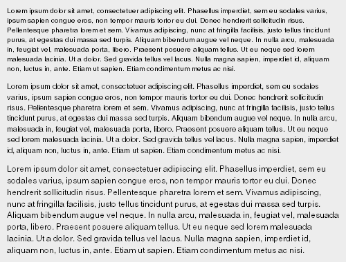
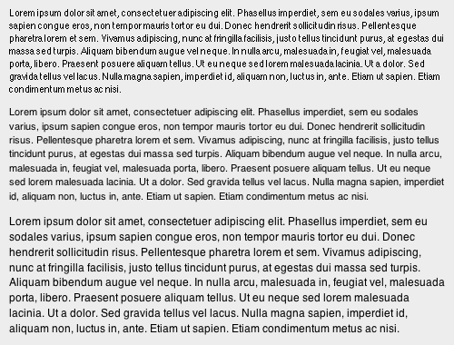
I made an example page to show the various Helvetica sizes from 10px – 20px.
So I guess this is more of a call to action than a post. So web designers, Stop Using Helvetica at such small sizes!
";s:13:"numberOfLikes";N;s:10:"bodyBlocks";a:0:{}}}}}i:1;O:25:"yii\caching\TagDependency":3:{s:4:"tags";a:4:{i:0;s:7:"element";i:1;s:29:"element::craft\elements\Entry";i:2;s:40:"element::craft\elements\Entry::section:4";i:3;s:7:"graphql";}s:4:"data";a:4:{s:40:"CraftCMSce35088bdfe0816226cd17fd051a4803";s:21:"0.70573500 1736501960";s:40:"CraftCMS2743a789e8993267a348eee1ee7e4450";s:21:"0.67537500 1713205687";s:40:"CraftCMS2ac34726f299f7e18e449d8e536c67f8";s:21:"0.84529700 1741778847";s:40:"CraftCMS3817d4a648fcfac939af46605323feb0";s:21:"0.36746500 1735923287";}s:8:"reusable";b:0;}}